Juventus Logo
Juventus was, is, and will be a great Italian club, a real token of Calcio for many decades to come. It is one of the oldest clubs in Italy. After the First World War, the team established its status as one of the best teams in the country, becoming a constant contender for medals. Juventus took 7th place in the list of the best football clubs of the 20th century according to FIFA and 9th place according to Kicker magazine. IFFHS also put Juventus in 2nd place in the ranking of the best European clubs of the 20th century.
Meaning and History
The most well-known club in Italy was founded back in 1897 by students of the Liceo Classico Massimo d’Azegli. The club’s first name was Sport Club Juventus (Latin for “iuventūs” meaning “youth”), and the team wore a pink uniform. In 1899, the name of the club changed to FootBall Club Juventus, and a year later the team started participating in competitions under the auspices of the FFI. It took six years for Juventus to win their first league title – in 1905. There were good and not-so-good times when it almost went bankrupt, but the team still exists and has many fans.
What is Juventus?
Juventus is an Italian professional football club based in Turin. One of the oldest and titled clubs in Italy, Europe, and the world. It is the third oldest Italian club and one of two clubs from Turin in Serie A.
1905 – 1921
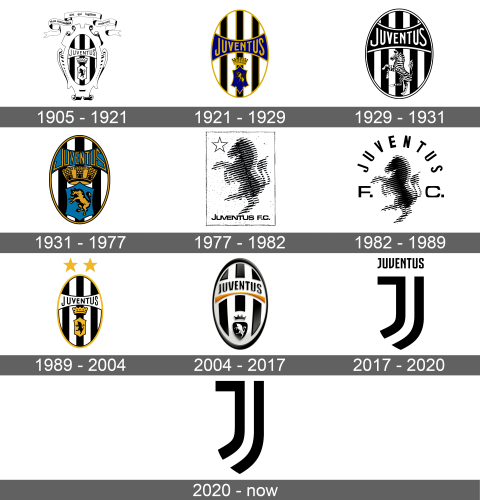
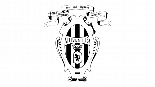
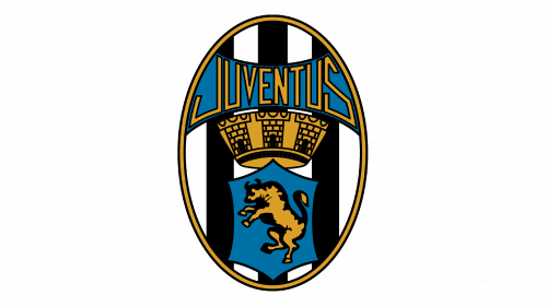
The original emblem of the team looked a lot like a heraldic symbol because it had an oval element in the center with intricate, curved details. The center oval element has wide black and white stripes going up and down vertically. Across this element, there is a banner with the word “Juventus” on it done in all uppercase letters. Underneath the banner, there is a crown, and below it has a symbol with a standing bull. Above this grand emblem, there is a long, curved ribbon with the team’s motto in Italian.
1921 – 1929
The black and white emblem not only acquired colors but also changed its form. Overall, it was simplified a lot and all the complex elements along with the ribbon were removed. It featured only the inner part of the previous emblem. The oval had a clean golden border. Inside, it still had three black and four white vertical lines, except the black lines were also outlined by a golden border just like the banner across the oval and a crest element. The name of the team that was written on the banner was also done in this gold color and had thicker lines. It contrasted well against the dark blue color of the ribbon. The golden bull was also depicted on a blue background. The crown had a more realistic look.
1929 – 1931
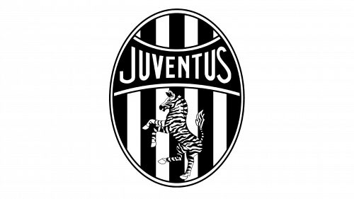
The logo was redrawn once more and the team return to a black and white color scheme. The oval acquired a double border with a thin black outline. The banner got wider and was moved into the upper half of the emblem. It was done in black and had a white followed by a thin black outline. The name was done in the same style only in white color. A major change was done when it comes to other elements on the emblem. They were replaced by a realistic drawing of a zebra that was standing on its back feet similar to the bull. It took slightly more than half of the oval emblem and looked striking against a background with multiple stipes.
1931 – 1977
A new variation of the 1921 emblem was brought back along with the color palette. The team left a golden border only around the oval emblem. Two black lines were added on both sides of the golden border. The banner, name, and crest with the bull all got black outlines. The name was written using a different style of font and had more straight lines and sharp edges. The crown looked a lot bigger and the details on it were more visible.
1977 – 1982
The horse was brought back. The new update was quite drastic as the team steered away from the heraldic emblem and depicted the horse on a white background with a rectangular thin outline. The shape of the animal resembled the one used before, but it was not a detailed drawing. The horse was done as diagonal black and white lines that formed a silhouette of the animal. At the top left corner, there was an outline of a star. At the bottom, it stated “Juventus F. C.” and although all the letters were uppercase, the first letter looked slightly taller. The logo was done in black and white colors.
1982 – 1989
The horse element was used as a standalone logo of the team. It was complemented by the name, which was written arching above the animal. The letters “F” and “C” were written at the bottom on either side of the animal. All the letters were uppercase. The previous color scheme was preserved.
1989 – 2004
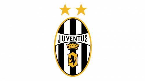
An updated logo introduced back in 1921 was brought back. It no longer has blue because the bull is done in black on a golden background while the black letters look perfect against white. The black lines also do not have golden outlines. Two golden stars were added above the oval emblem. Overall, the logo had a cleaner and more cohesive look.
2004 – 2017
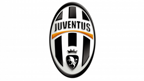
The redesigned logo had a 3D look and the only gold element was an arched line under the name. All the elements had white space around them. The center black stripe did not come all the way down as it did before, so the crown and the bull had a space of their own. The letters also got bolder.
2017 – 2020
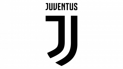
The new logo was simply a letter “J” with “Juventus” written above it. The name was meant to serve as the top line of the letter “J” while two more black lines formed the remaining portion of the letter. It had open ends and whites space between the lines and the word above. It was done in black and looked stylish and modern.
2020 – Today
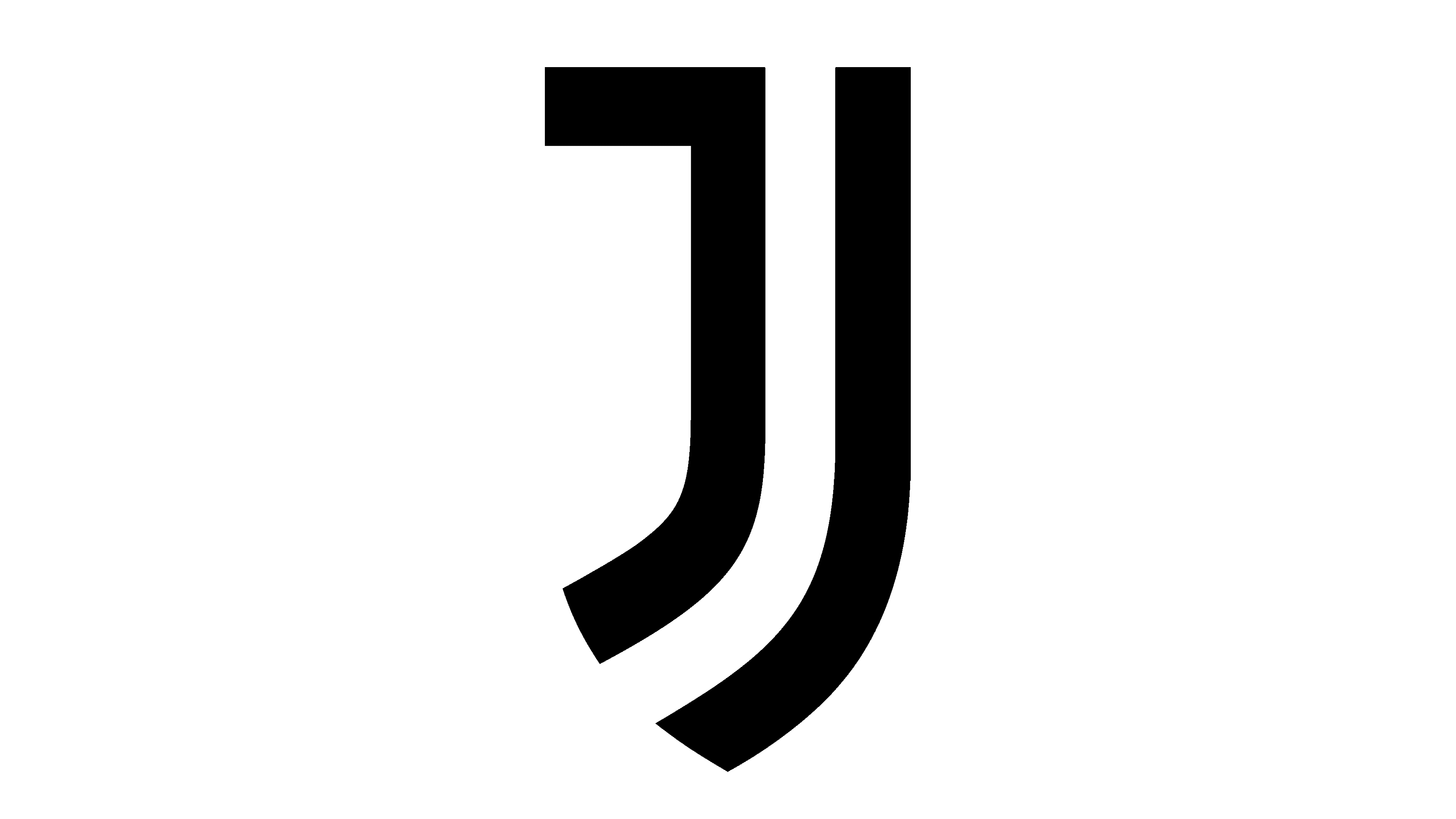
The team removed the name above. The new logo looked like a letter “J” with another line on the right partially repeating the vertical line. Just like the previous version, the logo looked simple, yet professional.
