Manchester City Logo
Manchester City Football Club is at the forefront of world football. The team has a huge number of stars, which allows us to increase the number of fans. The club has a long history. It was formed in 1880, changed its name several times, until it reached sports peaks.
Meaning and history
Manchester City Football Club is an English football club from Manchester. It was founded in 1880, although the current name wasn’t adopted until 1894. That makes it one of the oldest professional clubs in English history, and one of two major teams from this city.
Manchester City had its share of successes and low points. Their first big win was in 1904 at the FA Cup, followed by the First Division win of 1937. Since then, it started struggling financially, which drove them to the Third Division at the end of the 90s. Currently, it’s the 2nd club of the Premier League.
What is Manchester City?
Manchester City is one of the top-ranking professional football clubs in England. Active since 1880, it’s one of the oldest continuous clubs in this country. It’s regarded as one of the best teams in England and Europe, being steep rivals with another Manchester team, Manchester United.
1880 – 1887
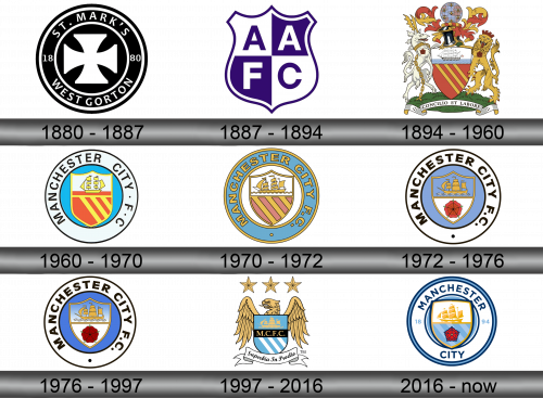
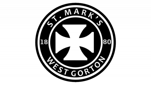
The team was originally called St. Mark’s (West Gorton). Its logo was a black circle with a name, in the center was a black cross on a white background.
1887 – 1894
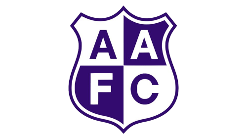
The first renaming took place in 1887. Ardwick A.F.C. Football Club had a simple emblem, a white and purple shield, in which the letters that are the abbreviation of the club are inscribed.
1894 – 1960
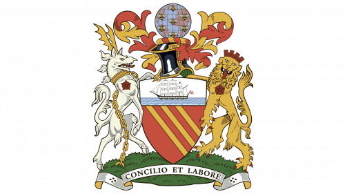
The first logo included the whole picture. A lion and an antelope are holding a shield, at the top of the shield is a ship, at the bottom – gold stripes on a blue background. Above the shield is a helmet and a globe. This is very similar to what Manchester United used at the beginning of their history. Manchester City last used this variation of their first logo in 2011.
1960 – 1970
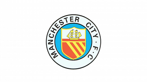
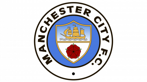
The logo has acquired more recognizable features. The shield with the ship and sails remained, but it was surrounded by an additional blue circle. It contains the name of the team in black letters.
1970 – 1972
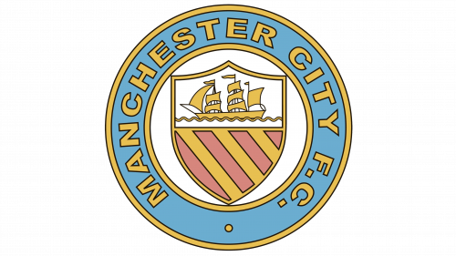
Colors have been changed. The shield with the ship began to be located on a white background, and not on a blue one. The team name is now written in yellow letters on a blue background.
1972 – 1976
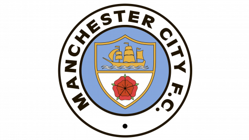
In 1972, the colors of the logo changed again. The team name is written in black letters on a white background. The shield with the ship is on a blue background. The bottom of the shield now displays a red rose on a white background.
1976 – 1997
The rose red has taken on a richer hue. The ship was previously depicted on a blue background, now the background is a gradient from white to blue.
1997 – 2016
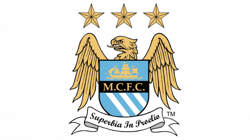
In 1997, the logo was designed with a shield with three stripes, but now they are white on blue. The abbreviation for the team name is found between the ship and the lower part of the shield. Below is a banner with a motto. around the shield is an eagle, above it – three five-pointed golden stars.
2016 – Today
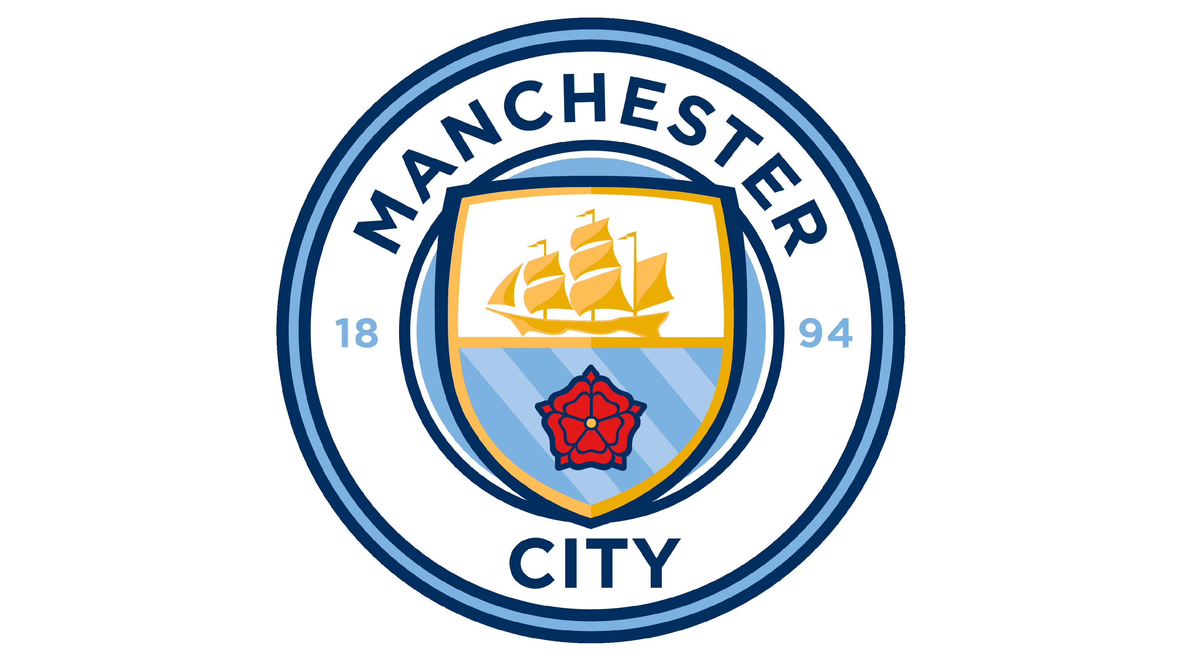
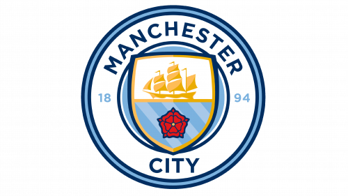
This logo is more traditional. There is also a shield in the circle. There was a place on the shield with three stripes and a red rose. Also, the year of foundation appeared here – 1894. The club has been leading its history since the time when it received its modern name.
Color and font
The name of the club is written in an original way. Manchester is drawn in an oval along the outline of a circle, and City in a straight line. The main color of the team is blue, so it dominates the design.
