Minnesota Wild Logo
The Minnesota Wild, an NHL team established in 1997, is currently playing its 24th season. The team’s general manager is Bill Guerin and the coaches have included Dean Evason and John Hynes. Key players include Jared Spurgeon (captain), Marcus Foligno, and Kirill Kaprizov (alternate captains). Their home arena is the Xcel Energy Center, with minor league affiliates Iowa Wild (AHL) and Iowa Heartlanders (ECHL). The team’s performance this season includes a mixed record of wins and losses, playing both at home and on the road. For detailed statistics and updates on their season, you can visit their page on Wikipedia.
Meaning and history
The Minnesota Wild, an esteemed member of the National Hockey League (NHL), emerged in the heart of Saint Paul, Minnesota, in the year 2000. This momentous event heralded the return of elite ice hockey to Minnesota following the relocation of the Minnesota North Stars to Dallas in 1993.
Embarking on their journey in the 2000-2001 season, the Wild captured the imagination of fans, intertwining Minnesota’s deep-rooted hockey traditions with their fresh identity. The choice of “Wild” as their moniker mirrors the state’s rich natural landscapes and diverse wildlife.
Their third season, 2002-2003, was a watershed moment as the Wild stunned the hockey world by advancing to the Western Conference Finals. This unexpected feat etched the team into Minnesota’s sporting lore.
Renowned for their emphasis on cohesive team dynamics rather than individual superstars, the Wild have cultivated a distinctive playing style centered around robust defense. This approach is exemplified by figures like Mikko Koivu, whose tenure as captain stands as a testament to steadfast leadership and reliability.
Throughout their history, the Wild have navigated the typical ebbs and flows of professional sports, including coaching shifts, player transitions, and varied season performances. Yet, their dedication to building a formidable and engaging team has been unwavering.
While the coveted Stanley Cup has remained just out of reach, recent seasons have seen the Wild consistently reach the playoffs, bolstered by a fervent and loyal fan base.
The Minnesota Wild not only represent Minnesota’s enduring passion for hockey but also have become a beacon of community pride and the embodiment of the state’s indomitable spirit. Their ongoing saga, a tapestry of victories and challenges, remains a vital chapter in NHL history.
What is Minnesota Wild?
The Minnesota Wild is a professional ice hockey team based in Saint Paul, Minnesota, competing in the National Hockey League (NHL) since 2000. Known for their spirited play and deep connection with Minnesota’s rich hockey heritage, the Wild has become a beloved emblem of the state’s passion for the sport. Their journey in the NHL is marked by enthusiastic fan support and memorable moments on the ice.
2000 – 2013
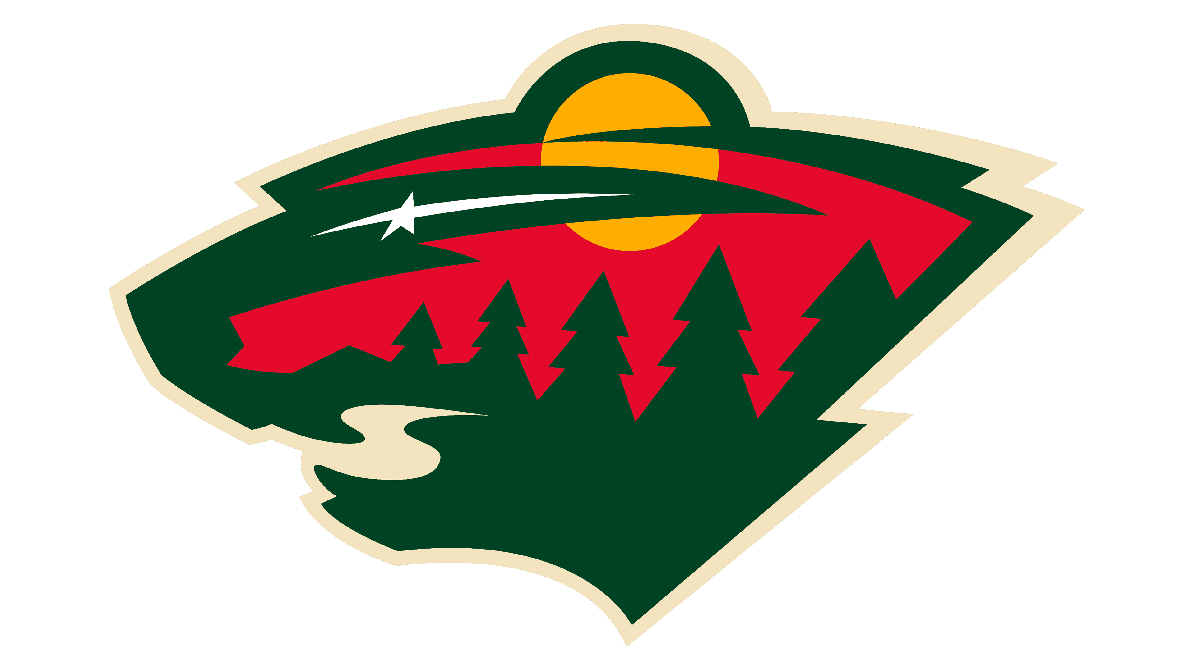
The emblem of the Minnesota Wild is a visual tribute to Minnesota’s wilderness and its status as the “State of Hockey.” At first glance, the logo presents the silhouette of a bear’s head, but a closer look reveals a landscape rich with symbolism. A setting sun or moon hovers over a forest of evergreen trees, casting its warm glow against a backdrop suggestive of the evening sky. A shooting star crosses the scene, adding a dynamic element of wonder and aspiration. The colors chosen—deep forest green, a bold red, and accents of wheat and white—are a nod to the natural hues found within the Minnesota outdoors. This logo cleverly encapsulates both the spirit of the wild and the heart of hockey.
2013 – Today
In the updated logo, the text “Minnesota Wild” that previously arched above the imagery has been removed, streamlining the design to focus solely on the graphical elements. This shift to a more minimalist approach places greater emphasis on the visual story within the bear’s silhouette. Additionally, the color palette has brightened subtly, infusing the design with a softer, more contemporary feel. The lighter hues may convey a sense of renewal or a fresh chapter for the team, while the cream outline now crisper against the lighter colors, enhances the logo’s three-dimensional effect. The design’s evolution reflects a modernized vision, keeping the team’s identity rooted in tradition while adapting to a changing aesthetic landscape.


