Most Famous US Music Festivals and Their Logos
The United States is a multicultural country. That is why a huge number of festivals are held here every year, very different in theme and atmosphere. Regular concerts are a great way to take your music experience to the next level, but many argue that music festivals are even better. Music festivals give people who can’t get enough of one concert the opportunity to enjoy music for days!
Countless people are attracted to music festivals in the United States. Music festivals promise a lively atmosphere, star-studded lineups, out-of-the-ordinary events, and an upbeat vibe. A variety of exhibitions, movie screenings, and exhibitions are frequently held in addition to performances. Festivals are growing in popularity and attention, and new ones are held every year.
We invite you to get acquainted with the most significant and interesting of them, including emblems that became an integral part of the festival they represent. You will see how each logo was designed to be a perfect reflection of the emotions and experience one will receive at the festival.
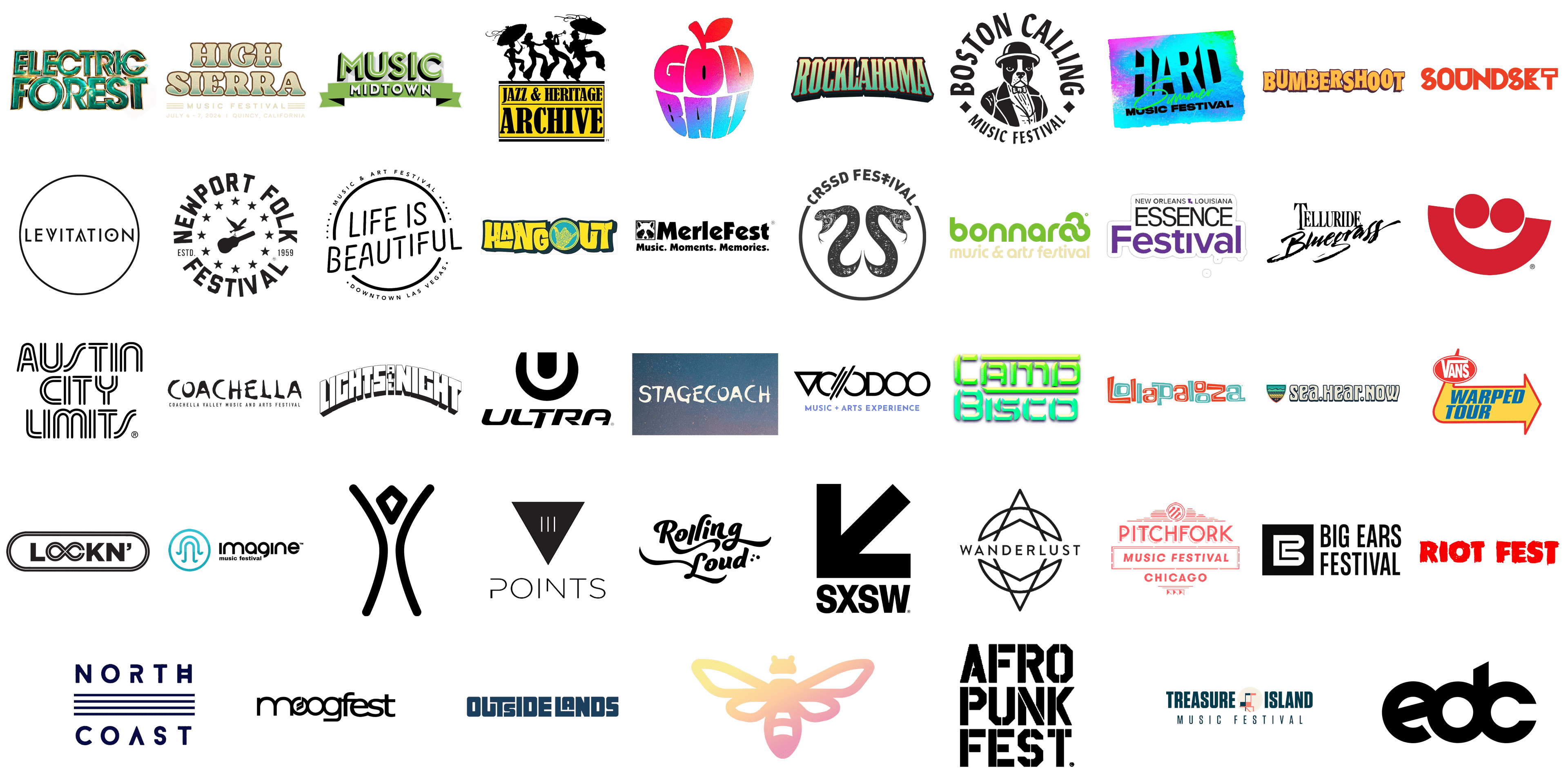
Bonnaroo
![]()
Bonnaroo, which means “Best on the street” in Creole slang, is one of the best festivals in the US that one won’t want to miss. Renowned for its colorful ambiance and varied lineup, Bonnaroo has grown to be one of the most eagerly awaited music events in the US. It features both established and emerging artists, offering a unique and varied musical experience to all festival-goers. The lively green color combined with the yellow reflects the event’s energy and cheer of the event. The use of a rounded font and all lowercase characters enhances a friendly atmosphere.
Boston Calling
![]()
Boston Calling was first held in 2013 but has already received many awards. Every year, multiple stages in Boston feature music from all genres, from hip-hop to alternative rock. In addition to musicians, the best stand-up comedians in America perform at the festival. This is a three-day music festival held on the grounds of the Harvard Athletic Complex that usually starts the weekend before Memorial Day. A logo featuring a Boston terrier wearing a tuxedo has been a prominent feature of Boston Calling. It not only hints at the place of the event but also gives it a more formal and at the same time amusing feel.
Coachella
![]()
Coachella is an independent music and arts festival, which has been held for twenty years in the USA in California. Stars of global pop and electronic music as well as indie rock and hip-hop are among the many types of musicians that perform at the event. The designers went for a funky, handwritten font style for the festival name to reflect the creativity and endless imagination that the artists bring to the event. At the same time, the black color created a neutral and timeless base. The logo looks quite unique, which makes it easy to associate it with this annual event.
Electric Daisy Carnival (EDC)
![]()
Electric Daisy Carnival is an exciting three-day music festival featuring the world’s top EDM artists. This event is not only about music but also about exciting art installations, carnival rides, interactive entertainment, and full-service concessions, making it a truly exciting experience for visitors. Although the initials in this logo look quite reserved, they are typically placed on a colorful, vibrant, and busy background. Such design allows the event holders to bring something new every year while still being able to preserve a recognizable image.
Firefly Music Festival
![]()
Over the course of its existence, the Firefly Rock Festival has earned a solid reputation and is the largest and wildest annual party in Delaware. It was visited by “The Killers”, “Kings of Leon”, “Red Hot Chili Peppers”, “Foo Fighters” and Sir Paul McCartney. The festival also delights visitors with an impressive range of food and drink items. A basic firefly silhouette can be seen on its own or used as part of a more complicated design that might also include the event name. Given the festival name, such an image was a great way to create an association with the Firefly Music Festival using minimal visual information. It also creates a very magical and enchanting atmosphere.
Hard Summer Music Festival
![]()
Since its 2008 launch, this two-day event has seen an electronic music explosion and has become a mainstay of the Southern California electronic festival scene. This music festival combines live acts, crossover artists, underground scene champions, and top-tier electronic music. The neon color of this emblem instantly catches the attention, especially of the younger audience. It reminds of all the fun at such music festivals, including unforgettable performances, energizing dances, and upbeat music. The contrasting black color of the inscription adds a bold touch.
Life is Beautiful Festival
![]()
There is a wide range of gastronomic and creative experiences available at this unique music and arts event, which is located in downtown Las Vegas. The goal of the Life Is Beautiful Festival is to unite individuals from all corners of the globe via a happy, upbeat musical experience. Interestingly, the event creators went with a black-and-white color palette for the logo and a minimalistic design. The round emblem shows that the event is meant to connect people around music and good food, while a simple design leaves space for endless creativity.
Lollapalooza Festival
![]()
Lollapalooza, which means “extraordinarily impressive”, is an annual music festival that takes place in Chicago and 6 other cities around the world. The most popular musicians perform at the festival. It also features dance and comedy shows, as well as a crafts fair. An iconic event logo features two “o’s” stacked on top of each other as well as alternating teal and orange colors for the characters. The colors are rather muted and create an old-fashioned and nostalgic feel, making one crave for remarkable memories for the rest of their life.
New Orleans Jazz Festival
![]()
The Jazz Festival is an annual celebration of the unique culture and heritage of New Orleans and Louisiana. It brings together unforgettable performances by nationally and internationally renowned guest artists to create one of the most diverse music festival lineups in the world. Nearly half a million fans gather annually for the seven-day event, which features virtually every style of American music. The festival’s logo tells the whole story with dancing silhouettes of musicians. Just looking at the logo, can be confident that it will never be boring at the New Orleans Jazz Festival.
Voodoo Music + Arts Experience Festival
![]()
Held every Halloween weekend, this festival offers visitors the opportunity to celebrate All Hallows’ Day in style to the sounds of a variety of alternative artists. It is known for peppering its performances with high-profile celebrities from all genres of music. Carnival rides and fortune-telling booths complement the music, and of course, the menu features a wide variety of delicious New Orleans dishes. As for the logo, the designer went for a rather simple emblem and played with the font to make the logo look distinctive. A light purple accent line at the bottom nicely complemented its geometric appearance with clean, black lines.
High Sierra Music Festival
![]()
The High Sierra Music Festival, held annually in Quincy, California, is a celebration of diverse musical genres and community spirit. Since its inception in 1991, this festival has attracted music lovers from all over the country, providing a platform for an eclectic mix of artists ranging from bluegrass and rock to funk and reggae. The logo of the High Sierra Music Festival features a retro-inspired, bold typography with a gradient effect that transitions from a soothing turquoise to a warm beige. This design captures the laid-back and inclusive vibe of the festival, evoking a sense of nostalgia and adventure. The festival typically takes place over the Fourth of July weekend, offering attendees not only an incredible lineup of music but also activities such as yoga sessions, parades, and workshops, making it a family-friendly event. The logo’s earthy tones and vintage style perfectly represent the festival’s emphasis on nature, community, and the rich cultural tapestry of the Sierra Nevada region.
Electric Forest
![]()
Electric Forest is an enchanting annual music festival held in Rothbury, Michigan, known for its unique fusion of electronic and jam band music, immersive art installations, and a magical forest setting. The logo for Electric Forest is vibrant and captivating, featuring bold, futuristic typography with a green and gold color scheme that sparkles with hints of light. This design reflects the festival’s electric energy and its otherworldly atmosphere, inviting festival-goers to step into a realm of wonder and creativity. Since its debut in 2011, Electric Forest has become a beloved event for fans of electronic music and live bands, offering a surreal experience that blends music, nature, and art. The festival’s logo, with its glimmering and dynamic style, encapsulates the essence of this mystical gathering, where attendees can explore the enchanting Sherwood Forest, adorned with interactive art, light displays, and secret stages, creating unforgettable memories under the canopy of trees.
Stagecoach
![]()
Stagecoach is one of the largest and most celebrated country music festivals in the United States, held annually at the Empire Polo Club in Indio, California. The logo for Stagecoach features a rustic, hand-painted style font that conveys a sense of authenticity and nostalgia, set against a backdrop of a starry night sky, symbolizing the open-air, desert setting of the festival. Since its inception in 2007, Stagecoach has been a haven for country music enthusiasts, showcasing a mix of legendary artists and emerging talents from the country, bluegrass, and folk genres. The festival’s logo perfectly captures the spirit of the American West, with its rugged, earthy design that evokes images of wide-open spaces and a rich musical heritage. Known for its lively atmosphere, Stagecoach not only offers stellar music performances but also a range of activities including line dancing, BBQ, and even a honky-tonk dance hall, making it a must-attend event for country music fans.
CRSSD Festival
![]()
CRSSD Festival, held biannually in San Diego, California, is a premier electronic music festival that attracts fans of house, techno, and indie dance music. The logo for CRSSD Festival is sleek and modern, featuring two intertwined serpents with menacing expressions, symbolizing the raw and edgy nature of the event. The minimalist black and white color scheme adds to the logo’s bold and striking appearance, reflecting the festival’s cutting-edge and underground vibe. Since its launch in 2015, CRSSD Festival has gained a reputation for its carefully curated lineup of top DJs and live acts, set against the stunning waterfront backdrop of Waterfront Park. The logo’s serpentine design and clean typography encapsulate the festival’s emphasis on high-quality music and a sophisticated, urban atmosphere. Attendees of CRSSD Festival can expect an immersive experience with multiple stages, art installations, and gourmet food and drink options, all contributing to the festival’s chic and contemporary appeal.
Rocklahoma
![]()
Rocklahoma is a renowned rock music festival held annually in Pryor, Oklahoma, known for its powerful lineup of rock and metal bands. The logo for Rocklahoma features bold, dynamic typography with a gradient effect that transitions from a cool teal to a fiery red, symbolizing the intensity and energy of the event. Since its debut in 2007, Rocklahoma has become a staple in the rock music scene, drawing fans from across the country for a weekend of hard-hitting performances and unforgettable experiences. The festival’s logo, with its striking color scheme and strong, angular font, perfectly captures the essence of rock ‘n’ roll rebellion and passion. Rocklahoma offers a variety of activities beyond the music, including a vendor village, camping, and after-parties, creating a comprehensive festival experience that celebrates the spirit of rock. The logo’s bold design reflects the festival’s commitment to delivering high-octane performances and a vibrant community atmosphere.
Lockn’ Festival
![]()
Lockn’ Festival, held annually in Arrington, Virginia, is a celebration of music, community, and collaboration, featuring a diverse lineup of rock, jam band, and Americana artists. The logo for Lockn’ Festival is sleek and modern, with a black and white color scheme and an infinity symbol incorporated into the typography, representing the festival’s focus on continuous musical exploration and connection. Since its inception in 2013, Lockn’ has become known for its unique artist collaborations and extended sets, providing an immersive musical experience for attendees. The festival’s logo, with its clean lines and symbolic design, reflects the festival’s emphasis on unity and the infinite possibilities of live music. Lockn’ offers a range of activities beyond the music, including yoga sessions, outdoor adventures, and a variety of food and craft vendors, making it a holistic festival experience. The logo’s modern and minimalist design embodies the festival’s spirit of innovation and community.
Soundset Festival
![]()
Soundset Festival, held annually in the Minneapolis-Saint Paul area, is a premier hip-hop festival that showcases a mix of established and emerging artists from the genre. The logo for Soundset features bold, geometric typography in a striking red color, symbolizing the festival’s dynamic energy and urban roots. Since its inception in 2008, Soundset has grown to become one of the largest hip-hop festivals in the country, attracting fans from all over to celebrate the culture and music of hip-hop. The festival’s logo, with its modern and edgy design, perfectly captures the essence of the event, highlighting its commitment to showcasing cutting-edge music and fostering a sense of community. Soundset offers a range of activities beyond the music, including graffiti art displays, a custom car show, and a skate park, making it a comprehensive celebration of hip-hop culture. The logo’s bold design reflects the festival’s dedication to delivering a high-energy and unforgettable experience for attendees.
Governors Ball
![]()
Governors Ball, held annually on Randall’s Island in New York City, is a multi-genre music festival that attracts a diverse array of artists and fans. The logo for Governors Ball is vibrant and playful, featuring a stylized apple with the festival’s name creatively incorporated into the design, symbolizing the festival’s connection to New York, the “Big Apple.” Since its debut in 2011, Governors Ball has become a staple of the summer music festival circuit, known for its eclectic lineup that spans rock, hip-hop, electronic, and pop music. The festival’s logo, with its colorful and whimsical design, captures the spirit of fun and creativity that defines Governors Ball. Beyond the music, the festival offers a variety of food vendors, art installations, and activities, creating a vibrant and immersive experience for attendees. The logo’s playful and artistic style reflects the festival’s commitment to providing a dynamic and inclusive environment where music and culture intersect.
Music Midtown
![]()
Music Midtown is a prominent annual music festival held in Atlanta, Georgia, known for its diverse lineup and vibrant atmosphere. The festival’s logo features bold, retro typography in a fresh green and black color scheme, symbolizing the festival’s dynamic energy and modern appeal. The design incorporates a banner, giving it a celebratory feel that aligns with the festival’s spirit of joy and community. Since its inception in 1994, Music Midtown has grown to become one of the largest music festivals in the Southeast, drawing tens of thousands of fans each year. The festival’s logo, with its eye-catching and playful design, perfectly captures the essence of Music Midtown, highlighting its commitment to providing an unforgettable musical experience. The event spans two days and features multiple stages with performances from top artists across genres, making it a must-attend for music enthusiasts. The logo’s lively design reflects the festival’s eclectic and inclusive nature, celebrating music and culture in the heart of Atlanta.
Burning Man
![]()
Burning Man is an annual event held in the Black Rock Desert of Nevada, known for its unique blend of art, community, and self-expression. The logo for Burning Man is minimalist yet profound, featuring a stylized human figure with outstretched arms, symbolizing freedom, creativity, and the essence of the human spirit. The design is simple and monochromatic, reflecting the event’s focus on radical self-reliance and participation. Since its inception in 1986, Burning Man has grown into a global phenomenon, attracting tens of thousands of participants from around the world. The event is characterized by its principles, including radical inclusion, gifting, and leave no trace. The logo’s clean lines and symbolic representation perfectly encapsulate the spirit of Burning Man, where attendees come together to create a temporary city dedicated to art and community. The event culminates in the burning of a large wooden effigy, symbolizing renewal and transformation, a theme that is mirrored in the logo’s timeless and impactful design.
Treasure Island Music Festival
![]()
Treasure Island Music Festival, held annually in San Francisco, California, is known for its eclectic lineup and stunning location on Treasure Island. The festival’s logo features modern typography with a geometric design, incorporating a stylized representation of a ship and an island. The navy blue and coral color scheme evokes the maritime theme, reflecting the festival’s unique island setting. Since its debut in 2007, Treasure Island Music Festival has become a beloved event for music fans, offering a diverse range of artists from indie rock to electronic music. The logo’s clean and contemporary design captures the festival’s innovative spirit and connection to the Bay Area. The event provides attendees with breathtaking views of the San Francisco skyline and a relaxed atmosphere, complemented by art installations and gourmet food vendors. The logo’s nautical elements and bold typography convey the festival’s adventurous and vibrant nature, celebrating music and art in a picturesque setting.
Levitation
![]()
Levitation, formerly known as Austin Psych Fest, is an annual music festival in Austin, Texas, that celebrates psychedelic music and culture. The festival’s logo features a minimalist, circular design with clean typography and a subtle geometric element, reflecting the festival’s modern and innovative approach. The black and white color scheme adds a timeless and sophisticated feel to the logo, symbolizing the festival’s deep roots in the psychedelic music scene. Since its inception in 2008, Levitation has become a key event for fans of psychedelic rock, featuring performances from legendary and emerging artists alike. The logo’s sleek and understated design captures the essence of Levitation, emphasizing the festival’s focus on musical exploration and artistic expression. Held in various venues across Austin, Levitation offers a unique and immersive experience, with live music, art installations, and a vibrant community of music lovers. The logo’s simple yet striking design embodies the festival’s spirit of creativity and innovation.
Sea.Hear.Now Festival
![]()
Sea.Hear.Now Festival, held annually in Asbury Park, New Jersey, is a celebration of music, art, and surf culture. The festival’s logo features playful, rounded typography with a vibrant color palette that includes shades of blue and orange, symbolizing the ocean and the sun. The design also incorporates a shield with waves and a beach scene, reflecting the festival’s coastal setting and surf theme. Since its debut in 2018, Sea.Hear.Now has quickly gained popularity for its eclectic lineup and unique blend of music and surf culture. The logo’s whimsical and colorful design captures the festival’s laid-back and fun atmosphere, highlighting its connection to the beach and the ocean. Attendees can enjoy live music performances, surf competitions, and art installations, creating a multifaceted festival experience. The logo’s beach-inspired elements and vibrant colors perfectly represent the festival’s spirit of celebration and community, making it a standout event in the festival calendar.
SXSW (South by Southwest)
![]()
South by Southwest (SXSW) is an iconic annual festival held in Austin, Texas, that combines music, film, and interactive media. The festival’s logo is bold and modern, featuring a distinctive arrow motif pointing in various directions, symbolizing the diverse and dynamic nature of the event. The black and white color scheme adds a timeless and professional feel to the logo, reflecting SXSW’s status as a premier cultural event. Since its inception in 1987, SXSW has grown into one of the largest and most influential festivals in the world, attracting industry professionals and enthusiasts from across the globe. The logo’s clean and versatile design captures the essence of SXSW, emphasizing its focus on innovation, creativity, and collaboration. The event spans several days and features a wide range of activities, including keynote speakers, film screenings, music performances, and interactive exhibitions. The logo’s directional arrows and bold typography convey the festival’s spirit of exploration and discovery, making it an essential destination for creatives and professionals.
Bumbershoot
![]()
Bumbershoot is an annual arts and music festival held in Seattle, Washington, known for its eclectic lineup and diverse range of activities. The festival’s logo features bold, playful typography in a vibrant yellow and brown color scheme, reflecting the festival’s fun and whimsical atmosphere. The design evokes a sense of joy and creativity, perfectly capturing the spirit of Bumbershoot. Since its inception in 1971, Bumbershoot has become one of the largest urban arts festivals in North America, attracting thousands of attendees each year. The festival’s logo, with its lively and colorful design, highlights its commitment to celebrating a wide array of art forms, including music, film, comedy, and visual arts. Held over Labor Day weekend, Bumbershoot offers a dynamic and immersive experience, with multiple stages, art installations, and food vendors spread across Seattle Center. The logo’s playful and energetic style embodies the festival’s mission to bring together diverse communities and celebrate the arts in a vibrant urban setting.
Austin City Limits
![]()
Austin City Limits (ACL) is a renowned annual music festival held in Austin, Texas, that features a diverse lineup of artists from various genres. The festival’s logo is sleek and modern, featuring a distinctive, geometric typography with a black and white color scheme, symbolizing the festival’s sophistication and broad appeal. The design captures the essence of ACL, highlighting its commitment to high-quality music and cultural diversity. Since its inception in 2002, ACL has grown into one of the largest music festivals in the United States, attracting music fans from around the world. The festival’s logo, with its clean lines and bold design, reflects the vibrant and innovative spirit of Austin, known as the “Live Music Capital of the World.” ACL spans two weekends and features multiple stages with performances from top artists, offering a comprehensive and immersive musical experience. The logo’s modern and elegant design embodies the festival’s dedication to excellence and its role as a premier cultural event in Austin.
Telluride Bluegrass Festival
![]()
The Telluride Bluegrass Festival, held annually in Telluride, Colorado, is a renowned celebration of bluegrass and acoustic music that attracts fans from around the globe. The festival’s logo features elegant, hand-drawn typography with a classic and rustic feel, reflecting the festival’s deep roots in traditional American music. The black and white color scheme adds a timeless and sophisticated touch, emphasizing the festival’s long-standing history since its inception in 1974. The logo’s script style captures the essence of bluegrass music’s rich, soulful, and authentic character. Held in the picturesque San Juan Mountains, the festival offers a breathtaking backdrop that complements the musical performances. The logo’s design mirrors the festival’s dedication to preserving and celebrating the heritage of bluegrass music while also embracing contemporary influences. Attendees can enjoy a diverse lineup of artists, workshops, and jam sessions, creating a vibrant and immersive experience that honors the spirit of bluegrass.
Hangout Music Festival
![]()
Hangout Music Festival, held annually in Gulf Shores, Alabama, is a premier beachside music event known for its eclectic lineup and vibrant atmosphere. The festival’s logo features bold, playful typography in a striking yellow and blue color scheme, reflecting the festival’s fun and laid-back beach vibe. The design includes a circular emblem with a hang loose hand gesture, symbolizing the festival’s relaxed and welcoming spirit. Since its debut in 2010, Hangout Music Festival has become a favorite among music fans, offering a unique blend of live performances, beach activities, and art installations. The logo’s whimsical and colorful design captures the essence of the festival, highlighting its commitment to providing a memorable and enjoyable experience for attendees. With multiple stages set against the stunning backdrop of the Gulf of Mexico, the festival offers a diverse range of music genres, from rock and pop to electronic and hip-hop, making it a must-attend event for music lovers seeking a beachside escape.
MerleFest
![]()
MerleFest, held annually in Wilkesboro, North Carolina, is one of the most celebrated roots music festivals in the United States. Named in honor of the late Merle Watson, son of legendary guitarist Doc Watson, the festival’s logo features bold, black typography with a distinctive raccoon mascot, symbolizing the festival’s connection to nature and the Appalachian region. The slogan “Music. Moments. Memories.” encapsulates the festival’s mission to provide an enriching and unforgettable experience. Since its inception in 1988, MerleFest has grown into a premier event, showcasing a wide array of genres including bluegrass, folk, country, and Americana. The logo’s friendly and approachable design reflects the festival’s welcoming and family-friendly atmosphere. Held on the campus of Wilkes Community College, MerleFest offers a range of activities beyond the music, including workshops, jam sessions, and children’s events. The logo’s nostalgic and inviting style embodies the festival’s dedication to celebrating traditional music and fostering community spirit.
Rolling Loud
![]()
Rolling Loud is one of the largest and most influential hip-hop music festivals in the world, held annually in Miami, Florida, with additional editions in other cities globally. The festival’s logo features dynamic, cursive typography in a sleek black color, symbolizing the bold and contemporary nature of the event. The design conveys a sense of movement and energy, reflecting the festival’s high-octane performances and vibrant atmosphere. Since its debut in 2015, Rolling Loud has become a cornerstone of the hip-hop community, attracting top artists and thousands of fans. The logo’s stylish and modern design captures the essence of the festival, highlighting its commitment to showcasing the best in hip-hop music. Rolling Loud offers an immersive experience with multiple stages, art installations, and food vendors, creating a comprehensive celebration of hip-hop culture. The logo’s sleek and edgy style reflects the festival’s position at the forefront of the music industry, making it a must-attend event for hip-hop enthusiasts.
Warped Tour
![]()
The Vans Warped Tour, often simply known as Warped Tour, was a traveling rock festival that toured the United States annually from 1995 to 2019. The festival’s logo features bold, blocky typography in a vibrant red, yellow, and blue color scheme, with an arrow motif symbolizing movement and direction. The inclusion of the Vans logo underscores the festival’s strong association with skate culture and alternative sports. The design reflects the festival’s energetic and rebellious spirit, capturing the essence of its punk rock roots. Warped Tour was renowned for its diverse lineup of punk, rock, emo, and ska bands, providing a platform for both established and emerging artists. The festival’s logo, with its eye-catching and dynamic design, perfectly encapsulates the sense of adventure and youthful exuberance that defined Warped Tour. Known for its extensive cross-country travel and outdoor stages, the festival became a rite of passage for many music fans, offering a unique and unforgettable live music experience.
Moogfest
![]()
Moogfest is an annual music, art, and technology festival held in honor of electronic music pioneer Robert Moog. The festival’s logo features modern, sleek typography with a minimalist design in black and white, reflecting the festival’s focus on innovation and cutting-edge technology. The inclusion of a stylized oscillator wave within the “o” symbolizes the festival’s connection to electronic music and its technological roots. Since its inception in 2004, Moogfest has become a premier event for enthusiasts of electronic music and experimental art. The logo’s clean and sophisticated design captures the essence of Moogfest, highlighting its commitment to exploring the intersections of music, art, and technology. Held in Durham, North Carolina, the festival offers a wide range of activities including live performances, workshops, and panel discussions, providing a comprehensive and immersive experience. The logo’s modern and elegant style embodies the festival’s mission to celebrate creativity and innovation, making it a must-attend event for fans of electronic music and technology.
Newport Folk Festival
![]()
The Newport Folk Festival, held annually in Newport, Rhode Island, is one of the oldest and most iconic folk music festivals in the United States. The festival’s logo features classic, bold typography in black and white, with a circular design that includes stars and a guitar silhouette, symbolizing its rich musical heritage. The inclusion of a bird in flight represents freedom and creativity, core values of the folk music tradition. Established in 1959, the Newport Folk Festival has played a pivotal role in the American folk music revival, showcasing legendary artists and emerging talents. The logo’s timeless and traditional design reflects the festival’s deep connection to the history and culture of folk music. Held at Fort Adams State Park, the festival offers stunning views of the Newport Harbor and a family-friendly atmosphere. The logo’s elegant and symbolic design perfectly captures the spirit of the Newport Folk Festival, celebrating its legacy and ongoing influence in the world of music.
Camp Bisco
![]()
Camp Bisco is an annual music festival held in Scranton, Pennsylvania, known for its eclectic mix of electronic and jam band music. The festival’s logo features futuristic, geometric typography in a vibrant green and blue color scheme, reflecting the festival’s energetic and innovative atmosphere. The design captures the essence of the festival’s blend of live instrumentation and electronic beats, symbolizing its unique position within the music festival landscape. Since its inception in 1999, Camp Bisco has become a beloved event for fans of electronic music and improvisational jams, offering a diverse lineup of performances. The festival’s logo, with its modern and dynamic design, highlights its commitment to providing a cutting-edge and immersive musical experience. Held at Montage Mountain, Camp Bisco offers not only music but also a range of activities including waterpark attractions, art installations, and camping, creating a comprehensive festival environment. The logo’s bold and vibrant style embodies the festival’s spirit of adventure and innovation, making it a standout event in the festival calendar.
Summerfest
![]()
Summerfest, held annually in Milwaukee, Wisconsin, is one of the largest music festivals in the world, known for its diverse lineup and extensive history. The festival’s logo features a bold, red icon resembling a smiley face with a half-circle and two dots, symbolizing joy and celebration. This minimalist design reflects the festival’s welcoming and inclusive atmosphere. Since its inception in 1968, Summerfest has grown into a massive event, attracting millions of attendees each year. The logo’s simple yet striking design captures the essence of the festival, highlighting its mission to bring people together through music. Held at the scenic Henry Maier Festival Park along the shores of Lake Michigan, Summerfest offers multiple stages with a wide range of genres, from rock and pop to hip-hop and electronic music. The logo’s bright and cheerful style embodies the festival’s spirit of fun and community, making it a beloved event for music fans of all ages.
Essence Music Festival
![]()
The Essence Music Festival, often referred to as Essence Fest, is an annual music and cultural event held in New Orleans, Louisiana. The festival’s logo features bold, modern typography in black and purple, with the words “New Orleans Louisiana” emphasizing its location. The design reflects the festival’s vibrant and dynamic atmosphere, celebrating African American culture and music. Since its inception in 1995, Essence Fest has become a premier event, attracting top artists and thousands of attendees. The logo’s sleek and contemporary design captures the essence of the festival, highlighting its commitment to empowering and inspiring the community. Held over the Fourth of July weekend, the festival offers a wide range of activities including live performances, empowerment seminars, and cultural showcases. The logo’s bold and stylish design embodies the festival’s spirit of celebration and empowerment, making it a must-attend event for fans of music and culture.
Imagine Music Festival
![]()
Imagine Music Festival, held annually in Atlanta, Georgia, is a premier electronic dance music event known for its immersive experience and cutting-edge performances. The festival’s logo features a sleek, modern design with a stylized wave icon and bold typography in black and teal, reflecting its aquatic theme. The logo’s clean and futuristic style captures the essence of the festival, highlighting its commitment to providing a high-energy and visually stunning experience. Since its debut in 2014, Imagine Music Festival has grown into a beloved event for EDM fans, offering multiple stages, interactive art installations, and stunning light shows. The festival’s logo, with its modern and dynamic design, emphasizes its focus on innovation and creativity. Held at the Atlanta Motor Speedway, Imagine Music Festival offers a unique and unforgettable experience, combining top-tier electronic music with a vibrant and immersive atmosphere. The logo’s sleek and stylish design embodies the festival’s mission to create a magical and transformative experience for attendees.
Lights All Night
![]()
Lights All Night, held annually in Dallas, Texas, is one of the longest-running electronic dance music festivals in the United States. The festival’s logo features bold, blocky typography in a black and white color scheme, reflecting its high-energy and futuristic atmosphere. The design captures the essence of the festival, highlighting its commitment to providing an electrifying experience with top-tier electronic music performances. Since its inception in 2010, Lights All Night has become a beloved event for EDM fans, offering an immersive and visually stunning experience with multiple stages and impressive light shows. The festival’s logo, with its bold and dynamic design, emphasizes its focus on high-energy performances and cutting-edge visuals. Held at the Dallas Market Hall, Lights All Night offers a unique and unforgettable experience, combining top-tier electronic music with a vibrant and immersive atmosphere. The logo’s bold and stylish design embodies the festival’s mission to create a magical and transformative experience for attendees.
Pitchfork Music Festival
![]()
The Pitchfork Music Festival, held annually in Chicago, Illinois, is a renowned indie music event known for its diverse lineup and innovative programming. The festival’s logo features a clean, minimalist design with modern typography in a striking red color, reflecting its contemporary and cutting-edge atmosphere. The design captures the essence of the festival, highlighting its commitment to showcasing emerging and established indie artists. Since its inception in 2006, the Pitchfork Music Festival has become a beloved event for indie music fans, offering a unique and curated experience with multiple stages and diverse performances. The festival’s logo, with its clean and modern design, emphasizes its focus on innovation and creativity. Held at Union Park, the Pitchfork Music Festival offers a unique and unforgettable experience, combining top-tier indie music with a vibrant and immersive atmosphere. The logo’s sleek and stylish design embodies the festival’s mission to create a magical and transformative experience for attendees.
Riot Fest
![]()
Riot Fest, held annually in Chicago, Illinois, is a renowned punk rock music festival known for its diverse lineup and high-energy performances. The festival’s logo features bold, red typography with a raw, hand-painted style, reflecting its rebellious and energetic atmosphere. The design captures the essence of the festival, highlighting its commitment to showcasing punk rock, alternative, and indie music. Since its inception in 2005, Riot Fest has become a beloved event for punk rock fans, offering an immersive and high-energy experience with multiple stages and diverse performances. The festival’s logo, with its bold and raw design, emphasizes its focus on high-energy performances and cutting-edge visuals. Held at Douglas Park, Riot Fest offers a unique and unforgettable experience, combining top-tier punk rock music with a vibrant and immersive atmosphere. The logo’s bold and stylish design embodies the festival’s mission to create a magical and transformative experience for attendees.
Outside Lands
![]()
Outside Lands, held annually in San Francisco, California, is a premier music festival known for its diverse lineup and stunning location. The festival’s logo features bold, modern typography in a navy blue color, reflecting its contemporary and sophisticated atmosphere. The design captures the essence of the festival, highlighting its commitment to providing a high-quality and immersive experience with top-tier music performances. Since its inception in 2008, Outside Lands has become a beloved event for music fans, offering a unique and curated experience with multiple stages and diverse performances. The festival’s logo, with its clean and modern design, emphasizes its focus on innovation and creativity. Held at Golden Gate Park, Outside Lands offers a unique and unforgettable experience, combining top-tier music with a vibrant and immersive atmosphere. The logo’s sleek and stylish design embodies the festival’s mission to create a magical and transformative experience for attendees.
Ultra Music Festival
![]()
Ultra Music Festival, held annually in Miami, Florida, is one of the largest and most renowned electronic dance music festivals in the world. The festival’s logo features bold, futuristic typography with a distinctive “U” icon, reflecting its high-energy and cutting-edge atmosphere. The design captures the essence of the festival, highlighting its commitment to providing a high-quality and immersive experience with top-tier electronic music performances. Since its inception in 1999, Ultra Music Festival has become a beloved event for EDM fans, offering a unique and unforgettable experience with multiple stages and impressive light shows. The festival’s logo, with its bold and dynamic design, emphasizes its focus on high-energy performances and cutting-edge visuals. Held at Bayfront Park, Ultra Music Festival offers a unique and unforgettable experience, combining top-tier electronic music with a vibrant and immersive atmosphere. The logo’s sleek and stylish design embodies the festival’s mission to create a magical and transformative experience for attendees.
Big Ears Festival
![]()
The Big Ears Festival logo features a bold and modern design that represents the avant-garde spirit of the festival. The logo consists of a stylized “B” that seamlessly transitions into an “E,” forming a unified and visually striking emblem. The monochromatic color scheme adds a touch of sophistication, while the clean lines and geometric shapes convey a sense of order and precision. Big Ears Festival, held annually in Knoxville, Tennessee, is renowned for its eclectic mix of music, spanning genres from classical to contemporary experimental. The festival embraces a spirit of exploration and discovery, offering attendees a unique auditory experience that challenges conventional boundaries. The logo’s design encapsulates this ethos, suggesting a bridge between different musical worlds and inviting audiences to delve into uncharted territories. The minimalist yet impactful design ensures the logo is easily recognizable and reflects the festival’s commitment to artistic innovation and cultural enrichment.
North Coast Music Festival
![]()
The North Coast Music Festival logo is a minimalist design that perfectly captures the essence of this Chicago-based event. Featuring a clean, sans-serif font, the text is arranged in a block format, creating a sense of structure and modernity. Three parallel horizontal lines run through the middle of the logo, adding a visual element that evokes the idea of waves or the rhythm of music, tying in with the festival’s coastal theme. The dark blue color scheme adds a nautical touch, reinforcing the festival’s name and its association with the waterfront city of Chicago. North Coast Music Festival, often dubbed “Summer’s Last Stand,” showcases a diverse lineup of electronic, hip-hop, and rock acts, attracting music lovers from across the country. The simplicity of the logo reflects the festival’s focus on music and community, offering a straightforward yet dynamic visual identity that resonates with its audience. This design approach ensures the logo is versatile and memorable, standing out in promotional materials and merchandise.
Wanderlust Festival
![]()
The Wanderlust Festival logo features an intricate geometric design that symbolizes the interconnectedness and balance sought through yoga, wellness, and music. The central element is a stylized compass rose, signifying exploration and the journey toward personal and collective growth. This design choice reflects the festival’s mission to inspire mindfulness and holistic living. The lines are clean and precise, creating a sense of harmony and tranquility. The black and white color palette enhances the logo’s versatility and timeless appeal, allowing it to be seamlessly integrated across various media and merchandise. Wanderlust Festival, held in various locations around the world, offers a unique blend of yoga sessions, outdoor activities, thought-provoking lectures, and live music. The logo encapsulates the festival’s ethos of seeking inner peace and outer adventure, making it instantly recognizable and deeply meaningful to its community of attendees. The symmetry and balance of the design reflect the festival’s commitment to fostering a well-rounded and enriching experience for all participants.
Afropunk Fest
![]()
The Afropunk Fest logo is a bold and powerful representation of the festival’s ethos. Featuring a strong, sans-serif font, the text is arranged in a blocky, almost graffiti-like style, which conveys a sense of rebellion and urban edge. The black and white color scheme adds a stark contrast, making the logo highly visible and impactful. This design choice reflects the festival’s roots in punk rock and its expansion into a broader celebration of black culture, music, and activism. Afropunk Fest, held in cities like Brooklyn, Atlanta, and Paris, is known for its diverse lineup that spans genres from punk to hip-hop to R&B, as well as its vibrant community of artists, activists, and attendees. The logo’s raw and unapologetic design mirrors the festival’s commitment to challenging norms and celebrating individuality and inclusivity. It is a visual embodiment of the festival’s spirit, making it a powerful symbol of cultural pride and artistic freedom.
III Points
![]()
The III Points logo is a minimalist yet striking design that captures the innovative spirit of this Miami-based music, art, and technology festival. The logo features three vertical lines arranged in a triangular formation, representing the festival’s name and its three core pillars: music, art, and technology. The simple geometric design is both modern and timeless, reflecting the festival’s forward-thinking approach. The black and white color scheme ensures versatility and ease of recognition across various platforms and media. III Points Festival is known for its cutting-edge lineup, blending electronic, indie, and hip-hop acts with immersive art installations and tech showcases. The logo’s clean and elegant design aligns with the festival’s mission to push boundaries and explore new creative frontiers. It serves as a symbol of the festival’s dedication to providing a multidimensional and avant-garde experience, making it instantly recognizable to its growing community of attendees and supporters.