Cars Brands that Start With V
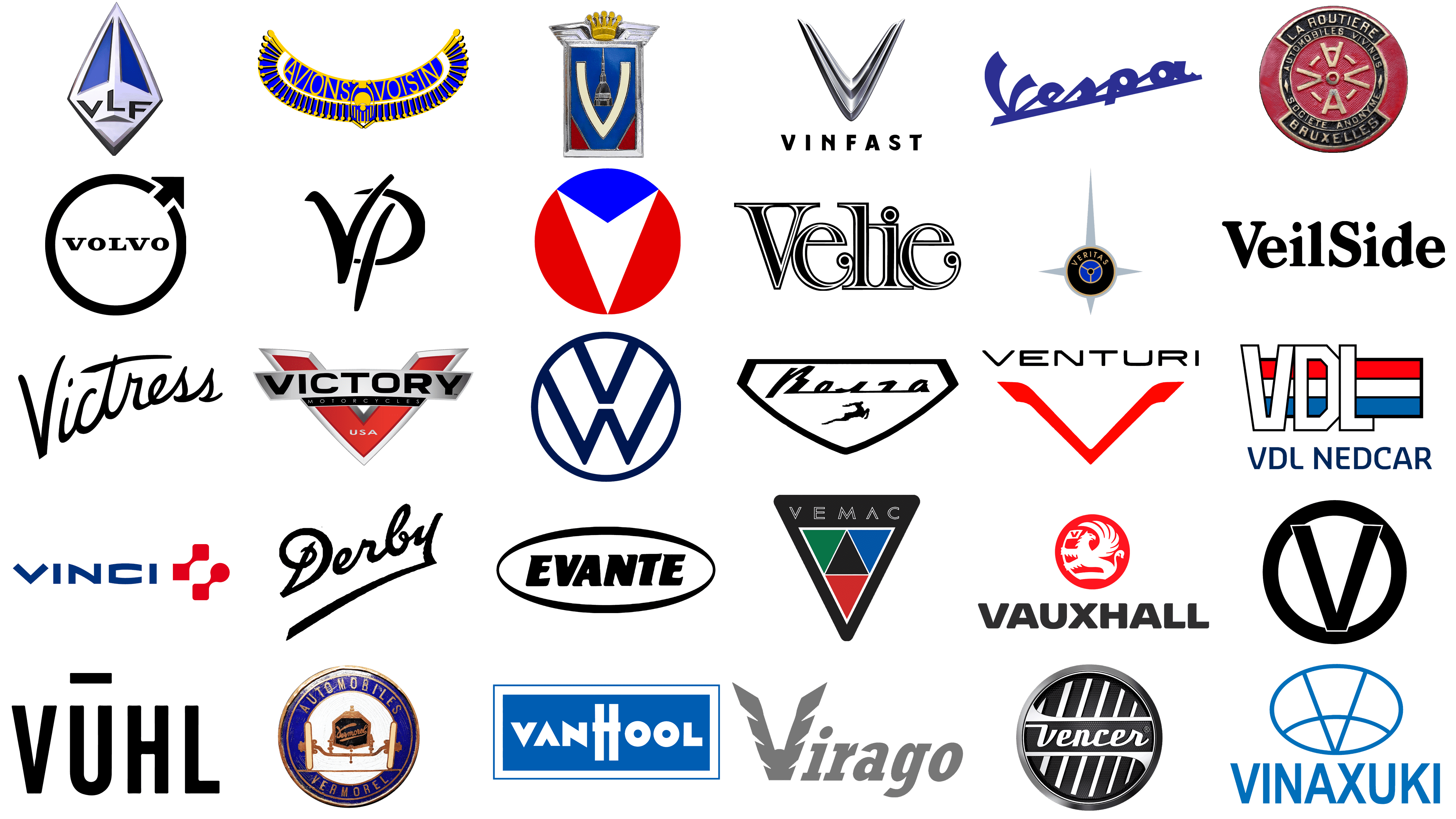
The allure of automotive logos extends far beyond mere symbols; they are emblems of history, innovation, and the relentless pursuit of mobility. As we embark on an exploration of car brands whose names start with the letter “V”, we delve into a realm where each logo is not just a mark of identification but a story in itself, a narrative of visionaries, victories, and vehicular voyages.
From the very heart of Sweden, Volvo stands as a bastion of safety and reliability, its logo a timeless representation of iron and resilience, symbolizing the brand’s commitment to durability. Contrastingly, the artistic elegance of Vignale from Italy showcases a different aspect of the automotive world, where luxury and bespoke design are paramount.
Venturing into the realm of high-performance and luxury, we encounter the enigmatic Vector Motors, an American brand synonymous with exclusivity and futuristic design. Its logo, a convergence of power and mystique, reflects the brand’s ethos of pushing the limits of automotive engineering.
Volkswagen, the people’s car from Germany, presents a logo that’s recognized worldwide, a symbol of accessibility and functionality. This emblem is as much a part of global culture as it is of automotive history, reflecting a legacy of mass mobility and the democratization of car ownership.
Then there’s the pioneering spirit of Vauxhall, a key player in Britain’s automotive narrative, whose griffin emblem encapsulates a heritage of innovation and adaptation. Similarly, Venturi, with its focus on electric mobility, mirrors the shift towards sustainable transport solutions, its logo a nod to a future where efficiency and environmental consciousness drive design.
The narrative takes a luxurious turn with Vandenbrink Design, where the logo is a token of artistic automotive expression, bespoke craftsmanship, and an individualistic approach to car design. And not to forget the high-performance spectacle of VUHL, hailing from Mexico, whose logo encapsulates the spirit of speed, performance, and the thrill of driving.
Each of these brands, with their distinctive logos, tells a unique story, painting a vivid picture of the automotive landscape. They represent a blend of heritage, innovation, craftsmanship, and a vision of the future, making the world of car logos a fascinating subject for exploration and admiration.
Vaillante
![]()
In the realm of imaginative motoring, Vaillante stands as a paragon, springing from the visionary mind of Jean Graton in the “Michel Vaillant” comic series. This fictitious French automaker, conceived in 1957, has become a symbol of the racing spirit, capturing the essence of velocity and vehicular prowess across the illustrated pages where it competes with its arch-nemesis, Leader. The emblem of Vaillante is a vibrant tapestry of red and blue, where a defiant blue chevron presides above, guiding the eye to a white ‘V’ that slices through a crimson oval like a vehicle forging its path to victory. This emblematic montage of hues and forms is a visual symphony that epitomizes both the verve of competition and the pinpoint accuracy inherent to Vaillante’s legacy.
Vale Motor
![]()
The narrative of Vale Motor is cloaked in an aura of enigma, a possible hidden gem within the automotive tapestry or a fictional entity awaiting discovery. Its symbol is a study in the power of understatement, with the name “VALE” manifested in bold, assertive lettering ensnared within a stark rectangular boundary. Below, the declaration “VALE MOTOR CO. LONDON” serves as a geographical and historical footnote, imbuing the logo with a dignified air of legacy and authenticity. This emblem, though shrouded in minimalism, projects a resonance of steadfastness and a time-honored lineage synonymous with Vale Motor.
Valmet Automotive
![]()
Valmet Automotive, hailing from the land of a thousand lakes, stands at the vanguard of automotive evolution. Since its inception in 1968, it has risen to become a bastion of automotive ingenuity, particularly in the burgeoning sector of electric vehicle technology. The brand’s insignia is a visual allegory of fluidity and interconnection, featuring dual chevrons in a duet of blues that intertwine like streams merging into a powerful river. This emblem floats above the brand’s title, rendered in a typography that is the epitome of contemporary finesse. The use of varied blue tones not only captures the crispness of Finnish design but also encapsulates the dependability and innovation that have become the hallmarks of Valmet Automotive.
Vandenbrink Design
![]()
The Dutch atelier of automotive art, Vandenbrink Design, weaves exclusivity into the fabric of its creations, offering a service that transcends mere transportation to become a statement of individuality. The company’s insignia, a marriage of metallic grace and a crimson heart forming an ‘M’, is a testament to its dedication to crafting vehicles that are as much a masterpiece as they are machines. The emblem, with its sinuous lines and bold chromatic choice, mirrors the ethos of Vandenbrink Design – that of sculpting automobiles into bespoke treasures, each with a narrative as rich and detailed as the script that bears the company’s name.
Vanden Plas
![]()
Steeped in the tradition of British luxury, the emblem of Vanden Plas speaks to a lineage of automotive nobility. The brand, which lent its coachbuilding mastery to Jaguar and Austin, is synonymous with opulence on wheels. Its logo, penned in a calligraphy that harks back to an age of handcrafted elegance, flows with the grace of a bygone aristocracy. Each curve and flourish of the Vanden Plas script is a homage to the brand’s heritage, a brand that once stood as a paragon of British luxury automotive craftsmanship.
Vanden Plus
![]()
The entity known as Vanden Plus remains shrouded in mystery, with scant details piercing the veil of its existence. Should this be a marque that dwells within the niche realms of the automotive world, its emblem suggests an entity unafraid to chart its own course. The ‘V’ and ‘P’ depicted in the logo entwine in a ballet of black lines, a visual allegory for a brand unbound by tradition, yet poised with a modernist’s eye. The abstract elegance of the form suggests a penchant for innovation and a break from convention, possibly the guiding principles of Vanden Plus’s approach to the art of the automobile.
Vector Motors
![]()
Vector Motors, the American dream manifested in the form of high-octane supercars, has, since its inception in 1971, been a beacon of innovation in the automotive world. Gerald Wiegert’s vision translated into the Vector W8 and M12, supercars that were not merely transport but a declaration of advanced aesthetics and engineering. The Vector Motors emblem is a testament to this legacy, brandishing a ‘V’ that slices through the air with its sharp angles and metallic sheen, interrupted by a red triangle that symbolizes the brand’s passion for high-speed and groundbreaking technology. This logo is the visual echo of the supercar ethos that Vector Motors continues to champion, a symbol of the relentless pursuit of automotive perfection.
Vegantune Evante
![]()
In the verdant fields of British sports car lineage, the Vegantune Evante stands as a bridge between eras, melding the timeless allure of the Lotus Elan with the progress of contemporary technology. The Vegantune Evante emblem, ensconced within an oval contour, bears the marque’s name in typeface that is both robust and resolute. This emblem whispers tales of a legacy reborn, a classic refined through the lens of modern performance enhancements. It signifies Vegantune’s dedication to the craft of car enhancement, where every vehicle is a canvas for both homage and evolution.
Veilside
![]()
Rising from the land of the rising sun, Veilside has etched its mark in the domain of aftermarket excellence. Recognized for its role in shaping the tuner and drift car cultures, Veilside’s entrance into the world in 1990 heralded a new epoch of car customization. The logo, distinct in its bold, black script adorned with unique serifs, mirrors the brand’s dedication to creating not just parts, but identities for cars. Veilside’s imprint on the automotive industry is as much about the visual statement as it is about the performance, a fact that their logo, a paragon of design prowess, reflects with every line and curve, affirming the brand’s contemporary dynamism in the art of automotive enhancement.
Velie
![]()
Velie Motors Corporation, a jewel in the crown of America’s automotive past, was an enterprise that seamlessly blended lineage with innovation. Under the stewardship of Willard Velie, a descendant of John Deere, the company carved out a niche for high-quality automobiles and aircraft engines between 1908 and 1928. The Velie logo is a tapestry of ornamental typography, a visual homage to the brand’s illustrious heritage and its pioneering spirit that introduced all-steel bodies and V6 engines to the world. The letterforms, intricate and reflective of the era’s aesthetic, whisper of a time when Velie vehicles were the embodiment of both luxury and the forward march of technology.
Vemac
![]()
Vemac, hailing from the land of the rising sun, stands as a beacon of Japanese motorsports and automotive craftsmanship. This marque has etched its name in the annals of racing series like Super GT, and its sports cars are a testament to the delicate balance between featherweight construction and formidable power. The emblem of Vemac, an inverted triangle pulsing with the hues of a traffic signal against a contrasting black, speaks of relentless motion and the brand’s multifaceted prowess. This emblem, minimalistic yet potent in its symbolism, encapsulates Vemac’s commitment to the relentless pursuit of speed and efficiency in the competitive theatre of motorsports.
Vencer
![]()
In the quietude of the Netherlands, Vencer emerged in 2010 as a boutique atelier of automotive artistry, crafting vehicles like the Vencer Sarthe that echo the Le Mans titans of yore. The Vencer badge is an ode to the synthesis of timeless design and contemporary technology. Encircled within a streamlined badge, the brand’s name is emblazoned over a backdrop that mimics a race car’s grille, flanked by wings that suggest velocity and refinement. Vencer’s insignia is a visual narrative of its dedication to forging automobiles that are not merely machines, but rather, moving sculptures that capture the quintessence of a classic sports car ethos.
Venturi
![]()
The principality of Monaco is home to Venturi, an avant-garde name in the pantheon of high-performance electric motoring. Renowned for their foray into the electric racing circuits, including the high-octane Formula E championship, Venturi has positioned itself at the vanguard of the electric revolution. The Venturi logo, a striking composition with a red chevron cleaving through the heart of a ‘V’, against a pristine background, is a metaphor for its cutting-edge trajectory in electric vehicle innovation. The bold, black script of the brand name anchors the logo, a testament to Venturi’s daring and dynamic approach to redefining the electric vehicle landscape.
Veritas
![]()
Veritas, the phoenix of German automotive engineering, rose in the aftermath of the Second World War, creating an indelible mark with its high-performance sports and racing cars. With a legacy encapsulated by the likes of the esteemed Veritas RS, the brand found its niche within the annals of racing glory. The Veritas emblem, crowned by a guiding star within a blue and yellow crest, is a beacon of the company’s pioneering spirit. The star’s radiant lines stretch towards the horizons of innovation, while the emblem beneath embodies the heart of Veritas – a steering wheel set on navigating the untrodden paths of automotive excellence.
Vermorel
![]()
The annals of French automotive history are graced by the presence of Vermorel, a manufacturer that seamlessly transitioned from automobiles to agricultural machinery. With roots deeply planted in the fertile grounds of the late 19th century, Vermorel carved out a name synonymous with luxury and innovation. Their logo, a tapestry woven with threads of gold and azure, holds within it a shield of intricate lineage, framed by a flourish of gold. The brand’s name, scripted within, harks back to a time when Vermorel vehicles were the very definition of opulence on wheels, a tribute to the brand’s luxurious French heritage.
Vernon Derby
![]()
In the quaint corridors of British motoring history, Vernon Derby stands as a symbol of the adventurous spirit of the 1920s. Though its journey was brief, the marque produced vehicles that spoke volumes of its unique approach to design and engineering. The Vernon Derby logo, with its fluid and ascending script, captures the essence of an era brimming with automotive aspirations. The unadorned elegance of the logo’s lettering mirrors the brand’s dedication to the art of car creation, a nod to Vernon Derby’s pursuit of innovation during the dawn of the automotive age.
Vespa
![]()
In 1946, in the heart of Italy, a revolution in two-wheeled transportation was born under the name Vespa, thanks to the innovation of Piaggio. This stylish and practical scooter became an emblem of freedom, its painted, pressed steel unibody and unique design combined with a front fairing, creating a cultural wave that transcended generations. The Vespa emblem encapsulates a blend of whimsy and functionality, with its italicized lettering reflecting speed and agility. The minimalist, winged design emphasizes Vespa’s esteemed status, not just as a scooter manufacturer, but as a beacon of Italian design and urban mobility.
Victoria
![]()
In the later part of the 19th century, specifically 1886, Victoria emerged in Germany as a pioneering bicycle maker. The brand later ventured into the realms of motorcycles and compact automobiles, distinguished by their pioneering designs and engineering marvels. Among their achievements was the creation of the KR 1, a vehicle that boasted an advanced engine for its era. Eventually, Victoria amalgamated with DKW during the 1950s. The Victoria brand is symbolized by a logo that features an extended typeface and ornate, flowing lines, reminiscent of an era filled with royal allure and mechanical ingenuity. This logo is a tribute to the historic motorcycles and cars that the German firm Victoria produced.
Victory
![]()
In the United States, 1998 marked the inception of Victory Motorcycles, established by Polaris Industries. The brand quickly made a name for itself with its contemporary American V-twin cruisers, touring, and sport-touring motorcycles, renowned for their stylish design and robust performance. However, in 2017, the brand ceased operations. The logo of Victory Motorcycles is a powerful testament to its American heritage, showcasing a ‘V’ winged emblem in red and silver hues, symbolizing strength, freedom, and the spirit of the open road—a spirit that was at the heart of Victory Motorcycles’ cruisers and touring bikes.
Victress Manufacturing Company
![]()
Venturing into the 1950s in America, the Victress Manufacturing Company carved its niche in the automotive history for its pioneering fiberglass body kits. These kits played a crucial role in the creation of some of the first American kit cars, highlighting the potential of fiberglass in automotive design. The logo of Victress Manufacturing Company is designed with a fluid, cursive script, exuding classic elegance and bespoke craftsmanship. This logo serves as a reminder of the company’s innovative role in American kit car culture, especially with its fiberglass body designs, marking a significant contribution by Victress Manufacturing Company in the automotive world.
Vignale
![]()
Founded in Italy in 1948 by the visionary Alfredo Vignale, Carrozzeria Vignale swiftly rose to prominence for its exquisite coachbuilding and bespoke automotive designs. Renowned for crafting custom bodies for a range of high-end vehicles, Vignale became synonymous with Italian elegance and artisanship in the world of automotive design. This era of magnificence continued until 1969, when Ford acquired the company. The Vignale badge, a testament to its legacy, features an ornate crest adorned with a royal crown and intricate detailing, set against a shield of blue and red. This emblem represents the Italian coachbuilder’s rich heritage of luxury and tailor-made craftsmanship, a hallmark of the Vignale brand.
Vinaxuki
![]()
Vinaxuki, Vietnam’s pioneering venture in the automotive sector, was established in 2004, marking a significant milestone as the country’s first domestic car manufacturer. Initially focusing on trucks and commercial vehicles, Vinaxuki mirrored the rising ambitions of Vietnam’s automotive industry. Despite its promising start, the company faced numerous challenges, leading to its closure in the mid-2010s. The Vinaxuki logo is a testament to the brand’s global aspirations, featuring a stylized circular emblem with intersecting lines that form a segmented sphere, reminiscent of a globe. The design, dominated by a professional blue hue, is split into three parts by lines suggestive of meridians, symbolizing the brand’s expansive reach. Below this emblem, the name “VINAXUKI” is boldly displayed in capitalized, sans-serif letters, exuding confidence and strength.
VinFast
![]()
VinFast, a subsidiary of Vingroup, one of Vietnam’s largest conglomerates, was established in 2017 and rapidly ascended to the forefront of the nation’s automotive industry. Distinguished as Vietnam’s premier car manufacturer, VinFast has gained international recognition, particularly for its commitment to electric vehicles, marking a pivotal turn towards sustainable mobility in Southeast Asia’s automotive landscape. The VinFast logo is characterized by a sleek and modern metallic “V”, rendered in a striking silver gradient that imparts depth and a three-dimensional quality. This is enhanced by the interplay of light and shadow, giving the logo a dynamic appearance. The “V” is designed with sharp, aggressive points, suggesting speed and performance, core attributes of the VinFast brand. The logo’s design merges minimalism with powerful imagery, combining smooth curves and sharp edges, embodying both elegance and strength. The brand name “VINFAST” is displayed in capital letters below the emblem, using a clean, sans-serif font. This typography, along with the uniform spacing between the letters, harmonizes with the symmetry of the “V”. The stark black text contrasts against a white background, enhancing readability and brand recognition.
Virago Cars Limited
![]()
Virago Cars Limited, though seemingly less prominent in the public domain, suggests a niche or historic automotive brand. Its logo features an abstract, stylized “V”, comprising two angular, wing-like shapes that evoke a sense of motion and freedom. These shapes are shaded in a gradient of gray, creating an impression of depth and layering. The word “virago” is presented in a lowercase, italicized font, providing a soft contrast to the assertive, uppercase “V”. The simple, unadorned font balances the emblem’s complexity. The darker gray of the text subtly separates it from the emblem, implying a focus on elegance and performance, with the winged “V” symbolizing the brand’s pursuit of excellence and innovation.
Vivinus
![]()
Vivinus, established by Alexis Vivinus in the late 19th century, was a French automobile and engine manufacturer noted for its lightweight cars and taxis, and its early technical innovations. The Vivinus logo features a vibrant red circular background, with a central motif and text creating a cohesive emblem. “LA ROUTIERE” is inscribed in block lettering in navy blue on the upper half, starkly contrasting the red background. This navy hue is also used for the border, encircling the entire design. At the center, cream-colored lines radiate from a point, resembling a shining sun or a wheel, with the lines representing rays or spokes. A large “A” in cream sits at this focal point. “AUTOMOBILES VIVINUS” is inscribed around this central design, interrupted by the protruding “A”. The bottom half of the circle bears “SOCIETE ANONYME BRUXELLES”, indicating the company’s corporate status and its connection to Brussels.
VLF Automotive
![]()
VLF Automotive, established in 2012 by a trio of notable figures including former General Motors executive Bob Lutz, designer Henrik Fisker, and entrepreneur Gilbert Villarreal, has emerged as a distinguished player in the American luxury sports car industry. Known for their limited edition, high-performance vehicles such as the Force 1 and Destino, VLF Automotive combines audacious design with powerful performance. Their logo is a testament to this ethos, showcasing a sharp, diamond-like shape that exudes precision and modernity. The logo’s main body gleams in sleek silver, reflecting a contemporary industrial aesthetic. Emblazoned within this diamond is the bold “VLF” in a solid, sans-serif font, each letter segmented into its own compartment – the “V” at the top, the “L” in the middle, and the “F” at the bottom. The letters are set in stark black, creating a striking contrast. Royal blue hues interspersed in the design add a touch of prestige and reliability. The silver diamond’s outline adds depth, reinforcing the logo’s dynamic and innovative feel, reflecting VLF Automotive’s commitment to futuristic and pioneering designs.
Voisin
![]()
Voisin, founded by Gabriel Voisin in 1919, has been a venerated name in the French automobile industry, known for its luxurious cars that blend innovative, aviation-inspired engineering with unique Art Deco aesthetics. The Voisin logo is a harmonious blend of blue and gold, reflecting the grandeur typical of Art Deco design. Its semicircular shape comprises two golden arcs filled with upright, feather-like shapes ending in spheres, symbolizing luxury and precision. The name “AVIONS VOISIN” is boldly inscribed in blue capital letters against this golden backdrop. Below, golden wings converge to a point, signifying the brand’s aeronautical roots and innovative spirit. The logo’s blue and gold palette not only offers a visually striking contrast but also conveys a sense of heritage and luxury, mirroring Voisin’s storied legacy in both aviation and automotive realms.
Volga
![]()
Volga, a brand under GAZ (Gorkovsky Avtomobilny Zavod), was a beacon of prestige in the Soviet Union, recognized for its robust and comfortable vehicles from the 1950s onwards. These cars were synonymous with governmental authority and reliable taxi services, encapsulating an era of Soviet automotive history. The Volga logo features a striking monochromatic design within an inverted triangular shield, conveying durability and protection. The brand name “Volga” is elegantly scripted inside the shield, offering a fluid contrast to the geometric frame. Below the name is the silhouette of a leaping deer or antelope, captured mid-bound, symbolizing grace, agility, and perhaps the vehicles’ natural elegance. The logo’s black and white palette imparts a timeless character, with the deer imagery suggesting a fusion of speed, freedom, and the brand’s graceful engineering. This logo adeptly balances traditional elements with dynamic imagery, reflecting Volga’s commitment to lasting quality and performance.
Volkswagen
![]()
Volkswagen, established in 1937 in Germany, has grown into one of the world’s most recognized automobile manufacturers. Famous for iconic models like the Beetle and the Golf, Volkswagen boasts a diverse portfolio that includes luxury cars, SUVs, and economical models. The company is also a front-runner in the development of electric vehicles and sustainable automotive technologies. The Volkswagen logo is a study in simplicity and clarity. It features a dark blue circle enclosing a “V” over a “W”. The “V” reaches up to the upper border of the circle, while the “W” extends its lower arms to the circle’s lower edge, creating a sense of balance and symmetry. The white color of the letters stands out sharply against the dark blue background, symbolizing clarity and precision. The logo’s rounded letter edges suggest approachability, and the circular shape represents unity, completeness, and Volkswagen’s global reach. The blue and white contrast is both striking and harmonious, making the logo easily recognizable and memorable.
Volvo
![]()
Volvo, a Swedish automaker established in 1927, has cemented its reputation for safety, quality, and environmental care. Known globally, Volvo’s range includes cars, trucks, buses, and construction equipment, and the brand is at the forefront of innovations in electrification, autonomous driving, and safety technologies. The Volvo logo is an embodiment of boldness and heritage. It features a black circle with an arrow pointing diagonally upwards to the right, also forming part of the circle’s border. Inside, the capitalized, sans-serif letters of “VOLVO” are centered in the upper half of the circle. The arrow, symbolizing masculinity and the ancient chemical symbol for iron, alludes to strength, durability, and the brand’s Swedish origins, known for its iron ore. The black and white color scheme is timeless and versatile, reflecting Volvo’s straightforward approach and commitment to quality. The logo acts as a seal of trust and excellence, mirroring the brand’s esteemed status in safety and reliability.
Vortex
![]()
Vortex Automotive distinguishes itself in the realm of high-octane sports and track vehicles, boasting the Vortex GT and Vortex V2 as its standout creations. With the GT, a mid-engined marvel, the thrill of acceleration from 0 to 60 mph in a swift 4.2 seconds is realized, thanks to its robust Ecoboost powertrain. The electric GT-EV variant further expands the brand’s horizons. The V2 inherits a legacy of racing prowess, achieving similar feats of speed, powered by a potent Ford engine. The brand’s emblem, a stark “V” encased in a circle, mirrors the fusion of strength and elegance that Vortex pursues, a visual testament to their commitment to power balanced with precision. For an in-depth look, visit the Vortex website.
VUHL
![]()
VUHL (Vehicles of Ultra High-performance and Lightweight), founded in 2013 by Mexican brothers Iker and Guillermo Echeverria, has carved a niche in the high-performance automotive sector. Known for the VUHL 05, a road-legal, lightweight supercar designed for both track and road use, VUHL embodies minimalism and high performance. The brand highlights Mexico’s burgeoning role in the high-performance automotive market, showcasing innovative design and engineering.