All Car Logos With Wings

Wings have always been a famous mark in the carmaking sphere. They often refer to speed, freedom, and perfection. Car badges with wings are among the most considerable in the world due to their style and elegance. This article is a complete guide to car badges showing wings in various forms.
Mazda
![]()
The logotype of a famous car producer from Japan depicts a silver oval frame with two lines going to the center. Their design both reminds wings and the letter ‘m’. Below the badge, they often depict the lettering in an angular sans-serif typeface with all letters except for ‘d’ lowercase. ‘Z’ is divided into three sectors by gaps.
Genesis
![]()
Genesis is a young South Korean brand of luxury cars that belongs to Hyundai. Since its foundation in 2015, the brand has been using a badge of a black hexagon with the brand name on it. The shape stands at the center of a detail showing two wide-spread silver wings.
Mini
![]()
Mini is a British brand of compact cars, now owned by BMW. Its latter logotype appeared in 2001 as a result of continuous updates of the previous logos. This badge represents a circle frame with the brand name in it. Each side of the circle has four lines with cut ends, getting longer from the bottom to the top ones.
Aston Martin
![]()
Aston Martin is a British marque of premium quality cars, started in 1913. Its original winged logotype was introduced in 1927, and since then the company has just improved the same concept. Now it shows an image of two wings, spread widely and straightly. Multiple lines split the image into sectors. At the center, there’s a rectangular block with the brand name. Sometimes, they also put the larger nameplate below.
Bentley
![]()
Bentley is a UK-based subsidiary of Volkswagen that manufactures hand-made luxury cars. They’re known for their astonishing status, quality, and design. Throughout its history, Bentley has developed only one logotype – two wide-open wings going out of a central black circle. It displays the bold ‘b’ capital on it. Both wings are supported by two decorations, looking like muscles. There are also 7 petals going from the circle’s bottom and a ring behind it.
Chrysler
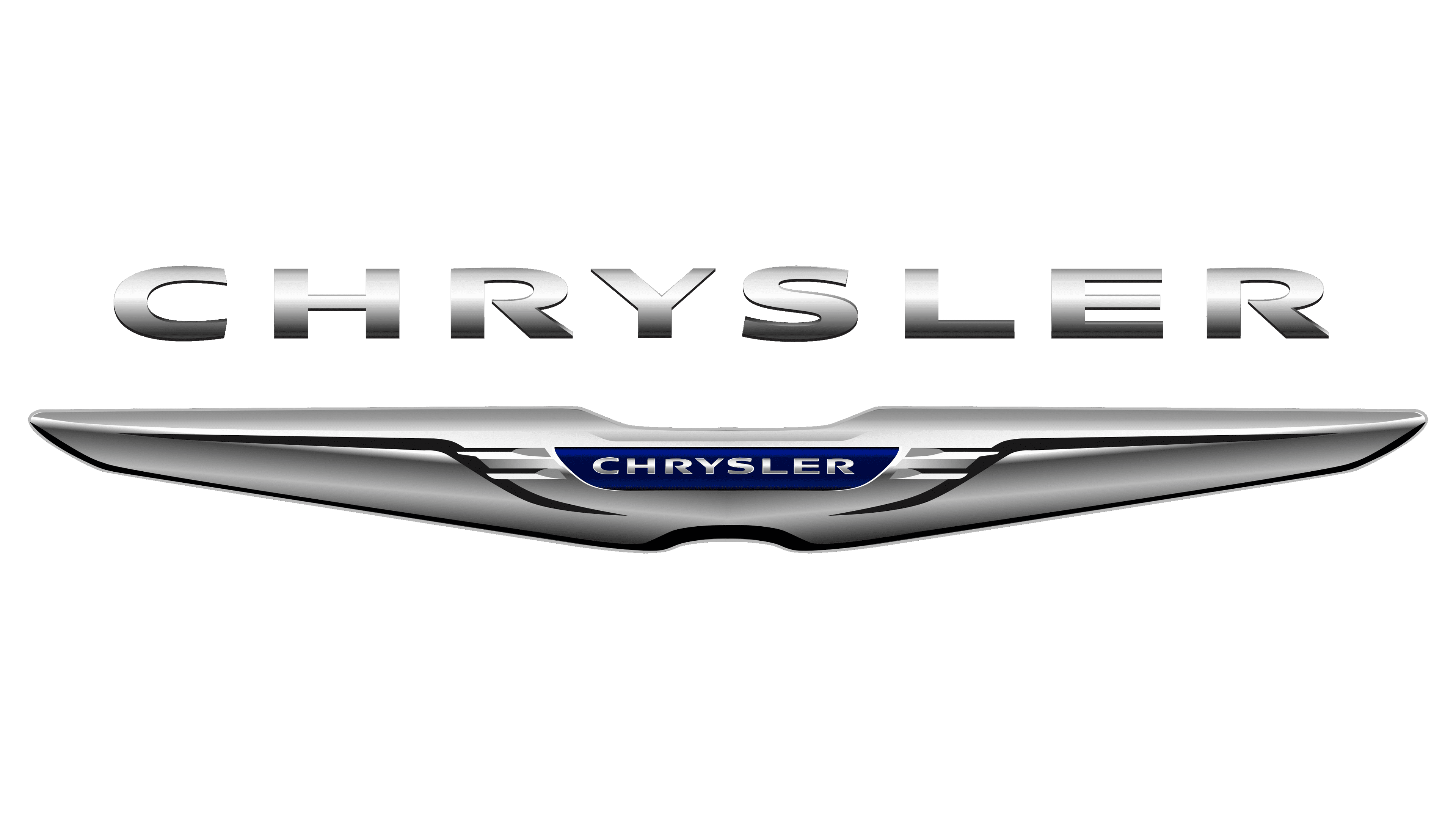
Chrysler is another brand of high-end automobiles. It forms one of the world’s largest automotive partnerships with Fiat. Chrysler’s former logotype depicted two silver wings that were narrowed and widened. This badge was rounded at the bottom, and straight at the top. The brand name in all sans-serif capitals stood in a small dark blue zone at the center, which was made volumetric by shadows. The nameplate above the badge had the same script as in the blue area.
Stutz
![]()
Stutz is a former American automotive manufacturer in the luxury and racing sectors. During its existence between 1911 and 1935, it used a logotype of a white circle with a brown outline and a red central part. The company’s address was written along the round’s edges. Two outstretched dark blue wings covered most of the circle. They were split into small sectors by brown lines, and their upper part was a checkered black-and-white area. The ‘Stutz’ word stood over the wings, and it had a semi-bold sans-serif script with the central ‘u’ shortened in favor of the ‘t’ letters covering it from above.
Duesenberg
![]()
Duesenberg was another auto manufacturer from the United States. It was active in the 1913-1937 period, during which Duesenberg created numerous luxury vehicles, famous among retro car lovers today. The company’s logo depicted a golden eagle, stretching its wings. The name was embedded into the image alongside the word ‘straight’ and the number ‘8’. The words had a classic slim uppercase script with prominent serifs.
Rezvani
![]()
American brands with wing logos include Rezvani as well. This is a young company of high-quality supercars, headquartered in California. Its red badge represents two outstretched wings with straight upper and lower edges. Each side has a small cut at the tip. Both wings are separated from the center, which shows two vertical lines reminding racing stripes. Behind the whole image, there’s a ring. Usually, they write a gray name caption below. It has a futuristic typeface with angular letterforms. The ‘e’ looks like three vertical bars laid in parallel.
London EV Company
![]()
Previously, London EV Company was a manufacturer of London’s legendary taxi cabs. Now owned by Chinese Geely, LEVC has once been the largest taxi maker globally. Its logotype displays a circle with a horse’s head drawn in front via white contours. Two wings are coming out of the circle. They spit into multiple styled feathers by the white lines.
Above the name, there is the acronym in capitals.
Lagonda
![]()
The logotype of a luxury car marque Lagonda was created in 1906. It shows a black-and-white image of the wings, joined together in a single piece. It’s rounded at the bottom, and straight at the top. The upper central part is rounded, and it has many lines splitting the area into multiple sectors. At the bottom, there is a similar pattern. The piece’s very center is clear of anything except for the capitalized brand name.
Morgan Motor Company
![]()
Morgan is a family-handled luxury automobile firm originating in the UK. Its refreshed logotype was introduced on the company’s 100th anniversary in 2008. It shows a ring, containing a blue area with multiple white lines crossing each other. A big gradient blue & white cross stands over the ring and shows the company name in all sans-serif capitals. Four wavy lines with upper-pointed tips go from the right and left of the circle. Together, they compose two impressive wings, stretching to the top.
JBA Motors
![]()
JBA Motors is a British engineering firm, specializing in the production of retro-styled cars. Its name was composed of the first names of the founders: Jones, Barlow, and Ashley. These characters are written in title case on an emblem of a black oval with two inner contours. A small piece with rounded corners goes out of its bottom and shows the word ‘motors’ also in all caps. This oval stands over the central part of an image of two wings, split into numerous feathers by outlines.
Suffolk Sportscars
![]()
Suffolk Sportscars or SS Cars was an English brand of sports saloons and 2-seaters. It was active during the 30s and then changed its name to Jaguar. The stylish brand logo featured a hexagon with a double black and white contour and two gothic letters ‘s’ occupying most of the shape. 9 petals are going out from the shape’s bottom. Finally, two striped black & white extensions go out from the central and lower edges of the hex. They’re followed on both sides by three bars, getting longer from the lowest to the top ones.
Hilman
![]()
Hilman was another former auto-creating firm, operating from 1907 until its closure in 1931. Their logotype represents a triangular frame containing white wings with some brown lines on them. The logotype center is given to a red hex with metallic brown contours on it and probably three stars at the top. Finally, the uppercase wordmark crosses the hex over.
Hispano-Suiza
![]()
Hispano-Suiza was a Spanish-Swiss brand of expensive cars, machine tools, and aviation components, founded in 1904. Recently, there was an attempt to revive Hispano-Suiza as a brand of luxury electric cars. In both the old and new brand identities, the insignia showed a circle with the Spanish flag in the upper portion and the Swiss cross on the red background in the lower area. The circle was contoured white to separate from two gradient black & white wings, each split into three parts.
Alta
![]()
Alta was a Greek car maker that ceased its operations in the 30s. Its zone of reference was the manufacturing of trucks and motorcycles, wearing the company’s impressive badge. It was a metal part, styled as a bat’s metallic silhouette with outstretched wings. There were two red triangles at the tips of both sides. It also had four lines of scales closer to the center, which itself showed the name with enlarged ‘a’ caps.
American LaFrance
![]()
American LaFrance was a marque of vehicles for firefighters. It appeared in 1873 and ceased to exist in 2014. One of its earlier logos displayed a dark black metal badge with a silver eagle sitting on it. The metal rectangle crossed the badge centrally. The Inscription ‘American LaFrance’ was gouged in it in narrowed uppercase letters.
American Austin
![]()
American Ausing was another mid-20th-century automaker that specialized in the luxury sector. Its logo depicted a rich red oval with some mythological bird, probably phoenix, at the center. The creature was facing left and raising its wings. A custom frame covered the oval. Its left and right sides have four paralleling lines, while the top and bottom areas depict the brand name cut into the metal.
Anteros
![]()
Anteros is a relatively young producer of premium and sports cars, established in 2005. They drafted their logotype from a black circle and a bright red triangle with a white contour over it. Most of its space is occupied by a black & white bull, raising its front legs and spreading its wings. Above it, they placed the name in a handwritten typeface.
Arash
![]()
The badge of a UK-based brand of sports cars shows a black crest with a golden outline. Its top is wider than its bottom. Their brand name in all golden capitals shows up at the top. The center was occupied by a descending golden eagle image.
Arrinera
![]()
The logo of Arrinera is an emblem consisting of a shield with a sharp tip. Its top depicts a stylized letter “A” in red color and its mirrored black version. A metallic black and white sharp-pointed arrow runs through the middle of the shield. The shield’s bottom is occupied by numerous red circles, joining with each other. The symbols “A” are in a sleek, futuristic font, and the black and white arrow gives the logo a sporty and dynamic feel.
Avion Voisin
![]()
The car badge of Avion Voisin was a beautiful representation of the brand’s heritage and passion for aeronautics. The centerpiece of the badge are stylized, outstretched dark blue wings, split into numerous feathers by the golden contours. The wings were showcasing the brand’s roots in aviation. The name is elegantly embedded into the wings in an uppercase sans-serif font, giving the badge a classic and sophisticated feel.
Bandini
![]()
The badge of a popular automaker from Italy is a yellow rectangle. It features a stylized rooster, symbolizing the brand’s passion for speed and performance. The bird is often depicted in red or blue, giving the badge a sporty and energetic feel. It stands next to a pillar with a flame, styled in numerous lines, placed around the letter ‘s’. The nameplate below the bird features the brand’s name in a capitalized font on a blue area. Finally, the bottom of the logo is occupied by the Italian flag colors.
Bianchi
![]()
Bianchi is among the oldest bicycle manufacturers in Europe. The company’s former circular badge featured a blue background, symbolizing the brand’s commitment to quality and timeless elegance. The center of the badge features a golden eagle standing at full height and spreading its wings. Its stomach shows a red oval with a white crest on it. The name is placed on a tiny red ribbon at the top of the logo.
Bignan
![]()
Bignan was a French automobile manufacturer active in the first third of the 20th century. Its metallic badge displayed a gray circle with a flying stork. At the bottom, there was a small circle with the name caption written in a two-line inscription.
Biddle
![]()
Biddle was an American brand of cars, operating for just seven years between 1915 and 1922. Its logotype depicted a black ring with a bold brown outline. A shield with rounded bottom was incorporated into it. This shield was split into two parts by a diagonal white stripe showing the capitalized name. The icon’s upper part contained a yellow crown, while its lower area showed one the winged sandals of Hermes.
Bizzarrini
![]()
Bizzarrini was an Italian manufacturer that developed pretty stylish sports cars during the 60s. Recently, the name was bought by Pegasus, which plans to revive it. Its badge depicted a red circle with a minimalistic eagle at the center. The black words with beige contours ‘Bizzarrini’ and ‘Livorno’ stood at the top and bottom respectively. The while circle had a custom frame with many cogs.
Cole
![]()
The Cole Motor Car Company was an American automobile producer that existed from 1909 to 1925. Their circular badge featured an eagle perched behind a square shield. The company’s name was inscribed on it. The eagle was depicted with its wings spread, symbolizing power and freedom, and the shield represented protection and stability. At the bottom of the crest, there was a ribbon with the company’s address.
Changan
![]()
Changan is a Chinese automaker that specializes in the production of passenger cars, SUVs, and commercial vehicles. The firm’s circular badge features a stylized letter “V” symbol at the center, set against a blue background. The “V” symbol is surrounded by two silver frames, which give the badge a sleek and modern appearance. The blue background represents trustworthiness, stability, and innovation, while the silver frames symbolize high-quality products and services.
Donkervoort
![]()
Donkervoort is a Dutch automaker that specializes in the production of premium vehicles. The company was founded with a focus on delivering vehicles that are both luxurious and technologically advanced. One of the defining features of Donkervoort’s vehicles is the company’s red badge, which features a wordmark in an oval, surrounded by numerous white-contoured stripes. These stripes compose stylized wings stretching out of the oval.
Durant
![]()
Durant was an American automaker from the 1920s that specialized in the production of stylish and high-performance vehicles. One of their car models had the company’s blue circular badge, contoured white. It featured a white & gray star, incorporating a square shield with the word “star”, written on a red diagonal stripe. A beige & white dragon with raised wings set on the star. Below it, there was the word ‘four’. Finally, the company name was placed at the bottom of the badge.
FAW
![]()
The FAW Group is a Chinese state-owned automotive manufacturing company. It’s the first automotive corporation in China, whose logotype was chosen at the very start. It shows a blue oval with a thick white inner contour. The number ‘1’ with a small lower serif stands at the center, surrounded by three stripes that looked like two stylized wings. The lower stripes are curled. Below the badge, they wrote the acronym in a sleek sans-serif typeface with cuts at the letter’s corners.
Gumpert
![]()
Gumpert was the previous name of the German auto brand Apollo. Its logotype depicted a gibbous red shield with a brown contour. The brown top area contains the company name in a black sans-serif script with tiny corners. At the center, they drew a white animal with the wings and head of an eagle. The animal was depicted in a powerful and dynamic stance, symbolizing the high-performance capabilities of the brand’s vehicles.
Haima
![]()
Haima is a 1992-founded Chinese car producer, owned by FAW. Their brand badge is based on a silver circle with some shadows on it. The image of two stylized wings stands over the circle. It gets bolder at the center, so the whole piece points centrally down. The name in Chinese and English is written below.
Hawk Cars
![]()
Hawk Cars is a small British assembler of sports cars that appeared in 1986. Its distinctive badge depicts a bright metal ring that contains an eagle flying somewhere. The upper part of the ring, where the eagle looks, shows a sky-blue area with a white dot, reminding the sun.
Heinkel
![]()
The former car manufacturer, Heinkel, was founded in Germany in 1922 and was involved in the production of aircraft engines for a period of time. The brand, which ceased operations in 1965, had a distinctive and easily recognizable logo featuring an italicized uppercase wordmark beneath a stylized letter “H”. The character boasts a big wing emerging from its horizontal bar to the left, adding to the emblem’s elegance.
Invicta
![]()
The little-known British car manufacturer, Invicta, appeared in 1925 and has undergone a few rebirths throughout the years. Despite these changes, the company’s visual identity has remained constant, consisting of an emblem with two large and expansive wings and a vertical banner with the wordmark, situated in the center of the design.
ISO Rivolta
![]()
ISO Rivolta was a small Italian car manufacturing company, operating from 1953 to 1978, specializing in the production of passenger cars and motorcycles. The brand had a simple yet striking visual identity, consisting of a white crest with thin lines resembling the Italian flag. A golden Griffin with a wing stood over them in clear, crisp lines. The wordmark was placed at the top of the crest, executed in semi-bold black handwritten letters. The address of the company was written in the lower left corner.
Isdera
![]()
The German car manufacturer Isdera, known for producing premium vehicles, was founded in 1982 and introduced its signature visual identity that same year. The design is a tall rectangular shape with a sky-blue background and black borders, featuring an upward-facing black eagle with outstretched wings, and a distinctive custom wordmark written in lowercase letters below it.
Jensen Motors
![]()
Jensen Motors was a British automaker, founded in 1922 and lasting for nearly 90 years until its closure in 2011. Its visual identity was sleek and distinctive, featuring a stylized emblem with straight triangular wings colored gray. A red circular badge was housed within the image, with extra slim and sharp lettering in the center.
Laraki
![]()
Laraki is a luxury automaker hailing from Morocco, founded in 1999 with a focus on creating high-performance vehicles. Its visual identity exudes sophistication and style, featuring a black circular badge with a silver wing and outlining. The bold, futuristic sans-serif lettering is typically positioned to the right of the emblem.
Packard
![]()
Packard, founded in 1899, was once a renowned American car manufacturer until its demise in 1956. Its visual identity was marked by an elaborate and detailed traditional crest, adorned in gold and red, with a graceful swan with outstretched wings perched atop the crest like a regal crown. The crest was situated inside a black oval, placed inside an ornamented silver frame.
Panther
![]()
The visual identity of Panther Automobiles, established in 1972 in Britain, exuded a delicate and refined look. An illustration of two outspread wings, crafted with numerous contours to create bold feathers, surrounded a wide grill. Over the image, there is a rectangle with the brand’s name on it. The whole logo has a black & white color palette.
Peerless
![]()
Peerless was a prominent car manufacturing company, established in the US in 1900. It was known for its elegant and catching visual identity, consisting of a diagonal script wordmark. However, when placed on the car’s hood, the Peerless emblem transformed into a striking symbol with a golden eagle occupying most of its space. The company name in golden letters was placed on a blue zone on the eagle’s chest. Below it was a white sharp-pointed shield with four geometrical shapes cut into it. Unfortunately, the company had to halt its operations in 1932.
Qvale
![]()
Qvale was a short-lived Italian automaker founded in 2000. Known for producing sedans with unique designs, the company’s style was emphasized by a sleek and contemporary logo. It consisted of a white dragon with minimalistic wings housed in a vertical rectangle with rounded edges, set against a black background. The distinctive yellow name, outlined in white, was placed beneath the dragon. The word ‘Modena’ was located below the name caption.
Rossion
![]()
Rossion is an innovative American car manufacturer that specializes in the creation of sports cars with cutting-edge designs and exceptional technical features. The brand boasts a monochromatic emblem, with curved sides and a depiction of a white eagle with its wings spread upwards and to the left. The wordmark, crafted in white, is elegantly placed along the top of the badge.
Russo-Balt
![]()
The Russo-Balt brand was a historical Russian automaker established in 1909 and discontinued in 1923. Its visual identity was anchored in the heraldic emblem of the Russian Empire – a two-headed eagle with wings boasting smooth lines and sharp angles. Both heads wore regal crowns, while another crown was above. The inscription ‘Russo-Balt Van Factory The Division of Cars’ was along the badge’s frame.
Simca
![]()
Simca was a French automaker, established in 1934 and dissolved in 1970. It was known for its vibrant and lively visual identity, featuring a bright blue rectangle stylized white swallow with elongated and sharpened wings. Below the shape, there was a red shield with white lettering with tall letters.
SsangYong
![]()
The latest logotype of SsangYong features the company’s name written in simple, modern lettering with an emblem upper it. The emblem consists of three stylized circular shapes merged together to form a unique design. The color of the logo is typically silver, which conveys a sense of sophistication and high quality.
Stoewer
![]()
Stoewer was a well-known name in German automaking history. It showed up in 1899 and produced cars from the same year. Its visual identity was distinguished by a grand and sophisticated emblem featuring a griffin with slender wings. This mythical creature was prominently displayed in a golden-contoured rich blue circle. The circle itself was located centrally inside a shield with the name at the top.
Trojan
![]()
The defunct British automaking brand, Trojan, was established in 1914 and known for its production of passenger and commercial vehicles. It used a distinctive brand mark, which was composed of horizontal lettering, enclosed in a rectangle with sharpened edges, smoothly merging with the stripes extending from both sides and forming two geometric wings. The gray-contoured red circle was placed behind the wings.
UAZ
![]()
UAZ is a Russian car company established in 1941, initially specializing in the production of military vehicles. Today, the brand produces a wide range of vehicles, including military vehicles, cars, buses, and trucks. The visual identity of UAZ features a stylized emblem with wings in the shape of a “V”, placed above a small circular frame containing their bold acronym.
Vauxhall
![]()
Vauxhall is a British car manufacturer with a rich history dating back to 1857. The brand has updated its visual identity with a modern and sophisticated emblem, showcasing a sleek silver Griffin with a single outstretched wing. The Griffin’s wing is depicted in smooth, clean lines and symbolizes power, speed, determination, and independence. The emblem is encased within a circular frame, further emphasizing the brand’s progressive and stylish image.
Virago
![]()
The Yamaha Virago is a legendary motorcycle model, first introduced in 1981. It has its own distinct logo, featuring a rectangle with the Virago wordmark along with the first character stylized as two sharp wings. The lettering in the emblem is smooth and italic, giving it a powerful and modern appearance that perfectly represents the unique character of the iconic bike.
Venturi
![]()
Venturi is a high-end car manufacturer based in Monaco, established in 1984. The brand prides itself on producing vehicles with striking designs and polished images, as reflected in its logo. The logo features a bold red oval emblem. Right at the center of the shape, there is a blue rectangle, contoured gray. It shows an eagle in two shades of gray, keeping something in its claws. Above it, there is a sun in the same shades. At the very top of the triangle, they wrote the sleek and modern name with small serifs at the left edges of the letters.
Wanderer
![]()
Wanderer was a German car and motorcycle manufacturer that was established in 1896 and ceased operations in 1946. Its logo was designed in a green and white color scheme, featuring a stylized “W” shaped like wings, giving the brand a powerful and confident look with its clean straight lines and sharp angles. The ribbon with the uppercase name was under the symbol.
Wuling
![]()
Wuling is a Chinese automobile brand established in 2007, primarily specializing in the production of electric vehicles. The brand’s logo features a red, abstract, winged emblem made of parallelograms and a dark gray uppercase wordmark to the right of it.