Best Porn Logos Sites And Studios
Discover the logos that are the most unforgettable and easily recognizable from companies operating within the adult entertainment industry. While the bulk of these logos hails from industry heavyweights, we’ve also included a handful of lesser-known ventures because of their emblem’s spectacular nature.
HClips
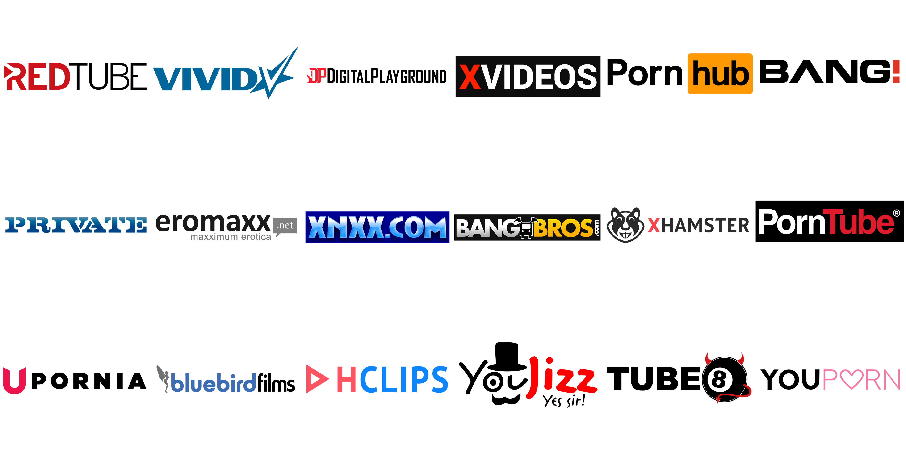
The logo of the adult tube website, HClips, boasts simplicity yet packs a punch in terms of memorability and distinctiveness. The centerpiece, a red triangle resembling a “play” button, features a small red “h” inside, while a suggestive oval shape in blue houses the word “clips” and sits adjacent to it. An alternate version exists where the “play” button is absent, and the “h” sports an arrow at its upper end.
YouJizz
The YouJizz logo, though its colors may evoke memories of the old YouTube wordmark, stands apart due to its unique typography. The word “You” on this logo is designed to look like a human face with one eye open and the other winking, complete with a hat and mustache. The suggestive phrase “Yes, sir” sits below it.
Tube8
The Tube8 logo, with its red horns and lengthy tail, seems to toy with the “devil” theme. The horns and tail belong to a creature made up of two circles and the number 8 within. This roundel emblem holds unmistakable anatomical symbolism.
Upornia
In stark contrast to many of its higher-ranked competitors, Upornia’s logo flaunts a pronounced symbolic aspect. The iconic winged “U” of the Upornia logo features two horns at its ends and a design that suggests anatomy.
BangBros
BangBros is a renowned maker of explicit content, controlling over 35 websites sorted out by various genres. Their logo features a white-contoured winged bus surrounded by the words ‘Bang’ and ‘Bros’, colored white and gradient yellow and orange respectively. A black rectangle encapsulates the logotype while also adding a contrast.
Private Media Group
Headquartered in Barcelona and San Francisco, the Private Media Group has evolved from its magazine roots and now encompasses a range of media, including print, DVD, internet sites, and mobile content. They are best known for their high-budget adult films such as “Cleopatra.” The emblem of the adult entertainment company features the word “Private” in bold block letters, either in red or blue with a gradient effect. However, what really captures one’s attention are the two sultry female figures that seem to be dancing.
Bluebirds
The logo of the film studio, Bluebirds, boasts a captivating emblem, starting with its inviting rounded type for the studio name. The blue color for the wordmark is a fitting choice, given the project name. Upon closer inspection, one can spot a tiny semi-transparent figure to the left of the lettering – a shapely female with bird-like wings, appearing to be in flight. Despite its small size, the female figure adds a subtle touch of artistry to the design.
Eromaxx Films
The emblem of Eromaxx Films showcases a large yellow lowercase “E” inside an orange circle, borrowing from the iconic simplicity of recognizable logos such as Twitter, Shell, Playboy, Nike, and Pepsi. However, as the full name is still necessary for recognition in the erotic movie industry, the complete version including the word “Eromaxx” is also used.
RedTube
RedTube, one of the three leading sites in the Pornhub Network, boasts over 90 million monthly visits since its launch in 2007. Its logo showcases the company name divided into two parts with red and white and stands out with a red circle inside the “R” symbolizing the “play” button. The logo for Lethal Hardcore embodies a menacing vibe with its silver grey, black, and white gradient scheme, and dynamic sharp ends on some of the letters, like the “H”.
PornTube
PornTube’s logo mirrors the old YouTube logo, with the company name separated by different colors and a similar typeface, albeit wider. Brazzers, the company owning over thirty hardcore adult websites, established in 2005 and now part of the Mansef group, showcases its brand through the orange “Z’s” in its minimalistic and masculine logo.
Bang! Originals
Bang! Originals, a renowned movie studio, features a distinctive logo influenced by the Samsung emblem with its flatter “A” and similar “NG” letters, while also incorporating a red exclamation mark and a second line in a thinner and rounded typeface.
Vivid Entertainment
The emblem of Vivid Entertainment flaunts a highly recognizable combination of a star and a large “V”, with the brand name in light blue to the left. This Los Angeles-based company dominates the US adult film industry, as noted by Reuters.
DP Entertainment
DP Entertainment, a prominent California-based studio, showcases its brand through the letters “DP” inside a red horse’s head, drawing attention not only as the company’s initials but also as a popular abbreviation in the adult industry. The full name of the company can be seen below the horse’s head.
YouPorn
YouPorn, one of the top sites in the Pornhub Network, features a modern and minimalist logo with a playful twist. The sans-serif typeface is elevated by the pink “O” , stylized as a heart and symbolizing the lighthearted nature of the site.
XHamster
Of all the top-rated erotic websites, XHamster is the only one with a mascot. The company chose a hamster due to its cuddly appearance, amiable disposition, and sensual energy, according to a representative.
XNXX
XNXX, a pioneering site in the online industry with erotic content, has been operational since 1997 and lists VLab Ltd, a Hong Kong-based company, as its registrar. The XNXX logo is distinct with its blue color scheme, a highly legible typeface with sharp edges, and a wave pattern.
XVideos
XVideos, the most visited adult site according to SimilarWeb’s late 2018 ranking, is not owned by WGCZ Holding, the Czech company that holds ownership over several major Internet sites and studios, including BangBros. The XVideos logo, with its generic sans-serif font and red initial letter inside a black rectangle, does not give away its industry. The palette is reminiscent of the YouTube logo.
Pornhub
Founded in 2007, Pornhub is now under the ownership of MindGeek, formerly known as Manwin, a private company headquartered in Canada but officially registered in Luxembourg. The Pornhub logo bears a striking similarity to the old YouTube emblem, with the website name split into two parts, the second part within a rectangle with rounded corners. The red elements have been swapped for orange and the white background for black.

