Car Logo with horse symbols on them
Creating a logo for some brand or other is a tiresome task. You’ll have to make sure the emblem is unique, comprehensive and gets the point across. Admittedly, there are symbols used across entire industries simply because they have a long history of doing that already.
Car brands are a good example of it. Someone set a trend of using horses for branding a long time a good, and it stuck. It’s not unsurprising, though – these animals are historically associated with raw power, speed, endurance, and traveling. The engine power itself is measured in horses.
So, let’s see just how many brands in the car industry are using horses for branding.
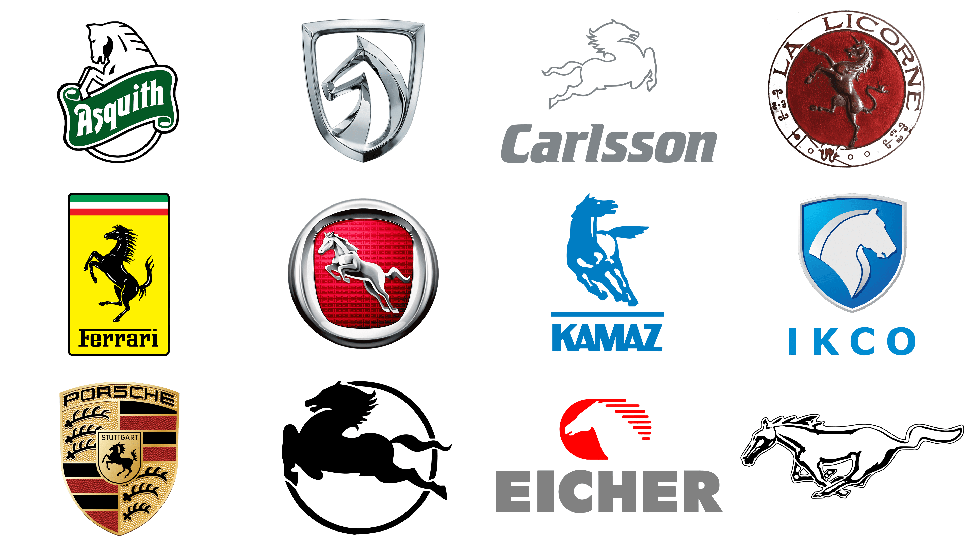
Porsche

Porsche has been founded in 1931 in Stuttgart, the capital of Württemberg – a small German region in the south. As a reference to this fact, and probably out of the patriotic zeal, the bosses decided to put both the city’s and the land’s symbols onto their emblem.
Stuttgart was originally a horse farm, which explains why they have a horse for a symbol. Porsche simply took it and surrounded it by the elements found of the Württemberg coat of arms, including the black-and-red stripes, black sabers on the yellow background and more.
There were some additions. The horse acquired a relief body, as well as a magnificent tail. The image is complemented by the name of the brand and the city: Porsche and Stuttgart. The company’s logo symbolizes dynamism and strength as its main qualities, roots, and history.
The logo was created by one Franz Xaver Reimspieß.
Ferrari
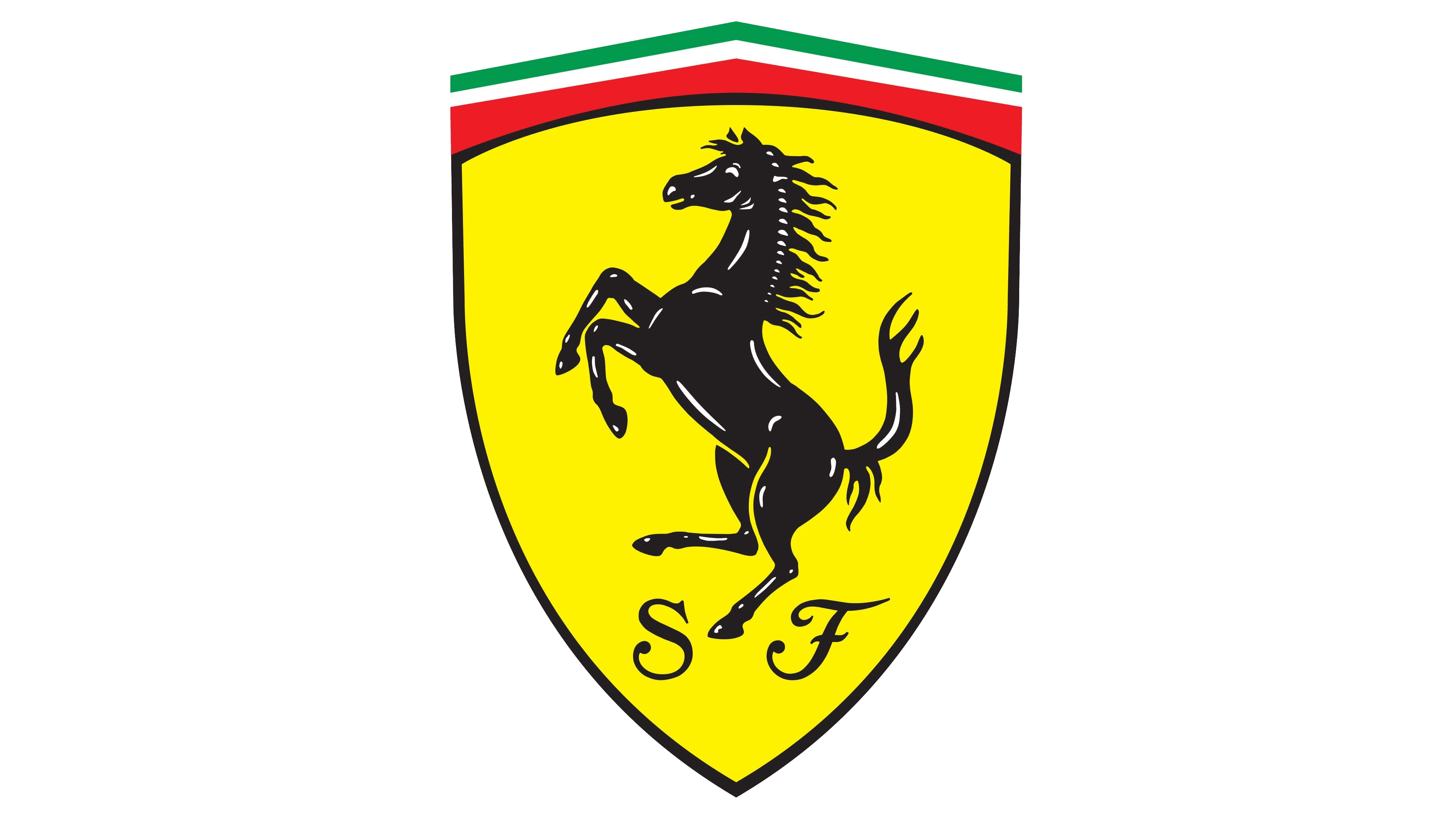
Ferrari is famous for their prominent place in the history of car engineering, although the branding choices they made are also pretty interesting. The horse first appeared on the Ferrari cars back in 1929. It wasn’t there just to symbolize power and speed.
Firstly, the founder, Enzo Ferrari, liked it personally and though it attracted good fortune. Another reason for introducing this logo was the death of the famed Italian pilot, Francesco Baracca, around the same time. His own personal symbol was a horse, and so Ferrari decided to make homage to him.
The logo consists of a black horse on a bright yellow background to honor the city of Modena. You can see a reference to Italy’s flag with red, white, and green colors at the top of the picture. The company now uses three logo variations: on a shield, on a rectangular backing, and a silver horse on a red background.
Ford Mustang
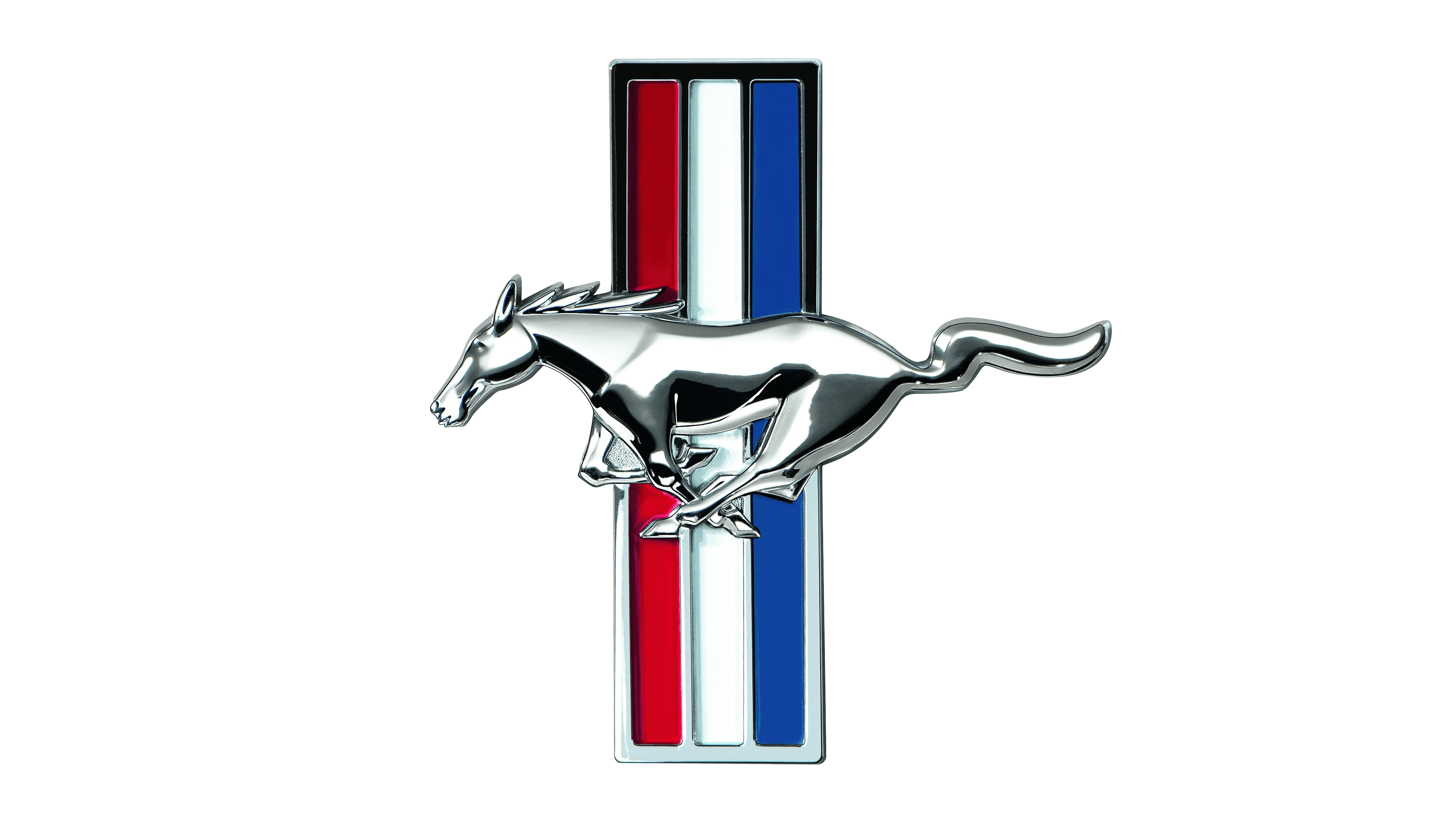
The brand’s logo, unlike previous companies, does not symbolize the neighborhood or specific people. The image was created by Phillip Thomas Clark, a 27-year-old designer who joined Ford in 1964.
Apparently, the creation process was rather stretched out and nuanced. It took a bit over 3 months to flesh out all the details. A lot of it was altered many times over, but eventually the company embraced the horse logo, deeming it fit for their use.
The image is basically a black silhouette of a horse running to the left somewhere. It is supposed to be one of the mustangs – the wild horses of the American prairies. It was a sound choice, because mustang symbolizes speed, power, as well as the American spirit.
Baojun
The Baojun brand represents budget cars on the market. The brand appeared in 2010 due to cooperation between General Motors, SAIC, and Wuling Motors.
Baojun is actually centered on equine symbolic. The name itself means ‘precious horse’ in Chinese, which relays the company principles of supplying the best, most powerful cars possible for a reasonable price. Horses also are a symbol of reliability, loyalty, among other things.
The brand also introduced a new logo for higher-end cars in 2019. It’s basically a picture of a diamond. A lot of the newer cars will be using this, while the horse logo remains the generic emblem variant.
Hanteng
Hanteng’s horse is depicted as if jumping over an obstacle and it’s an endearing motive. It’s supposed to symbolize determinedness, endurance and power, obviously.
One of the brand’s main purposes is developing new advanced tech for the cars – primarily in the engine department. The red color of the background complements this idea rather well here. Red is a color of fire, passion and directed strength, after all.
The name is also not that simple, as with many Chinese brands.
The ‘Han’ part stands for the Han dynasty – one of the most celebrated and accomplished Chinese dynasties. In China, they are viewed as one of the founding elements of the Chinese culture, Chinese way of life and even the structure of the state.
The ‘Tend’ refers to the galloping action of a horse. It’s there to hint at the technological process, the determination to improve the market, as well as strength, naturally.
Khodro

The car brand Khodro (or IKCO, formed from the name Iran Khodro Co.) uses a horse’s head as their primary emblem. One of the main reasons is that it’s an Iranian company. Persians are very fond of their horses, and even the parent company of Khodro has been using these for more than half-a-century.
Specifically, the emblem is an Arabian horse. Just like the physical counterparts, it has a massive head, short snout, small ears, strong neck and awesome hair. They took it and put it on a shield-like shape.
Determined to become a world-class automotive company, IKCO actively cooperates with German and French representatives, exporting products to more than 40 countries worldwide. They have several facilities, whose main purpose is to improve and research tech.
Carlsson
This car brand has German roots: it was founded in 1989 by the brothers Hartge (Rolf and Andreas) in Merzig (Germany). They are mostly modifying Mercedes cars used for racing.
In fact, the principles they employ for their work process are very well reflected both on the logo and the motto they’re using: ‘German treasure, noble blood, elegant temperament’.
The reason why they put a horse onto their logo isn’t just for obvious symbolism. The brand is heavily associated with the famed driver Ingvar Carlsson, whose personal symbol also featured a horse at high pace.
They constantly improve engine performance, equipping cars with specially designed alloy wheels and experimenting with aerodynamic performance. All this is conveyed by a silver horse flying forward on a round black emblem. Since 2015, the brand has been owned by the Korean company Sambo Motors Co. Ltd.
Asquith

Horses aren’t always just symbols for speed, strength and endurance. They are also famously hardy and industrious. Some companies care more for these qualities than anything else, and Asquith is one of them.
This British company mostly produces vans, trucks and trailers for work purposes. For instance, a lot of the ice cream trucks in Britain are created by this company. They are tirelessly creating more ways of making sure a lot of people can do their job in comfort, so it’s hardly a ‘power’ thing.
The founders of the company Crispin Reed and Bruce West, presented their first development in 1928. Moreover, they wanted to make mini-trucks in vintage style because they are out of competition and attract the attention of the target contingent.
In 1997, the company had to be shut down, unfortunately, and it wasn’t until just a few years prior that they started production again.
KAMAZ
KAMAZ is a Russian company solely focused on producing trucks and heavy machinery dedicated to surviving the harsh environment and roads of Russia.
These qualities are perfectly reflected by an image of a horse they are using for their main emblem. It’s a bulky, strong and muscular breed pictured in precisely the best position to show off the musculature and physique of an animal. KAMAZ trucks are supposed to be sturdy, powerful and reliable, incidentally.
The main color palette used on this logo is colors blue and white. They don’t tell a particular story, but the color blue is often used to represent freedom, depth and endless potential.
Eicher
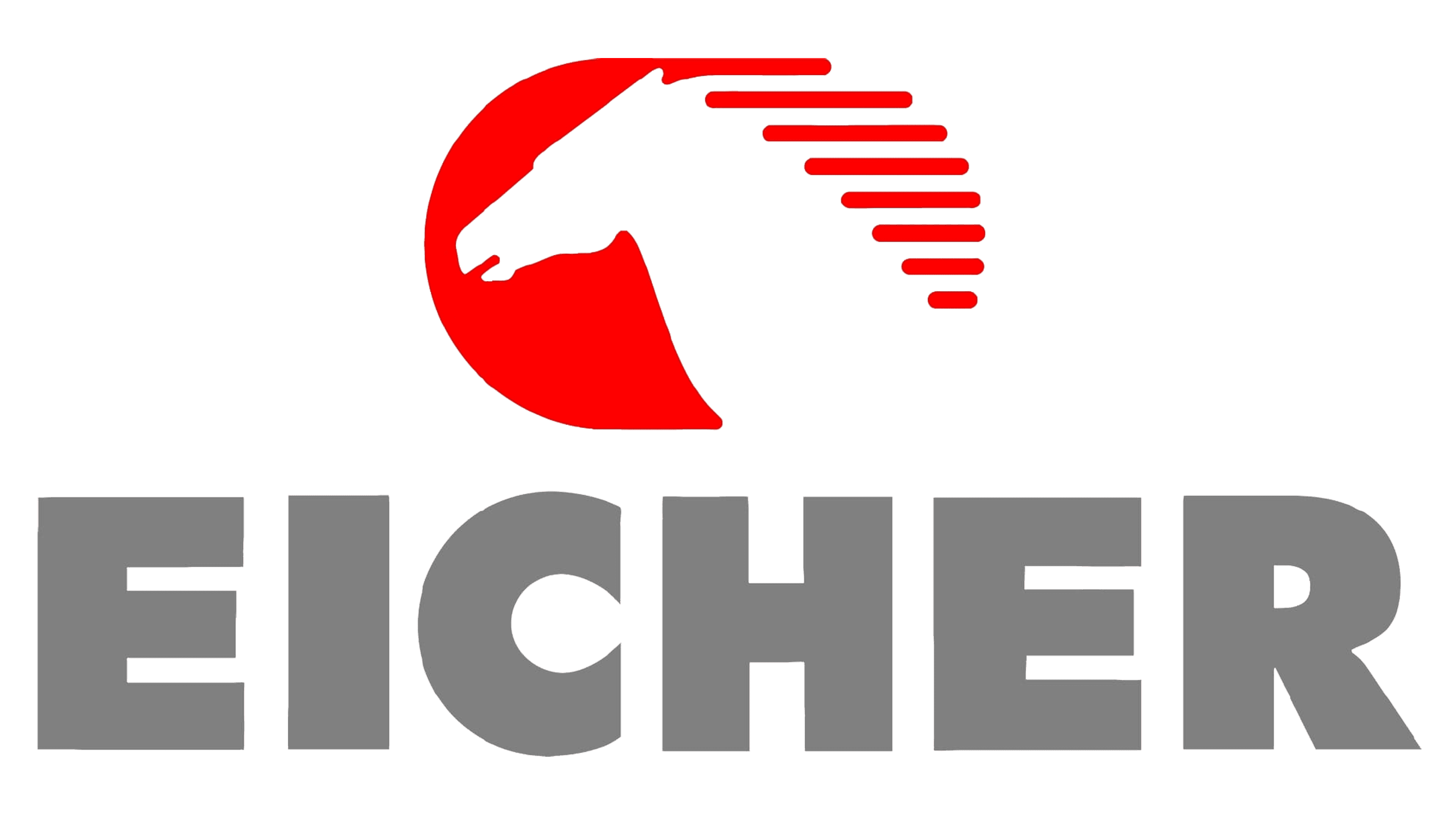
Eicher is an Indian producer of trucks, vans and other heavy vehicles. They are much like KAMAZ in this aspect, and they follow the similar logic in terms of symbolic.
They don’t particularly display anything save the fact that the horse is running at great speed somewhere to the left – the mane is styled into a bunch of horizontal stripes, which gives away a feeling of flying and wind-like speed. Of course, the horses generally inspire strength and hardiness, also.
Unlike KAMAZ, Eicher uses the color red primarily. It’s a color of aggression, passion and rage. In vehicular sense, it translates into power, endurance and momentum.
Corre La Licorne
![]()
Originating from Paris, the venerated Corre La Licorne, established by Jean-Marie Corre, crafted automobiles until the mid-20th century. Its emblem, a noble unicorn poised in ascent, is the centerpiece of a rich, crimson disc, edged with an intricate pattern. The legendary beast’s form, accentuated in a sculptural relief, imparts a tactile quality. Encircled by a pristine border, the name “LA LICORNE” is proudly displayed, punctuated by fleur-de-lis motifs and ornamental dots, channeling the brand’s royal lineage and French roots. This badge, rich in allegory, evokes the unique, mystical charm intrinsic to the fabled unicorn, symbolizing the marque’s distinct and storied history.
Hanteng Autos
![]()
Hanteng Autos, an emergent force in the Chinese automotive sector, engages in the crafting of conventional and new energy vehicles. Its insignia portrays a sterling steed ascending boldly against a crimson canvas graced with an intricate pattern, honoring its Sino heritage. The poised equine form, encased in a modern metallic ellipse, stands as a testament to the brand’s ambition and refinement, heralding a legacy melded with innovation. Hanteng’s badge, a fusion of ancestry and contemporary prowess, signals the firm’s dedication to pioneering within the international auto sphere.
Pegaso
![]()
Pegaso, a historic Spanish brand, is celebrated for its remarkable Z-102 sports car and diverse commercial vehicles, reflecting Spain’s post-war industrial ambitions and engineering innovation in the mid-20th century. The logo of the brand features a black silhouette of a rearing horse encircled by a thin oval line, creating a striking contrast. The horse, with its mane flowing back as if caught in a swift breeze, stands tall and proud, embodying the spirit of freedom and power. This emblem is a representation of the brand’s commitment to strength and elegance within its field, evoking a sense of motion and grace that is closely associated with the majestic animal itself.