Newcastle United Logo
Newcastle United is an esteemed football franchise hailing from the bustling city of Newcastle upon Tyne, England. Boasting an illustrious and historical past, the club has earned numerous distinguished accolades and harbors a fervent fanbase. Nicknamed the Magpies, Newcastle United’s home turf is St. James’ Park, a massive and iconic stadium. Throughout the years, the team has been renowned for cultivating exceptional players and hosting a lineup of legendary figures.
Meaning and history
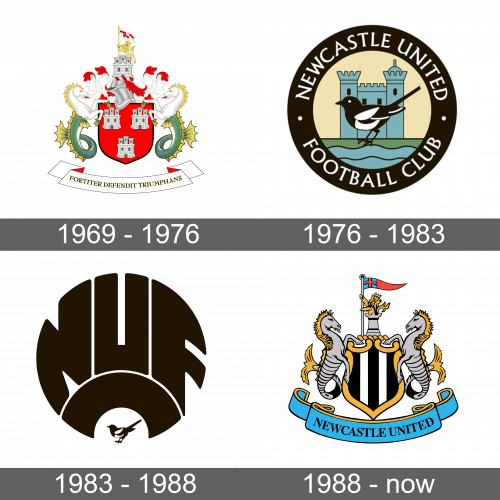
Newcastle United’s logo evolution took flight in the late 1960s, soaring to new heights by 1976 when it underwent a radical metamorphosis. The updated emblem featured a magpie in a circle, which ruffled feathers amongst fans who squabbled over its inspiration. Some saw it as a nod to the team’s black and white colors, while others suspected that the bird’s appearance owing to the multitude of ravens at St. James’ Park.
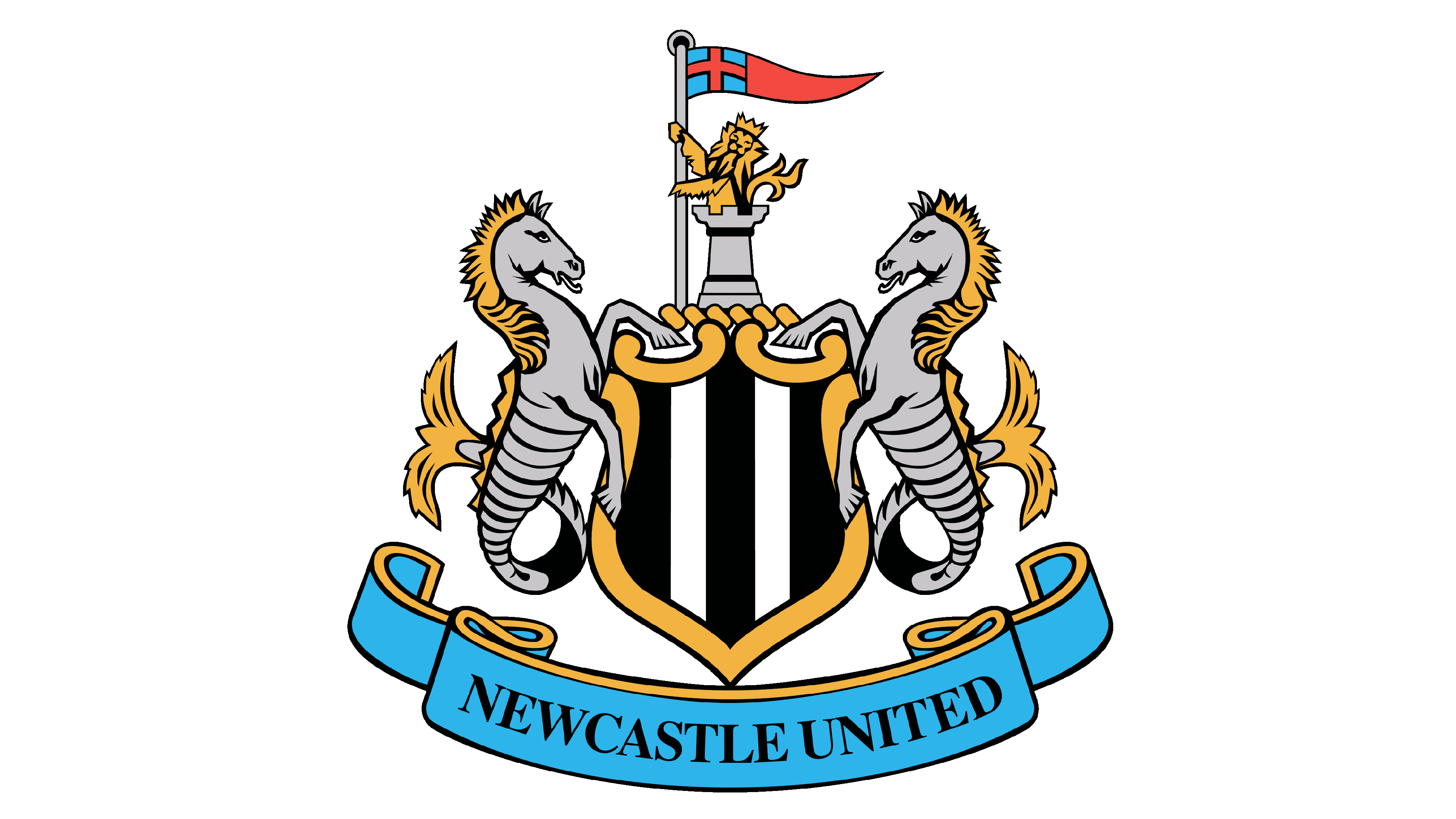
This identity remained perched for a dozen years until the club decided to take a flight of fancy back to its roots in 1988. The contemporary logo showcases a black-and-white striped shield, a royal lion with the flag of St. George, and two seahorses, all inspired by the city’s coat of arms.
The magpie, however, was removed from the emblem, but its significance as the team’s nickname remained firmly grounded.
The Newcastle United crest nests proudly in the family tree of the coat of arms of Newcastle upon Tyne, having undergone three significant changes since the 1970s. Each design paid homage to the city’s cultural and historical significance, incorporating the castle and the port, both of which hold a special place in the hearts of the residents.
Newcastle United is a legendary football club that has enjoyed a storied history, consistently competing in the Premier League, with scant exceptions. Founded in 1892, it quickly developed a fierce rivalry with Sunderland. The sports organization is currently owned by the Public Investment Fund of Saudi Arabia.
What is Newcastle United?
Newcastle United, a triumphant football organization, has spent the majority of its time playing in the prestigious Premier League, with a few fleeting exceptions. Its origin dates back to 1892, but the clash with its eternal adversary, Sunderland, erupted only six years later, further intensifying the team’s illustrious history. The sports entity is currently under the proprietorship of the Public Investment Fund from Saudi Arabia.
1969 – 1976
The inaugural insignia made its grand entrance at the Inter-Cities Cup Final in 1969. This emblem displays the Newcastle upon Tyne coat of arms, featuring four towers that embody the Norman castle known as New Castle.
Two sea stallions personify the bustling port, while the lion bearing the flag adorned with St. George’s cross commemorates the city’s valor during the Civil War. The bottom of the emblem is adorned with a ribbon sporting the bold motto “Fortiter Defendit Triumphans,” a nod to the epic showdown between the Scandinavian and English tribes.
1976 – 1983
The Newcastle United club decided to revamp its logo in the mid-1970s, unleashing a round emblem with the moniker “Newcastle United Football Club.” The circular icon pays homage to the Norman castle and Tyne River, two pivotal fixtures of the city. Notably, the magpie takes center stage in the logo, purportedly honoring the club’s nickname, “Magpies,” derived from the team’s signature black and white uniform.
1983 – 1988
A newfangled logo emerged in 1983, featuring an abbreviated and stylized “NUFC” in circular form. The solitary surviving feature was the beloved magpie, an avian symbol of the team’s moniker, which stems from their iconic black and white jerseys.
1988 – today
The year 1988 marked the resurgence of the club’s historical heritage, as they reverted to the emblem of the city. The same symbols persisted: the seahorses, towers, royal lion, and cross of St. George. However, the drawing style and color palette transformed.
The heraldic shield donned vertical black and white stripes, in a nod to the players’ uniforms. The Latin motto was done away with, and in its place, the team’s name appeared on a blue ribbon.
Color
The distinguishable Newcastle United logo is more than just the iconic black and white stripes. It also incorporates shades of grey, blue, and yellow, creating a multi-dimensional and captivating visual experience.
Font
The name caption on their official logotype has a serif, thick and bold script that comes in uppercase letters. The font is uniform in thickness and the edges are softly rounded, rendering a historic vibe to the logo. The final result is a fresh yet traditional emblem that exudes classic charm.


