Oklahoma Sooners Logo
The Oklahoma Sooners, the University of Oklahoma’s athletic teams, are a powerhouse in collegiate sports. Best known for a storied football program with multiple national titles and a record-setting winning streak under coach Bud Wilkinson, the Sooners epitomize excellence in college athletics. Beyond football, their achievements span basketball, gymnastics, and other sports, showcasing a well-rounded athletic prowess. With a passionate fan base and a tradition steeped in victory and resilience, the Sooners remain a symbol of competitive spirit and athletic success in the NCAA.
Meaning and history
The University of Oklahoma’s athletic teams, known as the Oklahoma Sooners, have carved a distinctive legacy in the realm of college sports. Originating in 1895, the Sooners initially stepped into the athletic world with a focus on football, gradually building a reputation in the regional sports landscape.
The significant turning point came in 1928 when the Sooners became part of the Big Six Conference, an affiliation that later evolved into the Big Eight and then the Big 12. This shift marked the beginning of an era of heightened athletic excellence, especially in football. The 1950s under coach Bud Wilkinson became a golden age, etching the Sooners’ name in history with a record-breaking 47-game winning streak, a feat that remains legendary in college football annals.
The following decades, particularly under the guidance of Barry Switzer and Billy Sims in the 1970s and 1980s, were marked by a series of national championships. Switzer’s era was defined by a formidable offense and a staunch defense, solidifying the Sooners’ position as a powerhouse in the football domain.
Basketball too saw its share of glory, especially during the tenure of coach Billy Tubbs in the 1980s. The team’s journey to the NCAA Tournament’s Final Four in 1988 exemplified their prowess beyond the gridiron.
In recent years, the women’s gymnastics team has emerged as a bastion of success, clinching multiple national titles in the 21st century and underscoring the university’s dedication to diverse athletic excellence.
The Oklahoma Sooners today stand as a symbol of relentless competition and a rich history of athletic achievement, backed by a fervent fan following and a deep-rooted tradition of sporting excellence. This legacy of the Sooners is not just a chronicle of victories and challenges but a testament to the enduring spirit and resilience that defines them in the collegiate sports world.
What is Oklahoma Sooners?
The Oklahoma Sooners represent the athletic teams of the University of Oklahoma, renowned for their achievements in college sports. Particularly celebrated for their football program, which boasts numerous national championships, the Sooners are a symbol of athletic excellence and competitive spirit in collegiate sports. Their legacy extends across various sports, highlighting a rich tradition of sporting prowess and a vibrant campus culture.
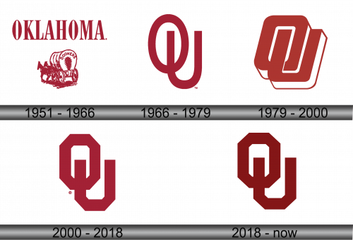
1951 – 1966
The logo is a symbolic representation of the Oklahoma Sooners, featuring bold maroon lettering that spells “OKLAHOMA” at the top. Below, a vintage, maroon-colored Conestoga wagon, bears the word “Sooners”. The wagon is covered with a curved canvas, suggesting the pioneering spirit of the Old West. The horses appears in mid-stride, implying motion and progress, while the wagon wheels show simplistic detailing, contributing to the logo’s classic feel. This image encapsulates the university’s heritage, the frontier history of Oklahoma, and the unyielding spirit of its athletic teams. The logo is trademarked, indicating its official status and the university’s protection of its brand identity.
1966 – 1979
The current logo showcases a strikingly minimalist design, a stark contrast to the previous one. It features the interlocking letters “OU,” rendered in a bold maroon hue, symbolizing the University of Oklahoma. This contemporary emblem, stripped of any additional graphics or text, conveys a sense of modernity and refinement. The clean lines and solid color of the letters project a sleek and straightforward identity, emphasizing the university’s initials without distraction. The “O” encompasses the “U,” suggesting unity and collaboration within the university community. This design is a clear shift towards a more abstract and iconic representation of the Sooners’ brand, reflecting a modern ethos while maintaining a connection to the school’s heritage.
1979 – 2000
Transitioning from the previous iteration, this logo presents the “OU” monogram with a dynamic twist. The letters are now depicted with a three-dimensional effect, outlined in white and shadowed to suggest depth. The maroon color remains a constant, tying it to the university’s traditional palette. The design is bolder, with the “O” intersecting the “U” in a more pronounced overlap, giving an impression of forward movement and interconnectivity. This visual depth and the angular lines of the letters create a more assertive and contemporary identity. The use of shadow and outline provides a visual pop that distinguishes it from the simpler, flatter designs of the past. With these changes, the logo maintains its iconic simplicity while conveying a modern, energetic feel reflective of the University of Oklahoma’s evolving spirit.
2000 – 2018
This iteration of the logo simplifies the previous design to flat, two-dimensional shapes, removing the shadow and outline to create a cleaner, more graphic look. The “OU” monogram is still the central element, but it’s been stylized into geometric forms: the “O” is an octagon, and the “U” fits neatly inside it, maintaining the traditional maroon. This design removes the motion implied by the previous logo’s 3D effect, instead opting for a bold, static presence. The sharp angles of the octagon add a modern edge, while the monogram’s symmetry speaks to balance and stability. A registered trademark symbol now accompanies the logo, indicating its official and exclusive use by the University of Oklahoma. The minimalist approach reflects a trend towards more streamlined branding in collegiate sports.
2018 – Today
In this version of the logo, the alteration is subtle, yet significant in its implication. The maroon hue of the “OU” monogram has been deepened, a change that may reflect a desire to project a richer tradition or perhaps to modernize the palette while respecting the historical identity. The shift in shade is a nod to the evolution of the brand, suggesting a maturity and refinement of the University of Oklahoma’s image. Despite this singular change, the logo’s overall integrity and design remain consistent, ensuring brand recognition and continuity. This nuanced update speaks to an attention to detail and the university’s commitment to maintaining a strong and distinctive visual identity.
