Oregon Ducks Logo
Oregon University does not stand behind the other education institutions and has close to 20 various sports programs. The track & field program along with the football team have seen the most success. Over 30 players have got on the NFL rosters, and there are many other achievements by the Oregon Ducks.
Meaning and History
The Oregon Ducks, or rather Webfoots as they were called before, started playing from the very first years of the University, which was founded back in 1876. In 1940, the athletic director made an unofficial agreement with Disney to use Donald Duck as their mascot, so the team was renamed accordingly. Although the Ducks do not have a national championship title, there are nine conference titles and it also won five Rose Bowl games.
What is Oregon Ducks?
These are athletic teams that the University of Oregon is proud to call its own. There are women’s teams that play tennis, beach volleyball, lacrosse and2 other sports, as well as men’s teams that also play varsity sports.
1974 – 1993
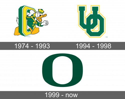
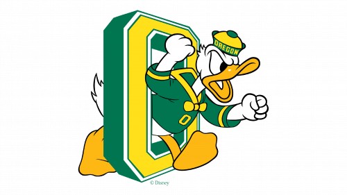
A duck character running out of the letter “O”, as if it was a gate, became the first logo of the sports team. The “O” was drawn at an angle, so there was a visible side of this three-dimensional letter. It looked like a vertical rectangle with cut corners. The sides were done in green, while the front was yellow and had a white and thin green outline on the outer and inner sides. One leg and tail were visible on one side of the letter while the rest of the body and head were already on the other side. The character was clenching fists, had a wide-open mouth and the whole expression showed that it was eager to fight. The duck had a green vest with yellow elements and a cap that said “Oregon” in the same colors. The mouth and feet were done in a slightly darker yellow, while the body was white.
1994 – 1998
An abbreviation for the “University of Oregon” in the form of letters “UO” served as the new logo. There was no more duck character. The letters slightly overlapped, with “U” being higher than the “O”. It had straight lines and angular corners, so the “O” resembled an octagon like it did in the original version. The main color was green, while thin white and yellow lines served as an outline that further interconnected the two letters.
1999 – Today
In the late 1990s, the sports department further simplified the logo. This time, it was a simple letter “O”. The green color was slightly a different shade and there were no more borders done in various colors. Moreover, the letter had smooth angles and rounded sides. It had thicker vertical sides and a thinner line at the top and bottom, with an oval shape being created in the center. Thanks to the fact that the green was used in all the versions of the Oregon Ducks’ logos, it was easily recognizable.


