Real Madrid Logo
Real Madrid is the leading club in Spain and around the world. He has many trophies on his account, he has won the Champions League several times. Its logo is so recognizable that even people far from football know it. This is due to the team’s numerous sporting successes.
Meaning and history
Real Madrid is an old Spanish football club, and one of the best in the world. It’s based in Madrid, the capital of Spain. The ‘Real’ in the name stands for ‘Royal’, which is an official stamp of approval the club received from the last king of Spain. This status was reaffirmed by the new monarchy, as well.
The club started in 1902, but its most prolific victories came in the 50s. During that time, they won 5 European Cups one after the other, setting a record. This golden age of Spanish football is notable for such personalities as Di Stefano and Puskas, some of the best player Real Madrid ever had.
The club continues to be a major force even now, with the total of 13 UEFA Championships under their belt.
What is Real Madrid?
Real Madrid is a top Spanish football club, one of the best in the country. It was founded in 1902 and was given a status of royal (‘real’) club in 1920. In the 20th century, they proved one of the most prolific clubs ever. Right now, RM easily finds itself in the top-5 football clubs every year.
1902 – 1908
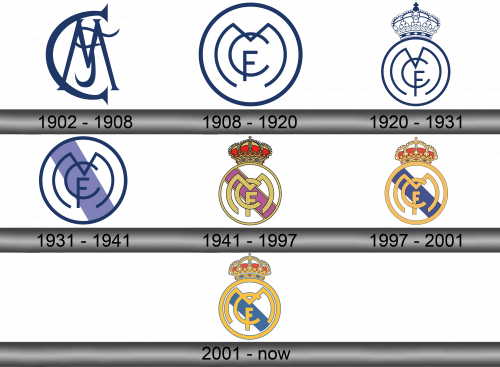
The first emblem appeared immediately after the club was founded. It consisted of blue letters F, C and M, which intersect with each other in a bizarre shape.
1908 – 1920
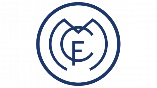
A circle appeared around the letters, and the intersection of the letters took on a familiar shape. The largest turned out to be the letter M, slightly less than C, and the smallest F, which is located at the bottom of the letter C.
1920 – 1931
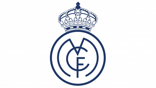
In 1920, the logo underwent minor changes. The position of the letters changed slightly, and a crown appeared on top of the club. No wonder the fans call Real Madrid a royal club.
1931 – 1941
During these years, the crown was abandoned, and a light blue stripe appeared inside, going from top to right down to the left. The letters and outline of the circle are made in dark blue, they are thicker than on the previous logo.
1941 – 1997
In 1941, the crown returned to the emblem, the stripe inside the circle turned purple, this is another symbol of power. The outline of the circle and the letters are in gold.
1997 – 2001
The biggest change in 1997 was the replacement of the magenta stripe with a blue one, and a number of other adjustments were made.
2001 – Today
In 2001, a number of small changes were made to the logo. The color of the strip became lighter, and she herself – narrower. The letters have become larger, and the rounded lines of the letter M have become almost flush with the circle that defines the inner content.
Color and font
Only initials are used in the logo, but they are made in a special font that is easy to recognize. The club is a royal one, which was repeatedly shown in the choice of colors for the design of the emblem. Now the main colors are blue and gold. The crown is an important part of the emblem of the Royal Club. It is painted using gold and red colors and also has blue gems.
