Samsung Logo
Samsung is the biggest electronics companies to come from South Korea, and one of the most successful electronics companies worldwide. They’ve been in business since 1938, although it wasn’t until the 70s that they started going international. That’s also when their iconic logotype first appeared.
Meaning and History
‘Samsung’ is a Latinized Korean phrase that basically means ‘three stars’. Of course, they give this name more meaning and purpose than what it seems to us. The stellar imagery has been used very frequently throughout the history of this company. Well, now you know why.
1938 – 1969
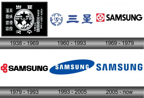
The very first logotype was a sort of booklet that described what the company is all about. There were a lot of traditional Chinese glyphs written in silver over the black square with tons of other text in Chinese characters. The text was mostly in Korean, although there seems to be a section meant for Japanese writing on the right.
The middle is occupied by a detailed image of three stars, a few stripes and a wheat ear, all grouped together inside a circle.
1960 – 1993
This was a design meant for home use. What’s particularly interesting about it is that was that the first design that featured the usual Samsung coloring. What’s more, it even made steps towards to full international emblem they use today.
There were three equal parts, all painted deep blue. The left-most was the ring symbol. Inside, it has a lotus emblem with three petals and a letter ‘S’ in the middle. It was followed by the two Chinese glyphs that essentially spelled the Korean name of the company.
1969 – 1979
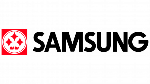
It was the first logo used abroad. For this purpose, they Romanized the words used to name the company, and what they got is the word ‘Samsung’. It was a pretty basic black type, although it slightly reminds you of the modern writing. The letter ‘A’ is different, and the letters in general are thinner and grouped tighter together.
Right on the left, they put a square with a circle inside. The circle is heavily inspired by the very first stars image, although the stars are more minimalistic and there’s virtually nothing else inside the ring.
1979 – 1993
They pretty much used the same design throughout this whole period. It was changed one time, but the only thing that came out of it was that the letters became noticeably wider – that’s it.
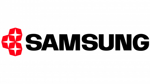
The text suffered little change in regards to the previous version. They just took the same concept and made the characters shorter and thicker. The font and the color pretty much stayed the same. What really changed was the emblem.
Instead of the stars fitted inside a circle, they now had three identical red octagons with white four-tipped stars inside. They were designed very neatly, too – the red parts are basically four identical rhombuses that surround the white innards.
1993 – 2005
In 1993, the company decided to introduce a uniform logo both for home and world markets. They basically took the writing from the previous version, made the letters way thinner and more spread-out, then colored them white and put them on top of the tilted blue oval.
That’s also when they designed the iconic ‘A’ look – basically just a turned-round ‘V’. This text design is used even now.
2005 – today
Nothing substantial was added in this iteration. What Samsung did in 2005 was simply take the writing from the 1993 logo, paint it blue and remove the oval. That’s really all there is to it. It has been pretty much the only Samsung logotype for many years.
Emblem and Symbol
The triple-star emblem Samsung used in different variations until 1993 has deeper traditional Korean meaning. The number three is a fairly powerful number that emanates plentitude and power, while stars may be interpreted as an attempt to reach out and explore, or simply as something big and spiritually-empowered.

