San Jose Sharks Logo
The Sharks do not belong to the teams with a long and glorious history. Yet, in a relatively short time, they were able to gain a good fan base that cannot wait for them to win the Stanley Cup. So far, they have a Presidential Cup along with several division titles and other achievements.
Meaning and history
The Sharks have been playing the games since 1991. They were not the first hockey team to play in California, but Golden Seals did not stay there for too long. This did not make some of their owners happy, so they sold their share in the Seals team and brought a new hockey team to the state. It looks like the Sharks are not planning to go anywhere as San Jose city has welcomed the players with all their heart. Besides including their location in the name, the founders added “Sharks” to the name. The latter was actually chosen by the locals.
What is San Jose Sharks?
The Sharks represent a hockey team that plays in the San Jose city in California. Over its history, the team has undoubtedly given fans the opportunity to experience the full range of emotions, from pride to confusion.
1991 – 1998
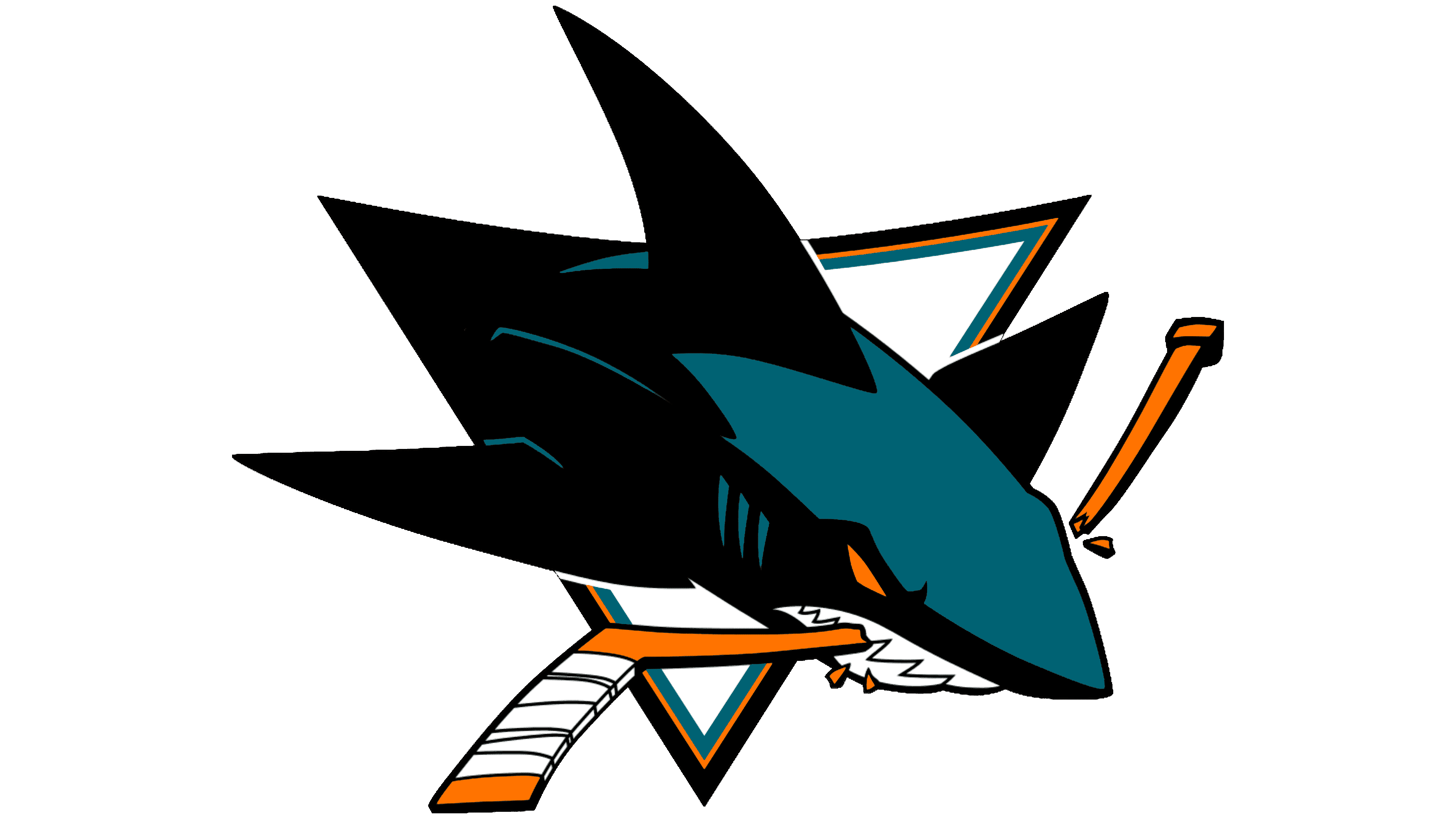
The logo design undoubtedly represents the name and the game of the team. It features a black and white shark jumping out of an inverted triangle. Its teeth are clenching a broken-in-half hockey stick of a yellow color. The logo has movement and reflects the strong and determined spirit of the team.
1998 – 2007
In the late 90s, specifically 1998, the design maestro introduced subtle shifts in the team’s emblem. The club’s hue transitioned to a soft, earthy brown. Additionally, the trio of curvaceous lines, symbolic of the gills, were modestly truncated. Apart from these nuanced adjustments, the core essence and foundational elements of the design were left untouched. These changes, though minor, reflected the evolving identity of the team and its adaptability, while maintaining the original spirit and legacy that fans had come to love and associate with the team. It was a blend of honoring tradition while embracing the future.
2007 – 2008
The teal color, which was previously seen only in the triangle, took a more prominent position as the highlighted parts of the shark itself. The shark here is not only larger but it looks fiercer. Its yellow eyes combined with larger teeth can drive any opponent away. Although all the details were redrawn, the original idea stayed unchanged and presented the Sharks as serious and powerful players who get what they want and nothing can stop them on their way.
2008 – Today
Although the triangle and hockey stick are gone, the shark character is instantly recognizable. Over the years, it became closely associated with the hockey players. Its black, teal, and white color palette with a touch of yellow strengthen the association. In this logo version, the full body of the shark can be seen. It is depicted from a slightly different angle and has its mouth open. One undoubtedly knows what will come next. This brave and confident logo inspires determination in the players and makes the fans believe that they can play on par with this character.
Font and Color
Although there are no inscriptions, the team managed to create a logo that will be closely associated with the Sharks team. Although initially, the black color with yellow dominated the color palette. Later, the teal color took a stronger position. Although the color can have a calming effect, it can also inspire a sense of adventure and exploration. It surely inspired the team to grow and reach new heights. Meanwhile, the black color was a perfect match for the brutal animal.


