Shell Logo
One of the biggest oil businesses in the world is known as Shell. It carries out geological research and produces oil and gas in more than 40 nations. Shell also owns or partially owns more than 50 oil refineries. Moreover, Shell owns a significant number of chemical enterprises, as well as a factory for the production of solar panels and other alternative energy sources. The company operates in over seventy countries around the world. Industrial safety, as well as a responsibility before society and nature, are the fundamental principles of Shell’s activities.
Meaning and History
Although established in 1907, the Royal Dutch Shell Company’s history dates back to the early 19th century. It begins with an antique shop in London where the Samuel family traded seashells, which is where the name of the company comes from. The concern was created by the merger of two other companies in anticipation of the expansion of the American trust Standard Oil. It was not until the summer of 2005 that the shareholders of both approved the merger of the parent companies into one business. Among other significant events, its website launched the Shell Virtual Assistant in 2015. It is a one-stop shop where customers and distributors can get answers to their questions about lubricants around the clock that is available in multiple countries.
What is Shell?
Shell concern is one of the largest suppliers of oil on the global market. The Shell factory produces a wide range of high-quality lubricants, including motor oils, oils for marine engines, and industrial lubricants, including hydraulic and transmission oils.
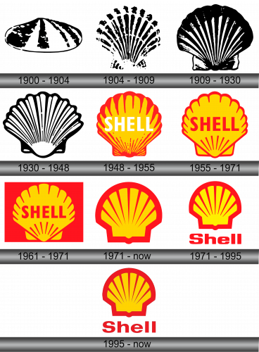
1900 – 1904
The original logo was an abstract image of a shell lying flat. It was wider towards the bottom and had several black vertical lines going from the top and spreading towards the bottom. There were no other elements.
1904 – 1909
The new logo was still a seashell, but now it was placed vertically and fanning out upwards. There were also more details, which made it look more realistic. The emblem was placed on a black square for a more dramatic and impressive look.
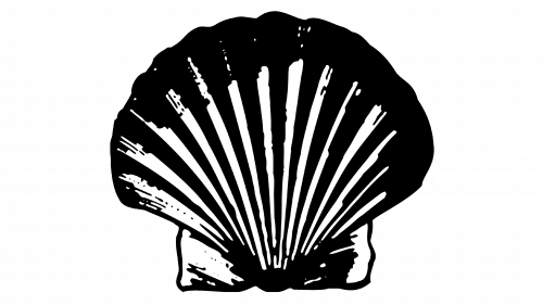
1909 – 1930
The emblem was modified and the main difference was a lack of the dark background. Instead, the designers gave the shell a darker look, especially at the top. Its overall appearance was also changed, but the idea was the same.
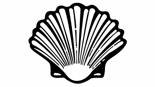
1930 – 1948
The shape of the shell was very similar to the one seen previously, but it was mostly white with a darker outline and details. As in the original one, there were no other details.
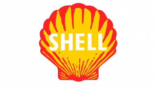
1948 – 1955
The brand steered away from the black and white emblem. In addition, it added a “Shell” inscription on the shell image. The shell was yellow with a red outline and other lines. The name was done in white uppercase letters using a basic, sans-serif font.
1955 – 1971
The designers fixed the fact that the name was kind of lost against the bright background in the form of a shell. The shell did not change its color scheme, although there were fewer details. What changed was the color of the lettering. It was the same red as the outline and popped beautifully against the yellow.
1961 – 1971
A minor change was introduced in 1961. The emblem stayed the same, but similar to what the company has done in the past, it was placed on a square background. This time, it was red.
1971 – Today
The company decided to return to the original idea of just a shell without the company name. The shell used for the past years has been used as a standalone emblem. It was a symbol of a powerful and well-known company.
1971 – 1995
Ten years later, the red square was gone. To maintain a relatively bold and solid appearance, the company added a much thicker outline to the shell. The designers gave it an even more abstract look with a smooth outer edge and even lines in the center. The name was written under the image, instead of over it for the first time. In addition, it was done using a different style of font with a more squarish look.
1995 – Today
The yellow color did not look as bright anymore. The font has also changed, but one would need to look attentively to realize that.
Font and Color
Although several versions of the logo, including the current one, did not feature any writing, the company did have its name written during some periods of its existence. It used a simple, sans-serif font with straight lines and cuts. Typically, all the letters were uppercase, although a couple of logos featured only the first letter being capitalized. For almost fifty years, a black and white scheme was used, which is explained by the time period of its usage. Since 1948, the logo acquired a familiar yellow and red color scheme. These are colors of power and energy, which is more than suitable for a large oil company.

