Swansea City Logo
This brand represents a professional football club from Swansea, Wales. It was formed by a group of local sports enthusiasts who aimed to establish a strong football presence in the area. They intended for the club to compete in national competitions and to foster community spirit through sports.
Meaning and history
Swansea City was officially established in 1912. Initially, it aimed to bring competitive football to the local populace. Throughout its history, Swansea City has seen various highs and lows, reflecting the dynamic nature of sports. Key dates include 1981, when the club reached the First Division, marking its highest position in the league. Another significant milestone occurred in 2013 when Swansea won the League Cup, a major trophy in English football.
What is Swansea City?
Swansea City is a professional football club based in Swansea, Wales. Known for its passionate fan base, the club competes in the English football league system. It serves as a cultural and social pillar in Swansea, promoting both sportsmanship and local pride.
1912 – 1922
The emblem features a central shield adorned with a stylized castle atop waves, symbolizing strength and maritime heritage. Flanking the shield, two mythical creatures, a lion and a dragon, each display a regal stance, signifying nobility and local folklore. An eagle perches above, adding a sense of vigilance and supremacy. The banner below proudly bears ‘Swansea’ as a testament to civic pride, while ‘Floreat’ suggests flourishing growth. The vibrant red contrasts with calm blue, weaving valor with serenity.
1922 – 1970
This crest shifts in color and detail, adopting a more monochromatic scheme with bold black contours. The castle and waves maintain their prominence but rest within a lighter blue shield. The lion and dragon stand in a vivid yellow, bringing energy to the badge. “Swansea Town” in assertive lettering replaces the previous banner’s text, marking an identity evolution. The inclusion of “A.F.C.” anchors the design in football culture, while the trim silver border encapsulates tradition and modernity.
1970 – 1972
The design now departs dramatically to a minimalist black swan silhouette with distinctive features. Its neck curves elegantly, culminating in a detailed orange beak. The body, abstract in form, suggests feathers through textured shading. This representation strips away earlier heraldic complexity, favoring a sleek, stylized approach. The swan’s pose is dignified, capturing the essence of Swansea with a single, powerful image. This emblem speaks to a modern identity, embracing simplicity and focus.
1972 – 1973
The redesigned logo for Swansea City features a modern, abstract rendition of a black swan. Compared to the detailed depiction in the 1970 version, this new badge has fewer details, emphasizing bold lines and slightly rough contours. The design excludes any additional elements, focusing solely on the swan. This streamlined approach gives the logo a stylish and mysterious aura, making it highly recognizable yet distinctly different in mood from its predecessor.
1973 – 1977
The emblem features a red dragon, an enduring symbol of Wales, in a rampant stance, which suggests readiness for battle. Above the dragon, the initials “S.C.A.F.C” are prominently displayed, indicating the Swansea City Association Football Club. The dragon, detailed with scales, wings, and a barbed tail, conveys both fierceness and pride. Its form is stylized yet recognizably Welsh, adhering to traditional heraldic design, and it stands against a stark white background, making the red figure even more striking.
1977 – 1979
Transitioning from the previous emblem, the current logo encapsulates a black swan within a circle, reflecting Swansea’s nickname, the Swans. This circular badge contrasts the earlier dragon motif, embracing a more serene yet dignified representation. Encircling the swan, the words “Swansea City F.C.” are clearly inscribed, emphasizing the club’s identity. The swan’s detailed feathers, curved neck, and elevated wing grant the design a graceful elegance. Black and white are the chosen hues, delivering a classic and timeless feel, distinct from the fiery red of its predecessor.
1979 – 1984
In this evolution of the logo, the swan remains central but gains a more dynamic posture with its wings in motion. The text has been expanded to “Swansea City Football Club”, offering a more formal and complete declaration of the club’s name compared to the previous abbreviation. This iteration also appears bolder, with the text and swan set against a darker, more pronounced circular background. The textured effect gives a gritty, tactile quality, adding a sense of depth and resilience. This design reflects a stronger identity, balancing elegance with a more assertive presence.
1984 – 1985
The logo retains its circular format, yet the swan’s silhouette is refined, exhibiting less texture and more clarity. The boldness of the previous design’s text and border has been softened, creating a cleaner and more modern aesthetic. The words “Swansea City Football Club” are consistently spaced, and the font size is more uniform, suggesting a focus on balance and readability. The overall effect is a sleeker, more streamlined emblem, aligning with a contemporary look while maintaining the club’s symbolic swan at its heart.
1985 – 1992
This logo marks a significant departure from the previous swan-centric designs. It now features a black double-winged figure, perched atop a pedestal, with a crown above, introducing a regal element. Below, there’s a banner, likely containing the club’s name, which embraces a classic football crest aesthetic. The pedestal sits within a stylized structure that hints at a stadium or arena, connecting the emblem to the club’s sporting venue. This design brings a sense of tradition and history, possibly looking to older heraldic crests for inspiration, and creates a more intricate and emblematic representation of the club.
1992 – 1993
This logo is a modern, stylized interpretation with a pronounced use of geometry. The swan, poised on a brickwork pedestal, has its wings expanded, set against a sky-blue backdrop, symbolizing both the club’s maritime connections and open aspirations. The name “SWANSEA” arches above, with “CITY F.C.” below, framing the bird; the text is in a bold, contemporary font. The use of black outlines against the white and blue background gives a clean, crisp contrast. This emblem merges traditional elements with a graphic simplicity, a clear nod to the club’s heritage while presenting a fresh identity.
1993 – 1998
This rendition of the logo introduces a more naturalistic swan set atop a three-dimensional white castle, symbolizing solidity. The swan’s detail is accentuated, with defined feathers and a more pronounced neck curve, emanating elegance and strength. The blue background, now segmented into waves, suggests Swansea’s coastal location. The enclosing circle has been retained, but “SWANSEA CITY F.C.” is now in a singular, continuous curve along the bottom, giving the text a more grounded appearance. The overall palette of blue, white, and black remains, preserving the club’s colors while delivering a more refined visual narrative.
1998 – 2022
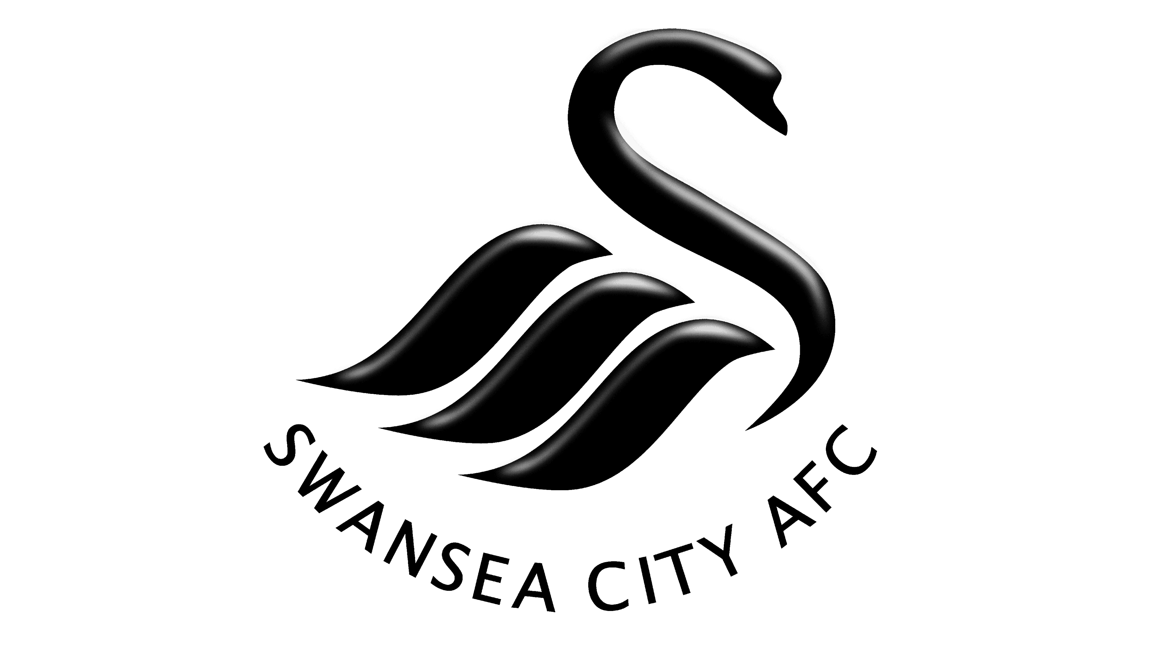
In this logo, abstraction takes center stage, stripping back to a sleek, minimalistic swan representation. The swan’s shape is reduced to a flowing, S-like form, with three pronounced curves evoking its body and wings. This fluid design is a stark contrast to the previous logo’s detailed realism. The color palette is simplified to stark black and white, emphasizing the silhouette’s elegance and grace. “SWANSEA CITY AFC” is written in a clean, sans-serif font, arched below the figure, maintaining a modern and sophisticated branding approach. The absence of additional colors or graphic elements highlights a focus on contemporary simplicity and brand recognition.
2000 – 2002
Maintaining its minimalist essence, the logo has undergone a vivid transformation with a bold shift to red, departing from the stark black of its predecessor. The emblem retains the stylized swan, but now it’s imbued with a vibrant hue symbolizing passion and energy. “SWANSEA CITY AFC” encircles the swan in the same modern typeface but now stands out with a striking red to match the bird. This alteration not only refreshes the club’s visual identity but also aligns it with the traditional color of Wales, creating a strong national connection. The design’s simplicity remains, ensuring the swan’s fluid form remains the focal point.
2005 – 2007
Returning to a classic black and white palette, this logo is encased within a complete circle, suggesting unity and totality. The swan motif is identical in form to the previous red version, symbolizing continuity and tradition in the club’s identity. “SWANSEA CITY AFC” follows the curve of the circle, fostering a harmonious balance between text and image. The change back to monochrome offers a nod to the club’s historical colors, while the enclosing circle creates a sense of inclusion and cohesion. The design is sleek and unfussy, which aids in its memorability and solidifies the emblem’s iconic status.
2012 – 2013
Celebrating a milestone, the logo is transformed into a golden shield for the club’s centenary, denoting 100 years (1912-2012). The emblem’s shape signifies tradition and achievement. The swan, now more detailed and graceful, is placed within the shield, with wings elegantly spread. Beneath, a ribbon carries the full club name and centennial dates, reinforcing the momentous occasion. The use of gold throughout symbolizes prestige and success. This special edition logo is a departure from the usual design, commemorating the club’s rich history and evolution.
2021 – 2022
This logo returns to a familiar design, with the swan perched atop a castle against a circular backdrop. “SWANSEA” arches above and “CITY A.F.C.” below, framing the bird. The foundation year “1912” is split and positioned at the top sides, honoring the club’s origins. The design is in classic black and white, invoking the club’s traditional colors. The circular shape, a recurrent theme in the club’s branding, suggests unity and continuity. The use of bold lines for the swan and castle reflects a return to the club’s established iconography, blending historical significance with modern design.
2022 – 2023
This logo reintroduces a blue sky background, a detail absent from the previous black and white version. The swan, now depicted in full, stands majestically atop the castle. “SWANSEA” crowns the top half, while “CITY A.F.C.” anchors the bottom. The founding year “1912” is divided and placed on either side, echoing earlier designs. This iteration creates a more vibrant contrast and depth, with the blue adding a fresh, dynamic element to the emblem’s aesthetic. The consistent circular boundary maintains the club’s enduring identity, encompassing its history and aspirations.
2023 – Today
Reverting to an earlier design, the logo features the stylized black swan against a white backdrop, forgoing the previous blue and circular elements. “SWANSEA CITY AFC” is arched below in a simple, modern font. The design is minimalist, with a focus on sleek lines to convey the swan’s form. This iteration abandons additional colors and symbols, emphasizing a stark, contemporary look that captures the essence of the swan through abstract shapes. The monochromatic color scheme ensures strong visual impact and easy reproduction across various media.


