Texas A&M Aggies Logo
The Wall Street Journal named Texas A&M University one of the top 25 universities in the United States when it comes to its graduates being in demand among employers. The Texas Aggies represent the university’s sports program. Similar to other universities, Texas A&M University has over 15 varsity sports among which are baseball, football, volleyball, tennis, and others.
Meaning and History
Since 1996, the Aggies have been members of the Big 12 Conference. The athletic teams are also part of NCAA Division 1. Most of the championship titles have been earned during the 2009 – 2017 period with an exception of softball titles earned in 1983 and 1987. There are close to 200 conference titles, but many of these were achieved in the early years starting from 1917. They got their name, Aggies, in 1920, but it was not until 1949 that the name was used officially. The word “Aggie”, itself, is short for agricultural.
What is Texas A&M Aggies?
These are athletes who compete in about twenty varsity sports. They represent Texas A&M University for over one hundred years.
1876 – 1907
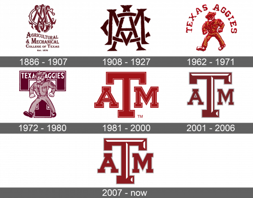
The first emblem was very typical for that time period. It featured a monogram with the university’s initials. The letters “A” and “M” overlapped each other, while the “C” intertwined with these two. The latter was white with a crimson outline and the other two letters were crimson. The monogram was balanced, and each letter had beautiful elements. Underneath, there was a full name of the educational institution, which was also done using a very fancy classic typeface. The first two lines used a bigger font and the first line was slightly wavy, rising above the capital “M” on the second line. At the very bottom, it stated the establishment year.
1908 – 1927
For some period of time, the Texas A&M Aggies used only the monogram part of the original logo, which was very simplified. This made it easier to discern the different letters and created even more symmetry. The letter “A” was somewhat longer than “M”, while “C” had more of a horizontal oval shape. The color palette was still crimson.
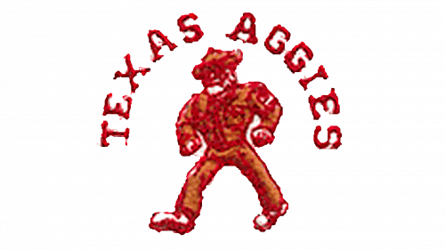
1962 – 1971
A man’s figure was the center of the new sport’s emblem. The man had wide shoulders and was walking with confidence. He was wearing a hat and one could see a badge on one of the sleeves. The logo had the team’s name “Texas Aggies” arching above the man and reaching his waistline.
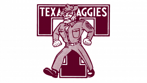
1972 – 1980
A man in a uniform walking forward with a confident and serious look still served as the key element of the logo. He closely resembles the figure used in the previous version, which includes a hat, beard, clenched fists, and a uniform that consists of a shirt and pants with a tight belt. Behind the figure, there is a large burgundy letter “T” with a white thin outline slightly indented inside. At the top of the letter across the top horizontal line, it says “Taxes Aggies” in capital white letters. The whole emblem was done in burgundy and white colors.
1981 – 2000
A large crimson “T” is drawn in the center. It has a very thin outline slightly indented inside, similar to what was done in the previous logo. To the right and left of the “T”, there are smaller “A” and “M” done in the same font and style.
2001 – 2006
An update done in 2001 gave the letter “T” a 3D effect. It was achieved by adding white lines at the top and on the right of the letter. The sports department also removed the thin border around each letter. Instead, it added a slightly thicker border on the outside of all the letters, which made it look as if it was a shadow. Letters “A” and “M” are smaller and thinner and almost fit under the horizontal crossbar of the “T”. The color was changed to a darker shade.
2007 – Today
The new logo featured the same abbreviation, only in a lighter color. The department also returned the larger “A” and “M”. In addition, the grey border also got lighter. With slight adjustments, this version of the logo has been used since the early 1980s.
