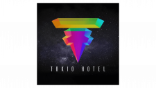
Tokio Hotel Logo
Tokio Hotel is a German rock band. Bill and Tom Kaulitz, twin brothers, created it. The band began in Magdeburg, Germany. They aimed to showcase their musical talents and connect with fans worldwide. Tokio Hotel gained fame for their energetic performances and unique style, appealing to a diverse audience.
Meaning and history
Bill and Tom Kaulitz formed Tokio Hotel in 2001 in Magdeburg, Germany. Gustav Schäfer and Georg Listing soon joined them. They released their first album, “Schrei,” in 2005, which quickly made them famous in Germany and other countries. In 2007, they solidified their international presence with their second album, “Zimmer 483”. They released their third album, “Humanoid”, in 2009, showing a shift towards electronic music. The band moved to Los Angeles in 2010, which influenced their later work. In 2014, they released “Kings of Suburbia,” and in 2017, they came out with “Dream Machine”. In 2021, they celebrated 20 years together with special releases and tours.
What is Tokio Hotel?
Tokio Hotel is a well-known German rock band recognized for their unique sound and lively performances. The band constantly evolves, exploring different music genres. They maintain a strong international fan base, showcasing their lasting influence on the music industry.
2001
The logo features the word “Devilish” in fiery, bold letters. The letters burn brightly against a dark background. Below the word, four young boys stand on a building rooftop. The boys face away, looking into the distance under a clear blue sky. This design captures a rebellious and adventurous spirit.
2005 – 2014
The Tokio Hotel logo features a bold, black design. A circular symbol with a stylized “T” and “H” sits above the band name. The letters in “Tokio Hotel” appear distressed, adding a gritty texture. The overall look is edgy and modern, capturing the band’s dynamic and rebellious spirit. This logo emphasizes their strong identity in the rock music scene.
2014 – 2017
The logo shows a significant change from the previous one. The font is now handwritten, giving a more personal touch. The symbol above the name is simplified, resembling a stylized “T” and “H”. The overall design is cleaner and more modern. The letters in “HOTEL” are spaced out, adding a contemporary feel. This updated logo reflects the band’s evolving identity and artistic maturity.
2017 – Today
The newest logo introduces a dramatic transformation. The design now features a vibrant, 3D multicolored symbol. The handwritten font is replaced with a sleek, modern typeface. The background showcases a starry night sky, adding a cosmic feel. This updated logo reflects a bold, futuristic direction for the band.


