Radiohead Logo
Radiohead is a British musical group originating from Oxfordshire. It appeared in the mid 80s to play rock songs on various topics, including modern urban issues, alienation, loss of friends, love, and others. Hence, the group is popular among the relatively young male and female audience. Radiohead consists of 5 members: John Greenwood, responsible for guitar, electronic keyboard and some other tools, Colin Greenwood playing bass, Thom Yorke, being the band’s voice, also playing guitar and piano, Ed O’Brien for second vocals and guitar, as well as Phillip Selway, performing drums
Meaning and history
![]()
The Radiohead’s musician list barely changed throughout the group’s history. Initially, it was a venture project, called On a Friday, and led by five friends studying in Abingdon School, located in Oxfordshire. John Greenwood, Colin’s younger brother, at the start played harmonica, then took the keyboard, and finally became the band’s guitar leader. The friends have decided to play rock music, inspired by after war avant-garde, jazz, and 20th century classic.
Until 1991, they hadn’t recorded anything special, they just chose their style and music mood. But in November 1991, the group played in Jeriho Tavern in Oxford, catching the attention of some recording companies. In December, they partnered up with EMI, signing a 6 album deal. On a Friday also changed the name towas also renamed as Radiohead after the EMI’s request. The name originated from an eponymous song “Radio Head” by Talking Heads.
The first work was called “Creep” and published in 1992. It got an international hype following the release of the band’s initial album, Pablo Honey, in 1993.
What is Radiohead?
Radiohead is a rock musical group, composed in 1985. Thom Yorke is the band’s main vocalist, Johny Greenwood leads the guitar, and plays keyboard, his brother Colin is bassist, Ed O’Brien carries an additional guitar and back vocals, while Phillip Selway is percussionist. They have 9 studio albums with the songs affecting the topics of present urban estrangement, alcohol, love, et cetera. Their style is influenced by jazz, electronic music, and krautrock of the 60s and 70s. Most of their works are usually related to teen audience.
1992 – 1994
![]()
The logotype for their original album, Pablo Honey, was just a nameplate in a lowercase sans-serif typeface. ‘Radiohead’ inscription was somewhat grainy and slim, and there were very small intervals between the characters. The first “r” character was painted white and put inside a black circle. The other symbols were black.
1994 – 2000
![]()
The next brand mark represented the name caption in a semibold capitalized script with angular forms. The letters were flattened and widened, and they almost didn’t have any gaps in between. All this added some minimalism to the name board, shown on the second and third albums.
2000 – 2003
![]()
The following wordmark had a very bold font. They refreshed the letters’ style, making them regular size. As previously, the symbols were uppercase, and had small spaces in between. Throughout the band’s history, this inscription was used only triple: for the ‘Kid A’ album, as well as ‘Amnesiac’, and ‘The Beas Of’.
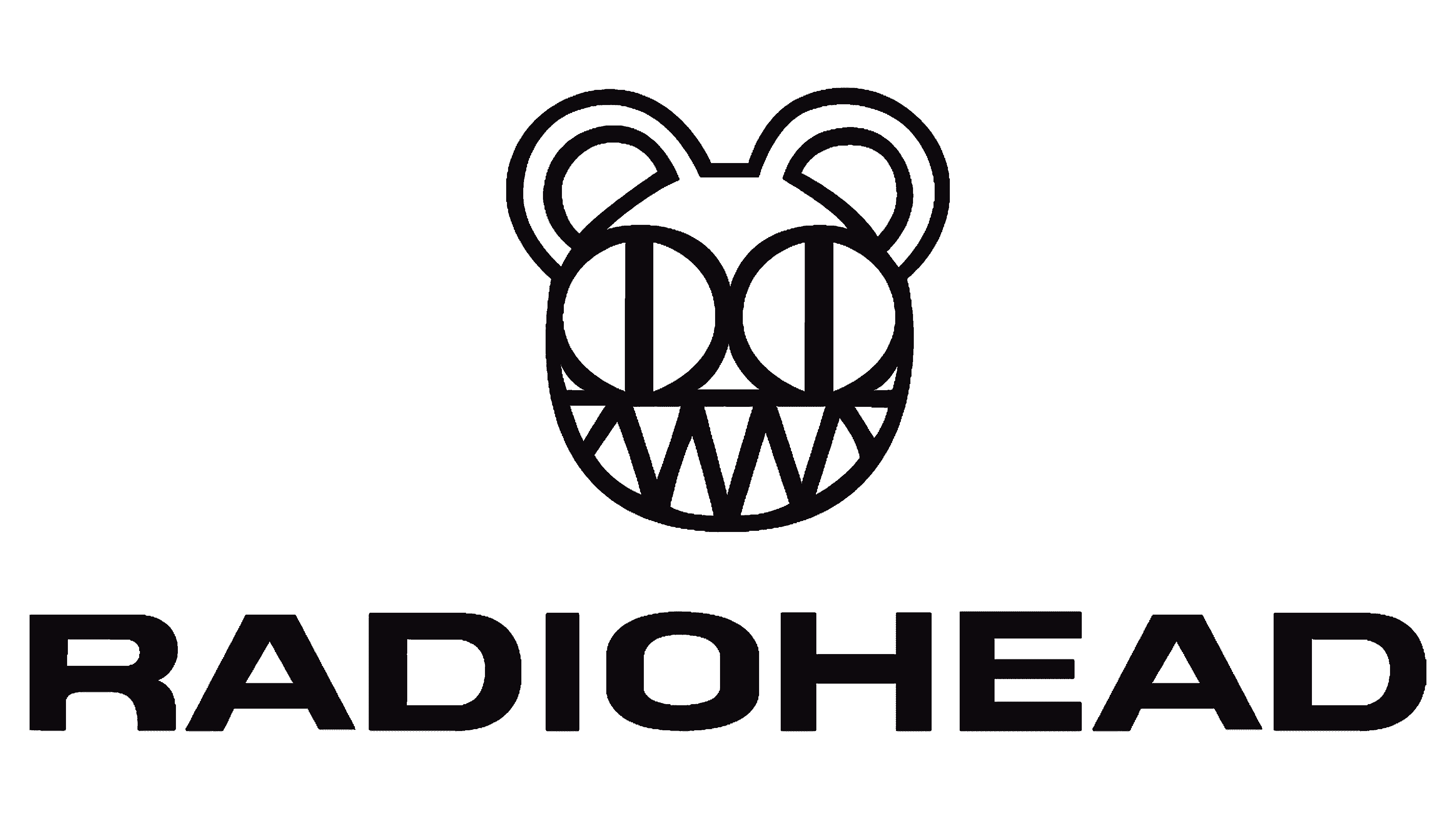
2000 – today
![]()
Probably the most recognizable logotype in the band’s marketing history appeared with the new century. This ‘Modified Bear’ crest shows a circle-styled head with two large ears, looking rather like rings. Inside the circle, they put two little rounds, each having a bold bar. The lower part of this somewhat creepy head was bordered by a stripe and contained multiple triangles, looking like a smile styled as a radio wave. Although it was used primarily during the Kid A album’s marketing, they sell merch with this emblem today.
2003 – 2007
![]()
For the 2003 ‘Hail to the Thief’ album, the marketers developed a serif inscription with the first ‘r’ capital, while other letters lowercase. The script didn’t have any outstanding features. It was rather a simple elegant style with small gaps in the space between the serif characters.
2007 – 2011
![]()
The Radiohead designers returned to the capitalized nameplates with the ‘Rainbows’ 2007 album. The new inscription had a typical sans-serif script
2011 – 2016
![]()
‘The King of Limbs’ album cover depicted a name with the sans-serif letters narrowed and elongated to the top. They hadn’t gotten any intervals and were practically merged to one another.
2016 – today
![]()
Their latter ‘A Moon Shaped Pool’ album had a wordmark with a typeface, similar to the 2007 style.
Font
The changes affected the size of the letters. For example, all characters became bolder and wider. The ‘e’ letter’s central bar now was shorter than the upper and lower ones. And the ‘r’ symbol was redrawn, so its diagonal bar changed its incline and got longer.
Color
The band’s official color code has been composed of black and white shades.


