Total Logo
The scope of the Total corporation’s activities includes geological exploration of resource deposits, extraction, processing, and sale of raw materials. In addition, Total is engaged in petrochemical production and energy. Concern for product quality is reflected in the significant amounts that the concern invests in scientific, research, and experimental activities. Together with automakers, the company puts its teams to international rallies, which have repeatedly received the title of the best.
Meaning and History
The company was born in 1924 when the French Petroleum Company (Compagnie Française des Pétroles) was formed by order of the President of France. It was focused on the search, extraction, and processing of oil to obtain light oil products – kerosene, gasoline, and diesel fuel. Unfortunately, the first and only deposit in France, discovered in 1925, exhausted itself in a few years. Total began to successfully develop new locations in Africa. The company was renamed in 1954 as its goal was to distribute and promote the gasoline produced by the concern around the world. By that time, Total gas stations were selling fuel and lubricants in Europe, Africa, and the United States.
What is Total?
Total is the second largest public company in France and one of the largest oil companies in the world, engaged in the exploration, production, processing, and marketing of hydrocarbons, as well as petrochemicals and energy. Total is one of the top five oil and gas “supermajors”, which also includes ExxonMobil, BP, Royal Dutch Shell, and Chevron.
1954 – 1955
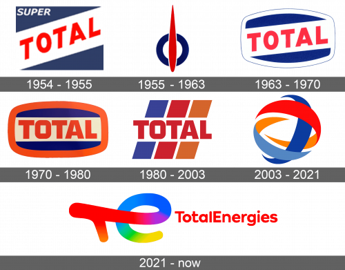
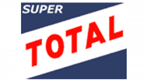
The first logo was bold and confident. It featured a dark blue triangle with a white banner running through it diagonally. This gave the logo some dynamics. The banner had “Total” written across in red, all uppercase, sans-serif letters. The word “Super” was placed in the upper left corner of the emblem in a slightly smaller, white font.
1955 – 1963
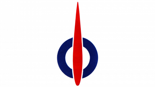
The brand decided to try something new. It was a geometric, abstract emblem with a red line, which resembled a drop or arrow with a pointed end at the top, running across a bright, blue oval shape. The emblem reminded many of a fuel indicator one would see in an automobile.
1963 – 1970
This time, the designers decided to play with an original version. They gave a rectangle a more rounded look and a white followed by a thin blue outline. The emblem looked like a badge. The name of the brand was kept unchanged, although there was no more “Super” at the top.
1970 – 1980
The new version was also an altered original one. They turned the white banner to place it horizontally and switched the color of the border. Now, it was a bright orange color, which was also used for the name.
1980 – 2003
The designers kept the color palette, but almost fully redrew the design. The name of the company remained unchanged, but in the background, one now saw three diagonal lines. They were blue, which was followed by bright orange and a lighter shade of orange. Such bright colors totally energized the emblem. The addition of diagonal lines reflected the fact that the product of the company is a driving force behind different machinery and automobiles.
2003 – 2021
A new spin was given to the emblem that stayed with the company for over twenty years. It featured several curved lines with sharp ends, intertwining and forming a sphere, which could represent a global outreach. The lines were different colors but brought the color palette from the previous version with an addition of a lighter shade of blue. The name was placed at the bottom and done in red but using a different font.
2021 – Today
This is a very minimalistic logo compared to the bright and colorful emblems used by the company earlier. It simply stated “Total Energies” in red with the first letters being capitalized. The company used a relatively basic font with rounded ends for a softer look. The emblem looked very stylish while the red color and close even spacing gave it some boldness and confidence.
Font and Color
A bright red color along with orange has always been a part of the logo. The red stands for energy and power, which is more than appropriate for a well-recognized petroleum company. There is also a blue, which not only balanced out the bright colors but also reflected the trustworthiness of the company. The designers used a very basic sans-serif font for over half a century. In 2003, they introduced a different sans-serif font that featured diagonal cuts, which gave it an interesting element. The latest logo uses a typeface that resembles Artegra Sans Extended SC ExtraBold.
