Wendy’s Logo
Wendy’s is a popular mostly American chain of fast-food restaurants. The main attraction is the ‘old-fashioned’ hamburgers and other typical fast-food dishes styled to resemble what people think are retro snacks. Gradually, they introduced more and more of modern food options, which eventually erased some of their unique touch.
Meaning and History
The first restaurant appeared in 1969, and the sale of old-fashioned burgers was the main shtick for many since day 1. The chain was named after the Dave Thomas’ (the founder) daughter, Wendy Thomas, while the mascot inspired by her featured an ordinary countryside her.
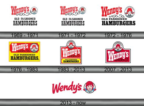
1969 – 1971
The first logo was a collection of written elements, as well as a mascot symbol that was there since the inception.
The name element was put in the top left part of the logo. It said ‘Wendy’s’ in an old-fashioned block typeface painted pale red. The letters weren’t placed on the same line, but gradually climbed up. This style was used continuously until 2013.
The girl symbol to the right featured a red-headed kid with tails, highlighted by the light blue bows. The striped dress was the same color.
The writing below was the slogan of sorts. It said ‘old-fashioned hamburgers’ in tall block letters, much like the ones used above. This design also persisted for many years.
1971 – 1972
Nothing substantial was added, except the circle where the girl was confined also had ‘quality is our recipe’ writing alongside the top edge.
1972 – 1976
Several changes happened in 1972.
Firstly, the color palette became rather brighter and more saturated. Secondly, the letters in the black secondary writing became shorted, well-proportioned, as well as aligned to the left now. Lastly, the girl now faced the onlooker, while before she looked slightly away.
1976 – 1983
The 1976 design saw major coloring changes: the entire think was put onto a bicolor rectangle, with the bottom part placed onto a yellow background, and the top part onto red one. Incidentally, it made the ‘Wendy’s’ writing turn white. The secondary writing didn’t change, although they did realign it to the center.
1983 – 2013
In 1982, they repositioned the elements. The bottom writing became smaller, while the primary writing was put in the middle of its red background. The girl symbol moved directly above the main text. Suffice it to say, the rectangle became a square after all these machinations, and they also gave it a nice double outline.
2007 – 2013
Used alongside the previous logo for several years, it was the same design, but with the bottom slogan removed at last.
2013 – today
In 2013, they simplified the logo dramatically. Now, there were only the main text part and the emblem left, but the positioning actually persisted from the 2007 attempt, even if the girl symbol became bigger.
The writing was changed to a hand-drawn red writing, while the layout of letters stayed largely the same.
At the same time, the girl in the emblem swelled in size, overcoming some of the circle boundaries. The way she looked also slightly changed to a more simplistic, proportionate and symmetrical design. The slogan from the top of the circle vanished.
Emblem and Symbol
A lot of the Wendy’s restaurants still use the pre-2013 emblem style as decoration – mostly for the exterior of the buildings, but there are also more uses. That’s the case because many of them were established before 2013, and the girl from before is still considered an iconic Wendy’s symbol.


