Abarth Logo
Abarth is a high-performance auto brand, founded by Carlo Abarth in Turin, Italy. Originally born from the passion for race cars and automotive engineering, Abarth specializes in creating enhanced versions of Fiat vehicles, focusing on sportiness and performance. Renowned for its iconic scorpion logo, symbolizing Carlo’s astrological sign, Scorpio, Abarth has become synonymous with speed, agility, and Italian automotive craftsmanship, catering to enthusiasts seeking thrilling driving experiences.
Meaning and history
Abarth was born in 1949, Turin, Italy. Creator: Carlo Abarth, a visionary in racing. It began with modifying Fiats. The scorpion emblem reflects Carlo’s zodiac sign. Abarth’s core: performance, speed. The 1950s saw Abarth’s cars dominate races. Innovation led to powerful, small cars. Abarth became Fiat’s racing department in the 1970s. The brand symbolizes Italian craftsmanship and performance. It’s known for the Fiat 500 Abarth, a small powerhouse. Abarth merges tradition with modern engineering. Abarth cars are celebrated by enthusiasts worldwide. They continue to push limits on and off the track.
What is Abarth?
Abarth stands as a testament to Italian ingenuity, transforming Fiat cars into high-performance marvels since 1949. With its scorpion emblem, it symbolizes a relentless pursuit of speed and precision, marrying tradition with cutting-edge engineering to delight driving aficionados.
1949 – 1954
The logo presents a dynamic scorpion, radiating energy, a symbol of Abarth’s fierce spirit in the automotive world. Below, “ABARTH & C” and “TORINO” declare the brand’s proud roots in Turin, Italy. The creature, aggressive and poised, reflects the brand’s racing edge and tenacity, while the shield embodies a legacy of protection and strength in performance.
1954 – 1958
The logo showcases vibrant contrasts with a red and yellow backdrop, evoking a sense of motion and intensity. “ABARTH & C.” arches proudly atop, set against a blue banner, emphasizing the brand’s name. The scorpion, now in bold black, strikes a more pronounced pose on this vivid field, suggesting relentless power and agility. The shield’s shape has softened, edges more flowing, reflecting a modernizing ethos while still honoring its storied heritage.
1955 – 1958
In this evolution, the logo’s palette softens, with the scorpion now cast in a subdued turquoise against a split yellow and red background. The “ABARTH & C.” text curves with a casual flair, mirroring the shield’s upper contour. The scorpion’s pose is less aggressive but still poised, conveying a blend of elegance and readiness. The blue outline gently encases the design, offering a calm yet distinct border, hinting at a blend of classic and contemporary influences within the brand’s identity.
1958 – 1969
This iteration of the logo introduces a sharper, geometric scorpion, its form stylized and angular, exuding a modernist aesthetic. The shield is now a striking blend of yellow and red, with a bold blue trim. The “ABARTH & C.” script adopts a blockier, more pronounced typeface, crowning the design with a confident, assertive air. The scorpion’s segmented body and claws appear almost architectural, reflecting a progressive evolution of the brand’s visual identity.
1969 – 2007
The logo now boasts a striking lightning bolt, adding a dynamic element across the scorpion, signifying electrifying performance. The scorpion itself is abstracted into a series of bold, black angular shapes on a red and yellow shield, suggesting a fusion of traditional symbolism with a new era of design language. The “ABARTH” name is prominent in a clean, sans-serif font, contrasting starkly against the blue banner, which now forgoes the “& C.” for a streamlined appearance. This design iteration communicates a forward-looking energy and a break from the past.
2007 – Today
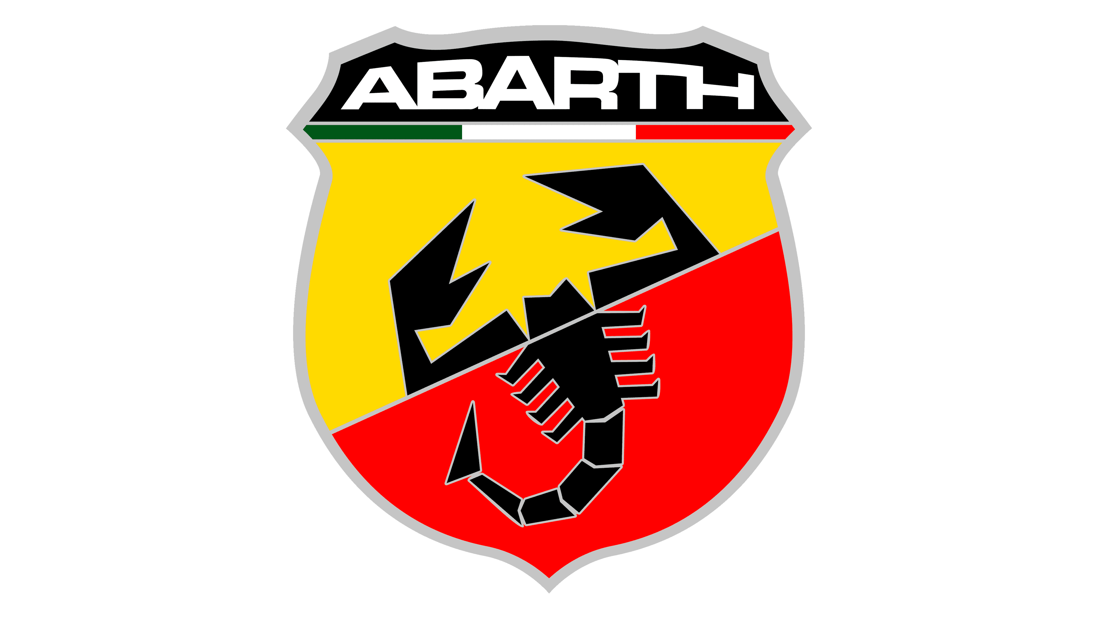
The latest logo iteration simplifies further, with “ABARTH” in a bold, black font atop a sleek, gray gradient. The Italian flag’s colors now neatly underline the brand’s name, emphasizing its heritage. The scorpion, reimagined in stark black, is set against the split yellow and red shield background, continuing to embody the brand’s fierce performance. This design streamlines elements to focus on a clear, modern identity, reflecting a contemporary Abarth that respects its rich legacy.


