Accor Logo
One of the most well-known tales of success in the contemporary hotel sector is embodied by Accor. Hotels in various pricing ranges are operated by Accor. Both five-star hotels (Sofitel) and numerous low-cost chains, including the well-known in Europe Formula1 and Etap, are among its trademarks. Along with other hotel brands, Accor also owns the Novotel, Ibis, and Motel 6 chains that are found along American highways. Accor runs a number of restaurant, casino, and travel agency chains in addition to hotels.
Meaning and History
Since the first hotel opened its doors almost 50 years ago, the hotel has grown to become one of the top 10 hotel operators in the world. It all began back in 1967 when Paul Dubreuil and Gerard Pelisson met in a small French town and created the first Novotel hotel. Despite the fact that the first hotel of the company was quite small, it provided service at a level noticeably higher than what was typical at that time. A quarter of all the Accor hotels are concentrated in France, along with the rest of the European countries, which is more than half of all the rooms. There is active development in the countries of the Asia-Pacific region, the Middle East, and Africa, as well as in South America. Accor came to North America quite late with the purchase of the Fairmont brand.
What is Accor?
Accor Corporation is a prominent player in the hotel industry. For instance, its branch, Accor Hospitality, manages more than 4,000 hotels across more than 100 nations. In addition to the hotel sector, Accor is also involved in other industries, such as the leisure and travel sectors.
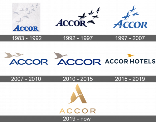
1983 – 1992
The name was done using a classic serifed typeface. The letters were blue with a thin black outline. The flock of flying Bernache Goose was featured above the name in a light gray color. It was simple, but this image has stayed with the company for many years.
1992 – 1997
The birds looked more realistic and bolder. They were positioned in the upper right corner and there were only five of them. This made the logo appear more cohesive. The color of the letters was also deeper and bolder, so there was no need for the dark outline.
1997 – 2007
The new logo was more abstract with three ducks that were flying up above the name. The latter was written using a different font, the most notable feature of which was the first uppercase letter “A”. It had a wavy horizontal line that added even more dynamics to this emblem. The whole logo had a lighter blue and white color palette.
2007 – 2010
A more modern typeface without serifs was used for the new logo. All the letters were uppercase and closely spaced together for a put-together look. The company also kept the blue color and three birds. This time, they were done in beige and one in white. The birds were positioned right above the name on the left side of the emblem. There were no extra details on the goose, only a solid image with smooth lines.
2010 – 2015
The previous version was modified to include the word “Hotels”. The font was simple and featured thin, straight lines. It was stretched out to be the same length as the name, which has not changed its look. As for the goose. There was only one left. It was a beige color and featured a similar shape as the biggest one in the previous logo. The blue color also got lighter for a more welcoming feel.
2015 – 2019
It was not long before the new logo appeared. “Accor Hotels” was stated in deep blue and placed in one line. The was still a solid silhouette of a goose, except this time it was a golden color and centered right above the name. The relative consistency with the color palette and usage of the goose image made the company even more recognizable.
2019 – Today
The designers took the golden color from the previous logo and used it for the whole emblem, adding some highlights for a metallic look. It featured only the name of the company done in a very similar style as seen earlier. The goose, though, was drawn in such a way that in combination with one diagonal line it was forming a letter, the initial of the name. It was a nice play with an element used since the original logo.
Font and Color
The company made little changes to the color palette throughout the years. Until 2019, varying shades of darker blue have been used for the name as well as other elements of the logo. This is a color that is used to represent stability, security, loyalty, and peace. A beige, and later a golden, color was introduced in 2007. The golden later became the only color being used in the emblem. When it comes to fonts, the company has transitioned from a font that had serifs and only the first letter being capitalized to a sans-serif typeface that was slightly modified as the logo has undergone changes.
