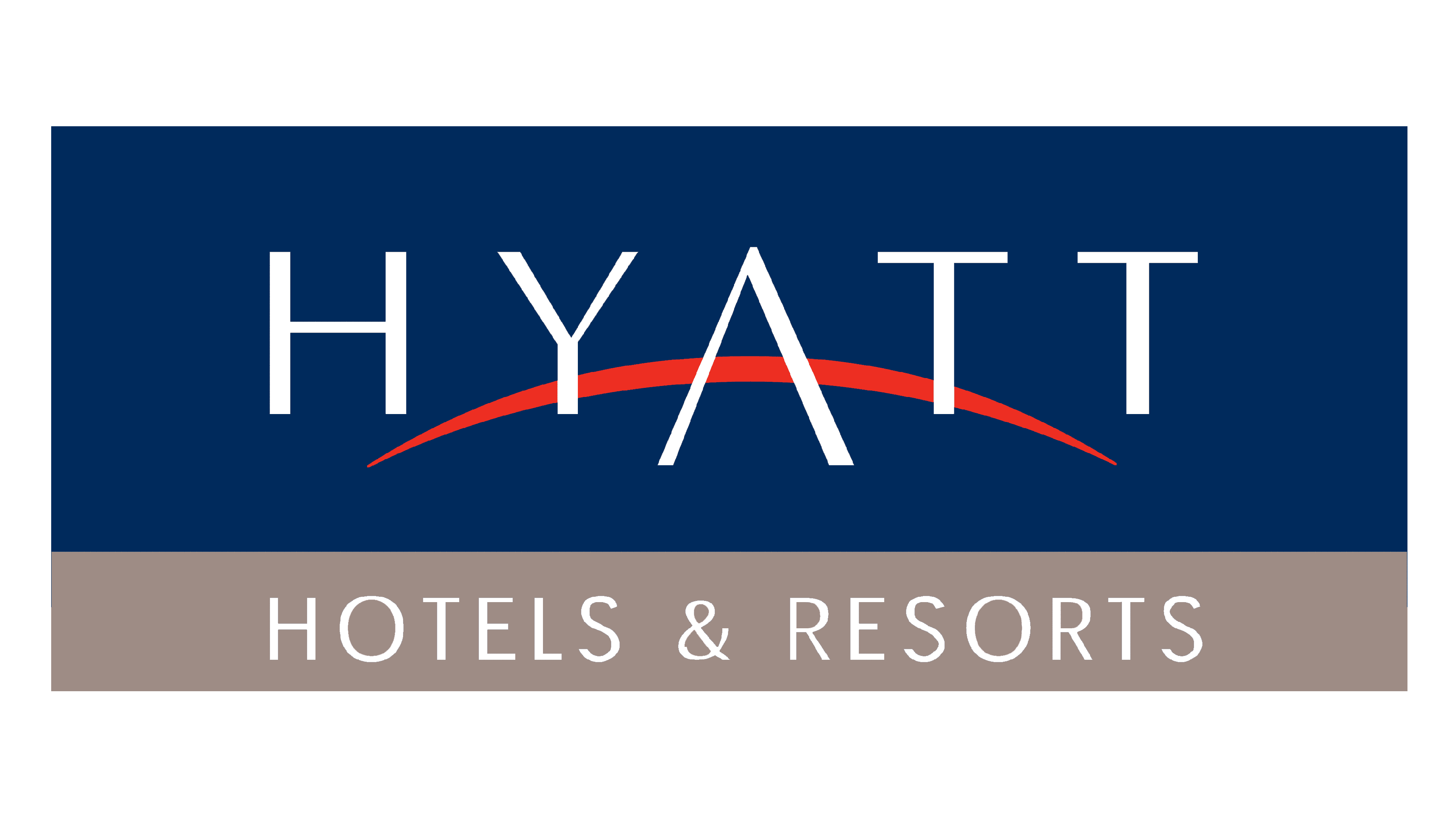
Hyatt Logo
Hyatt is a leader in the world’s tourism, based in Chicago, United States. Being one of the largest hospitality businesses, they operate more than a thousand all-inclusive hotels with excellent dining, meeting facilities, and various engagement activities for the guests. The company is famous for its employee treatment: Forbes ranked it #32 among the best companies to work for in 2019, raising to #16 two years later.
Meaning and history
![]()
Hyatt’s business dates back to 1957 when Jay Pritzker bought the Hyatt House motel baed near the LA airport. Partnering with his brother Donald, he set up a hotel chain with locations in San Franciso and Seattle. Hyatt also opened the doors of its current office in Atlanta, Georgia, in 1967.
Two years later, Hyatt has gone international after signing an administration agreement for the President Hotel in Hong Kong. The residency was later renamed after the company.
The brand continued to advance over the years to come. Hyatt founded its Grand Hyatt and Park Hyatt brands, now known for their all-inclusive luxury level, spas, and resting facilities. Since the 1980s, it has been establishing luxury hotels and resorts in large cities across the United States, Europe, Asia, and China.
What is Hyatt?
Hyatt is an American group of brands founded in 1952 and headquartered in Atlanta, Georgia. It is engaged primarily in luxury hotel administration and construction, as well as timeshare and vocational resort management. Having more than two thousand points of presence in 69 countries, Hyatt controls is recognized as one of the largest luxury hotel chains today.
1957 – 1990
![]()
The brand’s original logotype was a black inscription ‘Hyatt Hotels & Resorts’. The ‘Hyatt’ word was separated by a circle, containing a white four-leaf flower, which itself shows another four-leaf, split in two by a line.
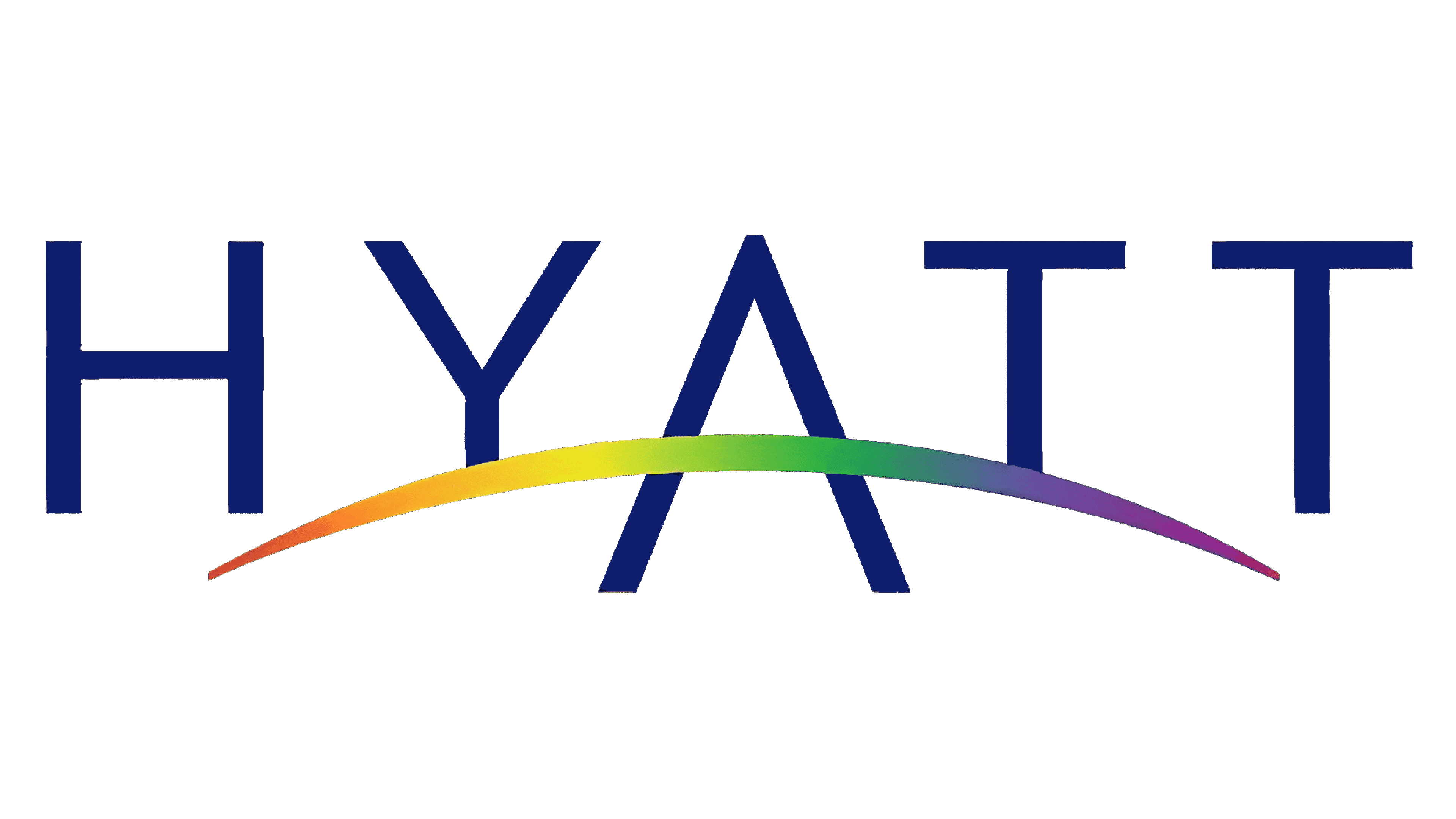
1990 – 2013
![]()
As the company grew and turned truly international, Hyatt decided to change its visual identity in 1990. Now it showed the brand’s uppercase name having its letters placed over a red arc, featuring the global level of the hospitality chain. This arc crosses the ‘a’ letter, replacing its horizontal bar.
2013 – today
![]()
In the latter design, they’ve renewed the color palette and slightly changed the typeface.
Color
Throughout its history, Hyatt used thee major color codes: black and white for the original logo, dark blue, red & white for the 1990 redesign, and bright blue and white for the modern one.
The modern logotype shows just the blue wordmark placed on a white background, but previously the letterforms had blue letters put over a blue line. They chose this color as it symbolizes confidence, reliability, and trustworthiness.
Font
The current Hyatt inscription displays a classic capitalized typeface with semibold letterforms without serifs. All symbols stand far from one another. The central ‘a’ character doesn’t have a central bar. Instead, the arc on the background covers the letter, perfectly fitting it.
In the 1990 wordmark, the letters were a little bit slimmer. The arch also didn’t go through them, so it looked like the letters have small contours.