Super 8 Logo
Super 8 guests can expect standard comfort and accommodations expected in a modern hotel. In addition to offering a free breakfast, Super 8 also offers free Wi-Fi so its guests can access necessary information from any location within the establishment, including the on-site cafe. Many Super 8 hotels also provide pet-friendly accommodations and private parking for a negligible price.
Meaning and History
The story takes place when Dennis Brown created a marketing association of already-operating hotels in 1972. A year later, it was dissolved and together with his partner Ron Rivett, Brown established their own new Super 8 Motel corporation. Super 8 is a hotel/motel chain from the United States that has managed to enter the international market besides opening hotels in neighboring Canada. In 2004, their first motel opened in Beijing, and now there are more than 600 Super 8 hotels in China. All of them are modest, but neat inside. The name “Super 8” represented the initial hotel fee of $8.88.
What is Super 8?
Budget hotel chain Super 8 Worldwide Inc. is based in the United States and is a subsidiary of Wyndham Worldwide Inc. Over 2,000 hotels are owned by the corporation globally. The network is growing and developing as the number of new establishments increases continuously.
1982 – 2008
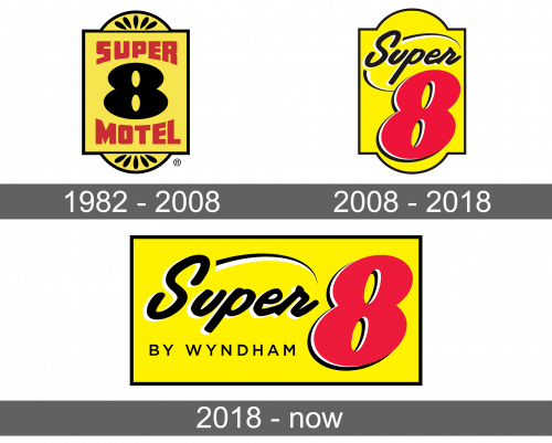
At the top, it stated “Super”, while a bold number “8” was presented in the center in black. Below, there was an inscription “Motel”. The letters were also quite thick and while the top and bottom were straight, the other two sides repeated the curves of the “8”. For the base, the hotel used a house number plate with a vertical rectangle and two arches with some details that resembled flower petals inside were added at the top and bottom. There was a thin black border around each element, while a yellow color was used for the inside. A bold red color contrasted well against the bright yellow.
2008 – 2018
The base had the same outer shape, but there were no details inside of it, except for the name. The latter featured a large red number “8” that was taking up the lower two-thirds of the emblem. It had a black and white shadow on the left for some volume. The word “Super” was done in black and stretched across the top. The black letters were italicized and had white highlights for some dimensions. Two lines arched above and below, framing the name and giving it some dynamics.
2018 – Today
The name was written using the same font and colors. However, the designers placed it on a horizontal rectangle, instead of stacking vertically. The base was yellow with a black border, which resembled what the company had before. In addition, instead of the lower arched element under the name, it stated “By Wyndham”, which made reference to the parent company. The font was basic with thin lines and all uppercase letters.
Font and Color
Originally, the logo featured a bold, sans-serif font that would otherwise look basic if it was not for the arching element. In 2008, a new typeface was introduced. It featured cursive, italicized writing with letters connecting only in a few places. The lines were quite thick. When it comes to the colors, the corporation stayed consistent and used only saturated black, red, and yellow for its emblems. It also added a bit of white for highlights later in its history. These colors stand for leadership, sophistication, and positivity.
