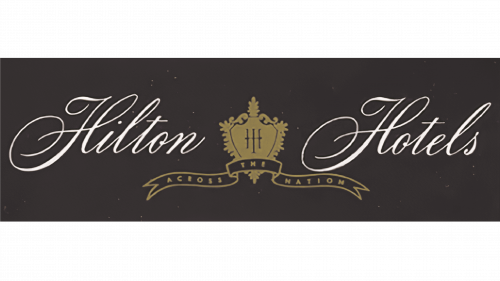
Hilton Logo
Histon Hotels & Resorts is an American company engaged in the hospitality business. The first hotel opened its doors thanks to Conrad Hilton, and since then, the brand has grown into an international network of 584 hotels and resort facilities with 216,379 rooms in 94 countries. The company belongs to Hilton Worldwide, a holdings company founded by Hilton himself.
Meaning and history
The chain started in 1919 when Conrad Hilton purchased his first hotel in Cisco, Texas. He acquired several more hotels in 1920, and they expanded into a network named after the founder in the 1920s.
The Hilton hotel chain made a serious effort to improve the customer experience in the following years. For instance, the hotel in Waco, Texas, became the first to install an air conditioning system and cold running water. By 1943, Hilton became a chain operating on both US shores after acquiring two hotels in NYC. One of them, the Roosevelt hotel, was the first to set up a television in guest areas in 1947.
In the following decades, the company grew in size and client performance by adding the reservation system, supporting credit card payments, and opening new points of presence across the country and abroad.
What is Hilton?
Hilton is an American chain of hotels and resorts, founded in 1919 by Conrad Hilton. Headquartered in McLean, Virginia, now Hilton controls over 580 locations with a total capacity of 216K rooms in 94 countries. The chain is recognized as one of the largest and most respected hospitable businesses.
1948 – 1967
The first registered corporate logotype was an inscription ‘Hilton Hotels’ written with the use of curved handwritten lines. Amidst the two words, there was a crown with two ribbons coming from it. All this stood on a brown rectangle.
1967 – 1978
In 1967, the brand designers completely renewed the logo’s appearance. Now it showed the capital ‘h’ with its vertical bars mirrored. Each bar had its upper and lower tips concaved and sharpened. The new brand mark used a monochrome black palette.
1978 – 1998
The company’s artists changed the corporate logotype in 1978 by removing the central line, which joined the two sides of the symbol ‘h’.
1998 – 2010
When the 20th century decayed, the Hilton hospitality chain developed a new logotype, amending it dramatically. It showed a slim oval spiraling close to the center. Its tip overlapped on the capital ‘h’ symbol, replacing the horizontal bar. Below the oval, they wrote the nameplate in a fresh serif typeface.
2009 – 2016
Following the division, the franchise’s secondary brand inherited the 1978 emblem, albeit with modern modifications. The designers creatively rotated the arch-like features by a right angle, leading to a captivating design. This innovative rendition, with its slender pillars, conjures images of both an ornate gateway and a regal crown. The top half boasts a shimmering silver hue, while gold graces the bottom. To the emblem’s right, the phrase “Hilton Worldwide” is inscribed in two tiers, crafted in a sophisticated, crisply cut font, adding an elegant touch to the overall design while paying homage to the brand’s legacy.
2010 – Today
The modern reinvention shows the same elements: the oval, encompassing the ‘h’, and the name below. There have been a few modifications in the new logotype. First, they slightly changed the name’s typeface and enlarged it. They also wrote the ‘hotels & resorts’ below it.
2016 – Today
Embracing the principle of minimalist aesthetics, the corporate heads greenlit a profoundly altered design: the brand’s moniker encased within a border. This emblem exudes understated elegance and bears striking resemblances to another iteration of the brand – particularly in the choice of serif typography. The decision to opt for such a design was a testament to the brand’s affinity for timeless sophistication and a nod to its roots, seamlessly blending contemporary minimalism with classic elements from its heritage. The new logo’s simplicity ensures its adaptability across diverse platforms while retaining a touch of tradition.
Font
The font is one of the logotype’s elements that changed in 2010. Previously, the name showed semibold characters with angular serifs going far to the side of the letter. There were other features, such as the block above the ‘i’ letter’s lower bar and the straight lower bar of the ‘t’. The modern design shows the script slightly modified while saving most of its previous features. For example, the aforementioned block became a dot, while the ‘t’ was curled at the bottom.
As for the ‘h’ character placed inside the oval, it has two bold bars, joined by the slim tip of the oval.
The ‘hotels & resorts’ inscription is introduced in a sans-serif typeface with capitalized letters.
Color
Their logotype usually shows up in two color codes: black and white or rich blue plus white. In both cases, the background is white.


