Ace Hardware Logo
Ace Hardware stands out as a shining beacon in the retail world, born from the collective ambition of a small group of hardware store owners. In Chicago, Illinois, these visionaries saw potential in uniting their efforts. Ace Hardware has grown, rooted in this principle of mutual support and strength in numbers, serving communities with a personal touch and a wide array of products.
Meaning and History
In the heart of the United States, in 1924, Ace Hardware sprouted as an innovative idea. Richard Hesse, E. Gunnard Lindquist, Frank Burke, and Oscar Fisher joined forces, giving birth to a cooperative that would redefine hardware retail. This initiative quickly expanded, reaching milestones with over 100 stores by 1949 and stepping into the global market in the 1970s. As of now, Ace Hardware has become a global presence, boasting thousands of stores worldwide. This growth underscores the enduring appeal and effectiveness of their cooperative business model.
What is Ace Hardware?
Ace Hardware operates as a cooperative of independent store owners. It’s renowned for offering a wide variety of hardware products, including tools, paint, and gardening supplies. The brand emphasizes community and customer service, making every visit personal and helpful.
1929 – 1930
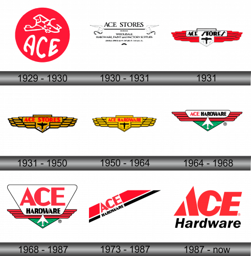
Encircled in a vibrant red orb, the logo boasts the word “ACE” in fluid, white script that exudes casual confidence. Atop, an airplane, white and stylized, symbolizing progress and the pursuit of higher goals. This depiction of the airplane hints at the brand’s commitment to soaring above and beyond in service and selection. The design is simple yet bold, a beacon of reliability and adventure in the sky of commerce. This emblem is a promise of the brand’s lofty aspirations and down-to-earth values, combined into a single, compelling image.
1930 – 1931
This variation of the Ace Hardware emblem embraces a classic touch, boasting “ACE STORES” in a timeless font, bold and centered. Underneath, a ribbon unfolds with “WHOLESALE” prominently featured, signifying the brand’s extensive reach. Words “HARDWARE, PAINT AND FACTORY SUPPLIES” further detail the store’s offerings, showcasing a direct connection with both the creation and supply of essential goods.
1931
The logo features a dynamic black airplane centrally placed within a protective shield. This plane is a symbol of innovation and speed, traits that are invaluable in the hardware industry. Above, “ACE STORES” stands out in bold lettering, framed by red, wing-like flourishes that suggest swift service. The contrasting colors and imagery in the logo combine tradition with a forward-thinking mentality, encapsulating the brand’s commitment to offering swift, reliable solutions.
1931 – 1950
The logo has transformed, now featuring wings spread wide in a warm, golden hue, suggesting an embrace of expansive service. “ACE STORES” is proudly inscribed in red over a rich, golden shield that echoes the wings’ color, creating harmony in design. The black airplane, centered on the shield, stands out as a distinct focal point, emphasizing progress and the power of flight. This version radiates warmth and ambition, with the golden tones symbolizing a commitment to quality and a golden standard in customer service. It’s a visual evolution from the earlier red-dominated design, offering a more nuanced and inviting aesthetic.
1950 – 1964
The logo maintains its foundational elements while shifting its color palette and text. The wings are now a bright, uniform yellow, suggesting consistency and energy. “ACE HARDWARE” replaces “ACE STORES”, boldly announced in red and signaling a more direct connection to the hardware industry. The shield’s hue has shifted to a crisp white, with the airplane in black retaining its central position. This update sharpens the focus on the brand’s core business, with a straightforward declaration of its market in the vibrant contrast of the text against the wings. The logo’s evolution reflects a streamlining of purpose and a brighter, more direct approach to branding.
1964 – 1968
In this evolution, the logo retains its iconic wings but refines them into streamlined red bands, promoting a sense of swiftness and efficiency. “ACE HARDWARE” now features prominently across a white banner, contrasting sharply with the red, making the brand name more pronounced and legible. The shield transitions to green with a white and green airplane, introducing a new layer of depth and symbolizing growth and vitality. The registration mark confirms the logo’s trademark status, underscoring the brand’s establishment and authenticity in the marketplace. This design iteration presents a cleaner, more modern look while maintaining the emblematic features of its predecessor.
1968 – 1987
The logo continues to evolve, now opting for a cleaner and more balanced design. “ACE” ascends above “HARDWARE”, both set in stark white against a vibrant red backdrop, for a bold contrast. The shield simplifies to an outlined form, preserving the airplane motif within a landscape of green, reinforcing themes of stability and growth. The red wings now form a solid base, enhancing the visual impact of the brand’s commitment to wide-reaching, reliable service. This iteration further refines the logo’s elements, focusing on a crisp, modern aesthetic while retaining the essence of its identity.
1973 – 1987
The Ace Hardware logo has undergone a striking simplification. Gone are the emblematic wings, in their place, a bold diagonal stripe cuts through the canvas, conveying movement and edge. The company name now splits across this dynamic backdrop, “ACE” in an arresting red block above, with “HARDWARE” in black below, creating a stark, modern contrast. It’s a stark departure from the previous design’s symbolism, opting instead for a look that’s both eye-catching and unmistakably current.
1987 – Today
Ace Hardware’s logo now showcases a towering “ACE” in bold, vibrant red, with the “A” elegantly leading the formation. The word “Hardware” is understated in black, granting a sleek balance to the design. Gone are the angular dynamics and stripes, instead, simplicity reigns with clean lines and clear, powerful font choices. The registered trademark symbol remains, subtly asserting the brand’s protected status.


