Nokia Logo
Nokia is one of the world’s largest manufacturers of cell phones and telecommunications equipment, becoming a market leader in the late 1990s and early 2000s. Founded in the mid-19th century, the company started as a small paper factory and changed several businesses before becoming one of the most influential players in the mobile phone industry.
Meaning and history
Up until 1967, Nokia hadn’t anything close to technologies. Initially, it was a pulp mill business set up in 1865 by Fredrik Idestam near Tampere, Finland. The company was named Nokia after the city where one of the factories was based. In 1871, Idestam partnered up with Leo Mechelin to set up a venture company.
During the following years, this joint business took part in various fields of manufacturing, including rubber, cable, and electricity production, as well as respirators production.
Finally, in 1967, three major rubber, electronics, and cable company united to form Nokia Corporation – a giant producer in the aforementioned industries, which would also start producing radio- and telecommunications products for the army and civilians. It entered the Soviet market in the 60s, trading telephone equipment made of U.S. parts.
In the 70s and 80s, they had been buying many European and Swedish companies manufacturing computers and TVs. One of such companies was Mobira, which launched the first international cell network in 1981 and produced the Nokia’s first mobile phone a year after.
Nokia, now focused on telecommunications, dominated the mobile phone market in the 90s and 2000s with their safe and quality products, known for innovations. For example, the 3600/3650 model was the first to have a camera. Nokia also gave birth to mobile gaming, as they ported and preloaded Snake on their products. By the end of 2007, they occupied half of the world’s smartphone market.
However, the market influence became to lower in the early 2010, following the Samsung, Apple, and other brands appearance. In 2011, Nokia sold its smartphones business to Microsoft and focused on other products. Although they still manufacture mobile phones, but they mostly focus on TVs, data network equipment, audio devices, Wi-Fi routers, et cetera.
What is Nokia?
Nokia is a multinational IT giant, based in Finland. Established in 1865 as a small pulp factory, it has restructured the business and now provides people with high-end electronic devices, as well as complicated software or data network systems.
1868 – 1898
The Nokia’s pioneer logotype appeared with the founding of the second pulp enterprise near Nokianvirta River. It featured a part of a salmon with its mouth open. The fish, probably symbolizing the river, was drawn in a ring with two inscription on it. The upper one read: ‘Nokia Osakeyhtio’, while the lower featured the ‘Nokia Aktiebolac’ wording. The sign hadn’t gotten any modifications up until its defunct almost a century later.
1898 – 1965

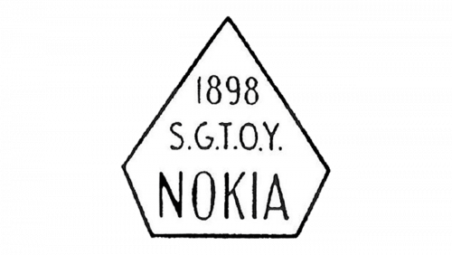
The second Nokia badge was created in 1898 and stayed with the company for more than sixty years. It was a very simple monochromatic logo in a chair of a pentagon, with its peak pointing up, looking like a diamond. The black outline of the logo was supporting the black bars of the three-line lettering, with the 1898 datemark on top, the “S. G. T. O. Y.” Abbreviation placed above the enlarged name of the brand.
1965 – 1978
The Nokia’s second logotype has once played a central role in the visual identity of another company, Suomen Gummitehdas Oy, occupied to rubber tiers making. Taking in sight their main specialization, the designers from the company used black circle. Nokia added a semicircular bar at its center, putting the company’s name on it.
1978 – 2023
In 1978, the Finnish corporation has simplified its logotype, removing all graphical elements and remaining only the name. It became probably the most recognizable word mark of all.
2023 – Today

The redesign of 2023 has introduced a very cool geometric badge, with the name of the brand set in the uppercase of an extended geometric sans-serif font, with the straight bars of some characters removed. The stylized wordmark is set in a bright shade of blue, which looks very progressive and energetic on a plain white background.
Font and Color

The fantasy geometric lettering from the Nokia logo is set in a minimalistic geometric sans-serif font, but with the rethought shapes of the characters. The closest font to the one, used in this insignia, is, probably, Rexton Light, but that could be also one of a dozen other modern sans-serifs, as the main idea here is in the missing bars.
As for the color palette of the Nokia badge, it is built around a delightful and intense shade of blue, which evokes a sense of creativity and confidence. Blue is also a color of security and quality, which is loved by technological companies, as it represents their strongest sides.


