Adelaide Crows Logo
The Adelaide Crows, officially known as the Adelaide Football Club, are a professional Australian rules football team. They were created to represent South Australia in the Australian Football League (AFL), the premier league of the sport. The team was established in Adelaide, the capital city of South Australia, as a unifying force to compete against established Victorian clubs. It has since grown into a beloved institution, celebrated for its contributions to the sport and its community engagement.
Meaning and history
Founded in 1990, the Adelaide Crows entered the AFL, uniting South Australia’s football fans. Initially, the SANFL owned them, ensuring local roots. Their first game in 1991 was a victory, sparking immediate interest. By 1997 and 1998, they clinched two premierships, skyrocketing their fame. Ownership evolved, with the club becoming independent, reflecting its growing stature.
Financially, the Crows diversified, investing in esports and real estate, showcasing innovation. Leadership changes, including coaches and presidents, marked adaptation and growth phases. Despite ups and downs, including finals and lean periods, their community support remained strong. The Adelaide Oval became their fortress, symbolizing their enduring legacy in Australian sports. Through changes, the Adelaide Crows remained a beacon of South Australian pride in the AFL landscape.
What is Adelaide Crows?
The Adelaide Crows, a beacon of Australian rules football, embody the spirit and pride of South Australia in the AFL arena. Established in 1990, they’ve woven a rich tapestry of competitive zeal and community unity, marking their territory with skill and passion on the field.
1990 – 1995
The Adelaide Crows logo is a striking emblem combining bold colors and imagery. A crow in profile, black with a red, yellow, and blue wing, anchors the design. This vibrant bird is set against a classic shield backdrop, outlined in red. The top banner, in deep navy, proudly bears the team’s name in bright yellow letters.
1996 – 1998
This variation of the Adelaide Crows logo maintains the original’s essence while introducing subtle updates. The crow’s silhouette remains a central figure, depicted in a poised, stoic stance. The shield is more streamlined, with softened edges, offering a modern twist. The color scheme is consistent, yet the stripes behind the crow appear more pronounced, enhancing visual impact. The banner atop, still in navy, features the team’s name in a slightly altered, clean font, reflecting a contemporary edge. A miniature crest resides in the shield’s corner, signifying a refined detail to the overall design.
1999 – 2009
In this rendition of the Adelaide Crows logo, the shield is notably absent, giving way to a free-form crow. The bird is dynamic, wings and tail adorned with the team’s colors, red, yellow, and blue, now appearing as swift, streamlined feathers. The crow, still blue, is more prominent, suggesting flight and movement. Below, the team’s name is in a bold, navy typeface, clean and straightforward without the previous emblem’s embellishments. The design feels liberated, focused on motion, reflecting a team soaring confidently into its future.
2010 – 2024
The logo shifts dramatically, now featuring just the crow’s head, stylized in a deep, electric blue. The eye, with a fiery pupil, adds intensity. Below, the team’s name bursts forth in a bold, 3D-like font with shadow effects, red letters edged with yellow, capturing attention. This design is a leap from tradition, emphasizing a modern, aggressive edge and a focus on the crow’s fierce gaze. It’s a fresh, energetic reinterpretation of the team’s identity.
2024 – Today
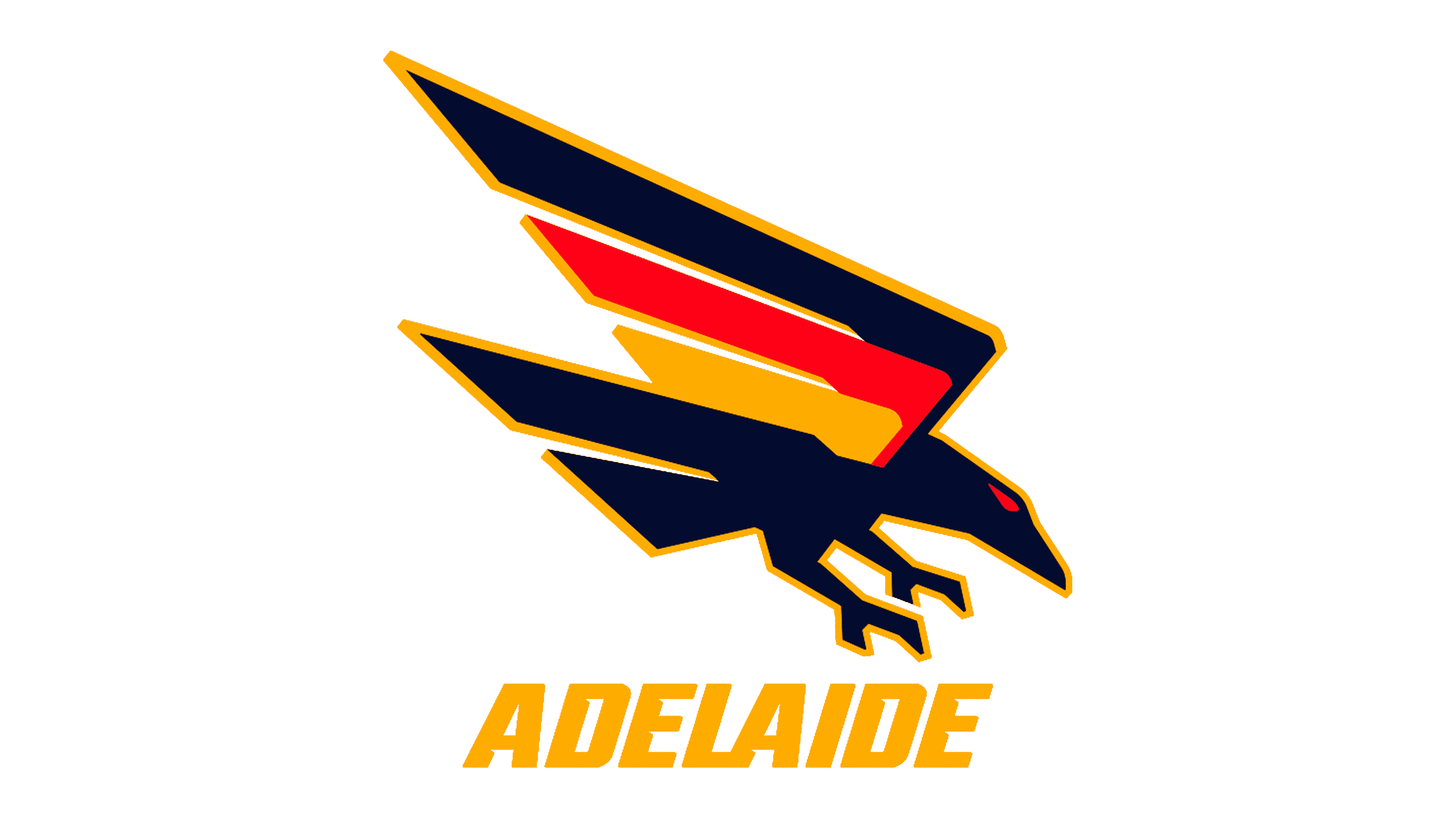
The Adelaide Crows logo features a stylized, dynamic crow in mid-flight, its sleek black form accented with sharp, angular wings that incorporate the South Australian colors of red, yellow, and navy blue. The bird’s fierce, forward-leaning posture embodies the team’s competitive spirit, while the bold, uppercase “ADELAIDE” text beneath in vibrant yellow ties the design to the city’s proud identity. This emblem uniquely captures the essence of both the club’s avian mascot and its regional heritage.


