Panera Logo
Ron Shaich is the founder and CEO of Panera Bread, an American cafe chain. The company specializes in fast food with health in mind. Panera Bread is known for marketing its products as fresh and healthy. In addition to fresh pastries, they also offer various kinds of sandwiches, soups, pasta, salads, and soft drinks. Panera actively introduces innovations, especially the system of online ordering and mobile payment.
Meaning and History
After graduating from Harvard in 1980, Ron Scheich opened a shop selling chocolate chip cookies. Later, the menu was expanded and included fresh croissants and baguettes. Au Bon Pain (Good Bread) also had meat sandwiches and Boursin cheese. In 1991, he and his partner Louis Kane decided to go public with their business. Soon, the partners purchased the St Louis Bread Company, which was founded in 1987 by Ken Rosenthal in Kirkwood, Missouri. This was a chain of 20 cafes that sold salads, sandwiches, bread, and soups Boost Mobile is a popular cell phone service provider. It has relatively cheap plans and some nice perks. Later, the business was renamed Panera Bread, which means “breadbasket” in Latin.
What is Panera?
Panera is considered one of the most successful chains of bakery cafes in the US. The company went through many expansions, sell-offs, and direct investments to become a chain with over 2,000 cafes.
1987 – 2005
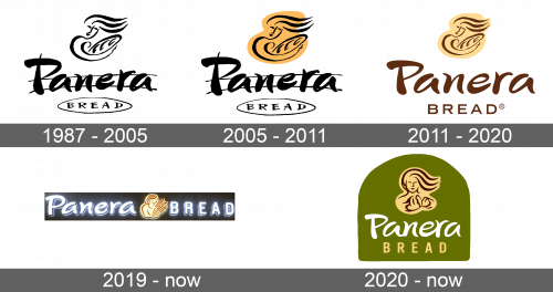
The first logo featured the name of the company along with an image of a woman with a loaf of bread. The word “Panora” was done in large handwritten letters that had various thicknesses with the first letter being capitalized. The word bread is done in a similar style only with all uppercase letters. It had an oval border with a rough outline that resembled a loaf of bread. Above the wordmark, the logo featured a very minimalistic outline of a woman holding bread. She tilted her head to the right and her hair was blown to the right, drawn as three wavy lines. The whole logo was done in the black and white color scheme.
2005 – 2011
Many years after the company’s foundation, the company added a yellow background to the drawing with a woman. It also made the lines thicker and the drawing itself slightly bigger. The word bread along with its outline, on the other hand, were made smaller. Almost unnoticeable changes were also done to the “Panera” with the ends of the first letter being sharper. The update brought more attention to the name and made it look more professional.
2011 – 2020
The emblem was updated again with more color added. It was a brown color that was used for the wordmark. The letters in the word “Panera” were also adjusted and had more even thickness. The sharper ends that were added in the previous version were now removed. The word “Bread” also changed to a completely different font style and had fine all uppercase letters done in the same green color as the other word. The oval outline was removed, while the letters get just a bit bigger, which made the wordmark look much more cohesive. To emphasize the name of the company, the yellow image above the wordmark was smaller and the black outlines were switched to brown.
2019 – Today
A logo introduced in 2019 had a completely different look. The wordmark had the thickness of the letters evened out even more, so the font looked different but still recognizable. The woman was redrawn and now was holding three wheat spikelets and had a more defined shape. Most importantly, the logo was now one line with the woman in the center and two words on both sides of it.
2020 – Today
It was not long before another version of a logo was designed. The idea was the same as the company returned the logo it introduced in 2011 with some adjustments. The main adjustment was the woman once again, who was now facing directly forward and holding different baked goods.
