Anytime Fitness Logo
Anytime Fitness is an American chain of fitness centers based in Minnesota and owned by Self Esteem Brands. It appeared in 2002 thanks to a group of entrepreneurs including Chuck Runyon, Dave Mortensen, and Jeff Klinger. Now Anytime Fitness is an international franchise with more than 5,000 health clubs across 50 countries. The brand’s clue is that it offers sports studios with 24/7/365 access, top-tier equipment, and professional instructors able to help with training programs.
Meaning and history
Anytime Fitness was established in 2002 by Chuck Runyon, Dave Mortensen, and Jeff Klinger. Partnering with a consulting company that has conducted marketing research on the needs of potential long-living fitness clients, the trio came up with a concept of a franchise of affordable gyms available anytime within walking distance near home. These values became fundamental to the chain and were reflected in its name.
Minnesota state was chosen as the place for headquarters because it didn’t have many fitness locations able to meet the aforementioned clients’ needs and desires at the time.
Their idea proved its sustainability during the years to come: by the end of the decade, Anytime Fitness has spread its operations across the entire United States, as well as Asia, Europe, and The Middle East, having more than a thousand gyms opened. Now, the company multiplied its gym number to 5200, which made it the largest gym franchise globally.
What is Anytime Fitness?
Anytime Fitness is an American brand of gym franchise, headquartered in Minnesota. It offers sports centers with 24/7/365 accessibility, equipped with high-end trainers, and supervised by professional instructors. The franchise has more than 5000 locations and 3+ million customers.
2002 – 2021
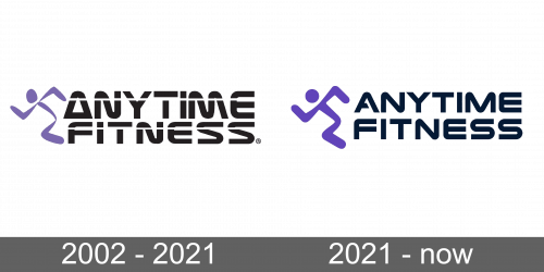
The brand’s original logotype was a running manikin image, placed to the left of the nameplate. It was written in a two-line inscription with custom letters. Both words are pierced by paralleling white lines, adding some dynamic and movement to the logo.
2021 – today
In the latter logo, they’ve changed the wording’s typeface and enlarged the emblem. Using minimalistic forms and colors, the designers featured a stylish yet distinctive logo, associated with sport and health.
Color
In the brand logo of 2002, the designers determined the brand’s color code showing the running man painted violet and the black inscription on its right. In the following brand signature, they just enriched the violet shade. This color combination creates a strong feeling, related to sports and health.
Font
At first, the nameplate had a fat uppercase typeface, showing rounded and smooth characters. It had many characteristic elements, such as the ‘a’ looking like a triangle with a rounded top, and the ‘n’ and ‘m’ letters with ‘floating’ central bars. The designers made an accent on the word ‘anytime’, enlarging it and thereby stressing the fact that the gyms are available for everyone at any time. In many aspects, this script was close to Laserian font.
The following version of the brand’s wordmark, however, utilizes a different font, looking more like the Conthrax typeface. The nameplate features bold uppercase letters, as before, but the letterforms now don’t have any wavy lines. They are straight yet streamlined. Moreover, both words are now of equal size.
