Crunch Fitness Logo
Crunch Fitness is an American company and franchisor of fitness centers, founded in 1989 and located in New York City. It has a network of 400 locations in North America and Europe. They divide into two categories: Crunch Signature, applying to high-end sports centers offering various programs, high-performance trainers, services, and comforts, and Crunch Fitness, offering high-intensity interval training workouts and standard gym amenities.
Meaning and history
![]()
Crunch Fitness traces back to a basement-level fitness center opened in 1989 in New York’s Greenwich Village. Throughout the years to come, the brand spread its operations slowly across the US. The club mainly appealed to young people willing to become fit and healthy. In doing so, Crunch Fitness developed various programs, services, and activities to make people feel comfortable in the gym, including group yoga workouts, personal training, nutrition, workout plans, sauna, pools, multiple classes, et cetera. They also started offering merchandise with their distinctive logotype.
These marketing efforts eventually led the brand to success. In 2016, Crunch Fitness opened more than a hundred locations within several months. The brand didn’t stop at that point and continues to open new locations and launch new services and programs.
What is Crunch Fitness?
Crunch Fitness is a franchise chain of sports centers originally from New York City. It was established in 1989 as a small aerobics center in a basement, and since then it has grown into a large chain with 400 points of presence in the US, Canada, and European countries. The company offers two types of fitness halls: the Signature centers are top-level locations with multiple training programs, classes, personal coaches, and different services; the Fitness locations have group classes, HIIT programs, and standard gym services.
1989 – 1990
![]()
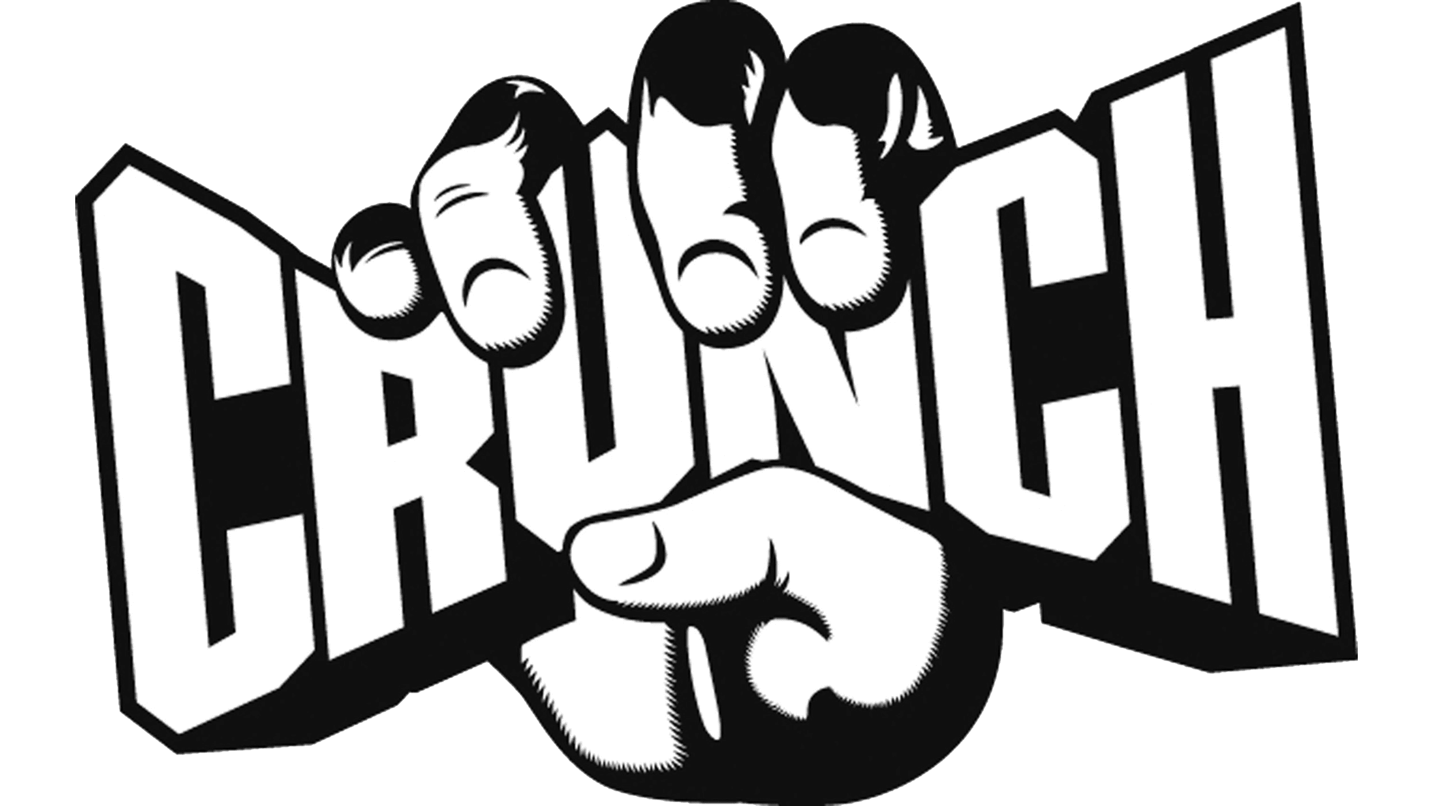
The first logotype lasted only a year but determined the modern logo’s design in many aspects. The signature featured a yellow plate, crunched and tightened inside a black fist. This board read the brand’s name in uppercase letters of different sizes. The message was clear: to become fit, strong, and healthy, one should apply all the diligence, patience, and effort and literally crunch in the fitness hall.
1990 – today
![]()
The 1990 design has the same concept as before: the fist squeezes the plate reading the name. But the details have changed: now, the letters occupy most of the board’s place, so the space between them serves more as a contour. Moreover, the brand mark received a new color code consisting of only bright and warm shades.
Color
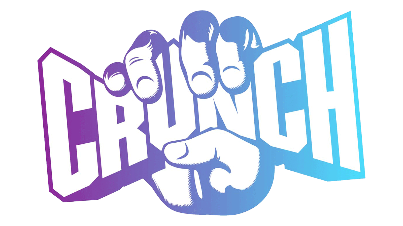
These shades include white for the name caption, red to represent its contour, and orange accompanied by red to show the fist. This shade applies to the official design posted on the website and to the Crunch Signature sports centers. The Fitness-titled facilities have a blue and white signboard.
Font
The current typeface used for the ‘Crunch’ inscription shows heavy symbols, executed in bold lines. The letters don’t have any serifs nor a wide space in between, but they are angular and massive. Oppositely, the 1989 signboard features a typical uppercase sans-serif lettering, whose only feature is the letters sized differently.