National Australia Bank Logo
National Australia Bank (NAB) is a major financial services organization in Australia. Andrew Thorn established the bank. He founded it in Melbourne to support business and personal finance. NAB aims to offer comprehensive banking services including loans, savings, and investment products.
Meaning and history
National Australia Bank was founded on October 1, 1981. The creation of NAB resulted from the merger of National Bank of Australasia and the Commercial Banking Company of Sydney. This merger aimed to form a stronger entity capable of competing more effectively. Over the years, NAB has expanded its operations and now serves customers globally, marking its presence as a significant player in the banking sector. Key milestones include its entry into the UK market in 1987 and the acquisition of several smaller financial institutions.
What is National Australia Bank?
National Australia Bank is a leading banking institution in Australia, known for its extensive range of financial services. These include banking, credit services, and investment opportunities for both individuals and businesses. NAB operates worldwide, providing a network of support for global financial needs.
1982 – 2006
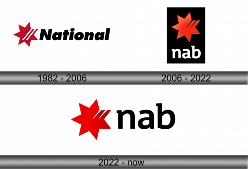
The logo showcases a bold red star with a swift diagonal white stripe, cutting through its center. The star is left-aligned, radiating dynamism and energy. Next to it, “National” is written in solid black, capitalized letters. The font is unadorned, strong, and easily readable. The stark contrast between the red, white, and black signifies strength and clarity. Overall, the design communicates reliability and forward momentum, suggesting a brand that’s progressive and trustworthy.
2006 – 2022
In this logo, a vibrant red star grabs attention against a deep black backdrop. The star, stylized with energy, has a dynamic duo of white streaks piercing through, implying speed and precision. Below, ‘nab’ appears in lowercase, white, clean letters, a stark shift from the previous uppercase. The use of lowercase suggests approachability and modernity. This contrast of colors and shapes creates a balance, symbolizing a bank that’s both stable and innovative.
2022 – Today
The latest logo variation presents a red star, now on a white canvas, maintaining its dynamic form with two white stripes. Near it, ‘nab’ stands in bold, black font, distinct in its lowercase presentation. This shift from a dark to a light background offers a fresher, more contemporary appeal. The simplicity of the design reflects a modern, accessible brand image, one that speaks of a customer-centric approach and transparent services. The red, white, and black palette remains, a nod to tradition amidst change.


