Bad Bunny Logo
Benito Ocasio (aka Bad Bunny) is an American rapper of Puerto Rican descent. Many of his works actually have a touch of Hispanic music. His music is generally a fusion of various genres. The dream of being a performer originated at an early age. For instance, he sang in the choir as a small child. When he grew up, Benito began to take an active interest in modern music and even sang his own songs. By adding a Latin touch and a little reggae to the typical trap, Bad Bunny was able to create a new unique style. Bad Bunny is admired all over the world, and his tracks regularly hit the top of the music charts. The singer also regularly appears on the pages of the world’s major publications.
Meaning and History
The career of Bad Bunny began in 2013, and by 2021, he became one of the most-streamed music artists in the world. Initially, Bad Bunny, whose real name is Antonio Martinez Ocasio, worked in a regular supermarket and recorded his songs at the same time. He wrote music and lyrics, recorded them in the studio, and posted them on the internet. Fame came to Bad Bunny thanks to YouTube, where he posted a video with his song “Soy Peor”. It gained a lot of views and became very popular on the internet in a very short period of time. One of the songs posted on the SoundCloud platform attracted the attention of a music company, Mambo Kingz, which decided to promote the singer. Thus, his professional path began in 2016. Later, he became one of the first Spanish-speaking performers to gain recognition in the US and Europe.
What is Bad Bunny?
This is a singer and songwriter with Puerto Rican roots. The young hip-hop star has already collaborated with numerous singers recognized across the globe and has big goals for the future. He often appears on TV shows, gives concerts, and gradually expands his audience.
2013 – today
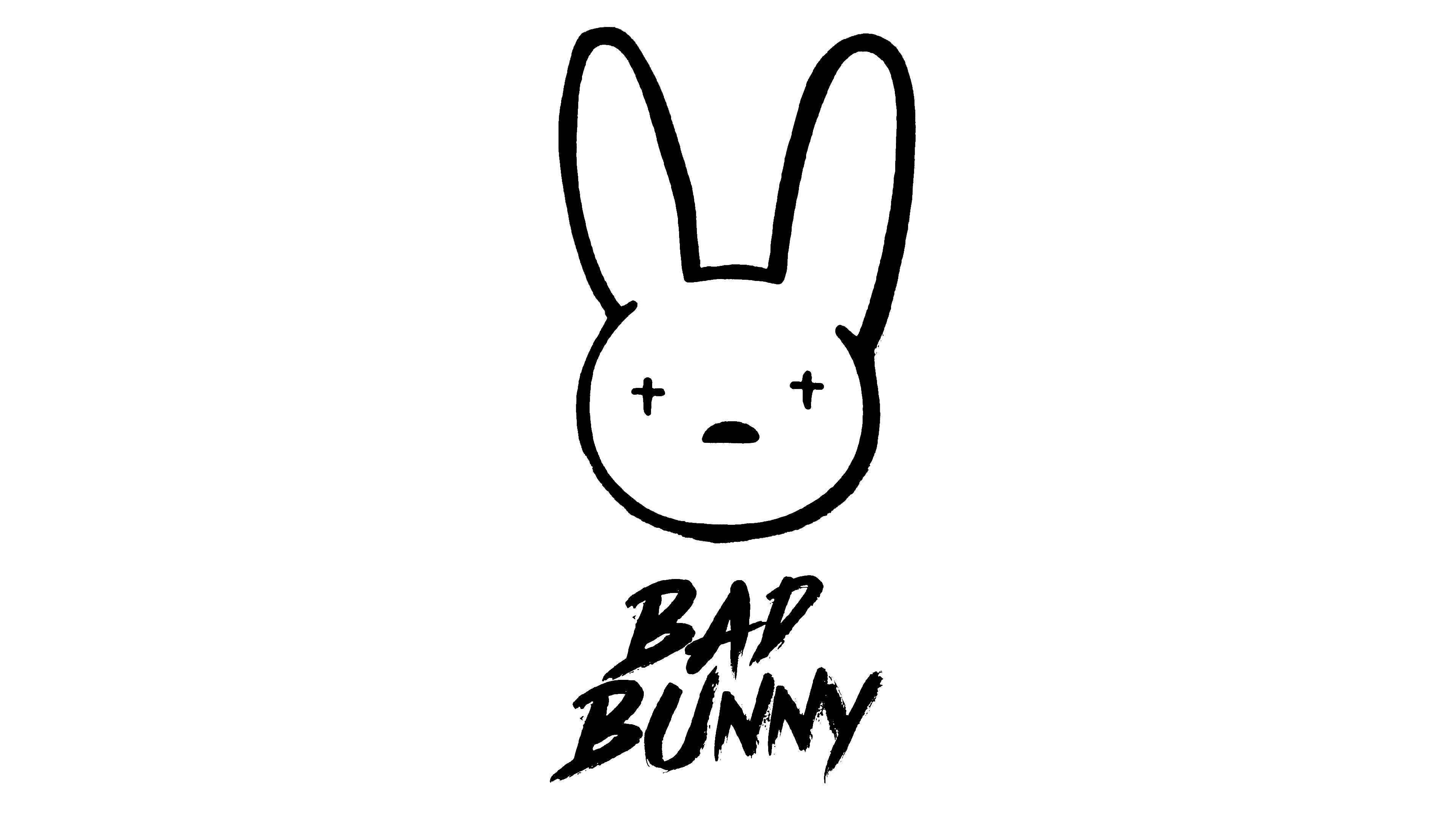
The main emblem is a simple outline of a bunny’s head (a circle with two slits at the top where two longer shapes for ears connect to the head). The face is basically two small black crosses and a rotated letter ‘D’ for the nose/mouth of the same color. Both are rather small. It’s usually accompanied by a wordmark, which is the artist’s name written in two lines. It is done using sharp capital letters that resemble paint strokes, as there are uneven edges. Such a handwritten and not very neat typeface, along with the fact that all the letters are not written in a straight line, further strengthens the idea of a “bad” bunny.
Font and Color
The color scheme of the emblem is black and white. Although the bunny’s head is white, it has a black outline, which combined with the black font and the overall style of the emblem hints that the bunny is not just a fluffy white ball of cuteness. At the same time, black color is associated with power, intelligence, and strength. The font is very similar to Cry Wolf Italic. It seems that the brush strokes have barely touched the paper in some spots as the edges are quite uneven, with white streaks between the black letters.


