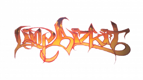
Limp Bizkit Logo
Limp Bizkit, an American nu-metal band, gained fame in the late 1990s. Known for merging rock, rap, and alternative elements, they stood out with their energetic music and provocative lyrics. Fronted by Fred Durst, the band’s distinct style, often featuring heavy guitar riffs and turntable scratches, resonated with a diverse audience. They’re acclaimed for hits like “Rollin'” and “Break Stuff,” symbolizing the angst and rebellious spirit of the era. Their live performances are marked by high intensity and a unique visual style, contributing to their iconic status in the rock genre.
Meaning and history
Limp Bizkit, formed in 1994 in Florida, revolutionized nu-metal. Frontman Fred Durst, bassist Sam Rivers, drummer John Otto, guitarist Wes Borland, and DJ Lethal crafted a unique sound blending rock and hip-hop. They gained fame with their 1997 debut album “Three Dollar Bill, Y’all.” Their 1999 follow-up, “Significant Other,” skyrocketed them to stardom, featuring hits like “Nookie.” The 2000 album “Chocolate Starfish and the Hot Dog Flavored Water” broke records.
Known for their energetic live shows, they often courted controversy and media attention. Their style, combining aggressive music with raw lyrics, resonated with many fans. However, they faced criticism for their brash attitude and lyrical content. The early 2000s saw internal conflicts and Borland’s brief departure. Their popularity waned, but they continued making music and touring. They experimented with different styles in later albums, with varying success.
Limp Bizkit remains a pivotal band in the nu-metal genre, influencing many artists. Despite ups and downs, they maintain a dedicated fan base.
What is Limp Bizkit?
Limp Bizkit is an American band that pioneered the nu-metal genre, blending elements of rap, rock, and alternative music. They rose to prominence in the late 1990s with their dynamic performances and controversial, yet catchy, lyrical themes, led by charismatic frontman Fred Durst. Their distinct style, marked by heavy guitar riffs and innovative turntablism, has left a lasting impact on the music scene.
1999 – 2003
The logo is a flamboyant interplay of fiery tones and artistic lettering, embodying a gritty, edgy vibe. Swirling strokes of reds, oranges, and yellows suggest a fusion of fire and metal, symbolizing energy and intensity. The letters twist and turn dynamically, each character uniquely contorted, reflecting the band’s unconventional and rebellious spirit. This emblem is not just a name but a visual echo of the musical explosiveness for which the band is known. It stands as an iconic symbol, capturing the raw essence and creative force of Limp Bizkit’s identity in the music world.
2003 – 2011, 2013 – Today
This logo takes a stark turn from the fiery aesthetics previously noted, opting for a clean, bold, and patriotic palette. The striking contrast of red and blue, divided by white space, gives a nod to Americana, while the whimsical, silhouetted figure adds a playful touch. The band’s name is spelled out in bold, red, sans-serif letters, exuding a sense of straightforward confidence. This emblem feels more polished and graphic, a departure from the organic, flame-like forms seen earlier, indicating a possible evolution in the band’s branding strategy.


