Tottenham Hotspur Logo
Established in Tottenham, North London, Spurs rose from humble beginnings, crafted by schoolboys under Bobby Buckle’s guidance for winter amusement. This English football club now stands among the elite. Spurs have a rich history, celebrated for their dynamic playing style and dedicated fanbase. They’ve won numerous domestic and European titles, embodying football’s passion and competitiveness. Their home ground is the state-of-the-art Tottenham Hotspur Stadium.
Meaning and history
Tottenham Hotspur, affectionately called Spurs, was formed in 1882 by schoolboys from Hotspur Cricket Club. They became professional in 1895, joining the Football League in 1908. Spurs first dazzled in 1901, winning the FA Cup as a non-League club, a unique achievement. The 1960-61 season was legendary, they claimed the first 20th-century English League and FA Cup double. Spurs shone in Europe too, lifting the UEFA Cup in 1972 and 1984. They’ve had ups and downs but remain a Premier League staple. Icons like Greaves, Hoddle, and Kane have donned the lilywhite jersey. The club’s ethos, “To Dare Is To Do”, captures their adventurous spirit.
What is Tottenham Hotspur?
Tottenham Hotspur is a beacon of English football, nestled in the heart of North London since 1882. With a legacy built on daring play and a community of fervent supporters, Spurs embody the spirit of both tradition and ambition in the beautiful game.
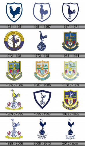
1921 -1951
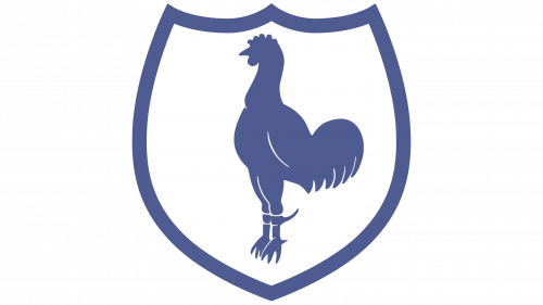
1951 – 1967
In this rendition of the Tottenham Hotspur crest, the cockerel stands tall, exuding confidence and might. It’s stripped of any additional elements, focusing purely on the bird’s silhouette, which speaks to a modern, minimalist approach. The cockerel’s feet are firmly set, banded, suggesting strength and resilience. The shield’s outline is sleeker, with a clean, uninterrupted flow, embodying a contemporary spirit. This emblem reflects the club’s progression while honoring its storied past.
1967 – 1971
In this iteration, the cockerel’s stance is more dynamic, with detailed feathers and an alert eye, symbolizing vigilance. The tail feathers are more pronounced, suggesting pride and grandeur. The feet gripping a ball are gone, focusing on the cockerel alone, which emphasizes the club’s forward-looking ethos. The shield maintains its simplicity, framing the bird in a timeless elegance. This design captures a blend of tradition and a leap towards modernity, reflecting the club’s evolving legacy.
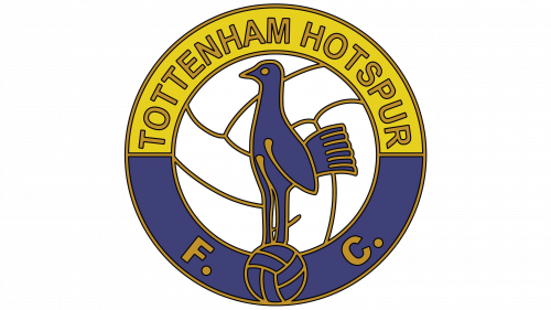
1972 – 1981
This emblem heralds a significant evolution, bursting with color and intricate detail. The cockerel, now full-bodied and perched on an old-fashioned football, is encircled by a golden band bearing the club’s name in bold letters. Blue segments radiate from the center, creating a wheel-like background that signifies motion and progress. The inclusion of the initials “F.C.” acknowledges the club’s footballing identity. This design is richer in elements, a nod to the era’s zest for vibrancy and flair, encapsulating the essence of the club during that period.
1973 – 1981
The design has pivoted to a stark, monochromatic silhouette. The cockerel is perched atop a simplified, stylized football, capturing an essence of elegance and minimalism. Gone are the previous emblem’s vibrant colors and intricate details, replaced by a bold, navy-blue outline that exudes modernity and sophistication. This stripped-back approach reflects a contemporary era, focusing on the essence of the club’s symbol without any distractions. It’s a visual declaration of the club’s commitment to a clear and focused identity.
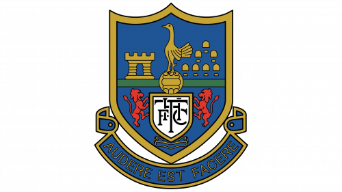
1983 – 1984
This emblem revives rich color and complex iconography. The cockerel stands regal atop an ornate ball, flanked by two fierce lions. Below, a scroll bears the Latin motto “Audere Est Facere” (To Dare Is To Do), encapsulating the club’s philosophy. The shield is layered with symbols of the club’s London heritage: the famed castle and the iconic London buildings. This crest is a tapestry of tradition, ambition, and locality, a far cry from the previous minimalist design, imbuing the club’s deep roots and lofty aspirations into one heraldic display.
1985 – 1986
This version of the crest maintains the heraldic shield, yet introduces brighter hues and a more stylized cockerel. The central shield has been simplified, now highlighting the initials “THFC” more prominently. Surrounding the shield, the lions remain as vigilant guardians, but the scroll’s color has shifted to a blue, making the motto “Audere Est Facere” stand out strikingly. The background elements, including the castle and trees, have been rendered in a more abstract, less detailed style, reflecting a modern approach to design. This evolution marks a subtle yet impactful refresh, blending tradition with a touch of contemporary simplicity.
1987 – 1988
The crest iteration brings a softer color palette with pastel shades, offering a gentler visual impact. The cockerel and ball motif remains central but with a less pronounced outline, integrating seamlessly into the shield. The backdrop elements, such as the castle and trees, have adopted a more illustrative style, enhancing the emblem’s narrative quality. Notably, the ribbon with the club’s motto “Audere Est Facere” transitions to a sky blue, lending a fresh and airy feel to the design. This crest iteration speaks to a blend of heritage and approachability, maintaining core symbols while refreshing the overall aesthetic.
1988 – 1989
In this crest, there’s a return to a more pronounced color contrast, with the shield’s perimeter outlined in yellow. The cockerel is more detailed and colored in a vibrant blue, standing out against a lighter background, giving it a more prominent position. The castle and trees are more stylized, and the football beneath the cockerel features a subtle detail. The lions are rendered in a deeper red, creating a striking visual balance with the blue. The motto “Audere Est Facere” remains prominently displayed on the scroll, affirming the club’s enduring ethos in a harmonious blend of tradition and revitalized design elements.
1989 – 1995
Stripping back to essentials, the crest centers on the iconic cockerel, boldly detailed in blue atop a football, with yellow flourishes. The full-bodied lions have transitioned into sleek silhouettes, accentuating the “THFC” initials. The daring motto, “Audere Est Facere”, is proudly displayed on a yellow scroll. Gone is the shield, making way for a stark, pronounced statement. This simplified design champions a contemporary emblem, foregrounding Tottenham’s timeless symbols.
1995 – 1997
The design evolves, embracing a deep blue shield backdrop. A strong, graceful cockerel stands poised above the football, stripped to its simplest form, sans prior yellow embellishments. The football crisply encapsulates the “THFC” initials, boldly affirming the club’s identity. Shedding all superfluous detail, the emblem emerges stark and impactful. Embracing modernity, this minimalist approach centers on clean lines, offering a robust, unfettered visual identity that sharply captures the club’s core with fresh clarity and boldness.
1997 – 1999
The crest reintroduces the full heraldic shield, enrobed in royal blue, with a return to the detailed, multicolored design. The cockerel stands proud in white, contrasting sharply against the blue, with the ball restored to its traditional detailed form. Below, the “THFC” monogram is back within a white shield, flanked by the red lions. The scroll with the club’s motto, “Audere Est Facere”, is once again present, underscoring the club’s philosophy in bold yellow. This design harkens back to the club’s rich traditions, blending them with vibrant color to create a sense of legacy and pride.
1999 – 2006
Streamlining further, the emblem discards the shield, spotlighting the cockerel and football. Blue defines the cockerel, subtly highlighted with yellow, perched on a ball marked with “THFC”. Below, the club’s motto “Audere Est Facere” arcs in bright yellow, a vivid proclamation. Simplified red lions now guard the ball, pared back from the previous crest’s complexity. This rendition celebrates minimalist grace, foregrounding Tottenham’s timeless icons over the ornate heraldry of its predecessors.
2006 – 2013
The crest evolves into a bold, uncluttered design, featuring the cockerel in dark blue atop a simplified football. The intricate details are removed, presenting a sleek silhouette that’s contemporary and striking. The name “Tottenham Hotspur” encircles the bottom in a graceful arc, replacing the previous scroll and motto. This minimalist approach exudes confidence and modernity, with the emphasis on clean lines and the iconic cockerel symbol, a nod to the club’s history while looking decisively to the future.
2013 – Today

The emblem distills to its essence, embracing just two hues. A navy blue unites the cockerel and football, abandoning all accentuation. “Tottenham Hotspur” forms an arc beneath, foregoing its previous banner embrace. Stark lines and color restraint highlight the design’s contemporary edge. Representing a marriage of minimalism and heritage, the emblem spotlights the club’s enduring icons, shedding textual clutter. This iteration forges a sleek, modern identity for Tottenham Hotspur, sharp and unadorned.

