Boston Red Sox Logo
One of the most successful and talked about teams in baseball is the Boston Red Sox. To date, the Red Sox have appeared in eleven World Series. What’s remarkable is that they won seven of them. There hasn’t been a single Red Sox game that hasn’t sold out. Although the home stadium cannot accommodate too many people, this disadvantage is compensated for at home and away matches.
Meaning and History
The new club was formed in 1901, and in 1912 its home was Fenway Park, which it remains to this day. The team became the MLB champion for the first time in 1903. It made the greatest contribution to the fame and prestigious position of the club in the league. However, the team was not always at its best. For a whole 86 years, the team did not participate in the World Championships, which brought it fame the other way. During that time, though, the players showed unprecedented skill and continued to set records in the division tournaments. The Red Sox, at different times, were known as the Boston Puritans and the Boston Pilgrims. It so happened that the team from Chicago was the first to use the item clothing as their team name, and Boston followed suit. The name finds its origin in the fact that workers at the wool mill that sponsored the team wore red socks as a sign of support for the players. Newspaper publishers have always tried to save space on the front pages, which gave birth to “Sox”.
What is Boston Red Sox?
Boston Red Sox are one of the strongest teams in MLB. At the beginning of the twentieth century, this team was the strongest in the league, but later experienced a series of failures called the “Curse of the Bambino”. Nonetheless, the Red Sox have had many outstanding players and coaches throughout their history.
1901
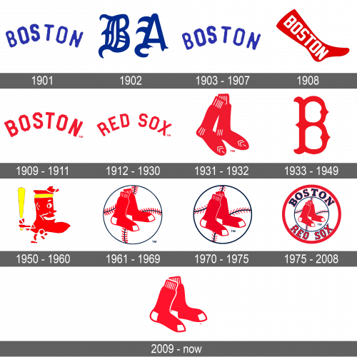
The team started with a relatively simple logo that allowed it to figure out its name without changing the logo. Nonetheless, it was used only for a very short period of time before being updated. The logo was blue, symbolizing kindness, devotion, good reputation, and commitment. It calms, disciplines, stimulates movement, and increases the feeling of self-confidence. The lettering had no serifs and had an uneven edge, which made it appear that the logo was hand-drawn. To give the logo a feeling of dynamics, the team had it printed to create an arch.
1902
A new logo featured a completely different font with “BA” printed using a Gothic font style. The initials stand for “Boston Americans”, which is how the team was known at the time. This logo was a better representation of a team that was gaining recognition. The blue color of the same shade was still in use.
1903 – 1907
For several years, the team used the logo it had originally. Its simplicity allowed the logo to be easily remembered, which is exactly what a new team needed.
1908
This is the first time the logo features a red color. It is not surprising as the team was now called the Red Socks. The designers did not try to invent the wheel and used a red sock as a base for the logo. Across it, the logo had “Boston” printed using a sans-serif geometric font that presented the team as confident and determined players.
1909 – 1911
Although the red color was preserved, the logo looks very different. There is no sock, and the team name was printed in an arch, just like it was in the original version. There was another element that connected this logo to the earlier versions. The team used the same geometric font as in the previous version. It was surely a perfect fit for the team.
1912 – 1930
The new logo is done in the same style as the previous one – a red color palette and bold, geometric font that creates an impression of a powerful and energetic club. The difference was in the name. Now, it said “Red Sox”, which is how the team was known for a few years now.
1931 – 1932
This logo brings back memories of another logo with a sock that the team has already used. This time, though, there were no inscriptions, just two red socks. One of them overlapped the other at the top as well as at the heel. White lines created a pattern and made the logo look a bit more interesting. This rather simplistic design required no explanations from the fans of the club.
1933 – 1949
The club returned to a more exquisite design for its logo. It used a Gothic style font to print the first letter in its name – the “B”. The initial is done in bright red, which became closely associated with the team. There are no socks or other inscriptions, but this makes the logo appear sophisticated and grand.
1950 – 1960
The socks returned and stayed with the club for many years to come. In this version, there is only one sock and it is stylized as a player with a yellow baseball bat in the hands and yellow headband. The expression on its face reflected satisfaction, confidence, and determination. It was surely one of the funniest logos the club has used.
1961 – 1969
The designers created a more serious and professional emblem for the Red Sox. It had a baseball ball in the background and a pair of red socks placed in front. The red, white, and a bit of black were a classic combination that created a feeling of perfection, strength, and power.
1970 – 1975
The logo was slightly redrawn, which gave the logo a lighter feel. First of all, the red color was no longer as dark. In addition, the black lines got notably thicker. The red lines that created a pattern on the ball not only became thinner and not as frequent but also changed the direction.
1976 – 2008
The earlier logo was upgraded and turned into one of the most complex and detailed logos the team had so far. It was placed on a larger white circle with a thick red border. The red color, by the way, was darker again, giving the logo a classier appearance. The full name was split in half with “Boston” printed across the top in dark blue using a bold font with slab serifs and a thin red outline and “Red Sox” done in red with a thin black outline and featuring a Gothic font seen in the earlier versions.
2009 – Today
Everything from the previous logo was scratched, leaving only the pair of socks. The club has already used such a combination and such an illustration was closely associated with the Boston Red Sox. This simplistic design made it obvious to everyone that the club needed no introduction and has earned recognition and admiration.
Font and Color
Looking at the history of the Boston Red Sox, it becomes obvious that the red color of various shades was the main color of the club. There were splashes of black and yellow and white was used as a base color, but red remained the most prominent color symbolizing the strength, power, and determination of the team. It is worth admitting that a saturated blue color was used for the first few years, but only the most loyal fans know that.
When it comes to fonts, the club always went for bold fonts that not only created a stronger image but also made the inscriptions easily readable. It switched a few times between a Gothic typeface style and more strict, geometric fonts, combining both in one of its logos.
