New York Yankees Logo
New York Yankees is a professional Baseball team from New York. There are several prominent teams in this region, but Yankees stand out as the oldest and most iconic among the still existing ones. They are probably the first (or perhaps even the only one) baseball team anyone outside of the US would name.
Meaning and History
![]()
The team started in Baltimore in 1901, and they were called Baltimore Orioles back then. It wasn’t until a few years later that they moved to New York, and definitely not until 1913 that they starting going by the ‘Yankees’. Since then, there was little change in branding.
1901 – 1902
![]()
The very first logo belonged to the team’s predecessor – the Baltimore Orioles. It was a vertical oval colored orange and with black inner space (colored as oriole, a bird native to Maryland). This obviously was supposed to resemble the letter ‘O’.
1902 – 1903
![]()
In 1903, they instead adopted a simple blue letter ‘B’ (after Baltimore). The style was the usual ‘athletic’ font used by the teams back then (well, and now).
1903 – 1904
![]()
By 1903, they moved to NY and changed the name to Yankees. The logo was now two capital letters from the city’s name. They were written in peculiar new style – dark brown letters made up from thin elaborate shapes. No explanation as to why they looked voodoo.
1904 – 1905
![]()
Not much changed in 1904, except the color change: from brown to dark blue. Everything else stayed exactly the same.
1905 – 1906
![]()
In 1905, the letters were simplified a bit. They now looked like bones with few elaborate details. What’s more, they were fused together into one space (although not to the extent they later reached). The colors also became even darker.
1906 – 1907
![]()
In 1906, Yankees scaled down on darkness of their letters, as well as on the proximity of one to another. In fact, they casted them apart way more than was reasonable. You could now fit one more letter in the vacant space between.
1907 – 1908
![]()
And in 1907, they drifted even more apart. Now you could fit two letters in the middle of the logo.
1908 – 1909
![]()
The next year, they changed the letters style. Mostly, they stayed as before, but designers added more blobs all over them. Also, they made the bar that connected the letter ‘N’ thinner. But that’s all.
1909 – 1912
![]()
In 1909, they introduced a very special symbol – both letters put on the same place in a bizarre shifting style. The letters changed thickness nearer to the tips and in occasional places. Moreover, they were weirdly warped outwards, and the proportions were thrown out the window.
They did smash the letters together before, but now they truly occupy the same place. This style later grew astoundingly popular.
1913 – 1914
![]()
In 1913, they changed the proportions a bit, but it wasn’t close to looking ordinary. The colors, meanwhile, changed from blue to brown with a touch of grey.
1915 – 1946
![]()
The layout stayed the same this time. The color returned to the pre-1913 shade, and that was the only change for decades.
1947 – 1967
![]()
In 1947, the main logo saw a major change in design. It was now time of elaborate emblems, and Yankees introduced a white baseball with red seaming and a thick outline with the same color. On top of it was the word ‘Yankees’ in twisting spaghetti-font (also red).
Notably, they put a baseball bat (also red with some white in it) where the left stick of the ‘k’ would be. Crowning the bat was the classic hat of Uncle Sam – adorned with American flag aesthetic (stripes, stars and so forth).
1968 – today
![]()
The only change they adopted in this next evolution was the change of color on the hat’s bottom. Before, it was light blue (not at all on the American flag). Now, it was white, which is more proper.
Emblem and Symbol
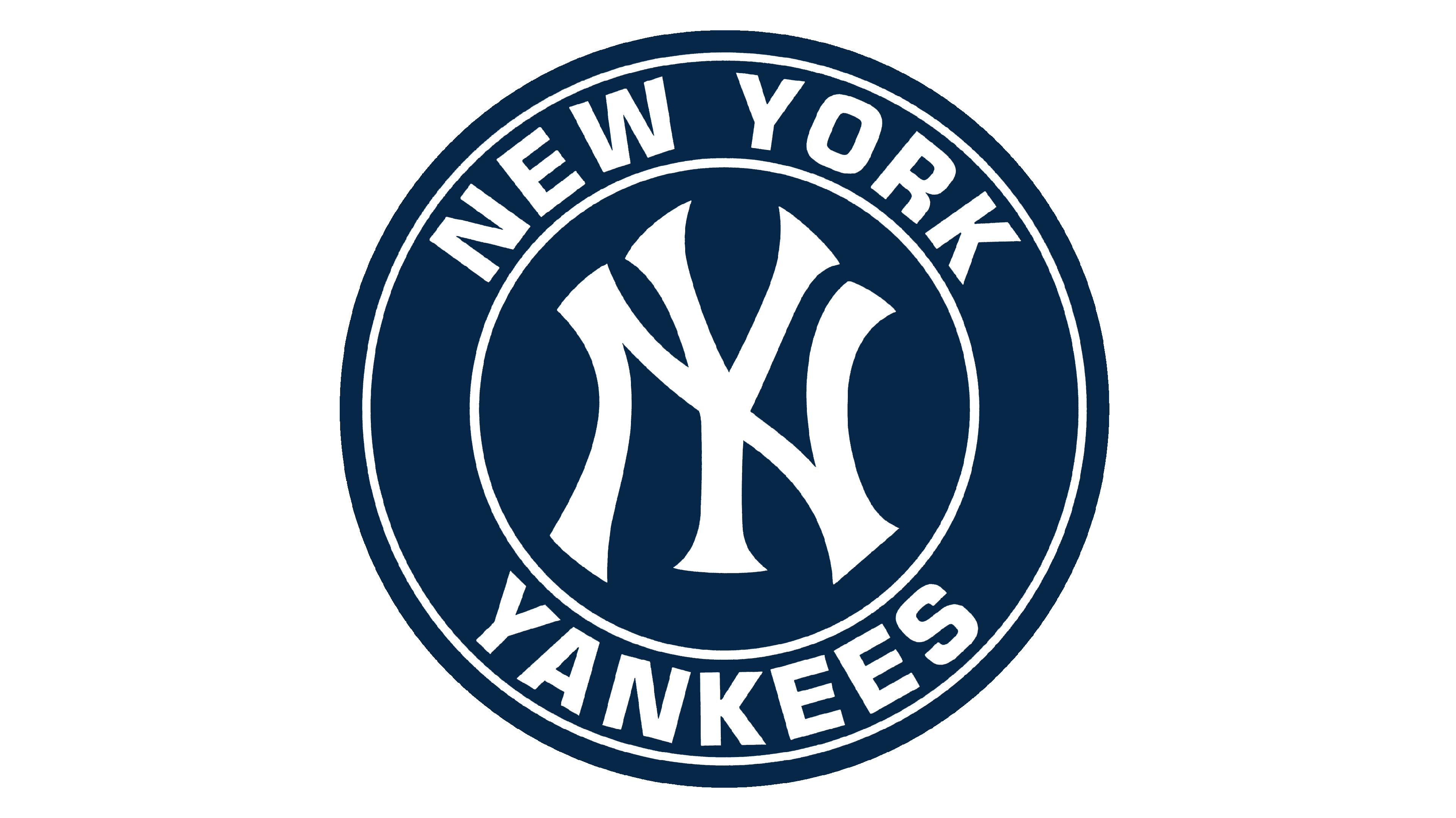
Although they changed the main emblem to the baseball symbol in 1947, the ‘NY’ composition still decorated the caps even into the 21st century. In fact, a lot of people all over the world – including the mass of people who don’t care for baseball at all – wear the same caps because it’s a valuable brand.
What does the New York Yankees symbol mean?
The iconic badge of the New York Yankees club features a rounded medallion with the red baseball bat, a hat with the American flag pattern, and the name of the club. Hence, the bat is a representation of the club’s sports discipline — baseball, and the hat shows the Yankees’ patriotic mood and spirit. Actually, the hat was “stolen” from Uncle Sam.
What is the origin of the New York Yankees logo?
Up until 1904, the Yankees’ predecessors, the New York Highlanders, had the letters N and Y written separately on the badge, placed on the left and right sides of their jersey. In 1905, the letters began to be crossed, but they only lasted for a couple of seasons. Finally, in 1909, co-owner of the New York Highlanders, Bill Devery, decided to bring back the logo with the intersection of the letters N and Y.
Why do the Yankees have two NY logos?
The New York Yankees club uses not two logos, but three: for the helmet, the cap, and the jersey in the club’s uniform. The insignias vary in the shape of the letters, which make up the iconic “NY” monogram, however, all three designs are instantly recognizable and associated with the team.
Did the Yankees change their logo?
The last redesign of the New York Yankees logo was held in 1969, which says a lot about the club’s loyalty and confidence. However, before the last version of the badge, which became iconic by today, the logo of the baseball club has been redesigned about ten times.


