Houston Astros Logo
Houston Astros is a professional baseball club from the United States. It competes in the Major League Baseball as a member of the West Division, and has many prestigious awards from its career years, such as Gold Glove or Silver Slugger Award. The team appeared in 1962, and quickly became one of nation’s most successful baseball teams.
Meaning and History
1962 – 1964
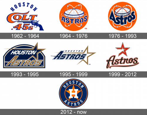
The initial team logo appeared when the team was known as Colt 45’s and depicted the blue gun with the team name on it. It had the serif orange-colored typeface with brisk C character and shading made from blue paint. Above it all, there was the name of the city where the team is from.
1964 – 1976
The following logotype featured the new name of the team (‘Houston Astros’), placed over the orange ball and Astrodome (The Stadium in Houston). Four baseballs were also rotating around the dome in various trajectories, traced with white.
1976 – 1993
The 1976 logo depicted the team’s name in lowercase letters of fat dark-blue typeface with connected characters. The Astrodome became a bit flatter, darker, and the rotating balls got smoother trajectories.
1993 – 1995
In 1993, the brand designers introduced a new logo, and that time it showed the tilted inscription, where the ‘Astros’ word had the golden sans-serif font with white contour, while the city name had the full white color. The distinctive feature of this logotype is the huge golden star, coming out of the simple line.
All this was on the orbicular blue-golden-white & again blue background.
1995 – 1999
The following logotype represented generally the same elements as the previous one, but the background was deleted, and the star found itself on the same level with inscription. The words, in their turn, were repainted blue.
1999 – 2012
In 1999, they again changed the logo. The city name disappeared, and the ‘Astros’ word got handwritten, changed the color to black and was gained the thin red contour. The familiar star was also recolored red-and-white and appeared above the word.
2012 – today
The latest logo is the blue-and-orange circle with the star and big H in the center. On it, there is also the full team name of the strong serif type.

