Atlanta Braves Logo
Atlanta Braves is one of the oldest baseball teams in America, at least amongst the still living examples. They are based in Atlanta, the capital of Georgia. As such, the Braves have long been among the best teams in the region. Presently, they are considered the best team in the Eastern States.
Meaning and History
![]()
The team in 1871 in Boston, and it was their homeland until 1952. Since 1912, they’ve been known as Boston Braves, and it wasn’t until 1966 that they finally moved to Atlanta to assume their current name of Atlanta Braves. The ‘Brave’ in this context means an Indian warrior, which was where they took inspiration for their branding from.
1883 – 1888
![]()
In 1883, they introduced the first logo. It was simply the name of their hometown, Boston, written in blocky capital letters and curved upside. All of these letters were painted bright red.
1889 – 1896
![]()
It’s pretty much the same logo, but colored dark blue instead of red, as previously seen.
1897 – 1899
![]()
In 1897, they decided to use just the capital ‘B’ in dark blue. This font wasn’t blocky anymore. Instead, they used a more elaborate, gothic style – probably to symbolize tradition.
1900 – 1901
![]()
Another color shuffle followed in 1900. This time, they changed the logo from blue to bright red.
1901 – 1906
![]()
Unable to settle on something, the team decided to introduce the very first logo they had, again.
1907 – 1908
![]()
It was the 1900 logo all over again, but with minor illustrative changes.
1908 – 1909
![]()
The font changed to a more mechanical and geometric style for a season.
1909 – 1910
![]()
This time, they picked the ‘B’ from the full team emblem and put it over the baseball with blue seams and outlines all over it.
1910 – 1911
![]()
Once more, the initial logo was returned.
1911 – 1912
![]()
Again, they used an old gothic ‘B’ in blue for a season.
1912 – 1915
![]()
As you remember, the team changed the name to Boston Braves in 1912, and that called for a suitable emblem. They used an illustration that depicted a profile of an Indian chieftain with a feathered headwear. The two dominant colors were white and red (naturally).
1916 – 1920
![]()
It’s the same logo as before, but put onto a dark blue circle as background.
1921 – 1924
![]()
The design resembles an old ‘mechanical’ logo from 1908, although this time they used blue instead of red.
1925 – 1928
![]()
Where the previous logo was noticeable wider, they made this attempt slimmer again. It was, in fact, slimmer than even the initial design from 1908.
1929 – 1935
![]()
In 1929, they decided to implement an Indian’s head as a logotype again. They added a lot of color this time, however. The skin became bronze, while a feathery headwear was now a multicolored mix of red, yellow, green and blue.
1936 – 1937
![]()
The 1936 logo is similar to the 1925 one, except it’s mostly yellow with some white and blue on it.
1938 – 1939
![]()
It’s much like the previous one, but much blockier and square for some reason.
1939 – 1940
![]()
The 1939 season emblem is mostly the same shape as 1938, but red with a thick blue outline.
1940 – 1941
![]()
An old gothic ‘B’ colored in blue, once more.
1941 – 1944
![]()
The same design with minor changes.
1945 – 1952
![]()
The inspiration for this attempt was obviously the previous Native American’s head they used. This one also has a dark skin, a red feather headwear and several colorful attachments in green and yellow.
1953 – 1955
![]()
There were a few minor changes this time around. The only reason for adjustments was the team’s move to Milwaukee. They also changed their name to Milwaukee Braves there.
1956 – 1965
![]()
In 1956, they finally created something new – again a head of a Native American warrior, but this time with realistic facial features. It was basically a head with the closed eyes and a wide-opened mouth (likely meant to be screaming). The face was mostly red, although the lines were dark blue, including the ones that made up the feather in this hair.
1966 – 1967
![]()
It was the first Atlanta emblem, and the only change that happened in 1966 was the skin change – where it was red before, it became dark brown.
1968 – 1971
![]()
In 1968, they added the word ‘Braves’ to the logo they used prior. It was a hand-written, fluid lettering in blue and with a red outline.
1972 – 1984
![]()
What they did in 1972 is add a blue square behind the ‘screaming head’ emblem. Simultaneously, the emblem itself was made bicolor, with red and white being the only two colors now. The same happened to the writing below, although it also had a blue outline to match the background.
1985 – 1986
![]()
In 1985, the writing was shifted to the left slightly and given a slight tilt to the right. The font also changed slightly, but not too much.
1987 – 1989
![]()
In 1987, the color palette changed all over the logo. All the colors were now much darker than before, and that’s pretty much it.
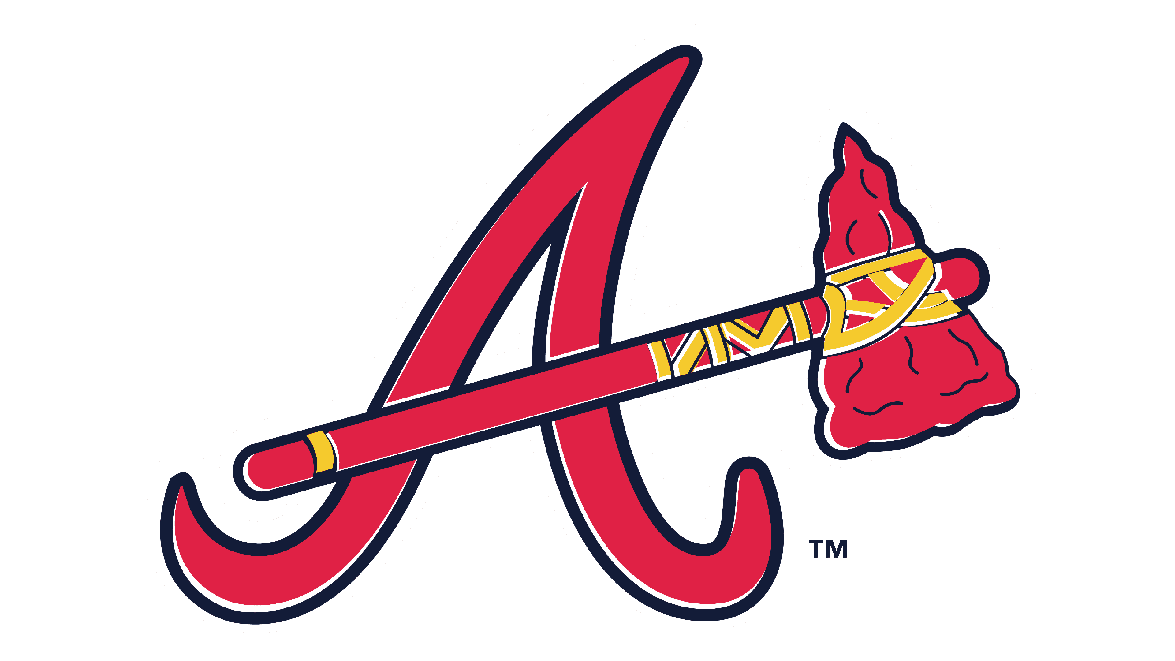
1990 – 2017
![]()
The 1990 saw the biggest change yet.
They discarded the Indian head as an emblem, but instead opted for a different Native American symbol. It was an ancient red hatchet colored in red with some blue inlays and yellow strings that held the thing together. To its left and up was the old Braves writing, but repainted to red and blue and slightly rotated.
2018 – today
![]()
They really just put the writing a bit closer to the writing for the 2018 season and onwards, and that was all that warranted the updated version.
Emblem and Symbol
The other notably symbol utilized by the brand (besides the main logotype) is the twisting capital ‘A’ set in different colors. Since 1990, it was mainly red and blue to match the logo, but there are also other options, not to mention some variations that change parts of the design.


