Pittsburgh Pirates Logo
The Pittsburgh Pirates are a professional baseball team based in Pittsburgh, Pennsylvania. Established in 1887, they’re a storied franchise of Major League Baseball (MLB), competing in the National League’s Central Division. Over the years, the Pirates have secured five World Series titles, with a rich history of iconic players and memorable moments. They play their home games at PNC Park, renowned for its stunning views. The team, often referred to as the “Bucs” or the “Buccos,” has a passionate fan base, making game days in Pittsburgh a vibrant and spirited affair.
Meaning and history
The Pittsburgh Pirates, originally known as the Pittsburgh Alleghenys, joined the American Association in 1882. By 1887, they shifted to the National League, adopting the “Pirates” moniker after a controversial player acquisition, which some viewed as “piratical.”
In the early 20th century, led by legends like Honus Wagner, they clinched their first World Series title in 1909. The Pirates hit a golden era in the 1920s, largely due to the synergistic duo of Paul Waner and his brother Lloyd.
Ownership changed hands multiple times over the years, with Barney Dreyfuss as one of the most notable early owners, who merged his team with the Pirates in 1900. Under his stewardship, Forbes Field was inaugurated in 1909, serving as the Pirates’ home for six decades.
The 1960 World Series was a historic moment for the Pirates. Bill Mazeroski hit a walk-off homer in Game 7, sealing a victory against the New York Yankees. This triumph was an emblem of the Pirates’ resilience.
In the 1970s, the Pirates found success again, clinching two World Series titles in 1971 and 1979. The ’79 win was particularly special, marked by the “We Are Family” slogan, inspired by Sister Sledge’s song, emphasizing team unity.
The late 20th century saw a decline in the team’s fortunes. This downturn lasted until the 2010s when, under the ownership of Robert Nutting, the Pirates experienced a revival. They made three consecutive playoff appearances from 2013 to 2015.
Throughout their history, the Pirates have moved stadiums a few times, with PNC Park becoming their home in 2001. Renowned for its scenic beauty, it symbolizes the rich legacy and hope for the future of this iconic baseball team.
1900 – 1907
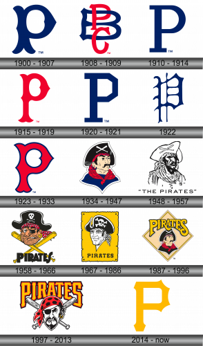
The debut emblem for the Pirates materialized in the dawn of the 20th century, precisely in 1900. It showcased an intricate Old English “P,” rendered in a deep shade of blue. This singular letter elegantly encapsulated two meanings: it not only represented the city of Pittsburgh but also alluded to the team’s moniker, the “Pirates.” Such design choices often highlight a team’s deep-rooted connection to its home city, emphasizing unity and shared identity. The utilization of the Old English font added a touch of timelessness and grandeur, cementing the team’s historical significance right from its early days.
1908 – 1909
In the year 1908, the team introduced a tri-letter emblem for the first time. Anchoring the design was a bold, crimson “B”, above which sat the azure-hued letters “P” and “C.” This amalgamation of letters, “PBC,” stood as an abbreviation representing the “Pittsburgh Baseball Club.” This emblematic choice signified a deeper bond between the club and the city, encapsulating their shared passion for baseball. The use of contrasting colors highlighted the importance of each letter, ensuring the club’s identity remained central to their representation. Such design evolutions often mirror a team’s evolving aspirations and the intent to engrave its legacy in the annals of sports history.
1910 – 1914
The team’s quartet emblem is reminiscent of its pioneering design. It prominently showcases a navy-tinged letter “P”, crafted with precision. This character is a nod to both the city’s name, “Pittsburgh,” and the team’s moniker, “Pirates.” This return to foundational roots symbolizes an ode to traditions, underlining the enduring legacy of the club. Such revisitations in branding often emphasize a blend of respect for historical significance and a desire for contemporary resonance. In this rendition, the hue and design intricacies ensure that while it harks back to the original, it still feels fresh and relevant in today’s sporting milieu. The intertwining of legacy and modernity makes this emblem particularly memorable.
1915 – 1919
Once more, the Pirates underwent a transformation, shifting their dominant hue from a deep blue to a vibrant red. The emblematic letter “P” was redesigned to showcase a sleeker, more modern silhouette. This transition wasn’t just about aesthetics; it reflected an evolution in the team’s identity and a desire to embrace change. By reinventing the color palette and refining the contours of their iconic letter, the Pirates symbolized growth, adaptability, and a fresh perspective. Such changes, while subtle, have a profound impact, signaling to fans and competitors alike that the team is continually looking forward, ready to carve new chapters in its storied history. This updated design elegantly bridges the rich heritage of the past with the promising potential of the future.
1920 – 1921
In 1920, the team revisited its roots, reintroducing the iconic red letter “P” emblem. This move was not just about aesthetics but signaled a nod to tradition and the rich history associated with that emblematic character. Representing the team’s moniker, the “P” has always been symbolic of the Pirates’ legacy. By re-embracing this classic design element, the team conveyed a sense of respect for its past while forging ahead into a new era. This decision resonated with longtime fans, evoking memories of previous glories, and signified a blending of past achievements with future aspirations. The revisited logo was a testament to the timeless nature of tradition, even in the ever-evolving world of sports.
1922
In 1922, the Pirates underwent a transformative shift in their branding. The previously simplistic letter “P” was reimagined with intricate flair, adopting the nuances of Old English typography. This new design boasted elaborate embellishments and ornate curlicues, enhancing its overall aesthetics. The transition wasn’t just a mere update but a stylistic leap, reflecting a blend of tradition with a touch of sophistication. This change demonstrated the team’s commitment to innovation while respecting its roots, seeking to bridge the gap between the past and the contemporary. The ornate “P” was more than just a logo; it was an emblematic representation of the team’s evolving identity, marrying tradition with modernity.
1923 – 1933
The team introduced a revamped design for the letter “P,” symbolizing the city of Pittsburgh. This updated rendition showcases a sleek red form complemented by a faint dark blue border. The adaptation not only redefines the team’s branding but also pays homage to the city’s vibrant spirit. This fusion of elegance and modernity captures the essence of Pittsburgh’s dynamic nature. It’s evident that this redesign wasn’t just a superficial change; it encapsulated the essence of the team’s journey and the deep connection with the city they represent. The fresh look, with its subtle color interplay, is a nod to the club’s rich history while paving the way for future endeavors.
1934 – 1947
In an unprecedented move within the club’s annals, the logo deviates from lettering altogether. The emblem now showcases a whimsically illustrated buccaneer donning a jet-black hat, under which two pristine white baseball bats are intertwined. Adorning the pirate’s neck and forehead are fiery red bandanas, adding a splash of color to the imagery. Glistening from one ear is a golden earring, reflecting the pirate’s love for treasures. Completing this swashbuckling figure’s attire is a deep blue shirt. This vivid emblem not only encapsulates the spirit of adventure but also merges the world of piracy with baseball, echoing the very essence of the team’s name and legacy. The blend of colors and elements paints a narrative of the club’s vibrant journey and ethos.
1948 – 1957
The graphic presented a grayscale depiction of a buccaneer adorned in a three-cornered hat, beneath which two baseball bats intersected in an “X” formation. Positioned below this illustration, the phrase “The Pirates” was emblazoned, utilizing an avant-garde sans-serif font. This typography choice featured elongated characters with generous spacing interspersed, conveying a sense of modernity and breadth. The entire design encapsulated both the fierce spirit of the team and the sophistication of contemporary aesthetics.
1958 – 1966
Once more, the Pirates emblem showcases a lively buccaneer, distinguished by his rugged facial hair and a jet-black captain’s hat. This spirited figure sports an iconic eye patch, indicative of many seafaring legends. Both of his ears are adorned with gleaming golden earrings, adding a touch of affluence. Peeking beneath his hat is a fiery red bandana, lending a touch of vibrancy to his appearance. Positioned beneath this seafarer’s visage are two interlocking sun-kissed bats, further cementing the baseball theme. Emblazoned below them is the word “Pirates” in bold, dark lettering. This captivating depiction was masterfully crafted by Jack Berger Sr, a talented artist from the Pittsburgh Press, weaving together both the pirate and baseball worlds into a harmonious emblem. The inclusion of rich details and symbolism encapsulates the essence and legacy of the team.
1967 – 1986
The artwork was a masterpiece from the talented Bob Gessner, who previously designed a logo for a renowned Pittsburgh NHL squad. This rejuvenated buccaneer, set against a golden parchment backdrop, exudes a more amicable demeanor. His iconic black pirate hat remains a defining feature, casting a shadow over his welcoming eyes. Beneath this affable corsair, the name “Pirates” is boldly inscribed in ebony letters. Gessner’s innovative touch is evident, merging historical allure with a contemporary vibe, ensuring that the emblem resonates with both traditionalists and newer fans alike. The inclusion of the parchment hints at tales of old, perhaps chronicling the rich legacy and adventures of the team.
1987 – 1996
In 1987, the Pirates underwent another branding revamp. The redesigned emblem showcased a vibrant yellow diamond as its backdrop. Within this geometric figure, there’s an animated depiction of a buccaneer donning a dark hat and a matching vest. The squad’s moniker is rendered in a sunlit yellow hue, accentuated by a contrasting black shadow. This reimagining seamlessly merges classic pirate imagery with a fresh and dynamic look, symbolizing both the storied past and the promising future of the team. The choice of the diamond shape subtly hints at the baseball field, linking the adventurous spirit of pirates with the thrilling challenges of the game.
1997 – 2013
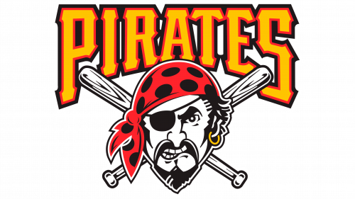
The team’s second-to-last emblem showcased a prominent golden “Pirates” script, beneath which rested the face of a buccaneer. This character’s head was adorned with a vivid red and ebony bandana, and a dark eye patch covered his right eye. A shiny earring dangled from his left earlobe. Positioned behind this maritime figure, two intersecting baseball bats formed an X, linking the team’s pirate motif with its baseball heritage. The emblem was an artful blend of traditional piracy symbols and the spirit of the game, underscoring the team’s adventurous ethos and its deep-rooted connection to baseball.
2014 – Today
The team’s leadership opted to revisit the emblem that marked the onset of the players’ journey – the singular letter “P.” Drawing inspiration from Old English typography, designers revitalized the letter, infusing contemporary flair. This golden “P” boasts four distinct spiky protrusions at its pinnacle, an extended main shaft, a distinct rectangular void, alongside parallel linework and pronounced serifs.
Initially making its debut in 1900, this iconic symbol resurfaced in 2014, preserving a chic emblematic identity. It seamlessly embodies both facets of the team’s moniker: “Pittsburgh” reflecting the geographic roots, and “Pirates” encapsulating the spirited nickname of the baseball contenders.

