Chicago Cubs Logo
Chicago Cubs is an old baseball team, amongst the most famed to come from Illinois. Although not particularly terrible in performance, they do have a sticky reputation of being a generally losing team. Even so, they are considered more-or-less a legend in baseball history.
Meaning and History
![]()
The team has been active since at 1870, but they weren’t called Cubs back then. The name as we know it now only emerged in 1902. A year later they got their first official emblem, and four years after that they entered the major leagues as Chicago Cubs. 1907 is considered the year when their career officially kicked off.
1903 – 1906
![]()
In 1903, they adopted the first logo, and it was rather simple. It was a dark blue shape consisting of two elements: a growing moon shape (there to represent the ‘C’) and a strange shape growing from its bottom that could be anything. Back then, this silhouette would probably be instantly recognized, but now it’s not clear what it is.
1906 – 1907
![]()
In 1906, they turned to a simpler shape. It was a wide letter ‘C’ with a thin lined and a big hammer serif on the end of the upper arch. This emblem was colored a greenish brown, unlike the previous design.
1907 – 1908
![]()
The 1907 design changed little. They changed the tips of the letter, so they now looked like tips of bones, and the middle of the line has also been given two bumps. There’s no clear telling what this is supposed to resemble.
1908 – 1911
![]()
In 1908, the first bear imagery appeared on the official symbolic. The letter is now much plainer and generally looks like a thick blue ring with a right quarter removed. Inside the ring is a brown bear standing upright with a baseball bat in its paws (in the same color).
1911 – 1916
![]()
The 1911 logo is the same design but completely in dark blue: including letter, bear and bat all.
1916 – 1917
![]()
By 1916, the design changed by the concept remained. They basically took the letter ‘C’, stretched it sideways, colored it red and outlined it in dark blue. The bear, on the contrary, remained blue but got outlined in red. It’s also on all fours now and is walking somewhere to the ride, by the looks of it.
1917 – 1918
![]()
In 1917 the logo changed to just the writing – Chicago Cubs – made in dark blue and written in the usual ‘college’ serif. The words were stacked one on top of the other, and the top one, ‘Chicago’, has been noticeably arched for some reason.
1918 – 1919
![]()
The 1918 is a gross simplification of the previous concepts, where they put some blue image (the uppercase letters ‘UBS’ this time) inside the encircling letter ‘C’. That letter is very weirdly styled this time – it’s just a grey rectangle with an opening in its right side. As you understand, together it’s supposed to red ‘CUBS’.
1919 – 1927
![]()
They actually combined the 16’ and 18’ logo this time by taking the red stretched ‘C’ and putting the letters ‘UBS’ inside it. The font on them changed a little to one of the ‘sports types’ of the time.
1927 – 1937
![]()
Here’s another mix: this time a combination of the red ‘C’-image with the blue bear from the 1911 logo (the one where he still the bat).
1937 – 1941
![]()
For a 1937 design, they actually took the 1911 logo design (more-or-less), but colored the ‘C’ in the red hue from later and put the blue ‘UBS’ writing in uppercase, thin letters. This design will inspire a lot of other attempts in the future.
1941 – 1946
![]()
That’s the last emblem featuring a bear on the main logo to date. It’s a realistic (more-or-less) head of the bear. It’s actively roaring in an aggressive manner, although it is still visible a cub (to fit the aesthetic).
The coloring changed to a light brown with some white additions (such as teeth and lower segments of the fur).
1946 – 1948
![]()
This time, they took the 1937 design (like mentioned) and rearranged it a tad. Where that design had a blue outline, the 1946 attempt has instead a white outline first that is surrounded by a layer of blue afterwards. In the middle, they put the white circle that is also outlined, and above that circle is the writing – now in the same pinkish red.
1948 – 1957
![]()
Not much changed from the previous concept, but they did made the big ‘C’ thinner, as well as lengthened and generally enlarged the other letters.
1957 – 1979
![]()
Another rearrangement followed in 1957. This time they put the writing part in the middle of the white circle (again outlined in blue) and changed proportions. Basically, the letters became wider and further apart.
1979 – today
![]()
This is the longest-enduring emblem yet. In fact, they changed little from 1957. Everything except the white background became thicker and wider (including ‘C’, letters and the blue outline).
Emblem and Symbol
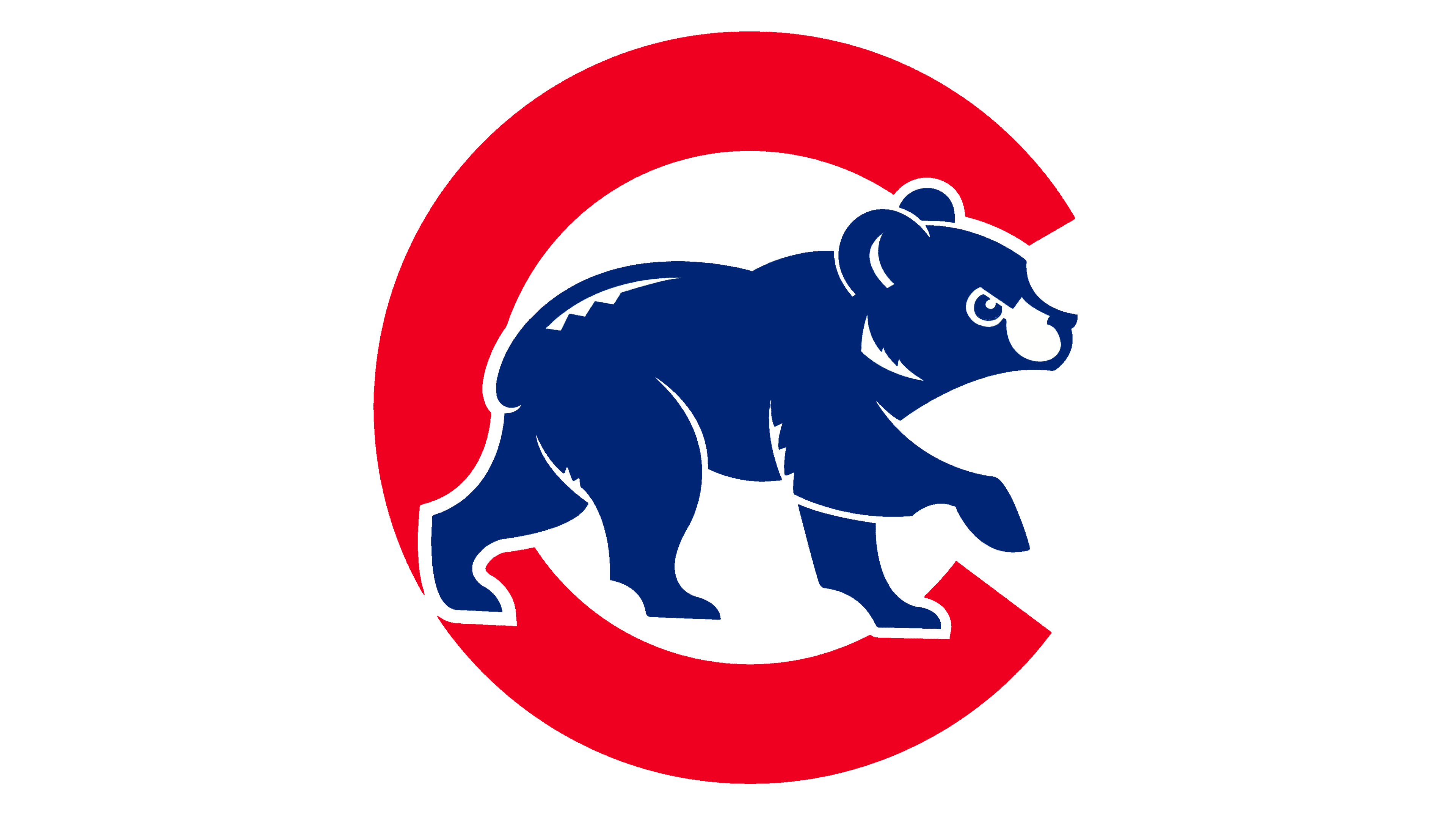
The team also has a minor emblem featured on the sleeves or on the fronts of the alternative uniforms. It’s basically the same letter ‘C’ in red, but with a blue cub – not inside it, but over it. This one is seemingly more popular with the fans, but is still a minor emblem.