Buick Logo
Buick is a premium American auto marque and part of the General Motors conglomerate, that crafts luxury cars, crossovers, and SUVs. Established in 1903 by David Dunbar Buick, it has since earned a reputation for delivering reliable and high-quality vehicles.
Meaning and history
The name Buick originated from the surname of its inventor-founder, David Dunbar Buick, a Scottish-American pioneer of the automobile industry. The brand’s name is now associated with innovation, refinement, and class in the automotive realm.
Buick made a name for itself in the early days by introducing some of the earliest gasoline-powered automobiles, including the pioneering Buick Model B in 1904. Throughout the years, the brand continued to pioneer innovative features such as the first overhead valve engine in 1908, the initial synchromesh transmission in 1929, and the earliest turbocharged V6 engine in 1978.
Today, Buick is an esteemed brand, celebrated for its elegant and tasteful vehicles, advanced safety features, and smooth driving experience. With a commitment to sustainability, technology, and performance, the brand is evolving and adapting to changing customer preferences.
What is Buick?
Buick, a renowned automotive marque that forms a part of the General Motors Company, has been in existence since 1899 and boasts a rich legacy of crafting top-notch automobiles. The brand has established a reputation for pioneering engineering, polished design, and state-of-the-art technology. In the contemporary automotive landscape, Buick presents an assortment of luxury cars that range from plush sedans to SUVs and crossovers, all built to deliver supreme comfort, exceptional performance, and unparalleled style.
1903 – 1905
The initial Buick logo depicted a stunning globe of our planet, with continents, oceans, meridians, and parallels all visible in striking detail. Emblazoned across the center of the map in bold letters was the slogan, “KNOWN ALL OVER THE WORLD,” while at the bottom, one could read “THE BUICK MOTOR COMPANY FLINT MICH. U.S.A.” A dapper Uncle Sam, the quintessential emblem of the United States, strolled across the globe, towing a tiny cart with a car in tow. The logo was a perfect representation of Buick’s ambition to create cars that would be loved and recognized worldwide.
1905 – 1911
In 1905, Buick unleashed its iconic badge onto the automobile world. A brass masterpiece, this symbol of automotive excellence featured the Buick name enclosed in a mysterious dark circle, bordered by a ring of the catchphrase “THE CAR OF QUALITY.” It was the perfect addition to the radiator grill of the Buick Model C, exuding an air of power and sophistication.
1911 – 1913
In 1911, the company adopted a new badge. It was a metallic piece in the form of an elongated letter ‘B’. It contained three letters ‘U’, ‘I’, and ‘C’, as well as the vertical bar of the ‘K’. All of these symbols were crossed by a horizontal stripe, and one could easily recognize the stylized name in that badge’s design.
1913 – 1930
In 1907, the creators opted for a cursive script with a subtle underline effect for the brand name “Buick.” The font color was pure white, and the designers gave it a 45-degree rotation. The writing sat atop a spacious blue square that had a broad, luminous frame.
1930 – 1937
During the dawn of the 1930s, a fresh and innovative nameplate decorated the radiator grilles of Buick automobiles. The moniker was inscribed in a slanted, diagonal manner, accented with the scarlet digit “8”. This numerical symbol denoted the eight-cylinder potency of the vehicle’s engine, which was regarded as a true marvel of engineering at the time.
1937 – 1939
When Ralph Pew stumbled upon a prestigious Buick family coat of arms edition, the brand executives adopted the old insignia as their official symbol. However, there was a caveat: the book only had a textual description of the coat of arms, and no illustration was available. The creative team, therefore, had to rely solely on their imagination and expertise to breathe life into the emblem. The result was a stunning red shield embellished with a diagonal checkered line, with a gold deer head in one corner and a cross with a circular aperture in the other.
1939 – 1942
The emblem was transformed in 1939, with a fresh rendition of the shield. It was elongated to stretch vertically and was imbued with a striking shade of pinkish-red.
1942 – 1947
The creative team tinkered with the shield’s contour, embellished it with timeless heraldic motifs, and embedded it within a sizable black orbit. This insignia was utilized briefly in 1942, after which the corporation pivoted to crafting military gear.
1947 – 1949
A refreshed rendition of the Buick family crest featured an engine element positioned atop a shield, stripped of decorative embellishments and circles, and framed with a more slender border.
1949 – 1959
The year 1949 saw the debut of a shimmering, lustrous metallic frame, enveloping the shield in a radiant aura. This was implemented to ensure the emblem aligned seamlessly with the elegant aesthetic of the cars it represented.
1959 – 1997
Buick’s identity took a momentous turn with the advent of a logo consisting of three overlapping shields. Each shield donned a distinct color – blue, silver-gray, and red – symbolizing three Buick models: Electra, Invicta, and LeSabre. The shields were enveloped within a broad ring, giving the logo a captivating appeal.
1975 – 1976
The Skyhawk models were distinguished by their unique symbol, an avian predator of dark color enclosed in a circular frame. The design proved to be a smashing hit, prompting Buick to implement it across all its automobile models in 1976.
1976 – 1990
The following logo displayed a new image, where a golden hawk lands on the polished, metallic name caption of an uppercase serif typeface.
1990 – 2002
After Buick bid farewell to its beloved red-tailed hawk, Happy, the company sought a new logo design. Inspired by a three-shield emblem, the designers gave it a facelift, removing the crest and adding a white checkered diagonal. The word “BUICK” in blue was placed below the ring, and two versions were created: a striking 2D design and a bold 3D version with a darker palette.
2002 – 2015
The previously-colored interiors of the shields have transformed, now flaunting a pure white hue, and all the external edges and slanted lines have undergone a metallic chrome coating.
2015 – 2023
The Buick emblem now flaunts a sleek, black “BUICK” inscription on the right side, while the iconic red, silver, and blue hues return to adorn the three overlaid shields. This revamped logo made its debut on the LaCrosse automobiles in 2017.
2023 – today
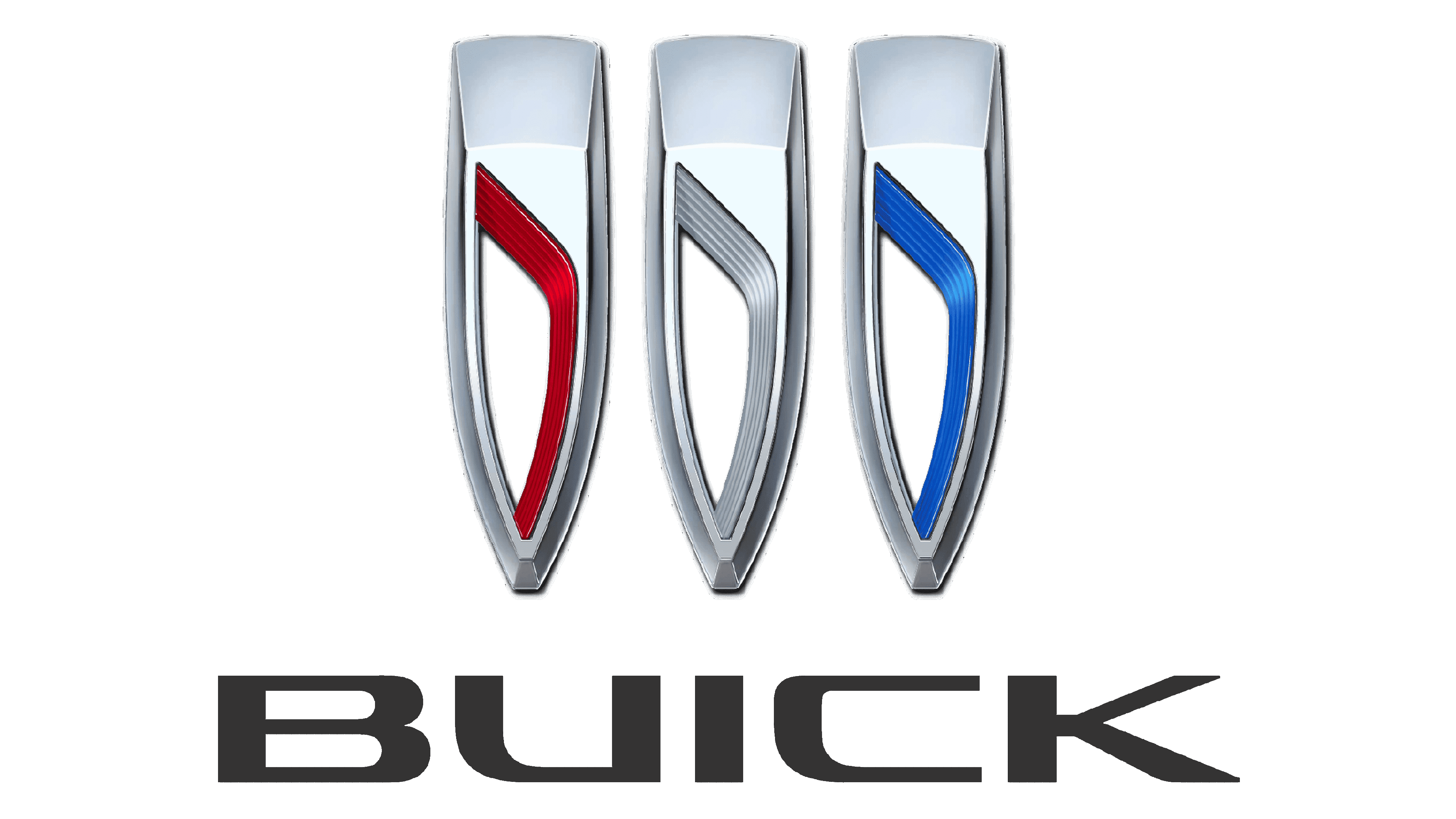
General Motors made a groundbreaking move on March 16, 2022, by submitting a trademark application for a new Buick logo to the US Patent and Trademark Office. Dubbed the “Three Stylized Shields,” the emblem is described by its name and is a significant departure from its predecessor. Instead of three triangular shields joined together diagonally, the new logo features individual shields with gaps between them, arranged horizontally. The surrounding ring that once enclosed the emblem is gone, giving it a fresh and modern look.
Font
The craftsmen opted for the Avenir typeface for the wordmark, a precise sans-serif with a modern feel invented in 1988.
Color
The palette comprises multiple tints of red, blue, and silver, with the addition of white and black to augment the gradient and intensify the 3D impression.


