Ford Logo
Ford is an automobile corporation with main offices in Michigan, USA. The enterprise sells cars and other vehicles under the Ford brand and many other brands. Ford is also known for its trucks. Ford owners have always strived to make costs lower and improve their products. Large-scale manufacturing of automobiles on an assembly line was first introduced by this brand, which made its cars quite famous.
Meaning and History
After falling off a horse in 1872, Henry Ford always desired to create safer and more reliable transportation. The Ford Motor Company was established by 12 friends from Michigan in 1903. The corporation was headed by Henry Ford, who had a 25.5% stake. In a relatively short period of time, the brand became recognized throughout the world as the creator of the first car for the general public. Ford and his son Edsel become the sole owners of the brand sixteen years after the launch. Ford Motor Company went public in early 1956.
What is Ford?
Ford is a famous American company that produces passenger cars such as Mercury, Ford, and Lincoln. The Ford brand became famous not only in the country of its origins but also in all parts of the world. It also has assembly plants in Canada, Mexico, China, Great Britain, and many other countries besides the US.
1903 – 1907
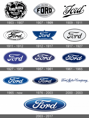
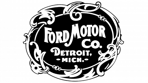
The logo was black and white with “Ford Motor Co.” done in beautiful handwriting. Underneath, it had “Detroit, Mich.” in smaller font, but also white and using the same style of letters. The frame had a very intricate design. The logo was done in the art nouveau style.
1907 – 1909
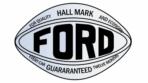
The new logo did not look anything like the original. It had a shape that was a mixture of an oval and a diamond. The figure had a very light blue and white gradient. It had “Ford” written across in bold, black uppercase letters that were almost touching an oval double outline. Above and below, it declared the high quality of its cars.
1909 – 1911
The brand name was the only element of the logo. It was black and the font resembled intricate italic handwriting. It was written on a slight diagonal with the right end going up and signifying the growth and innovation. All the letters were interconnected. The letter “D” curved down and under, creating a nice line that underlined the name. The name had quotation marks on both sides. There were no other elements.
1911 – 1912
The word “Ford” was placed in a white oval shape with a double, thin outline. The outline and the name were black. The designer played with the font style used for the previous logo and gave it some highlights. The letters looked thicker and rounder. There were no more quotation marks and the underline. Above and below the name, running right between the two outlines, it stated “The Famous Motor Cars” in black uppercase letters. The font had angular serifs and was quite thick.
1912 – 1917
A blue triangle with spread wings on both sides served as the basis. It reminded of a bird. The figure had a white outline that was moved a bit inwards to create a double border look. The word “Ford”, done in a typeface similar to the one used earlier, was written in large white letters in the center of it. At the bottom of the triangle, it stated “The Universal Car” in simple, uppercase letters. The phrase was also white.
1917 – 1927
The company brought back the oval design. This time, it had only one black border and just the word “Ford”. The name was in black and the letters were slightly redrawn to have more refined ends. The base color was off-white.
1927 – 1957
Ford changed the color scheme to white and purple. The letters were white, while the base color turned purple. It also brought back the double border, which looked like a thin white outline followed by an even thinner purple one.
1957 – 1961
A darker shade of purple was used as the base color and outline. The white outline got thicker, while the purple line was very thin. The name, which was white, had barely changed its shape. Only the letter “O” was more open due to the enlarged crossing line of the letter “F”. There were other minor changes to the font. The oval shape did not look as perfect anymore and looked more hand-drawn.
1961 – 1965
The letters got bolder, while the background turned into dark blue. The border had double white lines and double blue lines, with the outer blue line being thinner than the others. The oval shape looked more elongated.
1965 – Today
The designers have made some minor modifications to the font again. The letters “O” and “D” looked more round. The font resembled the one used back in 1912. There was only one white and blue border again. The blue color itself was much lighter.
1976 – 2003
The familiar emblem got a 3D appearance thanks to gradient colors. Dark cobalt was used for parts that were previously blue. In addition to the white and blue border, there was a thick silver outline on the outer edge. Although the font was kept the same, it was also given some volume. A silver was applied instead of white, which was used for many years.
2000 – 2003
For almost three years at the beginning of the 2000s Ford brand has been using a very unusual for itself logo. It was just a one-line “Ford Motor Company” inscription in fancy cursive typeface, set in the corporate blue color. The lettering features elongated tales and curved bars, which were especially seen in the capital letter “M”. The typeface of the logotype was copying the font from the regular Ford badge, so the first letter word of the line was almost exactly the same as the bold silver “Ford” inscription from the previous version of the badge.
2003 – 2007
The word “Ford” was white again. It still had volume, but it was created with the help of a shadow. The oval shape had a gradient blue that was lighter compared to the previous version. The outer gray border that was added back in 1976 got very thin.
Font and Color
Although Ford has changed its logo multiple times, the color palette stayed consistent. The font has not really changed much as well. An elegant cursive writing was used since 1909 with barely noticeable adjustments to the typeface. From 1903 until 1912, the color palette was black and white. It also returned in 1917 for ten years. Otherwise, the blue color along with white were used for over a century.
