BMW M Logo
BMW M, a division of BMW Group, specializes in the development and deployment of racing vehicles and technologies. It competes in various prestigious motorsport events globally, underscoring BMW’s commitment to excellence in automotive performance. It operates mainly in Europe and North America but has a worldwide presence due to its participation in international racing events. Owned by BMW Group, BMW M focuses on innovation in racing technology, thus enhancing the overall brand’s reputation for high-quality, high-performance vehicles. The division is integral in exemplifying BMW’s engineering prowess and commitment to automotive excellence on global racing stages.
Meaning and history
BMW M, the performance subsidiary of BMW Group, has a rich history marked by continuous innovation in high-performance automotive design and engineering. Founded in 1972, its mission has been to refine BMW vehicles for maximum performance and driving experience. It began with the creation of the BMW 3.0 CSL, showcasing advanced engineering and a sportier design, illustrating BMW M’s commitment to pushing boundaries in the automotive industry.
The ownership of BMW M hasn’t undergone significant changes; it remains an integral part of the BMW Group. However, its production strategies and models have evolved tremendously to adapt to market demands and technological advancements. Over the years, BMW M has introduced various iconic models like the M1, M3, and M5, each contributing to the brand’s legacy of combining luxury with exceptional performance.
BMW M’s developments have consistently emphasized precision, dynamics, and innovative technology, strengthening BMW’s presence and influence in the global automotive market. The company’s focus has remained on delivering superior driving experiences and enhancing the brand’s reputation for luxury, speed, and handling.
While BMW M continues to refine its existing models, it also embraces new technologies, remaining at the forefront of automotive innovation and maintaining its dedication to high-performance engineering and design. The subsidiary’s enduring commitment to excellence and innovation underscores its pivotal role within the BMW Group, influencing automotive trends and setting standards in performance, luxury, and driving experience.
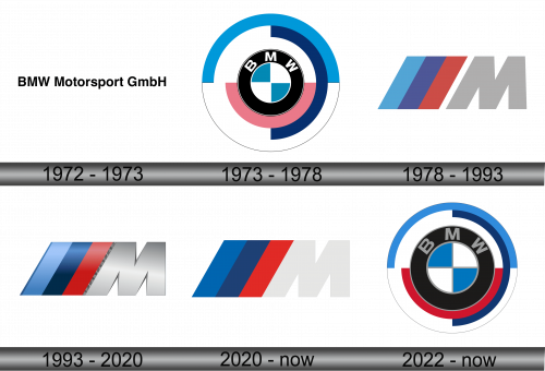
1972 – 1973
Originally, the BMW M sports car division bore the name BMW Motorsport GmbH, a detail manifested in its earlier logo. This prior emblem highlighted succinct black lettering set against a white backdrop. The robust, sans-serif typography, bearing resemblance to the Yoxall Bold by Roger White, underscored the brand’s commitment to reliability and professionalism. The simplicity and clarity of the design were symbolic of the division’s straightforward approach to engineering and its emphasis on high performance and precision, resonating with the core values and the ethos of dedication and integrity inherent to the BMW brand, conveyed through its focused and minimalistic visual identity.
1973 – 1978
In the year 1973, racing vehicles witnessed the introduction of a sophisticated, layered circular emblem. The nucleus of this symbol comprised a compact circle segmented into alternating blue and white quadrants, encircled by a black band where “BMW” was inscribed in pristine white letters. Enveloping this was an external layer of the insignia, presenting unequal semi-circles in shades of blue, white, and a distinctive pink. This elaborate symbol marked a pivotal evolution in branding, representing the fusion of heritage and innovation, and offering a visual narrative of the company’s enduring commitment to excellence and dynamic functionality in the realm of racing automobiles.
1978 – 1993
In 1978, the world witnessed the unveiling of the BMW M1, showcasing a refreshed logo. The creative minds accentuated the primary hues symbolizing BMW Motorsport:
- Blue – an intrinsic element of the Bayerische Motoren Werke’s corporate aesthetics, drawing inspiration from the Bavarian flag.
- Red – emblematic of motorsport’s exhilarating essence.
- Purple – a harmonious blend of blue and red, serving as an aesthetically pleasing intermediary between the two.
This vibrant color scheme is attributed to the innovative vision of Manfred Rennen and Wolfgang Seehaus, the brains behind the vehicles’ exterior and interior aesthetic appeal. The insignia illustrated these hues as three oblique stripes converging into a substantial parallelogram. Adjacent to this geometric configuration was a “M” in a sophisticated shade of dark grey, signifying the initial of “Motorsport.”
Speculation suggests that the inclusion of red was a strategic attempt to allure Texaco into a sponsorship deal with BMW M. However, despite the culmination of the partnership post the logo’s conception, the creators opted to retain the original design, deeming the tri-striped motif impeccably complementary to the vehicles. The emblem stood as a visual symphony, an embodiment of innovative design and dynamic spirit, amalgamating tradition with modernity, and continued to accentuate the brand’s identity in the competitive realm of motorsports.
1993 – 2020
Established in 1972, BMW Motorsport, subsequently rebranded as BMW M, marked the inception of a distinct racing car division, necessitating the creation of an emblematic representation. The symbol manifested as a fusion of three slanted stripes, each displaying shades of blue, dark blue, and red, anchored around a silver-gray rendition of the letter “M.” The inclinations of the tri-colored bands harmoniously aligned with the leftmost stroke of the “M.” The designers, in crafting this emblem, incorporated linear gradients to enhance its visual impact and interspersed darkened subtle contours to accentuate certain facets, rendering it a distinguished and memorable visual entity within the motor racing domain. The precise amalgamation of colors and thoughtful design details emphasized the brand’s dynamic and innovative spirit in the competitive motorsport landscape.
2020 – Today
Executives at BMW M opted to streamline the logo’s color palette to facilitate its replication in print mediums. Consequently, the gradient element was omitted, rendering the letter purely white, and the shadows were also eradicated. The modification aimed to enhance the logo’s adaptability and versatility in various reproductions. It is understood that this revised version was a collaborative effort undertaken by the professionals at the Pierre Mendell studio. This adaptation not only preserved the essence of the brand identity but also allowed for a more versatile and simplified representation, making it more accessible and recognizable across diverse platforms and formats.
2022 – Today
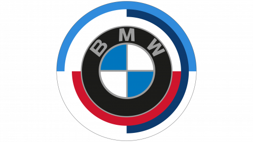
In honor of its half-century milestone, BMW M reimagined its vintage circular emblem from the 1970s, reintroducing it on models launched in March 2022. This revamped badge supplanted the customary blue and white circles, prominently featuring on wheel hubs as well as front and rear bumpers of the cars. Diverging from its classic counterpart, the contemporary iteration embraces a more subdued color palette. The alphabets “B,” “M,” and “W” have transitioned from white to a shade of gray. The previously soft pink semicircle has matured to a burgundy hue. Moreover, both the inner circle and the encompassing black ring have seen an enlargement in their dimensions. This modern adaptation blends nostalgia with contemporary aesthetics, offering a subtle homage to its illustrious heritage while aligning with modern design sensibilities. The renewed design not only resonates with long-time enthusiasts but also appeals to a new generation of fans, bridging the past with the present in a cohesive and stylish manner.


