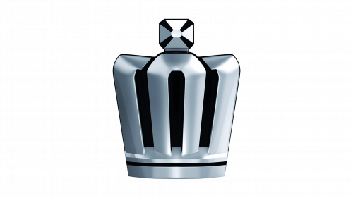
Toyota Crown Logo
Toyota Crown is one of the chief lines of cars produced by Toyota. You wouldn’t usually see them outside of Asia, because they manufacture them in relatively smaller numbers and sell at a higher price than usual. Basically, they are supposed to be premium cars for well-off white collars.
Meaning and History
They’ve been making this for a long time now. The first car was released in 1955, with new generation coming out every couple of years. ‘Crown’ refers to the purpose of these cars as executive vehicles – meant for people with wealth and status to get around the city.
1955 – 1962
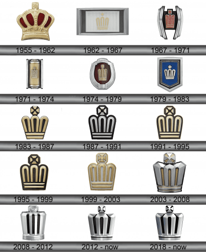
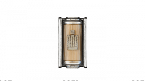
The first generation used badges that looked like some European imperial crowns – most notably, the British crown. It’s a golden rib-like carcass with a gem on top and red velvet adornment inside.
1962 – 1967
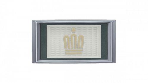
The second generation badge was instead a silver plaque with two layers of darker frame. Inside, they placed a little gilded illustration of a crown, a bit simpler than the 1955 variant.
1967 – 1971
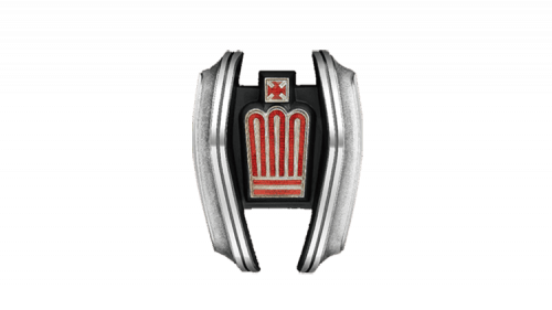
The third generation used a similar crown illustration, but designed in red and white instead. They put it onto a small and narrow black plaque that was then surrounded by two silver ‘wings’ on both sides.
1971 – 1974
The fourth generation was the same narrow crown, this time silver and placed onto a vertical golden bar with some metal frames on all sides.
1974 – 1979
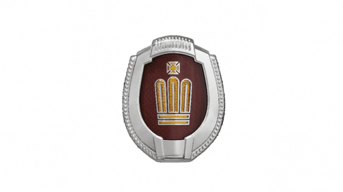
The fifth generation saw the emblem become gilded again. They placed it onto a vertical burgundy oval surrounded by frames made of (or made to look like) silver.
1979 – 1983
By the sixth generation, the crown symbol was widened a bit (especially close to the top). They generally made it proportional this time. Then, they also put it on the dark blue velvet placed into several layers of frame – including silver, black and gold.
1983-1987
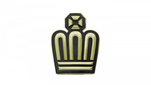
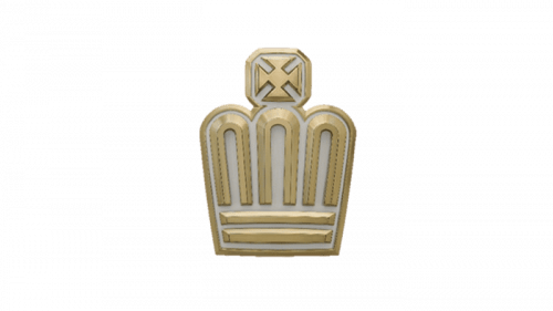
From the seventh generation and onwards, they’d take the crowns themselves and scrap the backgrounds. The shape pretty much stayed the same since the previous incarnation, but the coloring and texture changed. The designers added more volume and painted it gold with some black inlays.
1987 – 1991
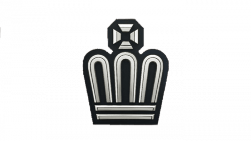
The eighth generation had the same emblem, but with silver main carcass and black inlays. Also, this one was given a thicker black outline.
1991 – 1995
The ninth generation was the same symbol, but a bit thinner and golden again.
1995 – 1999
With the tenth generation, they toned down on the saturation a bit, making the crown look somewhere midway gold and silver.
1999 – 2003
The eleventh generation was again just a golden carcass without much outline, but this time with insides styled as diamonds.
2003 – 2008
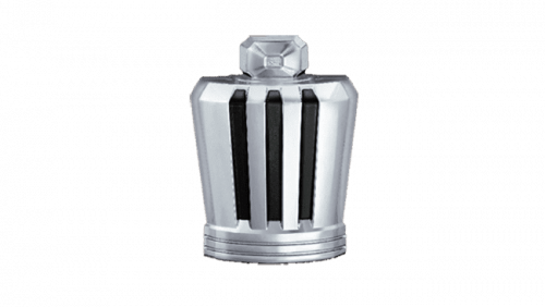
For the twelfth generation, they decided to discard the elegance they had before in favor of power. Basically, the crown was now visibly heavier and seemed like iron adorned with a gem on top. It also resembled a furnace, and this aesthetic was carried on into the further incarnations.
2008 – 2012
The mostly did the same thing for the thirteenth generation, but made the carcass lighter and thinner. The insides were now completely black, although the look of a heavy furnace stayed.
2012 – today
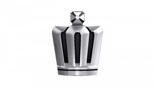
The fourteenth generation emblem was largely the 2003 logo, but lighter and more polished, like the 2008 variation. Also, they put the black inside it, like in the previous emblem.
2018 – today
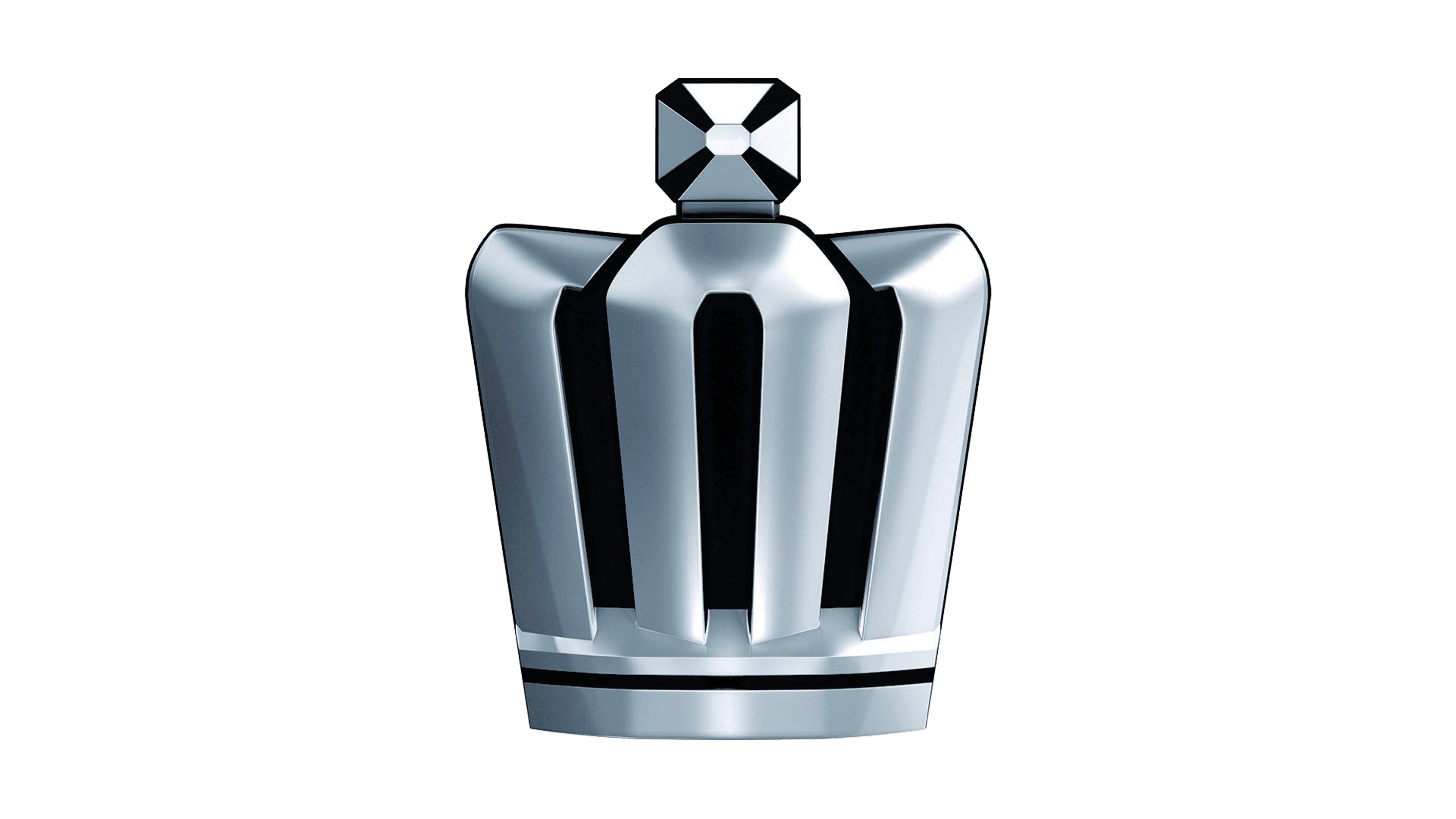
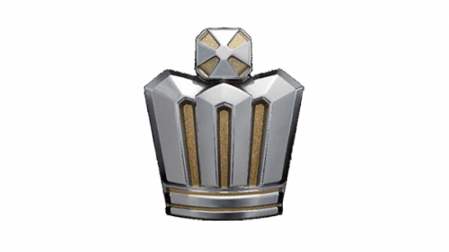
The fifteenth generation used a more aggressive and pointed crown design. It had tall shoulders, a silvery look and a square black background, most of the time. It’s rather simpler than most previous attempts.
Emblem and Symbol
Since 2003, the Crown series also used a real logo. These were mostly just badges, and while they are the usual means of identifying these cars, the lettering logo was the official logotype of these cars since the twelfth generation. These were plain, black, thin and tilted letters that made up the word ‘Crown’ together.
