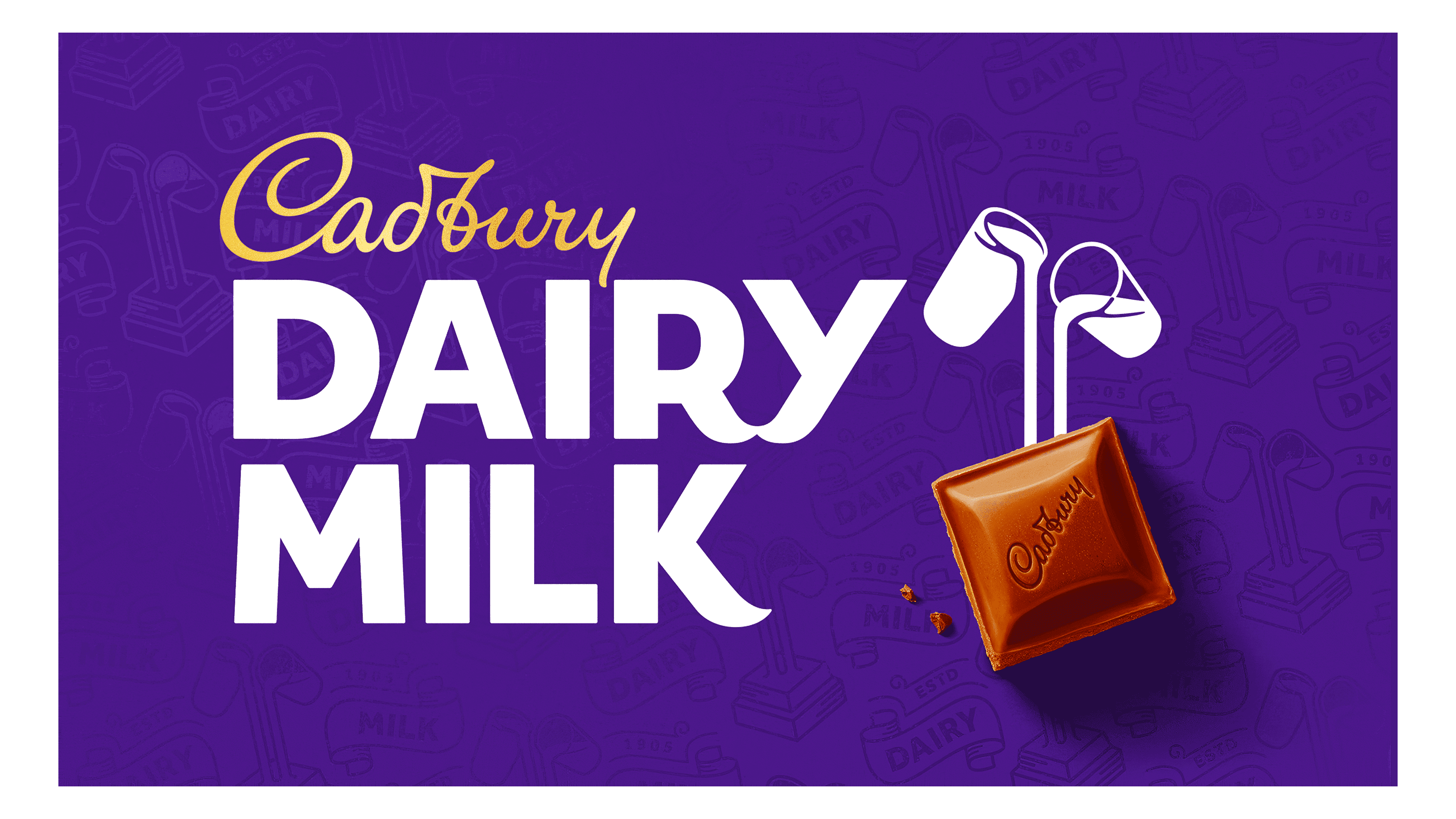
Cadbury Dairy Milk Logo
Cadbury Dairy Milk is a popular chocolate brand. Cadbury created it in England. The company aimed to produce a creamy, delicious chocolate bar. They designed it to be affordable and accessible. Cadbury Dairy Milk became a favorite among chocolate lovers worldwide. It contains a high percentage of milk, giving it a rich and smooth taste. The brand stands out due to its distinctive purple packaging. Cadbury Dairy Milk remains one of the most recognized chocolate brands globally. Its popularity spans generations, and it continues to delight chocolate enthusiasts everywhere.
Meaning and history
Cadbury Dairy Milk was first launched in 1905. The initial goal was to create a chocolate bar with more milk than any competitor. Cadbury Brothers, founded by John Cadbury, aimed to make high-quality chocolate accessible to the masses. In 1928, Cadbury Dairy Milk introduced Fruit & Nut, expanding their product line. By 1938, they launched the Whole Nut variety. The brand became the UK’s best-selling chocolate by 1920. In the 1970s, Cadbury Dairy Milk expanded globally, reaching new markets and gaining international acclaim. In 2010, Cadbury was acquired by Kraft Foods, now part of Mondelez International. Cadbury Dairy Milk continues to innovate with new flavors and variations, maintaining its position as a leading chocolate brand worldwide.
What is Cadbury Dairy Milk?
Cadbury Dairy Milk is a creamy milk chocolate bar. Cadbury created it to offer a rich chocolate experience. It has a high milk content, ensuring a smooth texture. The brand remains iconic and beloved globally.
1905 – 1915
The 1905 Cadbury Dairy Milk logo displays a vibrant and detailed design. Bold, red letters with a black shadow prominently showcase “Cadbury’s” at the top, creating a striking 3D effect. Below, a golden banner features the words “DAIRY MILK”, flanked by detailed floral motifs. A central graphic depicts a red and blue milk pail inscribed with “C.D.M.”, symbolizing the product. At the bottom, large red letters spell out “CHOCOLATE”, maintaining the 3D shadow effect. The entire design sits against a rich, purple background with a double-lined border, enhancing its vintage appeal. This early logo highlights the brand’s luxurious and artisanal qualities, making it stand out in its era.
1915 – 1923
The updated Cadbury Dairy Milk logo introduces significant changes while retaining its classic charm. The “CADBURY’S” text is now in gold and has a more elegant, refined font. The milk pail graphic in the center is modernized with cleaner lines and a darker purple color, enhancing its visibility. The “DAIRY MILK” text remains bold but is now white, offering a sharp contrast against the gold background banner. The floral motifs are simplified and dark purple, aligning with the pail’s color. The overall design is more streamlined and sophisticated, with fewer embellishments. This version exudes a sense of luxury and modernity while honoring its heritage. The rich purple and gold palette gives it a regal feel, ensuring it stands out. The changes reflect a move towards a more premium and contemporary brand image.
1923 – 1940
The 1923 Cadbury Dairy Milk logo brings several notable updates. The “CADBURY’S” text at the top is now in a more uniform, serif font, colored in a muted brown. The “DAIRY MILK” text on the wavy banners is now a deep purple, standing out against a golden background. The milk pail graphic in the center remains but is refined with sharper lines and a darker purple hue. Below the pail, “Regd. Trade Mark” is added in small, clear text, emphasizing authenticity. The floral motifs from the previous version are removed, resulting in a cleaner look. The “CHOCOLATE” text at the bottom is larger, in the same serif font as “CADBURY’S”, also in brown, ensuring consistency. The use of purple and gold continues to convey luxury, while the refined elements enhance brand recognition.
1940 – 1952
The 1940 Cadbury Dairy Milk logo introduces several refinements. The “CADBURY’S” text is now in a gold, serif font with diagonal lines, adding texture. The “DAIRY MILK” text on the wavy banners remains deep purple but with a modern, bold font outlined in black. The banners are golden, with a cleaner design and more pronounced curves. The milk pail graphic in the center retains its position but is simplified with clearer lines and a more detailed appearance. Below the pail, “REGD. TRADE MARK” is in a subtle, gold font, emphasizing authenticity. The “CHOCOLATE” text at the bottom is larger, matching the serif font style of “CADBURY’S”, and now also in gold with diagonal lines, ensuring consistency. The enhanced gold and purple elements convey luxury, while the refined design elements enhance brand recognition.
1952 – 1961
The 1952 Cadbury Dairy Milk logo introduces several updates while maintaining its classic elements. The “CADBURY’S” text is now in a more elegant, golden cursive script, giving a sophisticated touch. The “DAIRY MILK” text remains bold and purple but now sits on separate, subtly curved golden banners, enhancing its prominence. The milk pail graphic is removed, simplifying the design. Below “DAIRY MILK”, the word “CHOCOLATE” is added in a smaller, sans-serif golden font, balancing the overall composition. The background is now cleaner, focusing attention on the text elements. These changes result in a more modern and streamlined logo, reflecting a move towards minimalism. The luxurious gold and deep purple colors are retained, emphasizing the brand’s premium quality.
1961 – 1970
The 1961 Cadbury Dairy Milk logo introduces several notable changes. The “CADBURY’S” text is now in a golden, cursive script, giving a more modern and elegant touch. The “DAIRY MILK” text is bold and purple, placed on a solid, angular golden banner, simplifying the previous wavy design. The background is entirely white, focusing all attention on the text elements. The word “CHOCOLATE” is omitted, making the design more straightforward and iconic. These changes emphasize simplicity and modernity, aligning with contemporary design trends. The luxurious gold and deep purple colors are retained, reinforcing the brand’s premium quality.
1970 – 1980
The 1970 Cadbury Dairy Milk logo introduces several significant changes. The “CADBURY’S” text remains in cursive script but now features a richer, darker gold, adding depth. The “DAIRY MILK” text stays bold and purple but appears in a more refined serif font, enhancing readability. The golden banner is updated to a more angular, trapezoidal shape, providing a modern look. The overall color palette remains gold and purple, maintaining brand consistency. The minimalist design is retained, focusing on the essential elements. The background is still white, ensuring the text stands out.
1980 – 1991
The 1980 Cadbury Dairy Milk logo introduces several updates while retaining its classic appeal. The “CADBURY’S” text in cursive remains, but now it’s slightly bolder and more prominent. The “DAIRY MILK” text is still in purple but with a thicker, more pronounced serif font, outlined in gold. The golden banner has straightened, becoming a sleek horizontal bar above and below the text, adding a modern touch. The word “CHOCOLATE” is reintroduced, placed below “DAIRY MILK” in a refined, smaller golden serif font. The overall design is more structured and formal. The gold and purple color scheme is maintained, emphasizing luxury.
1991 – 1993
The 1991 Cadbury Dairy Milk logo introduces several updates. The “CADBURY’S” text remains in cursive but is now a lighter gold, appearing more refined. The “DAIRY MILK” text is in a dark purple serif font, thinner and more elegant than before. The gold horizontal bars above and below “DAIRY MILK” are retained but are now slimmer, providing a sleeker look. Below these bars, the phrase “Milk Chocolate” is added in a smaller, gold serif font, emphasizing the product type. The overall design is more minimalist and sophisticated.
1993 – 1999
The 1993 Cadbury Dairy Milk logo introduces several significant changes. The “CADBURY’S” text remains in a golden cursive script, but now includes an added illustration of two pouring glasses of milk in white with purple accents, positioned to the right of the text. The “DAIRY MILK” text is bold and purple, outlined in gold with a slight shadow effect, providing depth. The horizontal gold bars above and below “DAIRY MILK” are retained, but the top bar is slightly thicker. Below the lower bar, “Milk Chocolate” is in a smaller, more refined gold serif font, centered beneath the main text. The overall design incorporates more visual elements, adding complexity and richness. These changes enhance the logo’s visual appeal, making it more dynamic and engaging. The added milk illustration emphasizes the product’s creamy quality. The luxurious gold and deep purple colors are maintained, reinforcing the brand’s premium image.
1999 – 2003
The 1999 Cadbury Dairy Milk logo presents a vibrant and modern redesign. Designers placed the “CADBURY’S” text in golden cursive directly on a large chocolate square, emphasizing the product. Above the chocolate square, they positioned the illustration of two pouring glasses of milk, reinforcing the brand’s creamy quality. The bold, purple “DAIRY MILK” text, outlined in gold with a subtle shadow, now sits against a wavy white background strip running across the logo, adding a dynamic element to the design. The rich purple overall background enhances brand recognition. By omitting the phrase “Milk Chocolate”, the logo is simplified. These changes create a more visually engaging and contemporary look. The prominent chocolate square and milk illustration emphasize the product’s main ingredients. Retaining the luxurious gold and deep purple colors reinforces the brand’s premium image.
2003 – 2010
The 2003 Cadbury Dairy Milk logo introduces a vibrant and contemporary redesign. The “CADBURY” text remains in white cursive but is now enclosed in a bold, purple oval shape. This oval has a dynamic, flowing design that adds a sense of motion. The “DAIRY MILK” text is bold, purple, and outlined in yellow, set against a white, wavy banner that sweeps across the logo. The illustration of the chocolate square with pouring glasses of milk is retained but now appears more three-dimensional and detailed. This graphic is positioned on the right, seamlessly integrating with the flowing purple background. The overall background is richer and deeper purple, enhancing brand recognition. The phrase “Milk Chocolate” is omitted, simplifying the logo.
2010 – 2013
The 2010 Cadbury Dairy Milk logo introduces a sleek and modern redesign. The “CADBURY” text remains in golden cursive but is now smaller and positioned to the left, inside a swirling purple backdrop. This backdrop adds a dynamic, flowing element to the design. The “DAIRY MILK” text is bold, white, and slightly italicized, creating a sense of motion and energy. It is prominently placed in the center, curving upwards, enhancing its visibility. The illustration of two pouring glasses of milk remains but is more stylized and positioned above the “I” in “MILK”, integrating seamlessly with the text. The overall background is a rich, solid purple, enhancing brand recognition and visual impact. The phrase “Milk Chocolate” is omitted, simplifying the logo. The swirling purple backdrop and dynamic text emphasize movement and modernity. The luxurious gold and deep purple colors are retained, reinforcing the brand’s premium image.
2013 – 2021
The 2013 Cadbury Dairy Milk logo introduces several significant changes. The “CADBURY” text remains in golden cursive but is now slightly smaller and placed above the larger “Dairy Milk” text. The “Dairy Milk” text is bold, white, and uses a playful, rounded font, creating a friendly and approachable look. The letters are slightly tilted, adding a sense of fun and movement. The background is a solid, rich purple, enhancing brand recognition and visual impact. The phrase “Milk Chocolate” is omitted, simplifying the logo further. These changes result in a more modern, fresh, and dynamic look. The prominent, playful text and milk illustration emphasize the product’s creamy quality. The luxurious gold and deep purple colors are maintained, reinforcing the brand’s premium image. This version balances tradition with a fresh, energetic appearance, ensuring the logo remains iconic and easily recognizable.
2020 – Today
The 2020 Cadbury Dairy Milk logo showcases several significant updates. Designers positioned the “CADBURY” text in golden cursive above “DAIRY MILK”. The “DAIRY MILK” text, now bold and white, uses a modern, clean sans-serif font, creating a strong and contemporary presence. Capitalized letters enhance the visual impact. They placed the illustration of two pouring glasses of milk above a 3D chocolate square, emphasizing the product’s creamy quality. A rich, solid purple background features a subtle pattern of historical Cadbury elements, adding depth and brand heritage. By omitting the phrase “Milk Chocolate”, the design is simplified. These changes result in a more dynamic and visually engaging logo. The bold text and modern elements highlight the brand’s evolution and premium quality. Retaining the luxurious gold and deep purple colors reinforces Cadbury Dairy Milk’s iconic status.


