Car Badges With Stars
In the galaxy of automotive emblems, the star shines with a unique splendor, symbolizing far more than just a brand. It’s a beacon of aspiration, excellence, and innovation. This article ventures into the cosmos of automotive star emblems, unveiling the deep-seated meanings and stories that these celestial symbols hold within the automotive industry.
Stars have long been revered as guides and symbols of lofty ambitions. When these celestial bodies are etched into the logos of car brands, they acquire an added dimension of significance, often embodying the ideals of superior craftsmanship, cutting-edge technology, and visionary foresight. Mercedes-Benz’s emblem, the famous three-pointed star, encapsulates this perfectly. It represents not only the brand’s dominion over land, sea, and air but also its trailblazing journey in the automotive realm.
These stellar logos, varied in their artistic interpretation, converge on a singular narrative: a pursuit of excellence and an ever-reach for the extraordinary. This exploration delves into the heart of these celestial symbols, tracing their origins, deciphering their meanings, and illuminating how they reflect the soul of the brands they represent.
This journey through the universe of automotive star logos offers a glimpse into the creative use of symbolism in the industry. It showcases how a simple, universal shape like a star can be transformed into a powerful emblem of a brand’s legacy, aspirations, and the distinctive qualities that distinguish them in a competitive landscape.
Askam
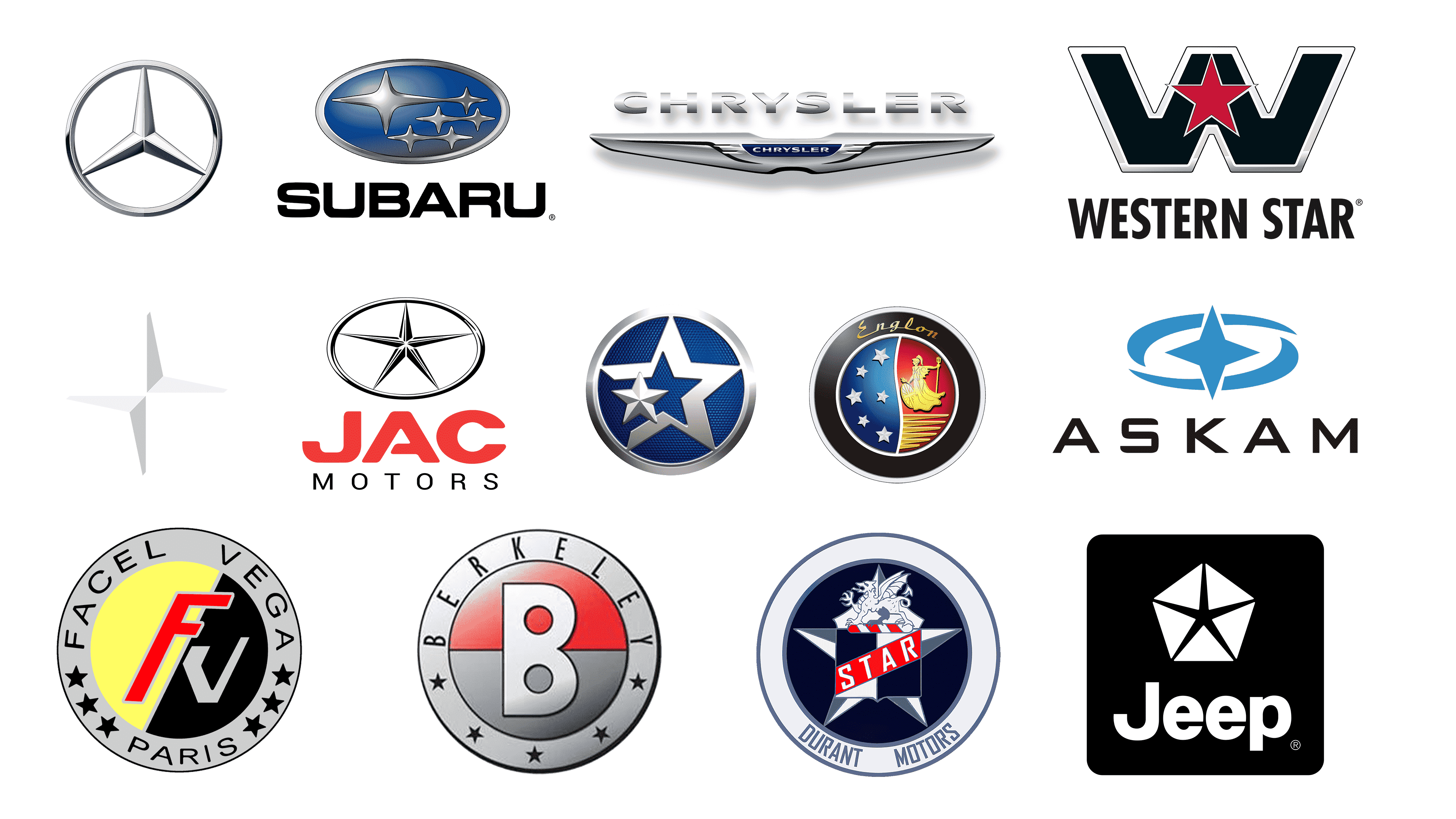
Formerly known as BMC Sanayi ve Ticaret A.Ş., Askam, a Turkish truck manufacturer, was known for producing commercial vehicles and trucks, playing a vital role in the Turkish automotive industry before ceasing operations in 2015. The brand’s logo features a stylized compass design with a sharp, four-pointed star central to the imagery, suggesting direction and precision. Surrounding the star is a pair of swooping blue arcs, creating a dynamic sense of movement and progression. The arcs are designed to resemble a spinning motion, conveying momentum and continuous advancement. Below the emblem, the brand name “ASKAM” is spelled out in bold, black capital letters, asserting a strong and confident presence. The font is modern, with clean lines that complement the logo’s overall contemporary aesthetic.
Benelli
Renowned for its rich history in motorcycle manufacturing, Benelli, established in 1911 in Italy, has evolved to produce a diverse range of bikes known for their distinctive design and spirited performance. The brand’s logo is a circular emblem framed by a metallic outline, encapsulating heritage and prestige. At its center stands a robust and detailed lion, an emblem of strength and pride, rendered in a poised stance. Encircling the majestic animal are two lush laurel wreaths, symbolizing victory and honor in classical tradition. Above the lion, the brand’s name “Benelli” is prominently displayed in bold, capitalized lettering, asserting the brand’s identity with clarity and confidence. Completing the emblem are three stars, possibly denoting excellence, quality, and the brand’s aspirations within its field. The entire design conveys a sense of timeless elegance and a strong Italian heritage.
Berkeley
Berkeley Cars Ltd, an active British car manufacturer from 1956 to 1960, gained fame for producing small, sporty, front-wheel drive cars with innovative fiberglass bodies, establishing a unique niche in the automotive history of the United Kingdom. The brand’s logo presents a bold and modern design featuring the letter ‘B’ as its central motif, set against a dual-tone background that splits the circle into halves—top in a gradient of red and bottom in metallic grey. The ‘B’ itself is stylized with a clean and contemporary font, segmented by a white vertical line, and including a smaller circular cut-out. Encircling the ‘B’ is the brand name “BERKELEY” in a sans-serif, capitalized typeface, suggesting a sense of inclusivity and completeness. The perimeter of the circle is adorned with five-pointed stars, adding a sense of achievement or high quality associated with the brand. The entire emblem is encapsulated by a fine, metallic outline that gives it a sleek, finished look.
Chrysler
Chrysler, an American automotive brand and part of Stellantis, has been a major figure in the automobile industry since its founding in 1925, known for its innovative engineering and iconic models that have shaped American car culture. The Chrysler logo displays a singular, prominent white five-pointed star centered within a blue pentagon, symbolizing precision and excellence. The sharp angles of the star contrast with the smooth lines of the pentagon, embodying a blend of innovation and tradition. Below this graphic, the brand name “CHRYSLER” is presented in bold, black uppercase letters, conveying solidity and strength. This minimalist yet powerful design captures the essence of the Chrysler brand, which is known for its blend of refined style and engineering prowess.
Durant Motors
Founded in 1921 by William “Billy” Durant, the former head of General Motors, Durant Motors aimed to compete with Ford and GM by offering a range of vehicles under various brand names, and while short-lived, it left a significant mark in the early American automotive industry. The brand’s logo is a vintage emblem featuring a navy blue and white color scheme. Centered within is a silver heraldic creature, resembling a mythical griffin, symbolizing strength and vigilance, perched atop a bold white star. Across the star spans a red banner with the word “STAR” in white capital letters, adding a vibrant contrast and drawing attention to the emblem’s core. Encircling this central design is a navy blue ring with the inscription “DURANT MOTORS” in white uppercase lettering, set against a grey outer band to complete the circular badge. The entire logo evokes a sense of grandeur and tradition, reflective of the brand’s historical significance in the automotive industry.
Englon
Launched in 2010 by the Chinese automobile giant Geely, Englon emerged as a successor to the Shanghai Maple brand, blending contemporary design with classic British automotive influences. Its emblem is a unique juxtaposition of Western and Eastern styles. On its left, set against a navy background, are five stars forming an arc, representing ambition and excellence. The right side shows a golden figure, reminiscent of a mythological deity or an esteemed person, holding a trident, set against a bold red and yellow-striped backdrop, symbolizing dynamism and advancement. A seamless line merges these contrasting halves, illustrating the amalgamation of diverse cultural elements. Above this symbol, “Englon” is elegantly inscribed in a golden, flowing script, adding a touch of sophistication. The logo is encased in a metallic grey border, enhancing its modern appeal.
Facel Vega
Operating from 1954 to 1964, Facel Vega, a French luxury car manufacturer, became emblematic of post-war opulence through its fusion of high-performance and artisanal quality. The brand’s emblem is a study in contrasts, featuring a ‘FV’ monogram at its heart – ‘F’ in a lively red and ‘V’ in polished silver, depicting a marriage of energy and luxury. This monogram sits against a gold and black backdrop for striking visual appeal, while a light grey ring encircles it, bearing the brand name and “PARIS,” highlighted with stars, alluding to its French origins and excellence. A dark grey border frames the logo, giving it a distinguished and modern edge.
JAC
Since its inception in 1964, JAC Motors, also known as Anhui Jianghuai Automobile Co., Ltd., a Chinese state-owned automotive firm, has been recognized for its affordable, reliable vehicles. The brand’s logo once featured a refined five-pointed star in a sleek oval frame, symbolizing elegance and precision, embodying JAC’s dedication to top-notch automotive engineering. The star’s grey hue added a modern, sophisticated touch, while the brand name, in a striking red, conveyed passion and energy. This combination of grey elegance and red vibrancy made the logo visually compelling and emblematic of JAC’s innovation, quality, and stylistic ethos, blending contemporary design with timeless grace.
Jeep
Jeep, a division of Stellantis and an iconic American brand, has been associated with adventure and resilience since its 1943 debut, originally serving military needs. Its logo features a stylized star within an pentagon, reminiscent of a badge, reflecting endurance and dependability. The brand name, in a sturdy, sans-serif typeface below the emblem, underscores robustness and consistency. Rendered in a classic black and white palette, the logo exudes a timeless, straightforward elegance, making it instantly recognizable and representative of Jeep’s legacy of ruggedness and freedom.
Mercedes Benz
Renowned globally, Mercedes-Benz, a subsidiary of Germany’s Daimler AG, has been a luminary in producing luxury vehicles, buses, and trucks since 1926. Its emblem, a three-pointed star within a circle, epitomizes sophistication and modernity. This star represents mastery in land, sea, and air travel, reflecting the brand’s roots and engineering prowess. The encompassing circle signifies wholeness and universal appeal. Below the emblem, the brand’s name is elegantly displayed in a classic, serif font, radiating opulence and heritage. This blend of the iconic star and distinguished typography embodies the brand’s ethos of premium quality, meticulous craftsmanship, and enduring grace.
Polestar
Originating as a high-performance division of Volvo Cars, Polestar, since 2017, has distinguished itself as a standalone Swedish brand, focusing on advanced electric vehicles with a commitment to sustainability and innovative design. Its logo, a two-dimensional, asymmetrically arranged star with four extended points, represents movement and forward momentum. Rendered in shades from light to mid-gray, the star adds a layer of sophistication to the emblem. The logo’s simplicity, free from extra embellishments, underscores Polestar’s dedication to simplicity, efficiency, and design innovation.
Pontiac
Operating under General Motors from 1926 until 2010, Pontiac carved a niche in American automotive history with its dynamic character and performance-focused vehicles. Its logo, a downward-pointing arrow, symbolizes momentum and resilience. Encased within this arrow is a contrasting silver border around a textured red field, centered with a white star, emblematic of quality and excellence. The brand’s name, in bold, uppercase, sans-serif font below the logo, blends traditional and modern stylistic elements. This design reflects Pontiac’s bold, ambitious spirit, befitting its storied place in the automotive realm.
Subaru
Since 1953, Subaru, a branch of Japan’s Subaru Corporation, has built a loyal international following, known for its boxer engines and symmetrical all-wheel drive. Its logo, a constellation of silver stars of varying sizes within an oval and set against a blue gradient backdrop, evokes space and dimension. The largest star, central and at the top, with others radiating beneath, represents unity and ambition. The oval frame signifies inclusivity and global presence. Beneath this, the brand name stands out in bold, all-capital, black letters, with a modern sans-serif font, reflecting reliability. The emblem is inspired by the Pleiades cluster in the Taurus constellation, symbolizing the company’s unity and goals.
Venucia
Established in 2010, Venucia, born from a partnership between China’s Dongfeng Motor Co., Ltd. and Japan’s Nissan, focuses on producing quality, affordable vehicles for the Chinese market. The logo features an innovative double-star motif, with a smaller star overlaid on a larger one, creating a dynamic, multi-dimensional effect. Set against a textured blue background within a silver oval, the design conveys innovation and scope. The dual stars represent a beacon of progress, embodying the brand’s pioneering spirit and ambition to lead in its sector.
Western Star
A subsidiary of Daimler Trucks North America since 1967, Western Star Trucks specializes in custom heavy-duty trucks, known for their ruggedness and dependability. The brand’s logo features a striking black ‘W’, outlined in white, commanding attention. Centered within this ‘W’ is a red star with a white outline, offering a vivid contrast. This star symbolizes quality and excellence, complementing the assertive ‘W’ to portray a strong, established brand identity. Below, the brand name is displayed in a modern, all-caps, black sans-serif font, enhancing the logo’s professional and contemporary aesthetic. This combination reflects the robust and trustworthy nature synonymous with Western Star’s reputation.


