Chrysler Logo
As one of the illustrious “Big Three” car manufacturers, Chrysler boasts a legacy of crafting a diverse array of vehicles, including iconic models like the Chrysler 300 and the esteemed Jeep brand. Throughout its journey, the company encountered financial hurdles and underwent changes in ownership, yet it continues to maintain a prominent position within the automotive industry, standing strong as an integral part of the Stellantis family.
Meaning and History
![]()
The company traces its roots back to 1924 when engineer and businessman Walter Percy Chrysler founded it following the merger of two companies, Maxwell Motor and Willis Overland. In the same year, their inaugural Chrysler car graced the market. In 2014, the company became a part of the car manufacturer Fiat Chrysler Automobiles, headquartered in the Netherlands. Over the years, Chrysler’s logo has undergone multiple transformations, reflecting the brand’s evolution and distinct identity.
What is Chrysler?
Chrysler is an automotive brand with nearly 100 years of history. It’s associated with extra luxury cars of high quality. Since 2014, the brand has been operating alongside Fiat and other brands in a huge business group called Stellantis.
1924 – 1928
![]()
The initial logo featured a golden wax seal bearing the inscription “Chrysler” across a diagonal stripe. The seal was adorned with two blue ribbons in the lower right corner, accentuating the brand’s exceptional nature. The intricate design showcased a red patterned center with zigzag lines gracefully extending above and below the name.
1928 – 1930
![]()
This version retained the wax seal image, now incorporating a state-fair-like ribbon and two wings. The large letters “CHRYSLER” dominated the seal, rendered in a dignified silver color.
1930 – 1936
![]()
In 1930, the wings were removed, and the seal transitioned to a luxurious golden hue with a dark-red heart. These colors were chosen to accentuate the brand’s opulence and high-quality offerings.
1936 – 1950
![]()
A decade later, wings were reintroduced to the emblem, this time widely spread on both sides. The chrome-like appearance of these elements added grandeur, although some observers noted their resemblance to car parts.
1950 – 1951
![]()
For a brief period, the company experimented with a different logo featuring a golden shield with a lion standing upright and facing left, accompanied by various crest-like objects. However, this attempt was short-lived, as the brand preferred to maintain its unique identity.
1951 – 1955
![]()
Returning to the winged emblem, the logo now depicted a three-dimensional bird soaring determinedly, symbolizing the brand’s perpetual progress and development. The metallic silver color added an air of elegance.
1955 – 1962
![]()
A new logo emerged resembling two boomerangs rushing to the right, signifying the rocket’s movement.
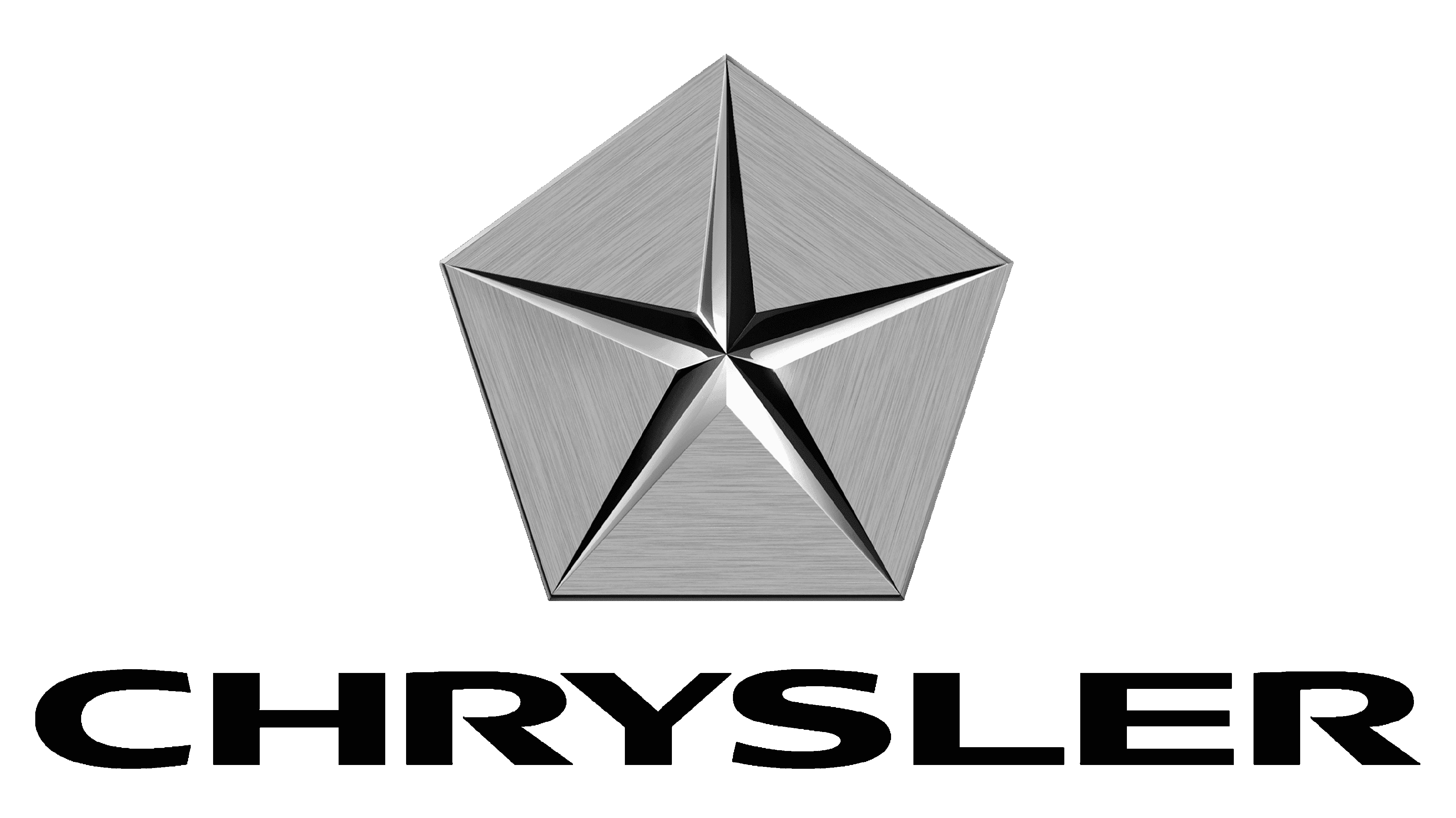
1962 – 1980
![]()
The symbol evolved into a five-pointed star positioned over a hexagon, becoming a legendary logo used in various iterations over four decades.
1980 – 1990
![]()
In 1980, a futuristic logo featured the brand name in a custom font with smooth strokes and wide spacing, exuding strength and confidence. Slits in some letters lent the inscription a distinctive and original touch.
1990 – 1993
![]()
A combination of the name and the winged seal from 1936 formed a stylish and sleek emblem, with bolder letters and sharper wings.
1993 – 1995
![]()
In 1993, the company paid homage to its founders by resurrecting the original wax seal image with a state-fair-like ribbon. The colors remained mostly the same, with the ribbon adopting a blue tone.
1995 – 1998
![]()
The next logo retained the golden seal from the previous version but with a more pronounced golden color, creating a medal-like appearance.
1998 – 2000
![]()
The emblem combined elements from 1936 and 1962, featuring an oval seal and refined elongated wings.
2000 – 2008
![]()
Utilizing elements from previous logos, the designers crafted a new emblem with a metallic silver three-dimensional star alongside the brand name in the 1990 font.
2008 – 2009
![]()
The star emblem took center stage, appearing more refined and cut out within the base. The inscription remained unchanged.
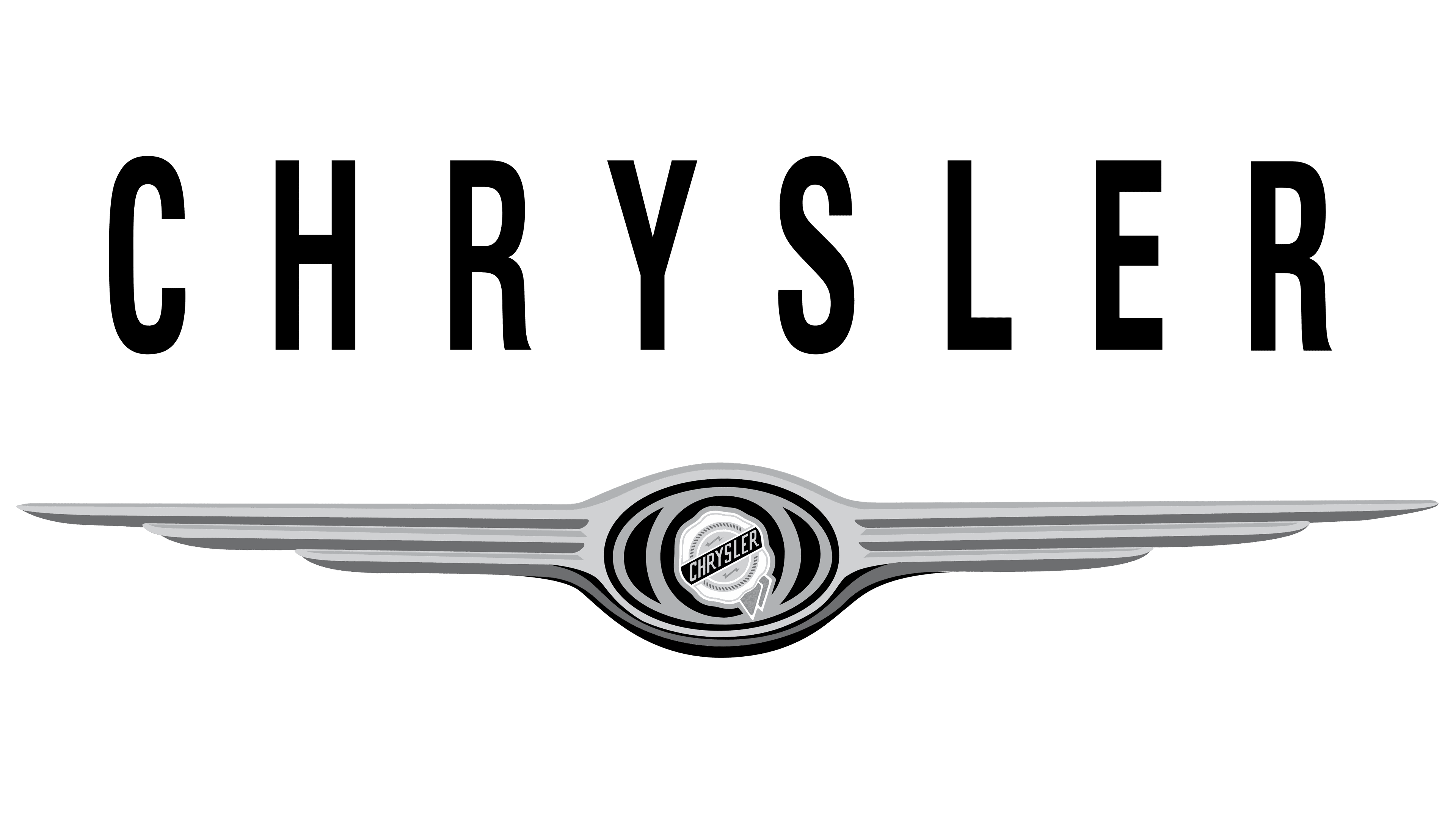
2009 – 2023
![]()
This version improved upon the 1990 emblem, featuring a blue line with the brand name. The wings adopted smoother and fuller lines for a more balanced and sophisticated look.
2023 – today
![]()
The latest logo, minimalistic and modern, retains the 1990 emblem with ultra-thin strokes for the font and the winged element. The redesigned logo exudes sleekness and sharpness, reflecting the brand’s contemporary outlook.
Font
The Chrysler logo boasts a bold and steady appearance, reflecting strength and professionalism with its uppercase lettering. The custom typeface used for the inscription is reminiscent of fonts like Joyride Wide and Vast XXXLBold, lending a distinctive and striking touch to the design.
Color
The logo’s colors, steel gray and blue, carry profound symbolism. The brilliant steel shade signifies an escape from the mundane into the realm of imagination and boundless possibilities. On the other hand, the blue hue serves as a captivating accent at the heart of the logo, symbolizing hope and determined aspirations toward dreams that transcend the constraints of everyday reality.


