Car Brands That Start With R
In the vibrant realm of automobile manufacturing, logos transcend their role as mere symbols of brand identity, becoming instead the very essence of the companies they represent. Among the myriad of logos in the automotive world, those starting with the letter “R” present a unique blend of heritage, creativity, and technological prowess. This journey into the world of automotive emblems takes us on a captivating exploration of brands whose names commence with ‘R’, revealing stories steeped in tradition, modernity, and evolutionary design.
Spanning a vast spectrum, these ‘R’ logos range from the classic elegance of Rolls Royce to the rugged dependability of Ram Trucks, embodying the core of diverse automotive brands. From Renault’s historic roots in innovative design to the pioneering strides of Rimac Automobili in the electric hypercar sector, each logo serves as a window to the brand’s soul, mirroring its history, design ethos, and targeted audience.
Take, for instance, Radical Sportscars, whose emblem encapsulates the thrill of speed and agility, symbolic of high-performance racing. In contrast, Roewe merges classical luxury with contemporary dynamics, while Rover’s timeless grace, embedded in Britain’s automotive narrative, sharply contrasts with RAESR’s futuristic vision in electric vehicle technology.
This article delves into the captivating backstories of these logos, exploring their evolution and the values and aspirations they represent in the world of automakers. Whether it’s the strategic use of color, the choice of typography, or the power of visual imagery, each ‘R’ category logo in the automobile industry is a testament to the art of branding and the diverse journeys of automotive innovation.
Embark with us on this intriguing exploration of ‘R’ automotive logos, where each emblem is not just a mark of identity but a story of innovation, heritage, and vision, painting a vivid picture of the automotive landscape.
Radical Sportscars
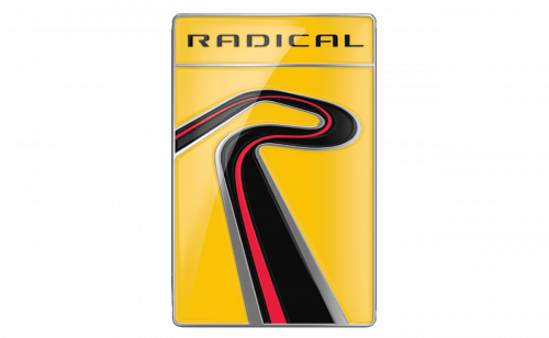
Established in 1997 in the UK, Radical Sportscars has made a significant mark with its range of racing and track-day cars, including the renowned Radical SR3. The brand logo is an artistic combination of symbolism and style. It features smooth ribbon graphics that resemble the letter “R”. The ribbon’s gradient of black, red, and gray imparts a dynamic, three-dimensional appearance, adding depth and a sense of motion. The combination of black and red symbolizes both passion and precision, while gray introduces a layer of sophistication and high-performance allure. Set against a vivid yellow backdrop, the logo is striking and distinctive, ensuring standout visibility. Its modern and energetic design effectively communicates the spirit of high-performance and automotive excellence, reflecting Radical Sportscars’ commitment to cutting-edge technology and innovative design.
RAESR (Rice Advanced Engineering Systems and Research)
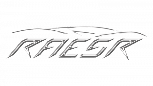
Originating from the innovation hub of Southern California, RAESR is dedicated to creating high-performance electric vehicles, notably the Tachyon Speed, an electric hypercar designed for optimal aerodynamics and speed. The logo features the word “RAESR ” in a bold, sans-serif typeface. The letters are thoughtfully spaced, projecting a sense of modernity and robustness. The creative design of the letters, partially executed without horizontal lines, adds a unique, artistic twist to the logo. Above this lettering, four strokes complement the lettering, creating a minimalist outline of the car’s silhouette. The logo’s color scheme is both simple and vibrant, in line with RAESR’s focus on pioneering design and advanced engineering in the high-performance electric vehicle sector.
RAF
RAF, an acronym for Russian Automobile Factory, was a prominent automobile manufacturer in Russia, chiefly recognized for its RAF-977 minibus, a common sight across the Soviet Union. The company’s logo is a striking monochromatic design, featuring the stylized letters “RAF” merged into a vehicle’s silhouette. The logo’s color scheme is simple yet effective, with bold, black letters set against a stark white background. Each letter is bold and capitalized, with sharp edges and angles that convey a sense of modernity and precision. The “R” and “F” at either end of the logo are particularly pronounced, creating a balanced and symmetrical look that is instantly memorable. In a clever fusion of form and function, the “RAF” letters are intertwined to represent the body of a vehicle, with the intervening negative space cleverly forming the windows and doors. This artistic blend of text and image embodies a brand identity that seamlessly marries automotive design with innovation and elegance. Simplicity is key in the logo’s wheel design, represented by unembellished circles at the base of the letters, adding to the logo’s abstract and stylized allure. The design’s minimalism, free from extraneous decorative elements, ensures its clean, recognizable appearance, epitomizing the RAF brand’s commitment to efficient and innovative vehicle design.
Railton
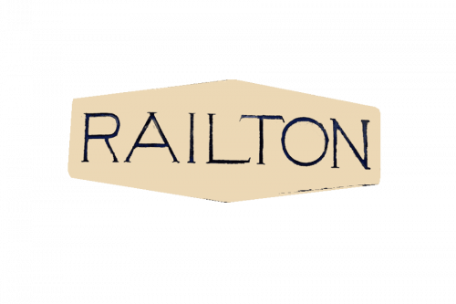
Railton, established in 1933 by Noel Macklin, quickly rose to prominence as a British car manufacturer renowned for its high-performance sports cars, uniquely built on Hudson chassis during the 1930s. The Railton logo, designed with an understated yet elegant flair, embodies the brand’s straightforward and dependable nature. It features a simple rectangular design, prominently displaying the “RAILTON” name in capital letters. The font, devoid of any unnecessary embellishments, reinforces the brand’s commitment to simplicity and reliability.
The background of the logo is a subtle light beige, contrasting sharply with the dark letters, which could be navy blue or black. This contrast not only ensures the logo is easily legible but also adds an element of sophistication to its overall design. This design aspect subtly nods to Railton’s heritage and its focus on quality and performance. Overall, the Railton logo is a reflection of the brand’s no-frills approach to automotive excellence, resonating with its dedication to building cars that are both high-performing and reliable.
Rainier
The Rainier Motor Car Company, flourishing in the early 20th century in the United States, was renowned for its manufacture of luxury automobiles, distinguished by their superior quality and innovation. The logo of Rainier showcases a stylized, cursive script spelling out “Rainier.” The font is characterized by its fluidity and dynamism, with strokes varying in thickness, imparting a sense of movement and vigor. The letters are rendered in black, featuring a subtle sheen indicative of a polished or glossy finish. The initial “R” is notably capitalized and larger, drawing focus and establishing a central point in the design. The tail of the “R” gracefully extends under the remaining letters, enhancing the logo’s cohesive appearance and reinforcing the luxurious essence of the Rainier brand.
Ralliart
Ralliart, the high-performance and motorsports division of Mitsubishi Motors, was actively involved in rally racing and the development of performance-enhanced Mitsubishi vehicles. The Ralliart logo displays the word “RALLIART” in a bold, sans-serif typeface, capitalized throughout. The letters are primarily black, interspersed with vertical stripes that transition from red to orange to yellow at the center, symbolizing speed and dynamism – traits emblematic of the automotive performance sector. This design mirrors Ralliart’s commitment to innovation and excellence in the realm of high-performance vehicles.
Ram
Established in 2010 as a division of Chrysler, Ram Trucks specializes in producing a range of robust and sought-after pickup trucks, formerly part of the Dodge lineup. The logo of Ram features a metallic silver depiction of a ram’s head, set within a shield-shaped emblem, positioned above the word “RAM” in capital letters. The ram’s head is intricately stylized with geometric facets, signifying strength and durability. The chrome element in the logo conveys a contemporary and high-quality feel, resonating with the Ram brand’s ethos of reliability and excellence in truck manufacturing.
Rambler
The Rambler automobile brand, a significant name in automotive history, originated with the Thomas B. Jeffery Company in 1900 and later became an important part of the American Motors Corporation lineup. The Rambler logo is marked by a distinctive, stylized “R” encased within an oval frame. This “R” is crafted with modern aesthetics, featuring intersecting lines and a prominent cross, symbolizing either precision or a sense of connectivity. The entire logo is presented in a striking shade of red, a color often associated with energy, passion, and a meticulous attention to detail. This color choice not only makes the logo stand out but also reflects the brand’s dynamic and innovative spirit.
Rapier
Rapier Cars, a British automaker in the early 20th century, was celebrated for its production of high-quality, luxury sports cars, notable for their unique engineering and design. The Rapier logo is an embodiment of elegance and strength, showcasing a metallic shield with a central stylized “R,” complemented by wing-like figures on either side. These wings, reminiscent of stylized feathers, imply lightness and speed, juxtaposing beautifully against the shield that symbolizes strength and protection. The metallic finish of the logo adds a layer of premium quality, resonating with the brand’s commitment to luxury and excellence in automotive design.
Razor
Founded in 2000 in California, Razor USA LLC made a name for itself by revolutionizing the scooter market with its iconic Razor kick scooter, later branching into electric scooters and ride-ons. The brand’s logo features a distinctive emblem resembling a circular saw blade, conveying motion and precision. This element is rendered in a vibrant red, imbued with sharp, jagged edges that mimic the teeth of a saw, suggesting both cutting-edge technology and the excitement of movement. The word “Razor” follows, written in a bold, black, sans-serif font that adds a modern and powerful aesthetic to the brand’s visual identity. This typographic choice further emphasizes the company’s focus on sleek, efficient design. The registered trademark symbol situated at the end signifies the brand’s established and protected status in the market.
RCH
RCH SpA, an Italian company, excels in offering technological solutions and systems tailored for the retail and public transportation sectors, including advanced point-of-sale systems and ticketing solutions. The logo of Replicar Hellas, a facet of RCH’s branding, is marked by a classic shield emblem, bathed in a deep, rich burgundy color with an elegant golden outline. This color scheme evokes a sense of luxury and traditional elegance. At the heart of the shield, the initials “RCH” are intricately intertwined in a sophisticated, serif typeface, symbolizing classic refinement. The logo is further enhanced by vertical gold bands that bisect the shield, adding layers of depth and dimension. This design choice highlights the brand’s meticulous attention to detail and its commitment to craftsmanship, reflecting the sophisticated and high-quality nature of RCH’s technological offerings.
Reliant
Founded in 1935 in England, Reliant made a name for itself, particularly with the Reliant Robin, a distinct three-wheeled vehicle known for its unique design and cost-effective operation, along with a series of sports cars. The logo of Reliant is a bold declaration of its identity, featuring a capitalized rendition of the brand name positioned above an image of a castle turret, all encased within an inverted triangle. The logo employs a monochromatic palette of black and silver, creating an aura of solidity and dependability. The inclusion of castle imagery in the logo is a nod to heritage and strength, aligning seamlessly with the brand’s name and ethos, suggesting that Reliant vehicles are both enduring and trustworthy.
Rezvani Motors
Rezvani Motors, founded in 2014 in California, has rapidly made its mark in the high-performance sports car sector with eye-catching models like the Beast and Tank. Their logo captures the brand’s core with a dynamic red eagle in mid-flight, symbolizing strength, passion, and a commitment to superior automotive performance. The eagle’s design, with its gracefully swept-back wings, suggests speed and agility, and the grille-like feature at its center nods to the brand’s engineering prowess. The “REZVANI” name appears below in a modern, sans-serif font, enhancing the logo’s sleek and contemporary feel, and perfectly embodying Rezvani’s dedication to innovation in automotive design.
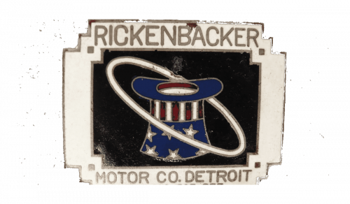
Rickenbacker Motor Company
Rickenbacker Motor Company, operational from 1922 to 1927 in America, is remembered for groundbreaking technological contributions like introducing four-wheel brakes in production cars. Their logo, steeped in the historical Art Deco style, features a top hat and a circle of stars within an orbit, signifying innovation and a forward-thinking approach, possibly reflecting its early aviation connections. The “RICKENBACKER MOTOR CO. DETROIT” inscription in a classic serif font underscores the company’s historical significance and pioneering role in the auto industry’s infancy.
Riley
Riley, a distinguished British automaker and bicycle manufacturer since the late 19th century, merged with British Leyland Motor Corporation, known for luxury and sporty vehicles. The Riley logo, set against a deep blue diamond-shaped backdrop, features the brand name in an elegant cursive script. This design choice imparts an artisanal, refined character, indicative of elegance and sophistication. The deep blue background conveys reliability and trust, aligning with Riley’s reputation. The diamond shape emphasizes the brand’s focus on stability and high-quality engineering, a nod to its legacy of esteemed, well-crafted vehicles.
Rimac Automobili
Rimac Automobili, a trailblazer in electric vehicle technology, was founded in Croatia in 2009 and has rapidly ascended to prominence for producing some of the fastest and most sophisticated electric hypercars worldwide. The logo of Rimac Automobili is distinctively encased within a shield, highlighting a prominently stylized “R” at its center. This design element, characterized by a unique font with partially absent lines on the left side of the letters, imparts a contemporary and minimalist flair. The logo’s clean lines and straightforward color palette are a reflection of the company’s unwavering commitment to innovation and the pursuit of excellence in high-performance electric vehicles. Rimac Automobili, through its logo, establishes itself as a leader in the electric automotive field, embracing modern design while pioneering new technological frontiers.
Rinspeed
Rinspeed, since its inception in 1979 in Switzerland, has made a name for itself as a hub of creativity and futuristic concepts in the automotive industry. Known for its innovative and unconventional vehicle designs, Rinspeed’s logo is a sleek embodiment of the brand’s progressive mindset. It features the company name in bold, uppercase letters, adorned with a 3D chrome effect, signifying the brand’s fusion of luxury and future-oriented technology. The metallic and contemporary aesthetic of the logo aligns seamlessly with Rinspeed’s philosophy of developing cutting-edge, avant-garde vehicles. This logo not only mirrors the company’s commitment to innovation but also positions Rinspeed at the forefront of automotive design and technological advancement.
Renault Samsung
Renault Samsung Motors, a subsidiary of the French automaker Renault and based in Busan, South Korea, specializes in producing a diverse range of automobiles, including electric vehicles. The logo of Renault Samsung is a model of sleek and contemporary design, featuring a stylized circular band. The use of black and silver gradients in the logo imparts a modern, high-tech aesthetic. Its design is characterized by simplicity and fluidity, embodying a sense of forward-thinking innovation and elegance. This emblematic logo perfectly encapsulates Renault Samsung’s commitment to advanced automotive technology and design, resonating with the brand’s focus on producing sophisticated and state-of-the-art vehicles.
Renault Trucks
As a part of the Volvo Group since 2001, Renault Trucks has been a significant player in designing, manufacturing, and marketing a diverse array of commercial vehicles, including those used for freight, delivery, and construction purposes. The logo of Renault Trucks is characterized by a striking red rectangle that serves as a background, accentuating the brand name “RENAULT TRUCKS” displayed in a bold, black, sans-serif font. Central to this logo is a silver diamond-shaped emblem that pops out with a three-dimensional effect, embodying the essence of robustness and durability. These attributes are crucial for a truck manufacturer, as they reassure customers of the vehicles’ reliability and endurance in challenging environments.
Renault
In the realm of global automobile manufacturing, the French multinational known as Renault stands as a historic figure. Established in 1899, its diverse portfolio spans from cars and vans to a historical array of trucks, tractors, and tanks. Its brand logo, a striking modern geometric design of interlocking diamond shapes, embodies dynamism and contemporary flair. The logo’s black coloration imparts a sense of elegance and power, reflecting the brand’s commitment to innovation and quality in vehicle manufacturing.
Reva
Emerging from Bangalore, India, the Reva Electric Car Company marked its presence as an early trailblazer in electric vehicle production. The Reva G-Wiz, one of the world’s first mass-market electric cars, is a testament to this pioneering spirit. The Reva brand logo, with its simple yet bold design, features the name “REVA” in a bright orange, rounded, sans-serif typeface. This design encapsulates the brand’s focus on innovation and its vision for accessible, forward-looking electric transportation.
Revere
In the bespoke automotive modification sector, Revere London distinguishes itself with a custom-tailored approach to luxury vehicles. From personalized interiors to enhanced performance and distinctive exterior designs, Revere’s craftsmanship is unparalleled. The brand’s logo, a shield motif with a central “R,” stars, and an arching “REVERE” banner, uses a monochromatic silver and white palette to exude classic elegance and premium quality. This reflects their dedication to tradition, excellence, and meticulous attention to detail.
Rivian
Rivian, established in 2009, has quickly ascended as a front-runner in the American electric vehicle industry, especially with its electric trucks and SUVs designed for adventure. The brand’s logo, featuring a diamond-shaped emblem. Its black lines against a white background create a modern, minimalistic aesthetic, symbolizing Rivian’s commitment to innovation and producing environmentally friendly, adventure-ready vehicles.
Roamer
Active between 1916 and 1929, Roamer, an American automobile manufacturer, was celebrated for luxurious vehicles that melded stylish design with robust performance. The Roamer logo, with its cursive, script-like font, speaks to classical elegance and the era’s emphasis on craftsmanship. This design captures Roamer’s commitment to high-quality, enduring luxury vehicles.
Robur
Originating from Germany, Robur built a reputation for its robust and reliable trucks and buses, especially in Eastern Europe from 1957 to the early 1990s. The Robur logo’s simplicity, featuring the brand name in a bold, sans-serif font alongside a diamond-shaped graphic, reflects its focus on industrial strength and functionality. This design perfectly encapsulates the brand’s dedication to producing durable and efficient vehicles.
Rocar
Originating in Romania, Rocar was a key player in the manufacturing of buses and trucks, contributing significantly to the country’s automotive industry in the second half of the 20th century. The Rocar logo features an abstract, kite-like figure centered around an ‘RC’ monogram. This simple but striking design, with its sharp angles, suggests motion and innovation. The monochromatic color scheme enhances the logo’s modernity and versatility, representing Rocar’s substantial impact on the Romanian automotive sector.
Rochdale
Rochdale Motor Panels and Engineering, operational in the UK from 1948 to 1973, specialized in manufacturing fiberglass car bodies and kits, especially for sports cars. The Rochdale Olympic logo is a testament to simplicity and elegance, featuring a curved band that elegantly surrounds the capitalized “Rochdale Olympic” brand name. Its unadorned design exudes a timeless, classic quality, reflecting the brand’s historical significance in British car manufacturing.
Rochet-Schneider
Established in France in 1894, Rochet-Schneider emerged as a prominent name in the manufacturing of luxury automobiles and commercial vehicles, distinguished by their high quality and innovative design. The logo of Rochet-Schneider is a tasteful representation of its legacy, featuring an elegant monogram that intertwines the letters “R” and “S” within a rectangular frame. The traditional style of the monogram resonates with the company’s historical roots in the early days of the French automotive industry. It symbolizes a tradition of craftsmanship and luxury, a testament to the brand’s longstanding reputation for producing vehicles of exceptional quality and design.
Roewe
Roewe, a prominent Chinese automotive brand under the umbrella of SAIC Motor, was established in 2006 and has since made a name for itself in producing a diverse range of passenger vehicles, including innovative electric models. The Roewe logo features a striking shield-shaped emblem with a striking two-color background divided into four sections into red and black. This shield is elegantly embellished with a golden lion brandishing a sword, an emblematic representation of regal strength and prowess. Overlaying this majestic lion is a stylized letter ‘R’ that seamlessly intertwines with the lion and its sword, symbolizing a harmonious blend of strength and elegance. This heraldic-inspired logo eloquently conveys Roewe’s dedication to luxury and high performance, encapsulating the brand’s ethos in a symbol that resonates with tradition, quality, and a commitment to excellence in automotive design.
Rolls-Royce
Rolls-Royce, established in 1904 in England, represents the pinnacle of automotive luxury, renowned for crafting some of the most opulent and revered vehicles in the world. The emblem of Rolls-Royce, characterized by two intertwined ‘R’s, stands as a beacon of elegance and luxury. This iconic design encapsulates the brand’s ethos of sophistication and exclusivity. The logo’s font, with its refined lines and minimalist approach, reflects the brand’s standing as a symbol of high-end luxury. Rolls-Royce’s reputation for exacting craftsmanship and timeless design has made its vehicles emblems of status and excellence, revered in the automotive industry for their unparalleled quality and aesthetic appeal.
Rootes Australia
Rootes Australia, a subsidiary of the British Rootes Group, played a significant role in Australia’s automotive landscape in the mid-20th century. It specialized in assembling and marketing a variety of British-designed automobiles. The Rootes Australia emblem is a textbook example of a classic text-based logo, framed within an elegantly curved banner. Central to this design is the ‘ROOTES’ name, boldly set in uppercase letters, with the names of its various car lines – Humber, Hillman, Singer, Sunbeam, Karrier, and Commer – gracefully arrayed around it. This logo employs a traditional typeface and a stark black-and-white color scheme, invoking a sense of nostalgia and vintage charm. It serves as a testament to the brand’s comprehensive range of vehicles and is a commemorative symbol of Rootes Australia’s influential and enduring legacy in the Australian automotive sector. This logo not only captures the essence of the brand’s diverse portfolio but also stands as a historical emblem of Rootes Australia’s crucial contribution to the automotive industry in Australia.
Rosenbauer
Rosenbauer International AG, headquartered in Austria, is a globally recognized leader in the production of firefighting technology and equipment, with a history dating back to 1866. The brand’s logo is a striking representation of its heritage and commitment to the industry, featuring a bright red “R” as its centerpiece. The “R” is designed with a stylistic slant to the left, suggesting a sense of forward movement and dynamism, aligning with the company’s progressive approach in firefighting innovation. Beneath this symbol, the brand name “rosenbauer” is inscribed in black sans-serif lowercase letters, lending the logo a modern and professional touch. The combination of vivid colors and a clear, straightforward design in the logo effectively mirrors Rosenbauer’s dedication to advancing innovation and ensuring reliability in fire protection equipment and safety technology.
Rossion Automotive
Established in the United States, Rossion Automotive has made a name for itself with the Rossion Q1, a high-performance sports car evolved from the British Noble M400. The logo of Rossion Automotive is a sleek embodiment of the brand’s ethos, featuring a black shield that encases a stylized white bird in mid-descent, its wings and talons elegantly outstretched. This imagery of the bird conveys a sense of power and precision, befitting the brand’s focus on performance. Above this dynamic figure, the brand name ‘ROSSION’ is prominently displayed in bold, capital letters, harmonizing with the emblem’s color and the potent imagery within the shield. This logo serves as a symbol of the brand’s pursuit of freedom, strength, and superior performance that characterizes Rossion Automotive’s high-performance vehicles.
Rover
Rover, a notable name in British automotive history established in 1878, began its journey with bicycles and later transitioned to cars and luxury vehicles until its closure in 2005. The Rover logo is a timeless representation of the brand’s heritage, featuring a classic shield design. At the heart of this emblem is a silver Viking ship, poised upward as if to symbolize forward movement and exploration. The ship is set against a red sail adorned with vertical white stripes, creating a striking contrast and depth within the design. Above the ship, the word “ROVER” is inscribed in silver capital letters, adding a bold and assertive touch to the emblem. This logo encapsulates Rover’s British legacy and its longstanding dedication to innovation and exploration in the automotive sector, reflecting the brand’s historical journey from bicycle manufacturing to creating luxury vehicles.
Royal Enfield
Royal Enfield, a storied British motorcycle manufacturer established in 1901 and now primarily based in India, is celebrated for its classic and enduring bike designs. The brand’s logo is a composite of multiple elements that embody its heritage and spirit. It features the words “ROYAL ENFIELD” in a robust, serif font, transitioning from a yellow to red gradient, colors that could be interpreted as symbols of energy, passion, and power. Above this text sits an emblem where the letters “RE” are gracefully intertwined within a circle, designed to resemble wings, hinting at speed and elevation. The emblem’s warm orange background, framed by a golden border, enhances the logo’s prominence, adding a touch of luxury and historical richness. This logo encapsulates the essence of Royal Enfield, blending its legacy of classic bike manufacturing with a sense of dynamic energy and enduring appeal.
RUF
RUF Automobile, founded in 1939 in Germany, has gained acclaim for designing, engineering, and manufacturing high-performance luxury sports cars, many of which are based on Porsche models. The RUF logo is marked by the letters “RUF” in a bold, sans-serif font, presented in a distinctive forest green color. The interconnected letters, with the “U” fitting neatly beneath the “R” and the “F” extending from the “U,” form a compact and unified design. The choice of forest green in the logo may be indicative of growth, ambition, and the brand’s commitment to technological innovation, reflecting RUF’s standing as a creator of advanced, high-quality sports cars.
Rumpler
Established in 1907 by Edmund Rumpler, the German company Rumpler was an innovative force in both automobile and aircraft manufacturing, known especially for the aerodynamically designed Rumpler Tropfenwagen. The logo of Rumpler features the brand name “RUMPLER” enclosed within an elliptical, horizontally-stretched border. The lettering of the logo has an informal, hand-drawn style, giving it a personal and approachable character. The uppercase letters are rendered with uneven lines and varying thickness, creating a playful and creative impression. This design choice reflects the brand’s unconventional and innovative spirit, capturing the essence of a company that was ahead of its time in both automotive and aviation technologies.
Russell Motors
Established in Canada as a subsidiary of the Canadian Locomotive Company, Russell Motors was known in the early 20th century for its production of automobiles and aircraft engines. The logo for Russell Motors captures the essence of the era in which it flourished, featuring a cursive, stylized script that spells out “Russell Motor Cars”. This font is infused with elegance and a vintage charm, reminiscent of the hand-lettering styles commonly seen in traditional sign painting of that period. The capital letters “R”, “M”, and “C” in the script are notably larger, creating a focal point and lending a sense of balance to the design. The upward trajectory of the text conveys a feeling of motion and progress, reflecting the dynamic nature of an automotive brand and its forward-moving ethos.
Russo Balt
Originating in the Russian Empire in 1909, Russo-Balt was among the pioneers in the automotive industry, producing cars, trucks, and airplanes, including luxury vehicles. The logo of Russo-Balt is circular and emblematic, at its center featuring a double-headed eagle, reminiscent of traditional heraldic coats of arms, symbolizing regality and historical significance. The logo is encircled by bold, capitalized text in the Cyrillic alphabet, reading “РУССКО-БАЛТИЙСКИЙ ВАГОННЫЙ ЗАВОД” at the top and “ОТДѣЛЪ АВТОМОБИЛЕМ” at the bottom. This translates to “Russian-Baltic Wagon Factory” with a department for automobiles, placing the brand firmly within its Russian origins. The inclusion of the pre-revolutionary letter “ѣ” (yat) in the text further anchors the brand in its unique historical and geographical context.
Ruston Hornsby
Founded in 1918, Ruston Hornsby was a renowned British engineering company, notable for its production of heavy oil and diesel engines, and later, locomotives. The company’s logo is a study in symmetry and solidity, featuring a monogram that intertwines the letters “R” and “H” within a circular boundary. The use of a serif font, characterized by sharp angles and thick lines, conveys a sense of strength and enduring quality. The monogram’s black color set against a cream background offers a striking contrast and lends the logo a timeless, classic appearance. This design is evocative of the logos often associated with traditional British companies, suggesting a rich heritage in craftsmanship and engineering excellence.
